Python mapping libraries

Izzy Miller
Hex is a remarkably versatile interface for GIS and geospatial data analysis, giving you full access to the capabilities of top Python mapping libraries like GeoPandas, P...
How to build: Python mapping libraries
They all laughed at Christopher Columbus when he said the earth was round. If only he’d had the technological prowess of Python mapping libraries to show all his naysayers the truth.
Visualization plays a huge role in data science and machine learning. But analysts often confine themselves to line charts and bar charts, maybe venturing into a cluster map if they feel crazy.
Mapping libraries allow analysts to transform complex geographical data into dynamic, interactive maps that reveal patterns, trends, and insights that would be invisible in more traditional forms of data visualization. It plays a crucial role in data visualization as it provides a spatial context to information, enabling a deeper understanding of patterns, relationships, and trends within datasets. Mapping is required in data visualization due to the following key aspects:
- Location-Based Decision-Making: In some business use cases, decisions are directly tied to the geographical locations. Mapping enables decision-making so that the data is connected to the geographic context.
- Impact Assessment: Maps are handy when assessing the global impact of events or phenomena across different regions. Some good examples are the impact of natural disasters and the spread of diseases, where mapping provides comprehensive information.
- Communication of Information: Since maps simplify the representation of spatial data, they can easily be communicated to a large audience who may not have a deep understanding of statistical or numerical analysis.
- Pattern Recognition: Sometimes, patterns such as clusters, outliers, or trends are not directly apparent in the traditional plots, so we need maps to help us identify spatial patterns.
Various tools and technologies are available for mapping, including programming languages and automated tools. In this article, you will learn about mapping and different mapping libraries in Python. You will also implement some of these libraries with the help of Python and Hex.
Python for Geospatial Data Analysis
When a system is used to analyze and display geographically referenced data, it is called a Geographical Information System (GIS). You must know that GIS and geographical data analysis are used interchangeably. Python is a highly used language for GIS as it provides a rich set of libraries (around 70 libraries) and has a very user-friendly syntax. Also, most GIS software, such as ArcGIS, QGIS, and PostGIS, provides an interface to analyze geospatial data with Python scripts.
Many resources are available for free to learn GIS with Python. Also, any library you use with Python does not require any license as they are all open source. Python can handle large and small types of geospatial datasets and supports hundreds of spatial data formats. The best part about geospatial analysis with Python is that you can combine different libraries to get yourself a more sophisticated map for your use case. Finally, Python has an active open-source community that contributes to creating new mapping libraries while enhancing the existing ones.
Python libraries enable GIS professionals to solve complex geospatial problems effectively by providing features such as map projection, coordinate transformation, spatial analysis, and interactive visualizations. Also, things are not limited to visualization; Python provides libraries such as PyTorch, TensorFlow, and sci-kit-learn that can be used for machine learning-based geospatial data analysis. Some use cases include Urban Planning and Development, Environmental Monitoring and Conservation, Precision Agriculture, and Energy Management.
Popular Python Mapping Libraries
Python provides a list of 70 libraries that can be used for mapping. Still, in this section, we will discuss the top 6 libraries regularly used to create geospatial data visualizations.
Note: While we will discuss different Python libraries, one library called Matplotlib can be used with all these libraries for other purposes, like creating a canvas and adding labels, titles, etc., to the plot for better interpretability.
Geopandas
Geopandas is an open-source project for working with vector geospatial data in Python. When working on any data science or ML-based project, you might use Pandas data structures such as Series and DataFrames.
Geopandas implements similar data structures named GeoSeries and GeoDataFrame to allow spatial operations such as merging, grouping, and spatial joining on the geometric types. Shapely performs these operations, while file access depends on Fiona and plotting depends on matplotlib. This helps remove the dependency of Geospatial datasets such as PostGIS.
Apart from this, Geopandas can seamlessly integrate with other Python data processing libraries like Numpy and Pandas. Geopandas also has a vast community of developers across the globe, which makes it easy to learn and discuss development ideas with others.
Folium
Folium is a Python library that leverages the Leaflet javascript to build interactive geo plots. Users can create interactive maps with pop-ups, choropleths, and markers using folium. It makes the graphs in an external HTML file that results in better user interactivity, which is one of the main reasons this library is mainly used for creating dashboards.
To handle large datasets, it uses map tiles and can seamlessly integrate with other libraries like Geopandas and Cartopy. You can easily create a base map of a certain width and height with a different set of map tiles, including OpenStreetMap, Mapbox Bright, Mapbox Control Room, Stamen (incl. Terrain, Toner, and Watercolor), Cloudmade, Mapbox, and CartoDB (incl. positron and dark_matter).
To sum up, using folium, you can manipulate and analyze the data using Python and easily visualize it in a Leaflet map.
Plotly
Plotly is an open-source, browser-based library that creates various interactive plots. It is powered by Plotly.js and can make over 30 plots, some of which include 3D graphs, financial charts, heat maps, or choropleth maps.
Plots created by Plotly are purely interactive, as you can hover over the graphs for more details and customize the layouts and appearance based on your needs. You can also create external HTML files to visualize the maps.
One significant advantage of Plotly is that it can easily be integrated with other Python libraries like Pandas, Numpy, and Matplotlib. Plotly also provides the functionality of quickly creating dashboards and web applications with the help of another framework called Dash. The paid version of Dash also provides options such as hosting and deployment.
Mapbox
Mapbox is a platform that provides mapping and location-based services, including customizable maps, geocoding, and navigation tools. Although Mapbox is a service in and of itself, you can include Mapbox features into your apps using the Mapbox frameworks and APIs.
Python libraries such as Plotly, Folium, and Geopandas can easily integrate with Mapbox to create interactive plots. The Mapbox GL JS library, in particular, is widely used for creating interactive and customizable maps in web applications. The only catch is that, to use Mapbox, you need to have a Mapbox account and a public access token for Mapbox.
Pydeck
It is built on top of deck.gl (a framework for visual exploratory data analysis of large datasets), Pydeck is a high-level library for creating interactive geospatial visualizations, both 2D and 3D. It provides a relatively intuitive interface to create visually appealing maps that can be easily integrated with Jypyter Notebooks or any other web application.
It is appropriate for investigating and presenting geospatial data because it enables a variety of map layers and visualizations. Also, to use Pydeck, you must have an internet connection; otherwise, the visualization will not render.
Cartopy
Cartopy is a popular Python package that analyzes geospatial data and creates maps. It uses PROJ, NumPy, and Shapely libraries for geospatial data analysis, while for creating quality maps, it relies on the matplotlib library of Python.
The ability to transform points, lines, vectors, polygons, and pictures between such projections and object-oriented projection definitions are critical characteristics of cartopy. It can create and integrate different data visualizations and maps with multiple map data sources. It is mainly used for large area / small scale data visualization such as scientific and environmental data.
Python Mapping Libraries in Hex
Now that you know a bit about Python mapping libraries and have been introduced to some widely used mapping libraries, it is time for practical implementation. This section will create different geospatial visualizations with various Python mapping libraries and the Hex platform.
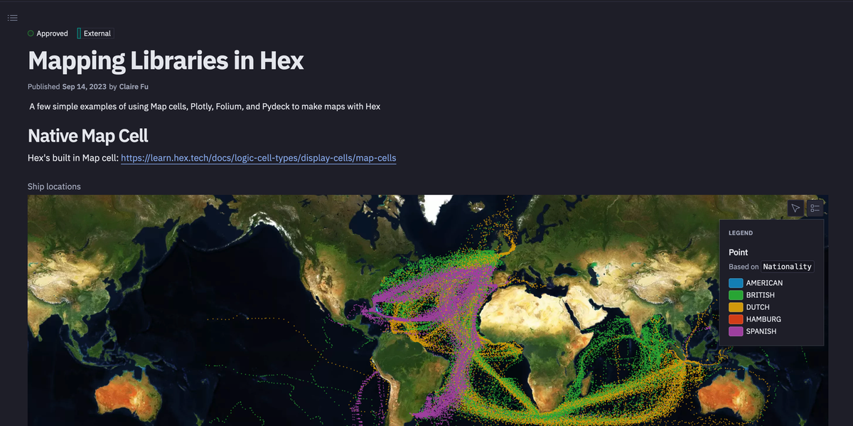
With seamless connection with your data warehouse and other data sources, Hex offers an exceptionally flexible interface for GIS and geospatial data analysis, granting you complete access to the functionalities of leading Python mapping libraries such as GeoPandas, Plotly, and Mapbox. It is a multilingual platform that allows you to write code in multiple languages like Python and SQL within the same environment, which provides different kinds of cells. It also provides a native map cell for effortless visualization of geospatial data.
You can also use the no-code visualization feature to create the interactive visualization without writing a single line of code. Finally, once you are done with geospatial data analysis and mapping, you can create a Dashboard and deploy it immediately with just a few simple clicks.
This section will use SQL to read the data stored in Snowflake Warehouse, Python to create different geospatial visualizations, and Hex as the development environment. Hex provides a cell type called Native Map Cell that allows you to develop other geospatial visualizations with code and no-code functionalities.
Read Data from Warehouse
To read the data from the warehouse, you can simply add the SQL cell in the Hex environment and write the SELECT command, similar to querying a database.
SELECT
	try_cast(LATITUDE as float) as lat,
	try_cast(LONGITUDE as float) as lon,
	"ShipType",
	"Nationality",
	"ShipName"
FROM DEMO_DATA.DEMOS.CLIWOC;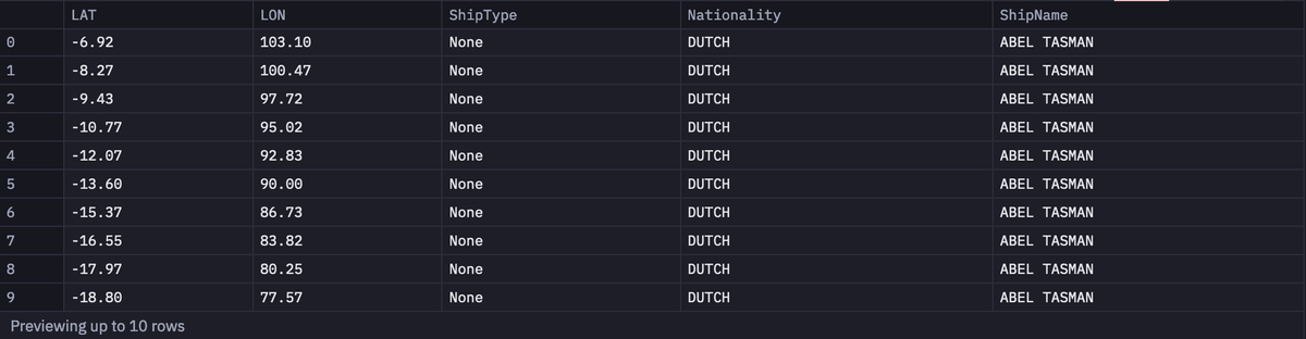
As you can see in the above command, we are loading the lat, lon, ShipType, Nationality, and ShipName columns from the CLIWOC table.
In the Hex environment, data is always loaded as Pandas DataFrames and the output of one cell can be easily accessed in the upcoming cells.
You can create a simple geospatial plot with the help of Mapbox (additionally with no code) as follows:
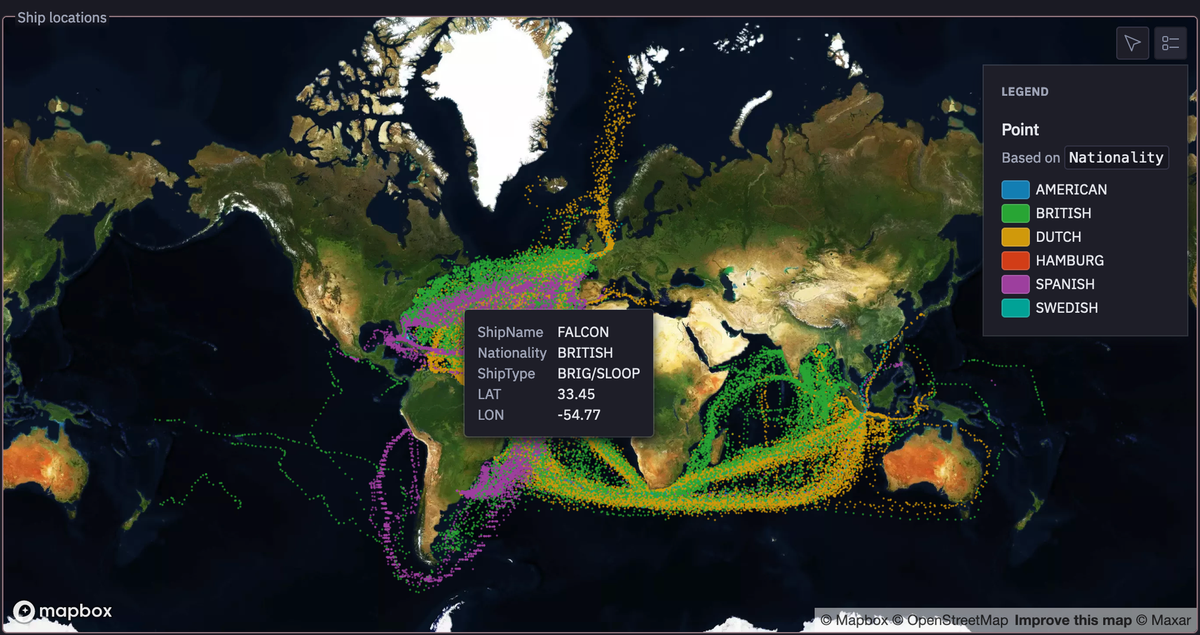
As you can see the above graph is interactive allowing you to hover for different important information, pinning to different locations, and showing the legend on the right side for easy interpretation.
Plotly + Mapbox
Now we will use Plotly and Mapbox to create a map for checking the peak_hour and car_hours in different locations using the carshare data from Plotly. The backend map is usually created by the Mapbox and over the map we will create different scatter points to check the required information. As mentioned in the Mapbox section above, you need to have the mapbox_token to work using Mapbox functionalities. The plot can be created with the following code:
import plotly.express as px
px.set_mapbox_access_token(mapbox_token)
df = px.data.carshare()
fig = px.scatter_mapbox(df, lat="centroid_lat", lon="centroid_lon", 	color="peak_hour", size="car_hours",
              	color_continuous_scale=px.colors.cyclical.IceFire, size_max=15, zoom=10, height=500)
fig.show()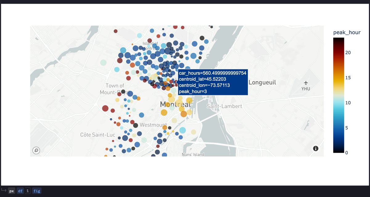
In the above code, we have loaded the Plotly library from Python and then we have defined the mapbox_token to access the Mapbox services. Next, we loaded the carshare data from Plotly and used the scatter_mapbox() method to create scatter points over the map to visualize the peak_hour, car_hours, and other required details.
Folium & Geopandas
You can also leverage the combination of Folium and Geopandas to create different clusters over the map. To do so, you need to import the following dependencies:
import pandas as pd
import geopandas
import folium
import matplotlib.pyplot as plt
from folium.plugins import MarkerCluster
We will be using the same carshare data for this section as well, the only difference is that we will be utilizing the GeoPandas data structure called GeoDataFrame for manipulating the geospatial data and creating visualizations.
geometry = geopandas.points_from_xy(df.centroid_lon, df.centroid_lat)
geo_df = geopandas.GeoDataFrame(df[['car_hours','peak_hour','centroid_lat', 'centroid_lon',]], geometry=geometry)
Next, we will create a canvas for rendering the map and then will create an object of the MarkerCluster method for creating different clusters over the map. Once done, we will iterate over the list of locations and add a marker based on the car_hours, color-coded by its type.
map = folium.Map(location = [geo_df['geometry'][0].coords[0][1],geo_df['geometry'][0].coords[0][0]] , tiles = "Stamen Terrain", zoom_start = 11)
marker_cluster = MarkerCluster().add_to(map)

geo_df_list = [[point.xy[1][0], point.xy[0][0]] for point in geo_df.geometry ]

# Iterate through the list and add a marker for each volcano, color-coded by its type.
i = 0
for coordinates in geo_df_list:
	type_color = "purple"

	# Place the markers with the popup labels and data
	marker_cluster.add_child(folium.Marker(location = coordinates,
                        	popup =
                        	"car_hours: " + str(geo_df['car_hours'][i]) + '<br>' +
                        	"Coordinates: " + str(geo_df_list[i]),
                        	icon = folium.Icon(color = "%s" % type_color)))
	i = i + 1
map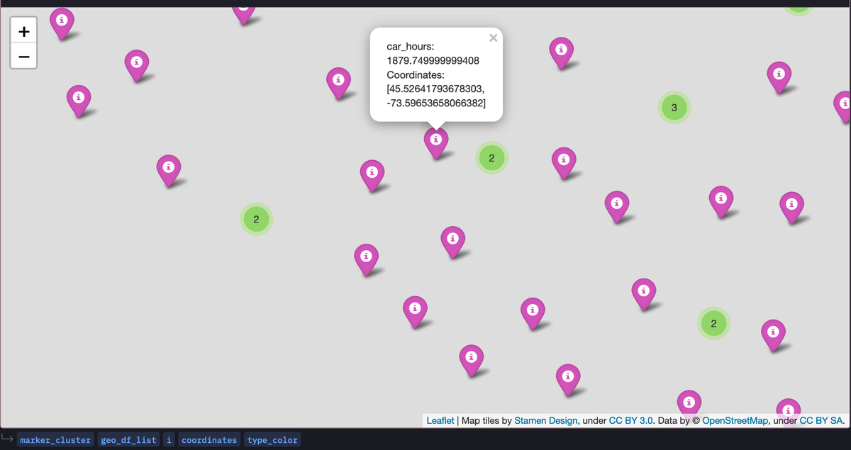
As you can see the above graph is interactive as you can hover over different clusters to get detailed information about the carshare.
You can also create a heatmap using the HeatMap() method from Folium as follows:
from folium import plugins
heatmap = folium.Map(location = [geo_df['geometry'][0].coords[0][1],geo_df['geometry'][0].coords[0][0]] , tiles = "Stamen Terrain", zoom_start = 11)

heat_data = [[point.xy[1][0], point.xy[0][0]] for point in geo_df.geometry ]

heat_data
plugins.HeatMap(heat_data).add_to(heatmap)

heatmap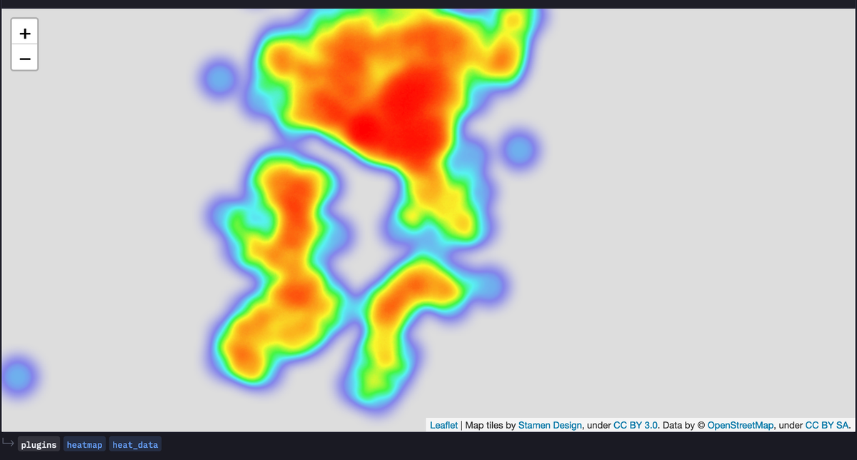
Pydeck
You can also utilize the deck.gl backend with the help of the Pydeck library in Python. You can use the Layer method to specify the type of visualization and other necessary details like dataset, aggregation, and opacity. Then using the Deck() method you can render the configuration similar to deck.gl.
import pydeck as pdk

COLOR_BREWER_BLUE_SCALE = [
	[240, 249, 232],
	[204, 235, 197],
	[168, 221, 181],
	[123, 204, 196],
	[67, 162, 202],
	[8, 104, 172],
]

view = pdk.data_utils.compute_view(geo_df[["centroid_lon", "centroid_lat"]])
view.zoom = 9

points = pdk.Layer(
	"HeatmapLayer",
	data=geo_df,
	opacity=0.9,
	get_position=["centroid_lon", "centroid_lat"],
	aggregation=pdk.types.String("MEAN"),
	color_range=COLOR_BREWER_BLUE_SCALE,
	threshold=1,
	get_weight="car_hours",
	pickable=True,
)

r = pdk.Deck(
	layers=[points],
	initial_view_state=view,
	tooltip={"text": "{car_hours}"},
)

r.to_html("heatmap_layer.html")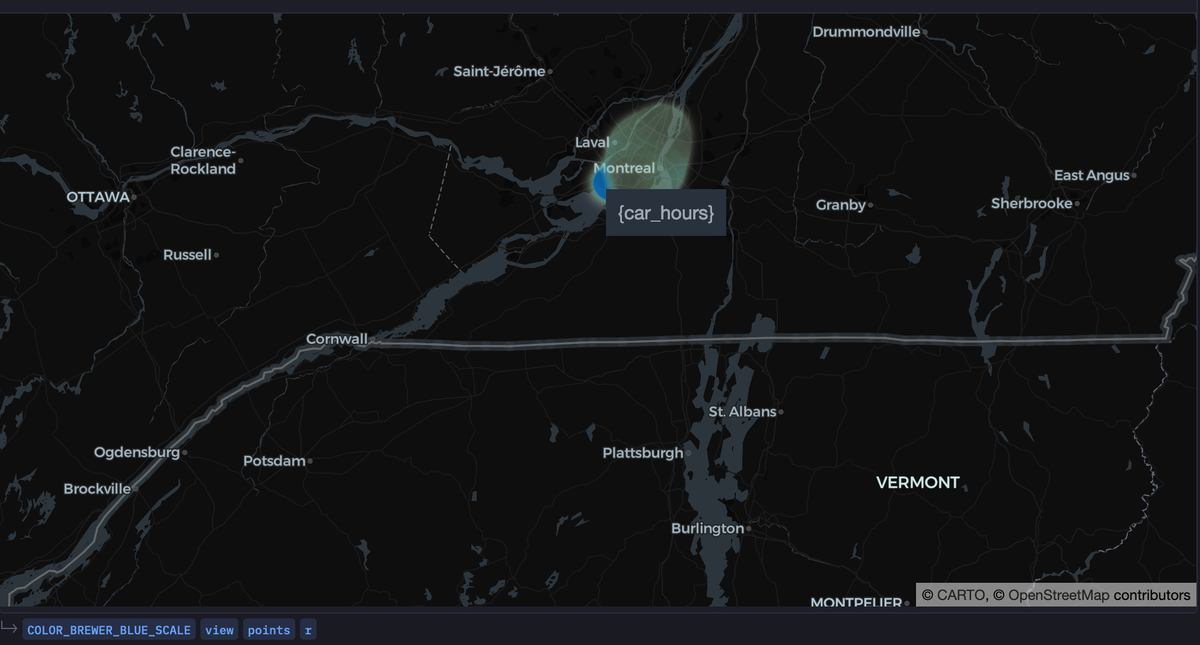
This is it, you have now created a lot of geospatial plots for the visualization of the geospatial data. You can now head over to the App section in the Hex environment to check the detailed dashboard created from the components that you have implemented. You can adjust the dashboard components according to your needs and once done you can click on the publish button to deploy the dashboard that you have created.
Best Practices
Now that you know about the famous mapping libraries in Python, you must also be aware of some of the common best practices for creating different kinds of maps. These best practices include:
Choosing the right library for specific use cases
Since there are a lot of libraries for creating interactive geospatial visualizations, it is recommended to take a look at the various advantages and disadvantages of these libraries before choosing them. For example:
- Folium: Great for creating interactive Leaflet maps.
- Geopandas: Extends Pandas to handle spatial data.
- Matplotlib and Basemap Toolkit: Useful for basic static maps.
- Plotly: Offers interactive and high-quality visualizations.
- Bokeh: Ideal for creating interactive, web-ready visualizations.
Pick the option that most closely matches your requirements.
Data Preparation
You must prepare your data to create an effective visualization, here preparing the data means converting the data to an appropriate format that is best suited for different libraries. For example, Geopandas work well with GeoDataFrames, while Folium often requires latitude and longitude values. You must also ensure that the data does not contain any irregularity or errors to avoid misinterpretation.
Experiment and Iterate
You should never be afraid of trying out different libraries for visualizations, try different ones and come up with the best one. Also, you must adapt to feedback and changing requirements for creating the best visualizations.
Performance Considerations
When using large datasets, you should surely think about interactive visualization as large datasets can affect the performance of these visualizations. Using data aggregation or sampling techniques for large datasets can surely help create different geospatial visualizations.
See what else Hex can do
Discover how other data scientists and analysts use Hex for everything from dashboards to deep dives.


Ready to get started?
You can use Hex in two ways: our centrally-hosted Hex Cloud stack, or a private single-tenant VPC.