Blog
A beginner’s guide to Python notebooks
Why data teams use notebooks, and how to get them up and running for coding and exploratory analysis

“When I started working on IPython I told myself and my adviser that this was just going to be an afternoon hack and that I would get back to 'real work' very soon.” (source)
So said Fernando Perez, the inventor of IPython and its successor Jupyter, in the final year of his PhD in theoretical physics at the University of Colorado, Boulder.
21 years later, that ‘afternoon hack’ is part of hundreds of thousands of data workflows, and forms the core of data analysis at companies like Netflix, Lyft, PayPal, and Bloomberg. But if you are used to hacking together Python scripts for your data analysis, then notebooks can look… odd. You code in the browser, you run it line by line, and why do you have to work with a colonel?
Once you get over the oddness, you can start to see what companies like Netflix see. Notebooks let you pull apart your code so you can see the data at every stage, examine and explore it, and then put it all back together again to present a full story.
In this post we’ll explain what data notebooks are, why we think they are important, and take you through the first stages of creating and using your own. Here’s what we’ll cover:
- Why data teams use notebooks, and why you should too
- Getting a notebook up and running
a. The cell
b. The kernel
c. Architecture and security
d. Installation options and distribution - Running your first code
- Doing something useful with your notebook
- Going deeper on data notebooks
Why data teams use notebooks, and why you should too
“run code, explore data, present results.”
This is the fundamental pattern of data analytics. Run some code, see what the data says, code, explore, code, explore, code, explore until you get something you can show to your team or the world (or not).

This is what Perez built his initial IPython notebooks for–making his own analysis easier. He wanted to take everything you do in a data exploratory pipeline and bundle it into a single document: the notebook.
Here’s what a published notebook can look like, taken from the Hex Use case gallery:
Notebooks are designed for this loop:
- Run code: A notebook runs Python code in the same way any .py file you write does; you can use all the same libraries, etc. in the same way a regular Python environment does.
- Explore data: In a notebook, you run lines of code in isolated cells. This makes it easier to see the output of just those lines. The outputs are presented inside the document instead of in a terminal, making it easier to see what’s happening with your data as you analyze. It’s iterative!
- Present results: You can incorporate visuals from the data outputs – like tables and charts – directly in the document, alongside text and other images to present your analysis as a single entity. You can then export the document in different formats with different styling. Much easier than telling your teammate to run a .py file in their terminal.
This all makes notebooks great for playing with your data. As you’ll see as we go through a couple of examples, you can stop the code at any point to take a look at the output, then go back and continually adjust your code until you get what you want. You don’t have to wait for all the analysis to happen–you can take it step-by-step.
Weirdly, this benefit of notebooks can also be a limitation. Analysts have primarily used notebooks for ad-hoc, small analyses. They explore the data and build a pipeline/model/workflow in a notebook, but then port it over to regular files (i.e. productionize it) when they need to schedule or scale the analysis or model.
But that is changing. Notebooks are critical parts of the data pipeline for major companies:
- At Netflix, most data access goes through a notebook rather than direct access through an API. They use them for scheduled tasks and have a set of templates to run specific analyses.
- At Bloomberg, they have experimented with notebooks embedded in the Bloomberg terminal so analysts can access data and test trading strategies directly in the terminal.
- At PayPal, they deploy Jupyter as a platform and have developed their own extensions to work specifically with PayPal data.
- At Lyft, they built LyftLearn, which uses Jupyter notebooks within Kubernetes containers to develop their ML models.
But we’re going to start simpler. Though notebooks at these companies are becoming sophisticated data tools, at their heart they are still just about “run code, explore data, present results.” That is what we want to show you how to do here. Let’s get going.
Getting a notebook up and running
It’s very easy, assuming that you’ve already got a Python environment installed and working. Install Jupyter by opening a new terminal and running:
pip install jupyterOnce you’ve got Jupyter installed, you can run it with:
jupyter notebookThere you go. A new browser window or tab should load http://localhost:8888/ and you are now up and running with a Python notebook. Perez’s afternoon hack in all its glory.
Let’s look at the interface and go through a few core ideas in notebooks before we launch into any code. The first page you’ll see is the directory:

Here we see what is in the directory where we launched Jupyter. In this case an env directory (always venv, people) and nothing else. To generate your first notebook, click on ‘New’ and select ‘Python 3 (ipykernel).’
This will create a file called Untitled.ipynb. (Congratulations, you’ve just created the first of your many hundreds of “Untitled.ipynb” files. Obligatory xkcd). .ipynb stands for IPython Notebook, and this is your actual notebook file.
Click on it and it’ll open up to this:

This is where you do your work in a notebook. All the code you’d normally put in a .py file will go here instead.
The cell
The most obvious part of this page is the cell. This is where you type all your code:

You type your code in there as you would in a .py file. The difference is that you don’t type all your code in a single cell. You write a single statement or small group of statements per cell and then execute just that code. Your entire notebook is made up of a sequence of these cells, building your analysis as you go. We’ll see how this works in practice in a minute.
Let’s talk about two other parts of this page, which are vital to understanding how notebooks operate. Up in the top-right corner you'll see a kernel indicator:

The kernel
“Python3 (ipykernel)” means this notebook is running (or going to run) the IPython kernel.
The kernel is the heart of a notebook. It is the process that is running your code. For most of the work you will do with a Python notebook, this is the IPython kernel. But, and this is the clever part, it doesn’t have to be. You can change the kernel your notebook is running to, get this, any other language. 🤯
Want to run R code? Use the IRKernel. Want to run Go? Use IGo. Want to go oldskool with some Fortran? You’ve got options with either Coarray-Fortran or LFortran. Whatever the flavor of your language, there is a kernel for you. You can even use an extension to mix multiple kernels within the same notebook.
This is why notebooks are no longer called IPython notebooks— IPython is now just the name of a single kernel available to you. They are now Jupyter notebooks because the ‘notebook’ part is language-agnostic. You can run whatever kernel you need that gets you the analysis you want. Think of a notebook as a particular way of interfacing with a programming language; the language itself can be pretty much anything.
Architecture and security
The second part to take note of is the ‘Trusted’ flag. As you’ll have noticed, given that you are working on ‘localhost’ and in a browser, when you run a Jupyter notebook, you start a server.
Here is the full architecture of the notebook you just started:
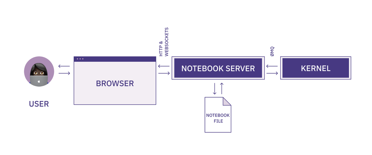
You code in the browser, the browser interacts with the server through websockets, and then the server interacts with the kernel through a message queue (and also writes to the notebook file).
It says ‘Trusted’ because it can also say ‘Not Trusted’ if you open up a file you didn’t write. Servers mean code execution, and as we’ve just seen, a huge benefit of Jupyter notebooks is that they can execute almost any code. Excellent if you wrote that code, not so great if you don’t know where that code came from.
If you were allowed to execute any code on this server, you would be opening up yourself to a world of pain. A malicious actor could send you a notebook file that you run which outputs JavaScript, which does unspeakable things.
Installation options and distributions
We’ll be using the pip install method throughout this article, but there are other options for starting a notebook.
The first is another way to get it up and running on your computer: Anaconda. Anaconda is a full ‘data science platform.’ It won’t just install Jupyter, it’ll also install all the other libraries you need for data science: pandas, numpy, scipy, matplotlib. Like 100 different libraries. This is good if you are going to be using all these libraries, but the pip way lets you have finer control over your dev environment.
The second way is to use an online notebook. This might be a cloud notebook like Hex if you are trying to connect to data in a selection of data warehouses. Or it might be an online version of Jupyter like JupyterLab or Voila. Both are going to work the same way (give or take some debugging) as a local version, with all the libraries preinstalled on the server.
Online notebooks tend to be better for collaborating and sharing. For instance, here is a notebook you can run to play around with the latest image-generating AI: Stable Diffusion.
Sharing and collaborating is a well documented weakness of notebooks. You have to share the document and collaborate back and forth, which feels like you’re doing data science for the Pyramids. Developers today expect much better collaborative tooling. These issues, along with code versioning, are being resolved by online notebooks that are designed with collaboration in mind, taking lessons from developer workflows and moving them into data analysis.
Running your first code
Finally, let’s write some code! We’ll do a kinda “Hello, World!” of data analytics: open a file, extract some data, print it, and plot a pretty picture. We’ll use the Animal Bites list from Kaggle.
Let’s load the data in. Add this code in the cell in your .ipynb file:
import pandas as pd
import matplotlib.pyplot as plt

df = pd.read_csv("Health_AnimalBites.csv")
Then press ‘Run’. Note that we’ve made sure our data is in the same directory as this notebook, so we’re using a root file path.
Womp womp. When I do this, I get an error:

Why? We haven't installed pandas in this kernel yet. If we were using Anaconda that would be taken care of, but since we installed our notebook with pip, we need to do this manually here.
This is an important point to note about notebooks. They aren’t themselves all-in-one data analytics platforms. All a Jupyter notebook alone is doing is giving you an environment designed for better data analysis. It is just a better medium.
So, back in the terminal let’s pip install pandas matplotlib and then come back here and rerun this cell. To rerun something, click on the cell again, and click ‘Run’:

Success! (if you count success as no errors, which every developer or analyst does.)
You should notice that the little In []: counter next to the cell has changed from 1 to 2. This tells you where this cell was run in comparison to other cells. For now, there is only this cell, but when you have dozens of cells you need to understand the order they were executed.
Now we start to come to the good part about notebooks. We don’t have any output from that code (it just reads data into memory), so the next obvious thing to do is something like df.head() to have a look at the structure of the data.
If we were doing this in a regular .py file that would be the next line. In a notebook, it is still the next line, but we can add it into the next cell, like this:

Here’s something fun. If you were doing this in a script and trying to see that data in the terminal, you’d have to run print(df.head()). Instead, here the notebook already knows you want to see the data, so shows it to you. It even nicely formats it with a CSS table for better readability.
So we added that code to the next cell, selected only that cell, and then clicked ‘Run.’ This shows two important features of notebooks:
- Variables are stored. We didn’t have to rerun that first cell to get df again, it was available to the second cell automatically.
- Cells can be run independently. If you think about how this might work in a .py file, you would always run the entire script each time. Not so with a notebook. You can run the analysis bit-by-bit, and even out of order, building up your exploration as you go.
That second point brings up a quirk of notebooks. Cells are independent so you can run them in whatever order you want. What would happen if we ran the df.head() cell first, before the cell where that variable was initialized? We’d get an error. For the most part, you aren’t going to do this, but be wary of it as your notebooks expand–if you get an error message it might be because you’re executing cells out of order.
Now that we have the dataframe already loaded in memory, we can write code in the cells below to perform any manipulation we want. For now, let’s just plot the species using pd.value_counts(df["SpeciesIDDesc"]).plot(kind='barh'):

And there we have our plot, within our notebook. All the code, the data, and the outputs are all in one place, that we can then use to collaborate with others (by sharing the .ipynb file and underlying dataset) or to present the results.
As it stands, it might not look incredibly presentable. Good enough for a standup with the rest of the data team, but maybe not for sharing around the company, but in that screenshot above, there is a little easter egg. Just above pd.value_counts(df["SpeciesIDDesc"]).plot(kind='barh') it says ‘Now let’s plot this data.’
You see, cells aren’t only for code. They can also be for text. You can write any markdown you want in a cell, and have it appear within the notebook. Let’s do that:

Now it’s looking a little better.
Doing something useful with your notebook
The example above is just to show you the concepts at work in a notebook. Now let’s build out a common workflow for an analyst. We’re going to recreate the report on ornithopter rental churn from the Hex Use case gallery. To do so, we’d want to:
- Import the data into our notebook
- Interrogate the data to find some basic information about the dataset
- Start exploring the data to learn more about each feature
- Run some basic analysis to build a picture of the relative importance of each feature
- Model out the features so we can use this dataset to predict future churn
We’ll start again with importing the libraries we’re definitely going to use:
import pandas as pd
import numpy as np
Then we can import the data:
churndata = pd.read_csv('churndata.csv')It is good practice to separate function calls to different cells. This way, you can see and debug the data from each function easily. Once we’ve got the data into a variable, we can start to look at it. Size, data types, and an actual look at some of the data is a good start:
churndata.shapeThis gives the output:
(2666, 22)So we have 2,666 rows and 22 columns.
Next, the data types of these columns:
churndata.dtypesOutput:
Unnamed: 0                         int64
int64_field_0                      int64
division                          object
customer_length                  float64
interplanetary_plan                 bool
gold_support                        bool
number_support_reqs              float64
total_day_minutes                float64
total_day_sessions               float64
total_day_charge                 float64
total_eve_minutes                float64
total_eve_sessions               float64
total_eve_charge                 float64
total_night_minutes              float64
total_night_sessions             float64
total_night_charge               float64
total_interplanetary_minutes     float64
total_interplanetary_sessions    float64
total_interplanetary_charge      float64
repair_calls                     float64
churn                               bool
sector                            object
dtype: object
Some ints, some bools, but mostly floats. So we know this is mostly a numeric dataset. Let’s have a look at it:
churndata.head()We used pd.head() before as well—this method returns the first five rows of a dataset. It gives you an understanding of what the data looks like without having to print out all 2,666 rows.

Let’s start plotting some of this data to better understand it. First churn:
pd.value_counts(churndata["churn"]).plot(kind='barh')The output is:

pd.value_counts() is a helpful way to quickly a) get counts of categorical data within a dataset, and then combined with .plot(kind='barh'), plotting that data.
As we have the churn numbers, we can also calculate the churn rate for the period:
churn_rate = churn[1]/(churn[0]+churn[1])
print(churn_rate)
Which gives an output of:
0.145536384096024Let’s take a step back for a moment and talk about reporting. The graph above and the churn rate are exactly what you might want to include in a report. But in their present state, they aren’t particularly visually appealing.
This is how that data is presented in the Hex gallery version:

Much nicer. Because of some limitations of Jupyter (for instance, no variables in markdown so no dynamic headers), we can’t make our output quite as nice, but we can make it clearer than it is.
First, let’s add the header. We can do that using a Markdown cell and a single # for an H1 header:
# Churn MonitorAfter that we can have another Markdown cell with the blurb:
This made-up Dune ornithopter rental churn dashboard is an analog to the kind of dashboard you might make to model and track retention at a real company. Open the comments for explanations of cells. This is an example of a high complexity Hex app.Then we can start to include the data. For the churn rate, we’ll use an f-string along with the data we’ve previously generated, along with working out the current quarter from today’s date:
from datetime import date
quarter = f"Q{pd.to_datetime(date.today()).quarter}"
print(f"{quarter} churn was {churn_rate*100:.2f}% with a total of {churn[1]} churned customers")
Which will output:
Q3 churn was 14.55% with a total of 388 churned customersNow we can spruce up our graph. You can plot data within a notebook using any viz library such as matplotlib or seaborn.
To create a similar chart with matplotlib we would first have to import matplotlib as we didn’t do so at the top. That’s OK, we can just do it now separately:
import matplotlib.pyplot as plt(Just as with a regular file, it is better to put all your imports at the top, to help both you and anyone else using your notebook remember/understand the libraries you’ve used. Just remember to rerun that import cell before you try to use the library).
Then plot that data with a little styling:
plt.style.use('ggplot')

x = ['False', 'True']
count = [churn[0], churn[1]]

x_pos = [i for i, _ in enumerate(x)]

plt.bar(x_pos, count, color=['blue', 'orange'])
plt.xlabel("Churned?")
plt.ylabel("Number of customers")
plt.title("Number of Customers by Churn Status")

plt.xticks(x_pos, x)

plt.show()
Which outputs this:

Better than our attempt with just pandas. Now, if you tried to use all that you’ve coded so far in your notebook as a report, it still wouldn’t look that good. For one, it would be full of code. For some reporting, that is good—if you are talking to a data team, showing your working is important. But if you want a report on churn for the company to see, they don’t need to see how the sausage was made.
To build a report that looks like a report you need to convert your notebook to another format, such as html, and ask the preprocessor nicely to not include all the code. You do that will this command in the terminal:
jupyter nbconvert --to html --no-input [notebook-name].ipynbThis tells the converter (nbconvert) to output to html, but without all your input cells included. What this does is take this:

And turn it into this:

Much better.
From here, the analytical world is your oyster. In the Hex Use case gallery example, we go on to perform some light machine learning to see what features predict churn. But you might want to explore each feature in more detail first, or build out interactive charts so your team can look at the data independently, or bring in other data to make this a more complete revenue metrics dashboard. With notebooks, you can do all of this, combining both the deep analysis and the metrics reporting in a single place.
Going deeper on notebooks
A few potential next steps:
Connect to different data sources.
Our example used a few local CSVs, but notebooks can connect to databases and data warehouses, cloud or otherwise. You could connect to Snowflake and then perform this exact same kind of analysis.
Try extensions.
Out-of-the-box, some aspects of Jupyter are limited (e.g. dynamic markdown). Extensions are add-ons that the community has built to improve utility. To install and use extensions run:
pip install jupyter_contrib_nbextensions && jupyter contrib nbextension installThen restart your notebook. You’ll have a new tab labeled nbextensions, where you can select different add-ons to improve your code or analysis.
You can prettify your code or use Autopep8 to conform to guidelines. Or use the ‘hide input’ extension to perform the same function as the --no-input flag in nbconvert, but directly in your notebook.
Build an entire report.
This should be where you want to go next. Take the ideas and code here, use it on your data and build out two reports: the first for your data team where you show the full analysis, code-warts and all, and the second for wider distribution in your company where you use the ‘hide-input’ options and all the markdown cells to generate a report that showcases your work and data to the full.
Being able to perform your analysis line-by-line and step into the data at any point means that you can get a greater understanding of all your data. Being able to easily generate reports means that others will start to better understand your analysis as well.
Notebooks don’t replace good analysis. They just make it easier to “run code, explore data, present results.”