


Our core focus at Hex is making analytics more collaborative and and easily shareable. A big part of that is our App Builder, which allows users to publish data projects as interactive web apps that anyone can use.
While the App Builder was a huge improvement over previous sharing workflows, we heard from our users that it still felt too hard to quickly build truly beautiful apps, so late last year we kicked off a project to see if we could make it better.
A little history...
The App Builder interface was one of the first things we built in Hex, but it’s already gone through several iterations. The most recent revamp left us with two distinct modes:
- Canvas: The first Hex App Builder – a free-form, drag and drop builder where you started, quite literally, with a blank Canvas.
- Story: Our second major addition – an auto-generated app layout that matched the linearity of your project’s “notebook” logic view, with minimal customization other than hiding content of your choice.
Quickly overtaking Canvas usage, it was clear to see that Story mode and its automagic 🪄 layout was a big success. But we kept hearing that app building wasn’t living up to our users’ expectations, so we dug in with user research to understand why.
Wearing our customer’s shoes
At Hex, engineers and designers engage directly with customers, conduct user research, and sit in their mud, really driving to understand how they do their work. In many cases, a great research insight might come from hopping into a shared Slack channel to ask a few questions, or doing a 30 minute screen share to fill in the gaps. (side note → I’ve never worked somewhere where it’s been so easy to convince users to take time out their day to chat with us 💜.)
Key research findings
Our research reaffirmed some hypotheses on where the App Builder was lacking, but also helped us codify an overlooked mental model in the way Hex users described their use cases. Almost unanimously, people described their Hex apps in one of two ways:
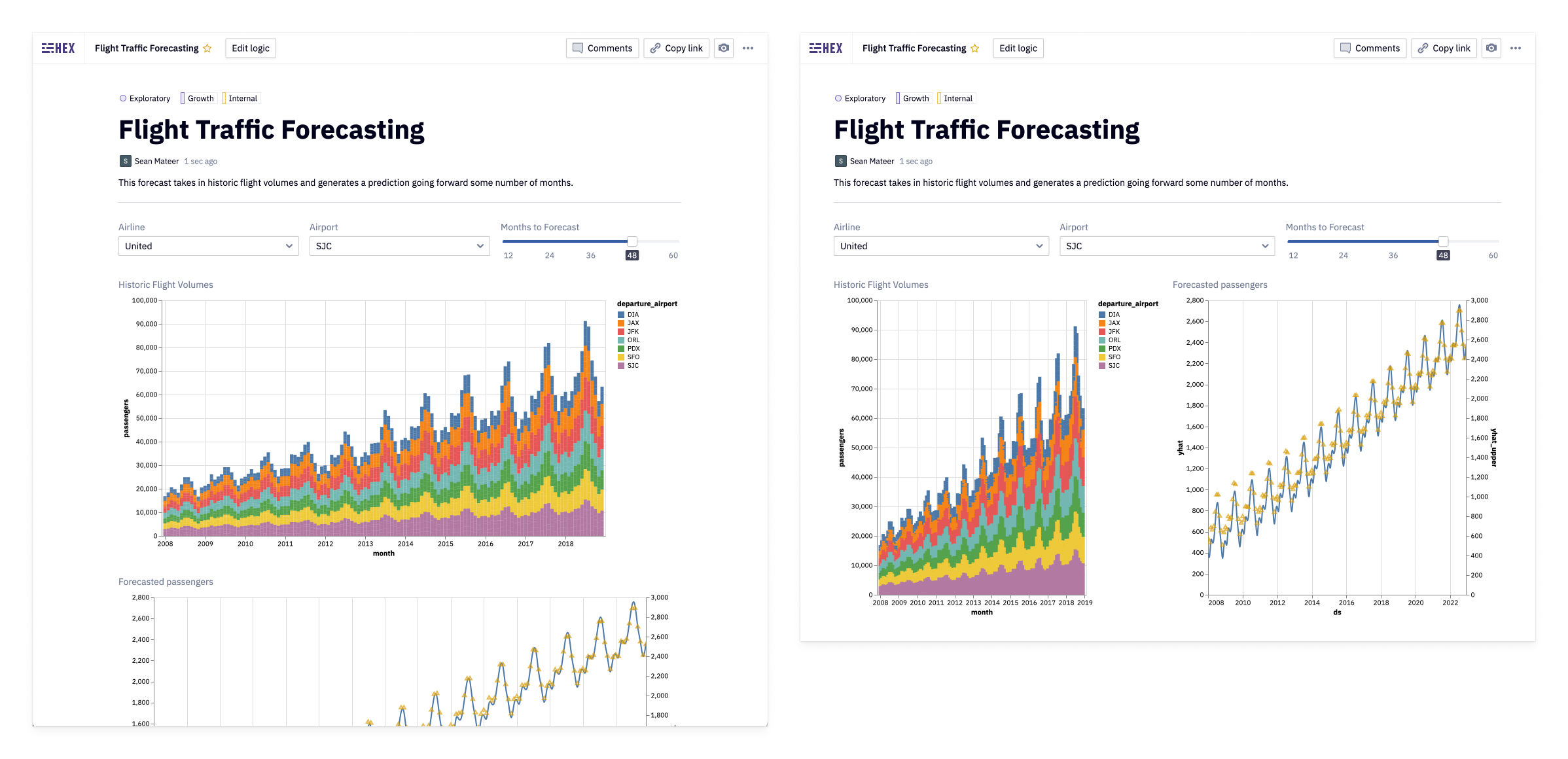
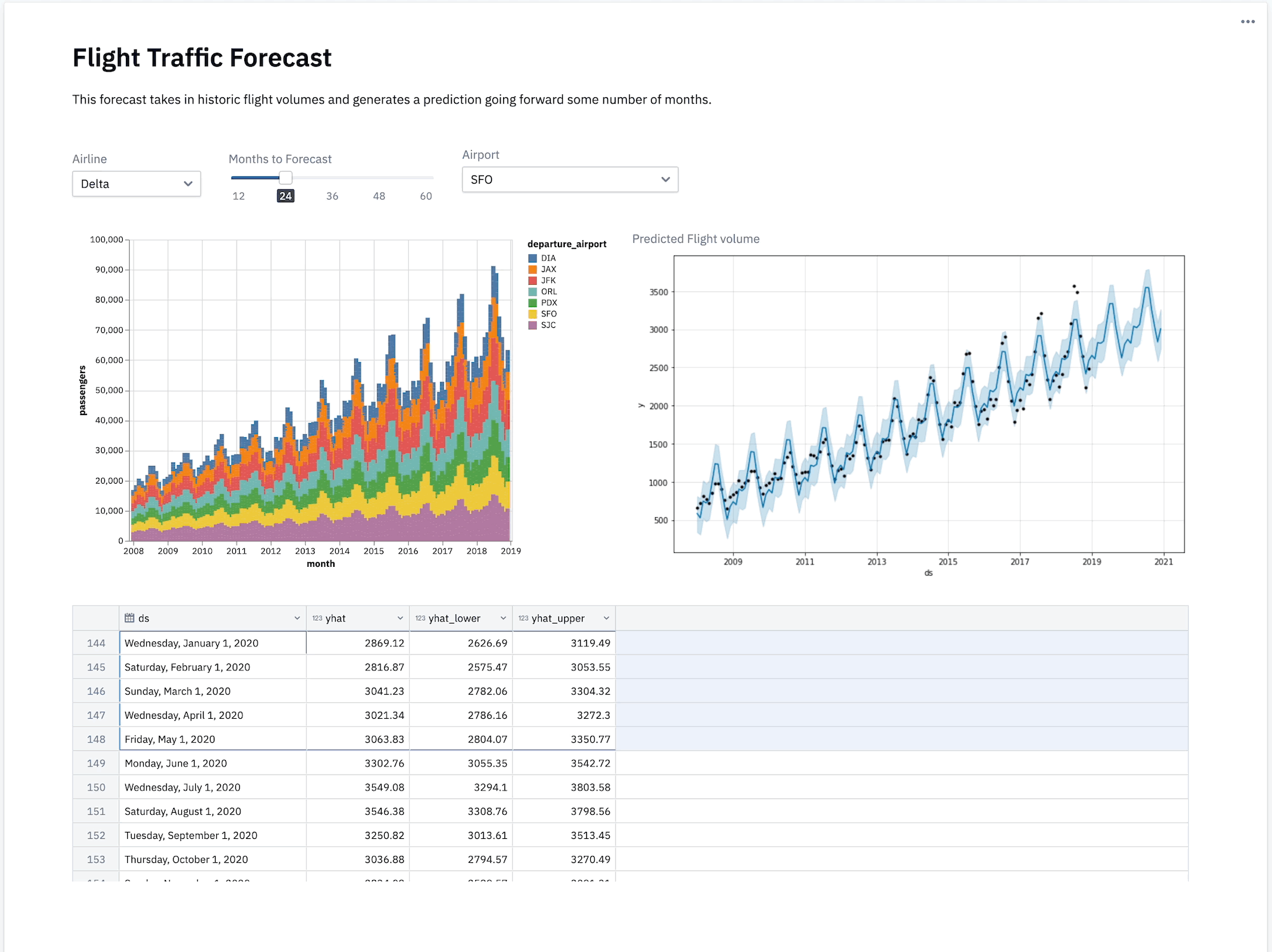
- “Narrative”: An app that resembles a document or report, intended to be consumed top to bottom. Typically, these apps very closely match the flow of analysis in Logic view.
- “Dashboard”: An app that may facilitate more free exploration or interaction, and often has a more complex layout. Dashboards are more likely to be built from scratch because they rarely match the default Logic view layout.
It turns out we had unknowingly supported these divergent use cases pretty well, with Story being used for narratives, and Canvas for Dashboards, but the real friction overwhelmingly occurred when the lines between those use cases started to blur.
Story is great for narratives, except for when it’s not
Surprise, surprise – the autogenerated apps of Story worked great when the linearity of your logic directly matched the order in which an app user would consume it. Unfortunately, a polished app is often the last thing on an analysts mind when they are exploring data in logic:
Story mode is great, but requires me to have a well thought out structure for the app while I'm exploring. I’m not thinking about the app while I’m working on my analysis, so I have run into situations where I needed to resort to Canvas to create a report that strayed too far from the order of my logic.
In many cases, we saw users wanting to create a document-like narrative with just a few tweaks compared to their logic – like the position of a chart or size of an element – but anything other than hiding cells required them to completely start from scratch with Canvas.
This meant a task as simple as putting two related charts side-by-side required you to start from scratch with Canvas - a potentially tedious task for a lengthy app.
Canvas solves the dashboard use case, but comes with its own set of woes
On the other hand, Canvas was chosen first by users describing the need for a dashboard, or those with a need for more flexibility in their narratives.
Ironically, the problem with Canvas actually wound up being too much flexibility. Canvas made you start from scratch, so for large apps it took a lot of work to insert every element. Because none of these elements were aware of where other elements in the app were positioned, inserting, resizing, and meticulously aligning dozens of elements could become a really tedious process.
It’s really difficult to modify my app when I need to insert something new in the middle.
Is there anything coming down the pipeline to help make app design easier like gridlines or auto-height adjustments?
Too hot, too cold
We’d given many users a better alternative with Story – they loved the autogeneration and responsive layout that Canvas had lacked – but it was too rigid.
While a small number of use cases benefited from starting with a blank canvas, many users opted to stick with Story and just rearrange their Logic views to make the inflexible app layout work. Only if that proved to be too difficult would they opt for Canvas, rebuilding their entire app just to make _minimal_ modifications they couldn’t do in Story mode.

Our goal and solution hypothesis
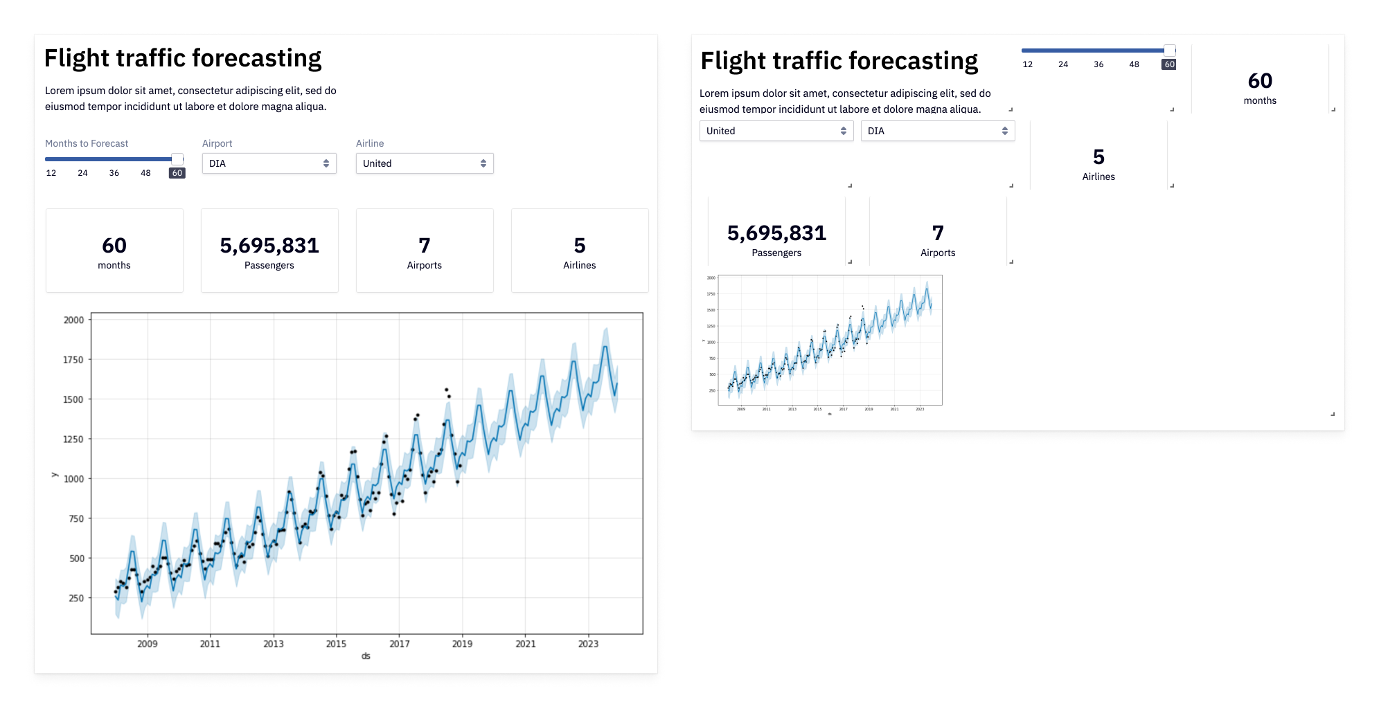
With our findings in mind and an obvious delta between our app building modes, we aligned on a goal: Experimenting with a new app layout type that would bridge the gap, combining the flexibility of Canvas’s drag-and-drop and the automagic layout of Story, while solving the pain points of each.
Our core hypothesis was that a “grid-backed” layout mode that initially snapped drag and drop elements to an invisible grid would provide a responsive foundation that supported both use cases.
We had a few hesitations though...
- Did we really need yet another mode to maintain internally and explain the benefits and use cases of to our users?
- Building a grid layout mode was no short order and felt like an “all or nothing” commitment. If our solution hypothesis was wrong, implementing this mode could be a time-consuming mistake in a culture where we prefer to ship value incrementally and as quickly as possible.

Prototyping a solution
For an experience that’s this interactive and filled with open questions, designing static mockups in Figma wasn’t going to get us very far. Our team of two decided to bias towards action and jump straight into a front-end prototype.
Failing fast with proofs of concepts
We initially considered prototyping a layout engine ourselves, but seeing as there’s no shortage of open source grid layout libraries out there, we decided it would be better to leverage prior art and move as quickly as possible to validate our hypothesis.
Within a few days, we had a basic prototype that allowed us to get a feel for the basic drag and drop interactions. Gray boxes aren’t very sexy, but they allowed us to move quickly and test interaction ideas such as inserting elements between existing ones - one of the most prevalent pain point of Canvas.
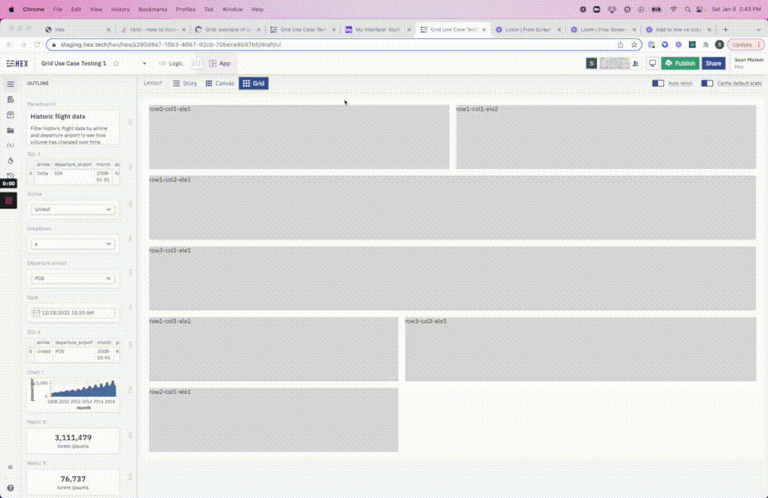
When we moved to rendering real elements instead of gray boxes, we saved a significant amount of time by only implementing the frontend. We left the time-intensive backend work – like saving element positions or handling our multiplayer collaboration features – for later.
At this stage, our success measures were simple: could we faithfully recreate Canvas layouts faster and less error prone than before?
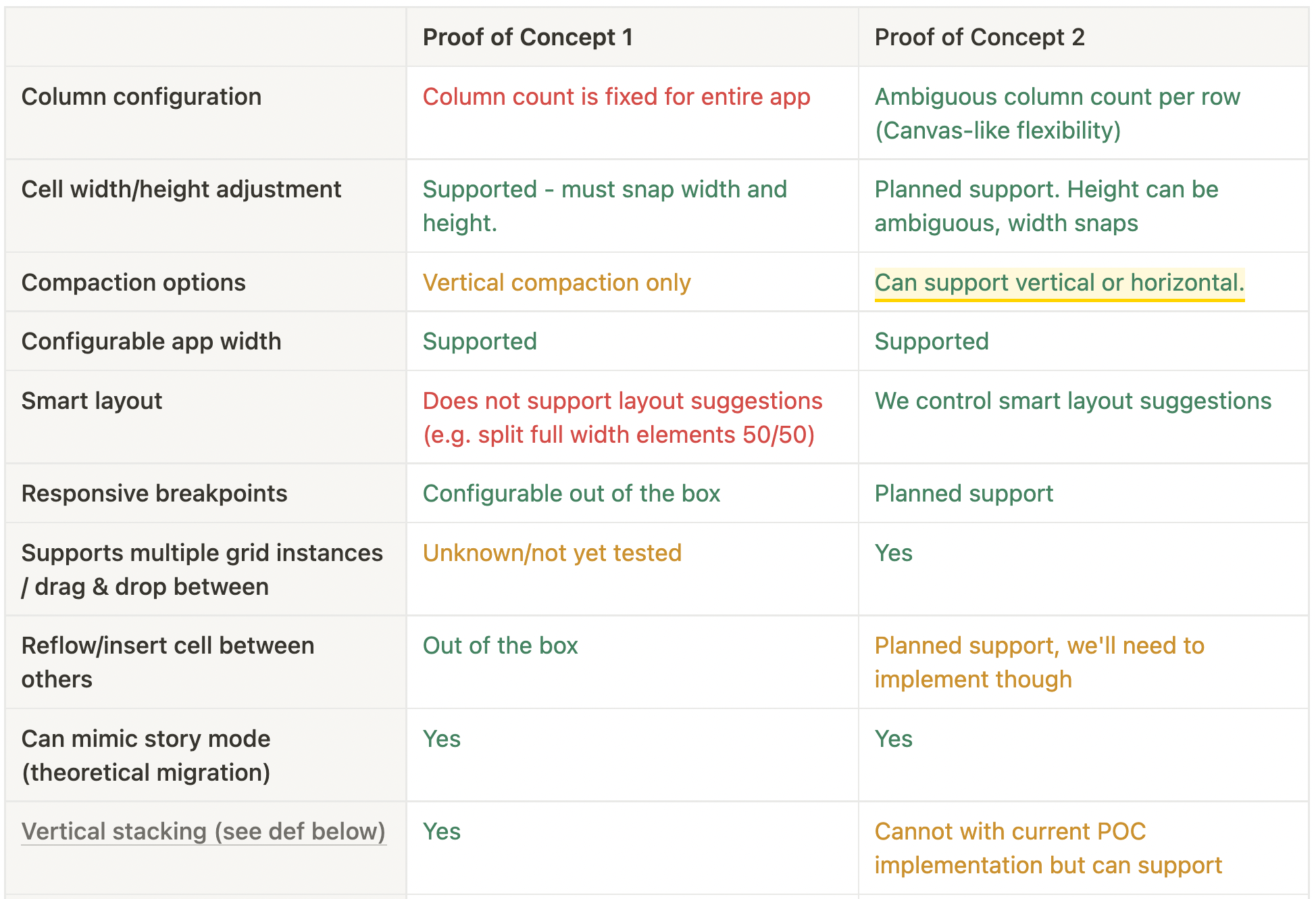
Our initial results were... less than stellar, but helped us both prioritize what capabilities were most important, and rule out some of the many grid libraries as options. The PoC above helped us determine that the inability to prevent app elements from “compacting” on the y-axis meant that a particular library was out of the question, as whitespace was an important Canvas capability we didn’t want to lose.
Testing to validate our approach
With a little work, we were able to coerce one of the third-party libraries into a usable prototype that met our general requirements, but simultaneously began to experiment with a lightweight, from-scratch implementation that made up for some of the shortcomings.
We took both of these prototypes and put them back in front of customers and internal users, gaining confidence that our hypothesis for a grid-backed layout was correct.
However, there were a few capabilities users expected that were particularly informative to our transition from prototype to production, one of which was the ability to vertically stack elements within a single parent row:
Transition from PoC to production
Ultimately, we found that our needs were unique enough to necessitate building our new App Builder’s layout engine ourselves, removing our reliance on the constraints of third parties, and giving us the greatest flexibility as we add even more app building capabilities in the future.
While making a production-ready layout engine took much longer than our PoCs did, our rapid, iterative, and experiment-based design process allowed us to move forward with confidence that we were making the right choice.
Shipping incrementally
Our biggest problem at this point was that all existing projects were in Story and Canvas layouts, so it was seeming like we would have to wind up with yet another app building mode (our worst nightmare 🙀).
As we moved into a production implementation and began to test internally, we struck upon a different idea: the new layout engine would become the layout engine for all existing story apps. Once fully released, the new builder mode would completely replace Story and Canvas (preserving “legacy” canvas apps as-is).
As much as possible, we strive to break releases down into their smallest possible components of value. This made releasing a new layout engine a bit nerve-wracking, since it’s a big bang feature that’s hard to roll out incrementally.
But we could replace the layout engine behind the scenes... So prior to actually releasing the new App Builder, we secretly began rendering all existing Story apps with the new engine. We preserved the UX of these story layouts and carefully made sure all apps were rendered _exactly_ the same, while we quietly prepared to flip the final switches.
After we were satisfied everything worked well, we flipped those switches and the best-of-both-worlds App Builder became the default new experience. The flexibility of Canvas’s drag-and-drop, the auto-generated layout of Story, and only one mode for us to maintain moving forward — win / win / win.
We couldn't end this tale without showing the finished product, so check out this quick video of how the App Builder turned out (or just fire up Hex and try it out yourself!)