Blog
Introduction to dimensionality reduction
Building an intuition around a common data science technique

Looking for a deep-dive into specific techniques, with Python examples? Check out the accompanying blog post, A practical guide to dimensionality reduction techniques.
Dimensionality reduction is a way to simplify complex datasets to make working with them more manageable. As data grows in size and complexity, it becomes increasingly difficult to draw meaningful insights, and even more difficult to visualize. Dimensionality reduction techniques help resolve this issue by giving you a smaller number of dimensions (columns) to work with, while still preserving the most important information.
Think of it like casting a shadow of a complex object - you lose some detail, but you gain a simpler representation that's easier to manipulate and make comparisons with.
Moving between dimensions
Before diving into the why and how of dimensionality reduction, let us first understand what it means to go from a higher dimension to a lower dimension.
Imagine standing in front of a bright light and trying to cast a shadow of your hand onto a nearby wall. You want the shadow to resemble your hand as much as possible, so you try rotating and orienting your hand in different ways.
The first way you try is to spread out your fingers and lay your hand horizontally so that it’s flat, but the resulting shadow looks like a long thick blob and bears no resemblance to your actual hand. You try again, rotating your hand 90 degrees downward, but again the shadow bears no resemblance to your hand.
On the third try, you orient your hand as if you’re giving the wall a high-five. And voila! A hand on the wall appears.
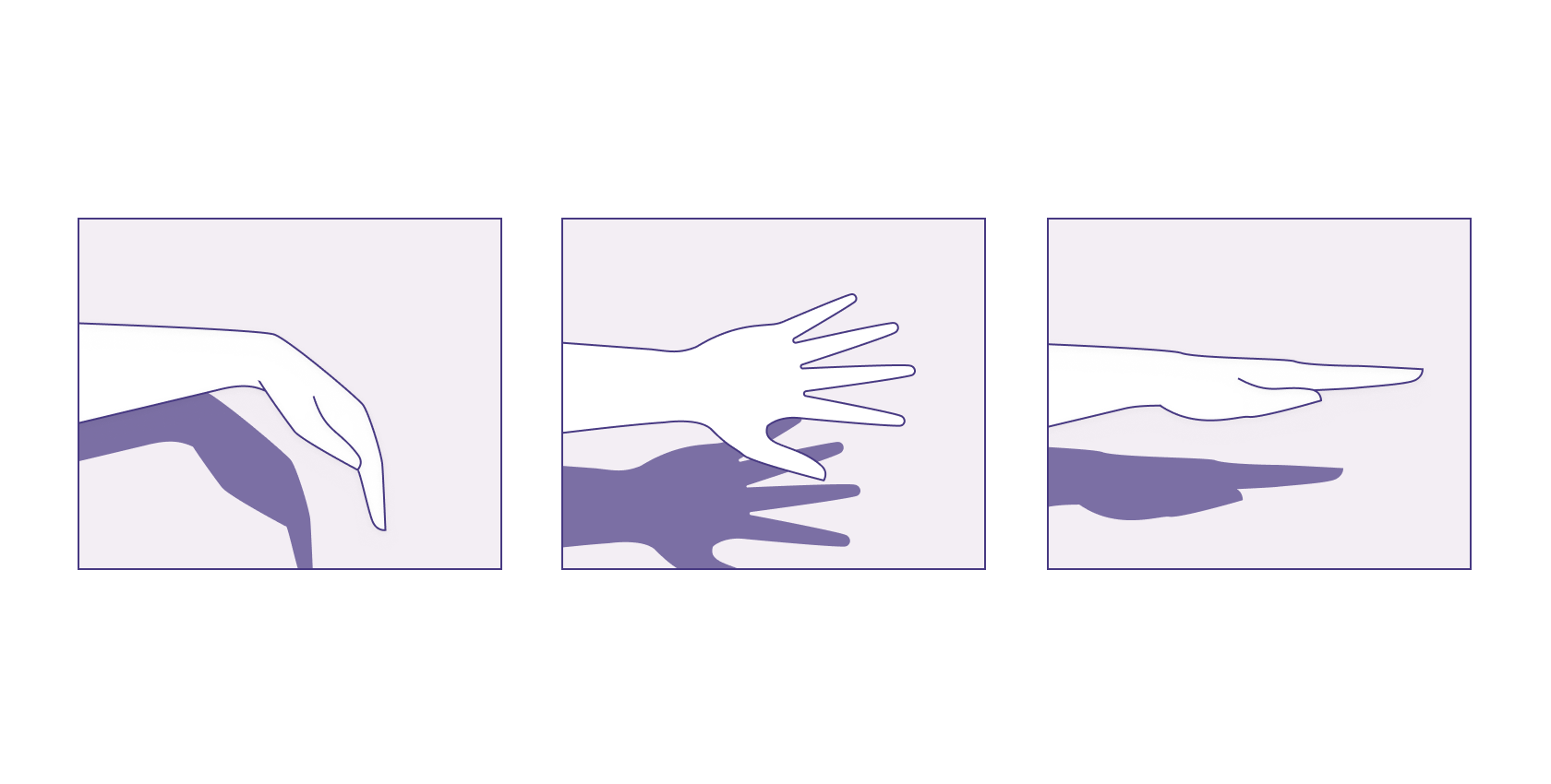
Rotating and orienting your hand to create a hand-like shadow on the wall is a real world example of dimensionality reduction. The shadow on the wall is a 2D representation of a 3D object. In this process, you lose some depth information, but you obtain a simpler representation of a more complex shape. If you want to compare the number of fingers of 500 hands, you don't need to know about freckles, scars, or skin color— you just need a shadow that shows the fingers clearly.
Of course, the challenge in our shadow example (and in dimensionality reduction in general) lies in figuring out how to cast a shadow that retains the information you do need, while removing as much of the irrelevant material as possible. For a hand, you might change the rotation and orientation of your hand, or the location and angle of the light source.
But in the world of data, we work with rows and columns, not hands and shadows. How do we project rows and columns into a lower-dimensional space? And hey, what even is a dimension, anyway?
What are dimensions?
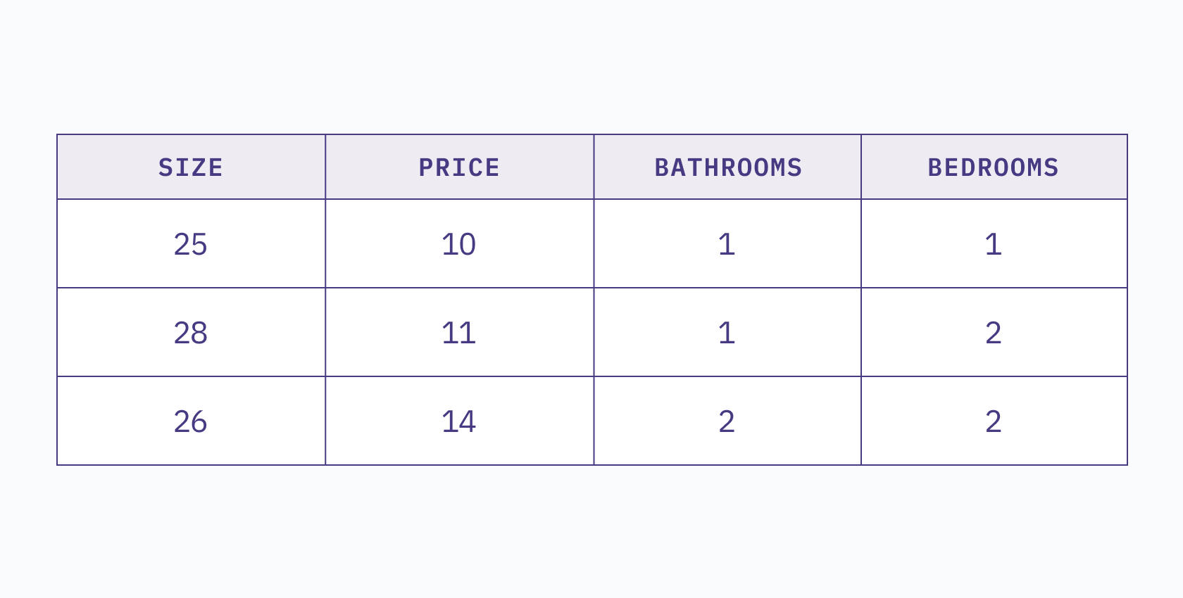
Dimensionality refers to the number of features or attributes in a dataset, or simply put, the number of columns in the dataset. For example, consider the following table:
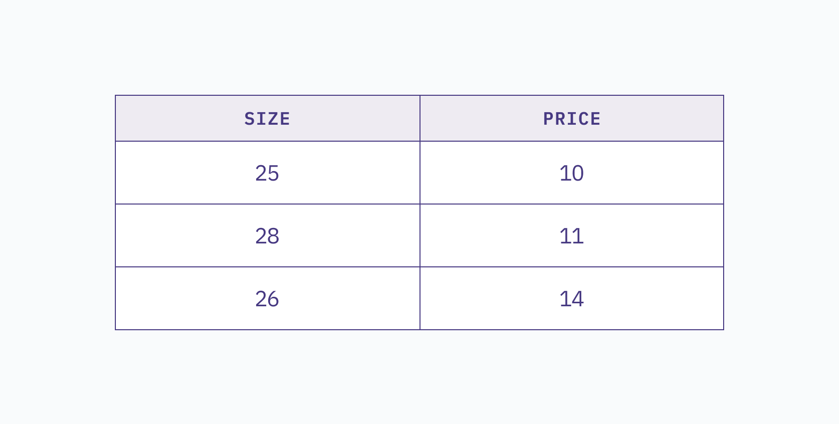
This two-dimensional dataset shows the price of a house in relation to its size. We can visualize this table in a 2D space, where each column represents a different axis.
If we add a third column, such as `bathrooms`, then our table becomes a 3D dataset, and all observations lie within a 3D space.
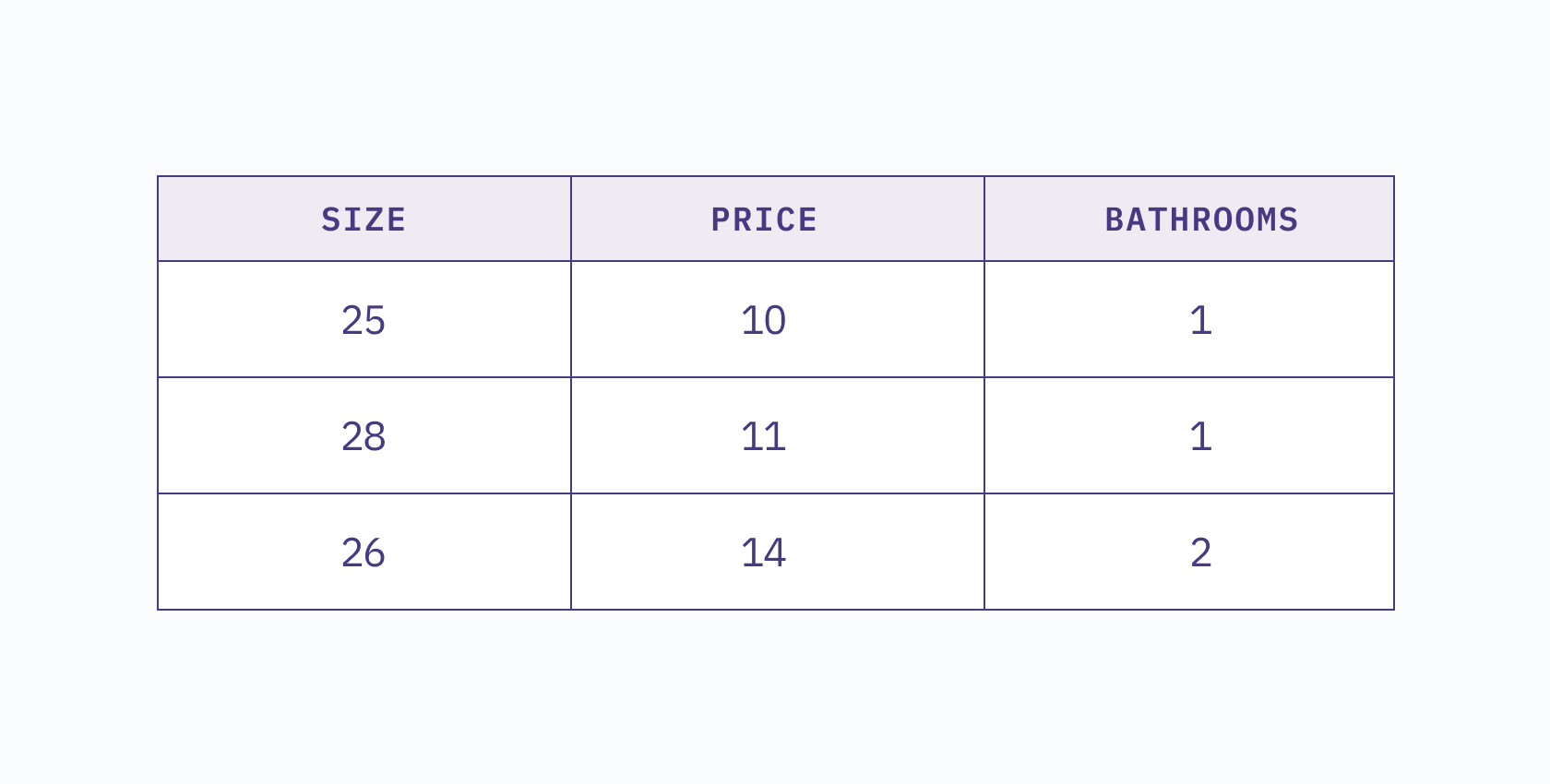
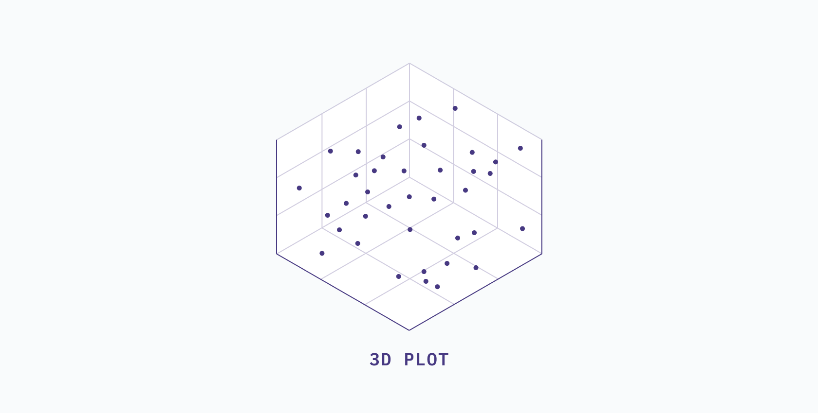
If we add a fourth column, such as `bedrooms`, then we have a 4D table, and all observations lie within a 4D space.
However, we encounter our first problem when we attempt to visualize a 4-dimensional space. What would a 4D space even look like? We can’t visualize a 4D space by just adding another direction to the axes, but maybe we can use our new dimension to determine the size of our data points on the chart...
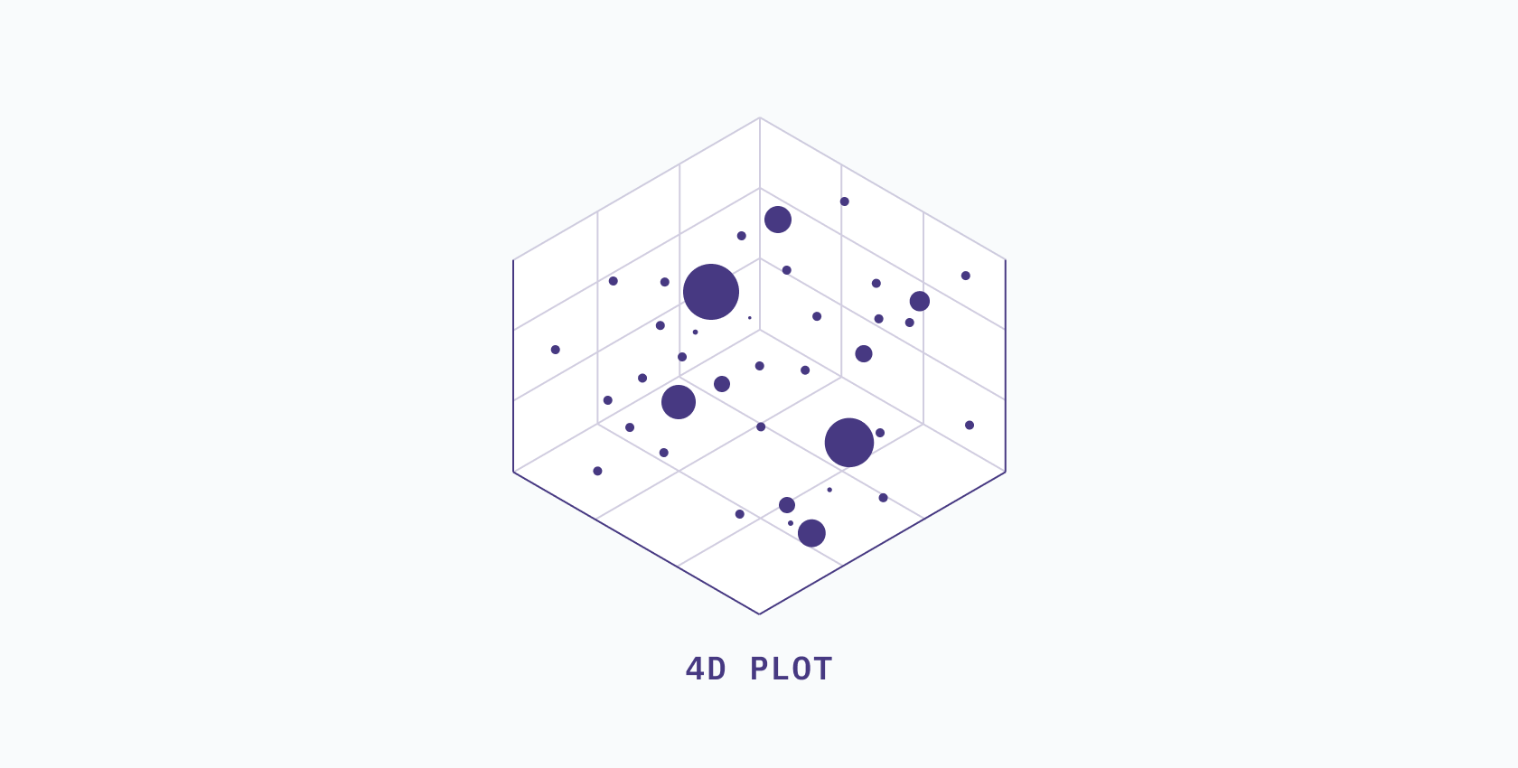
But then what if we add more dimensions? We can’t add another axis because it would be impossible to visualize. We're already sizing the points by one dimension. We could change the color... But what if we add another dimension? We start to get stuck.
In addition to this problem, the complexity of our dataset is increasing. Say we wanted to predict the price of our house using our 2D table. Keeping track of only one variable to predict the price in our heads isn’t that challenging of a task. This may even be true for our 4D table. However, how would you think about an 11-dimensional table?
By now, I hope it’s becoming clear as to what happens when we continue adding dimensions to our dataset. The problem we're trying to solve becomes more and more complex, and if we want to make any conclusions or predictions on the data, we'll have to keep track of more and more variables.
As the dimensionality, and therefore the complexity, of our data increases, the more difficult it becomes to work with. It’s almost as if we were cursed.
The curse of dimensionality
The Curse of Dimensionality sounds like something straight out of a pirate movie but what it really refers to is when your data has too many features. - Tony Yiu
Far from pirate fiction, this curse actually has its own Wikipedia page, sufficiently laced with complex math equations. Essentially, many of the techniques we have for working with data start to break down on datasets with very high dimensionality. Distance calculations don't work well, models are hard to fit, and things generally become difficult to handle.
There is no definitive method to determine when your dataset has too many features, but a good rule of thumb is to have significantly more rows than columns.
Imagine trying to predict the price of a house while considering 100 different factors that affect the final price. Your brain might explode! This is why we use dimensionality reduction techniques to simplify complex datasets and find a more manageable representation.
Dimensionality reduction techniques
Dimensionality reduction comes in two flavors: linear and non-linear reduction. While both methods aim to reduce the dimensionality of a dataset by projecting a “shadow” from a higher dimension to a lower dimension, each method goes about it in a different way.
Linear dimensionality reduction
Linear techniques aim to maintain the linear relationships in your data while reducing the dimensionality. In the simplest of terms, a linear relationship means that as one variable changes, there is a proportional change in the other variable.
For example, if you work twice as many hours, you might expect to earn twice as much money. If you were to work triple your normal hours, you might expect your paycheck to be three times larger. That's a linear relationship.
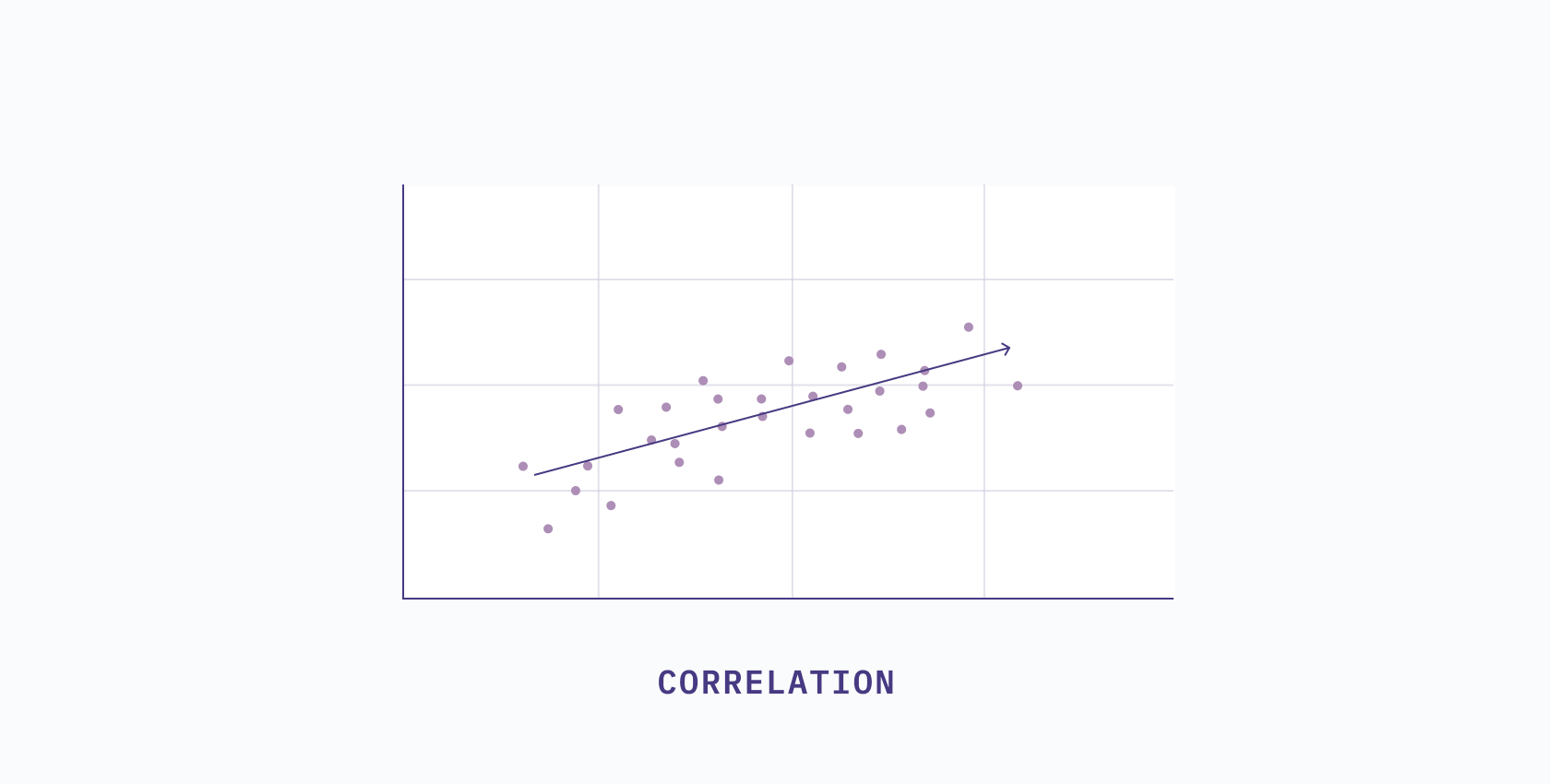
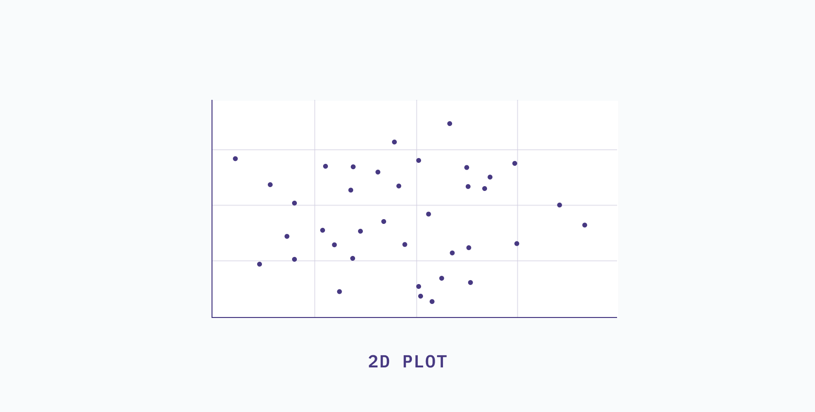
The key thing to understand is that linear relationships can be shown or described with a straight line. One way to get a sense of this is to plot a scatter plot and observe if the patterns seem to be distributed in a line. If there are too many variables to plot at once, you can look at the correlation between features. If the features are highly correlated, then a linear method will work well.
If you’ve determined that your data is indeed linear, some reduction techniques you could use are:
- Principal component analysis (PCA)
- Truncated SVD
- Independent component analysis (ICA)
For a more in depth look at what these methods do and how to implement them, check out this blog post that covers linear dimensionality reduction.
Non-linear dimensionality reduction
Non-linear dimensionality reduction techniques, on the other hand, try to capture the non-linear relationships in the data and represent it in a lower dimensional space. When data is said to be non-linear, it means that the relationship between variables is more complex than can be described with a straight line.
In this scenario, let's say if you work twice as many hours, you’d earn four times as much money. But if you were to work triple your normal hours, you might expect your paycheck to be nine times larger. That’s a non-linear relationship (a pretty good one too!)
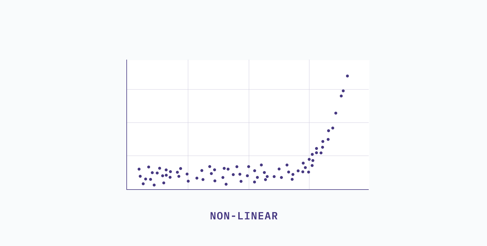
The key thing to understand here is that non-linear relationships can’t be described with a straight line. You can visually inspect the data through a scatterplot and if the relationship appears to be curved or doesn’t follow a straight line, then the data likely has a non-linear relationship. Alternatively, you can use correlation coefficients to test whether the relationship between variables is linear or non-linear.
If the features seem to be uncorrelated or the relationships between them aren’t straight lines, then you may want to use a non-linear reduction method. Some examples of non-linear techniques are:
- UMAP
- t-SNE
- Multidimensional scaling
For a more in depth look at what these methods do and how to implement them, check out this blog post that covers non-linear dimensionality reduction.
To reduce all that down...
Dimensionality reduction aims to project data from a high dimensional space (lots of columns) into a lower dimensional space (few columns). This is done to simplify complex datasets, speed up performance, allow for understandable visualizations, and avoid overfitting— amongst other reasons. Depending on the relationships present in your data, you may want to use a linear or non-linear technique, and you can try out various methods to uncover these relationships.
It also comes in handy at puppet shows.
If you'd like a more in-depth look at the algorithms and why there are so many options for dimensionality reduction, read this accompanying article on specific linear and non-linear techniques.