Blog
Hex for Analytics Engineers: Data Transformation
Streamlining analytics engineering workflows with Hex


This is part 1 of a series on using Hex for analytics engineering workflows.
Stay tuned for the next posts, and drop a line in this thread on dbt slack if there's an analytics engineering concept you're interested in having me cover! If you're not a member yet, join here.
While most people think of Hex first as a tool for data science and analysis, it is a highly flexible platform that can help support all kinds of interesting and valuable work up and down the data stack. Today, I’m writing about how Hex helps transform the workflows of analytics engineers like me.
I was hired as Hex’s first data team member and only analytics engineer, and we joke that one of my roles is “dogfooder in chief”: part of my job is to use the product and provide feedback to the rest of the Hex team.
It was surprisingly easy to ditch my old process and move all of my data transformation development work to Hex. As I used the product more and began using the full feature set, I kept making my process more efficient and effective. Whether your title is analytics engineer, data engineer, BI developer, ML engineer, or analyst — if you’re transforming data, I'm confident that Hex is a great workspace for you.
Why do we need to do transformation in the first place?
- 🥳 We have new data
- 💡 We’re creating new metrics
- ❓ We’re helping someone answer a question or make a decision
- 🤔 Someone DMed us on slack to say “that data looks wrong”
For all of these needs, my workflow looks something like this:

Inside the data transformation step are iterative cycles of exploration and building. As I start to understand the data, I’m continuously building that understanding into the transformations I’m writing.
Using Hex as a workspace for developing transformations has unlocked huge efficiencies. I’m faster, better, and crucially— I can more clearly communicate my process to reviewers. Here are three ways Hex has upgraded my data transformation workflows.
What is this Data, Anyway?
The first step in any transformation process is to build a mental model of the datasets you’re working with.
Before Hex, I’d use a query like select * from table_of_interest limit 100; to eyeball a sample of data. From there, I’d write more queries to continue building my mental model and exploring my data.
In my first week at Hex, I realized I could use input parameters to automate the parts of this process that are standard for all explorations. It took about 30 minutes to build a dead simple app that automates the common tasks I do often when getting to know a dataset.
This app let me operationalize the common sense checks I do on any new data source. By making my workflow automatic, I’ve ensured I won’t miss a step. Instead of selecting whichever 100 rows the database happens to return, a random sample ensures I’m seeing something representative of the data.
Non-Linear Development of Transformations
Pretty DAGs don’t build themselves.
Beautiful transformations don’t spring forth complete from my mind, and they probably don’t from yours either. Sure, the end product of a successful transformation task flows smoothly from source to final model. Along the way lots of iteration and experimentation helps me understand what shape the final transformations should take.
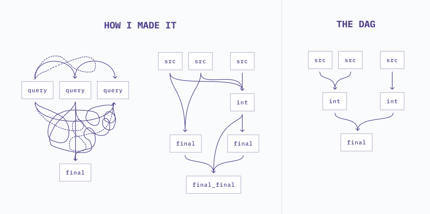
The SQL notebook format of Hex makes it easy to develop transformations in a non-linear fashion. If I’m developing a model with a large number of CTEs, I can write each one as a separate cell. When I’m happy with each piece on its own, I combine them in another SQL cell representing the final model.
If I see something interesting or unexpected, I can easily duplicate my query cell to take a look. The results of the duplicated cell can be easily compared to the original. I can see both at the same time in Hex’s notebook format, or I can query the two datasets together with Dataframe SQL.
Hex makes it easy to move between detailed row-by-row data and a summary that will tell me if my transformation is working as expected.
Parameterizing my queries supercharges my investigations of oddities I find as I’m transforming data. For example, let’s say I find anomalously high activity from a subset of users:
- I can write one query that finds the high activity users.
- I use an input parameter to create a dropdown menu that allows me to pick one of these users to check out.
- I can feed this user id into a second, more detailed query to decide if the activity is reasonable or not.
Here’s a quick Loom that demos a use case like that.
Visualize Transformed Data as You Work
You build your models, pass PR review, merge your code, run it in prod, and go to build your dashboard.
As soon as you see the first visual, something doesn’t look right. The visualization confirms that there was a mistake in your code. It was invisible to you and your reviewers until you saw the data. Ugh. Reset, back to transformations and another round of PR review. This has happened to me, and despite your best intentions it’s probably happened to you too.
Visuals are an incredible tool for validating data explorations and transformations.
A few weeks ago, a colleague sent me a slack message. They were building a rolling seven day window metric and something looked funny. Instead of being relatively smooth, there were big seasonal dips in the plotted metric for weekends. It looked more like daily than weekly.
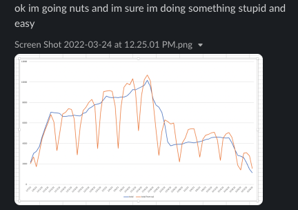
I looked at the code. They looked at the code. After a while, we realized the problem was that the data was missing a date spine and days with no activity weren’t represented. It was a quick fix to get the query working as intended.
Hex’s built in chart cells make it quick and easy to create a quick visual while you’re working on queries. If I need something more custom, I can dip into Python.
Visuals help me build a deeper and better mental model of the data I’m working with. It’s quicker and easier to make my final transformations, and they’re higher quality with fewer iterations thanks to a better mental model.
Hex 🤝 Analytics Engineering
Working in Hex keeps me in flow when I’m developing. I can spin off new cells to investigate something weird, annotate my work with Markdown, and prototype dbt models with dataframe SQL.
Instead of bouncing between queries, models, and wherever-it-is-I-can-visualize-this-data, I have all of my work in one place. I can detour and deepen my analysis when I need to, without losing the thread I’m trying to follow through to my end goal.
Are you using Hex to develop data transformations or do other analytics engineering work? I'm writing more posts on this subject, and I'd love to include your experiences and learn some new tricks! Come say hi in my thread on dbt slack (if you're not a member, join here) and let's nerd out together 🙂.