


Part of the magic of code notebooks is being able to see your outputs as you work, where it becomes second nature to chunk analysis into bite sized pieces (cells) and you get an output in between each step.
This is great, but we've found that static, plain text dataframe outputs leave much to be desired for end-users of these analyses. They're unable to interact with the data, and are required to scroll through seemingly redundant series of cells, each a minor variation of the prior cell.
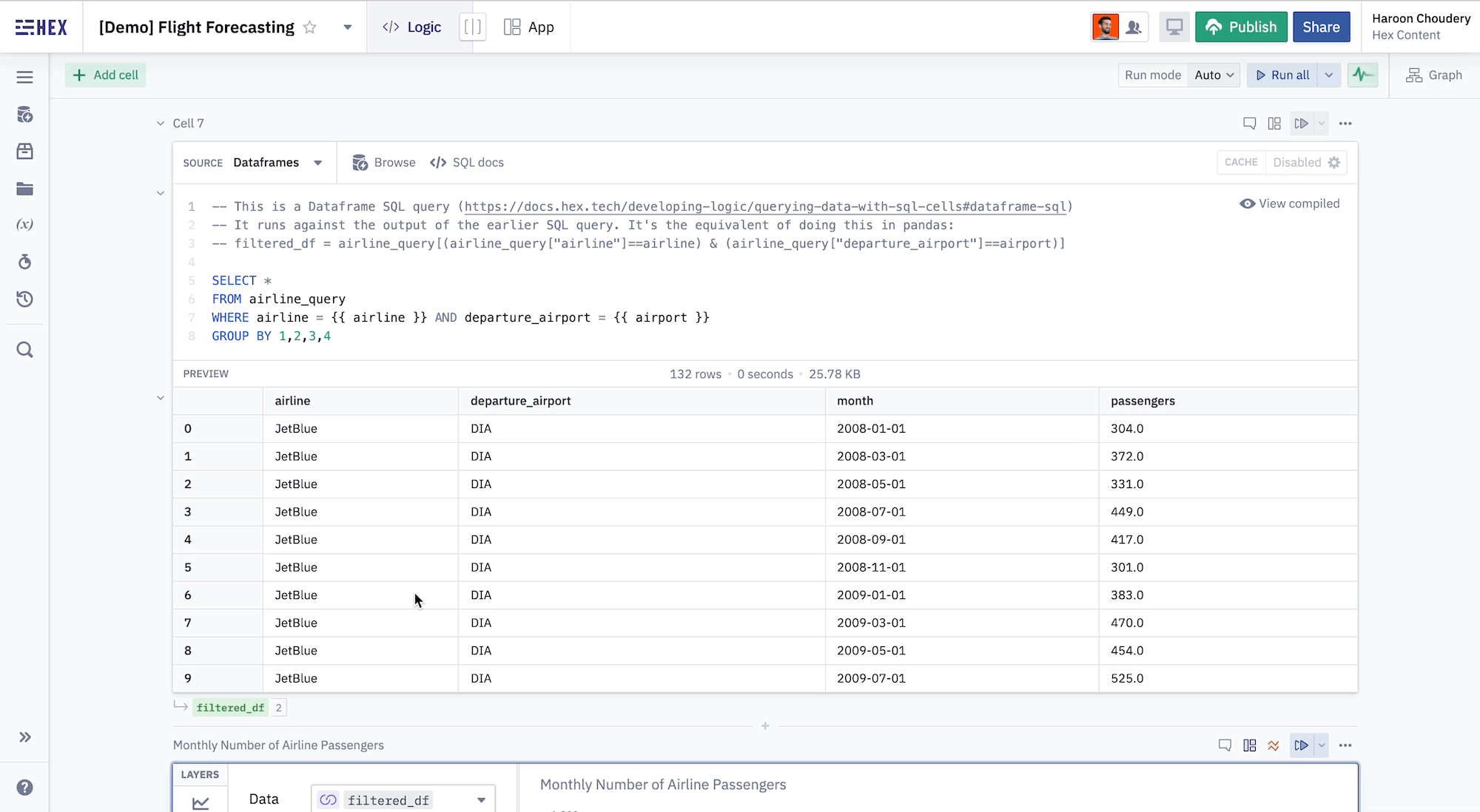
We also believe the speed of iterations when interacting with tabular data in code notebooks is slower than it should be. The usual workflow comprises writing several queries to analyze your data, each printing out a static output that helps you fill in the puzzle piece by piece.
Write query → Re-run code → Analyze → Repeat
But what if you want to solve the puzzle more quickly?
A common workflow for interacting with tabular data might be to export a dataframe to a spreadsheet tool like Excel. This way, you're able to interact with the data in a more intuitive way, but this isn't a perfect solution either. Now, you're dealing with the messiness of having to transport data between two different tools.
What if you were able to interact with dataframes in a powerful way, from the same place where you're doing your analysis? Well imagine no longer...
More Visual Control
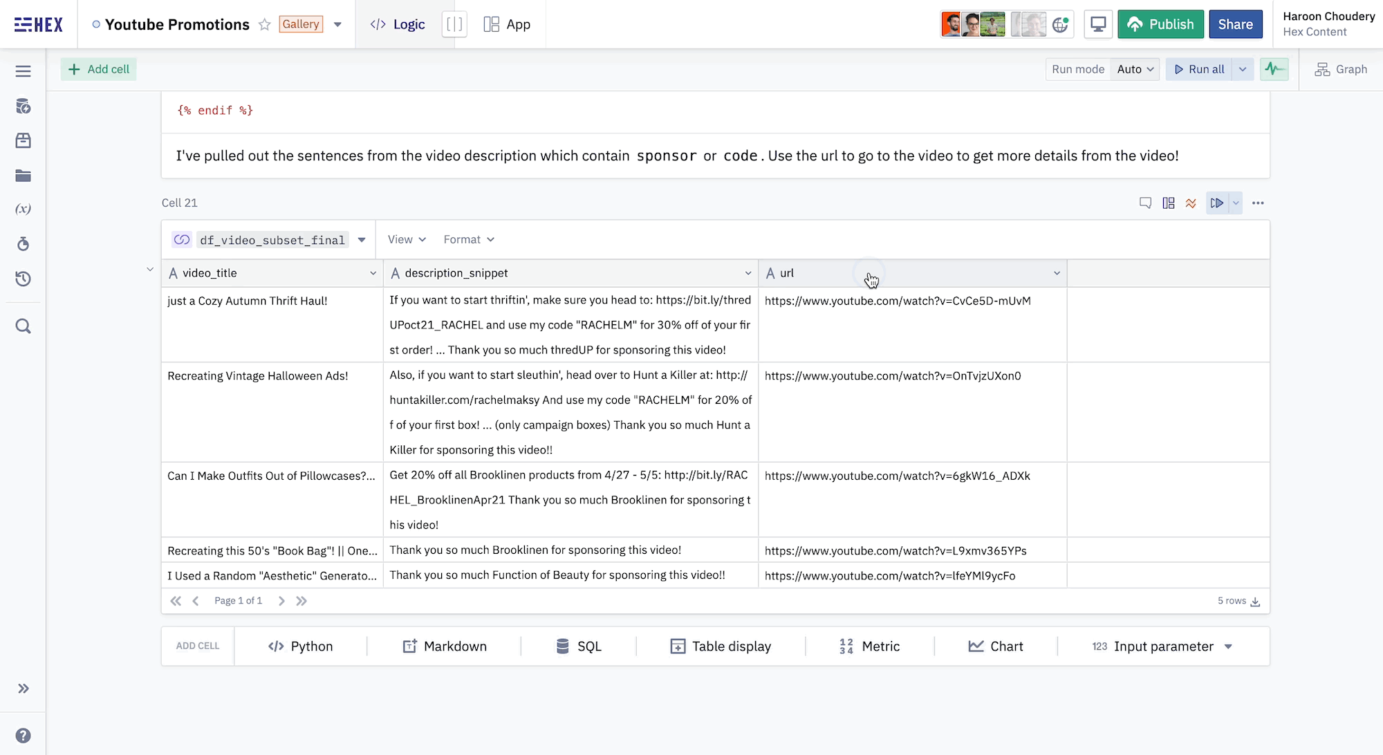
With Table Display cells in Hex, you can view a connected dataframe in an interactive GUI that displays your tabular data in a beautiful way.
Whether you're writing code or viewing a published app, you can now paginate through output tables, analyzing data row-by-row. No more dull plain text outputs.
And that's not all — we introduced several more features to make it easier for you to analyze your data and create outputs that delight end consumers.
Column Formatting
With column formatting, you can quickly change column types right from the table. You can convert columns to the currency, percentage, and date formats of your liking. You can even convert them to clickable URLs!
Conditional Formatting
Conditional formatting makes it easy to highlight interesting cells or visualize tabular data in a more colorful way. Quickly add conditional formats that apply to specific columns, or the entire table.
Other Simplifying Features
Anyone that has used spreadsheet software like Excel may notice additional features they're familiar with, like quick resize of columns. These emphasize our commitment to making the experience as intuitive as possible for users, so you're not left missing Excel.

Quicker Iterations
With Table Cells, we're laying the foundation for a more intuitive way of interacting with tabular data. This is another step towards our mission of making it as seamless as possible for Hex users to extract the insights they need and create beautiful reports to share with others.
Have any suggestions on how we can improve Table Display cells? Tweet us @_hex_tech.