Blog
Detecting Seasonality Through Autocorrelation
Autoencoders and methods like ACF and PACF effectively identify seasonality in time series data, enhancing business forecasting.
If you sold Christmas trees, you wouldn’t be surprised to see a slowdown in sales in July. Same if you had a Halloween store—you’ll have a lot of vampire masks still in stock in February.
Seasonality is an extremely common phenomenon where recurring patterns occur in time series data over a certain period. These patterns often repeat at fixed intervals, where the trend changes with the changing season. This up-and-down pattern that repeats every year is seasonality. It’s a cycle that has both periodicity and predictability.
But seasonality goes beyond just high-street sales. In finance, it provides a deeper understanding of market dynamics and equips traders and investors with the knowledge to make informed decisions, manage risks, and optimize their trading strategies. Leveraging seasonality can be a game-changer in achieving success and profitability in a business.
Detecting seasonality becomes essential. Autoencoders are majorly used for this because they can learn meaningful data representations in a lower-dimensional space. Here, we will work through a classic example of seasonality, air travel, to see how you can identify, interpret, and use the seasonality in data to make better decisions.
Autocorrelation Basics
Autocorrelation is a fundamental concept in time series analysis that identifies the relationship between a data point and its past values in an identical time series. It allows us to identify whether a pattern repeats regularly in seasonality and its timing and magnitude.
Calculation of Autocorrelation
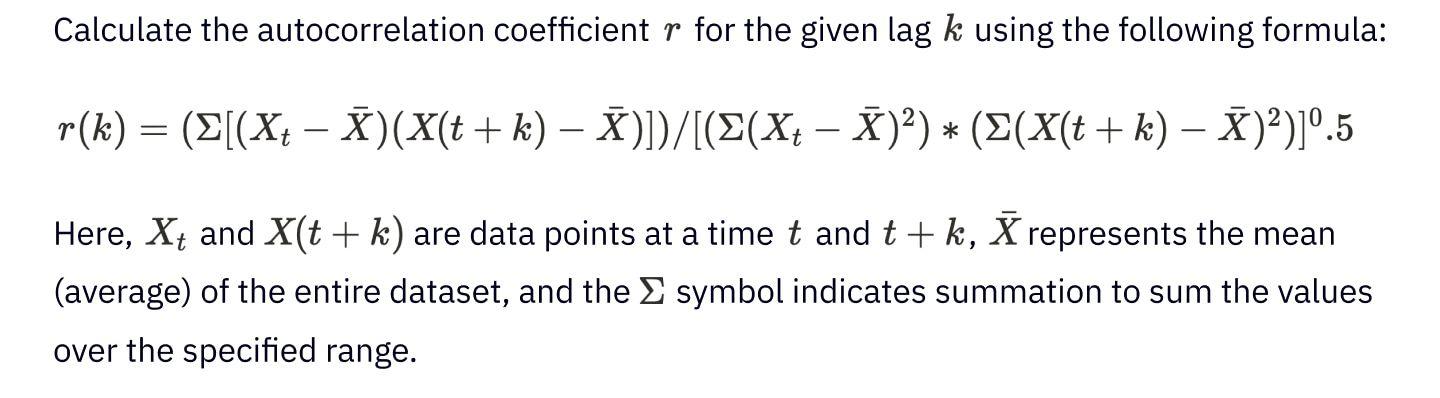
You can calculate autocorrelation by comparing the data series to itself, with a time lag or offset. This offset is often denoted as $k$, representing the time intervals between data points. The autocorrelation result is a set of correlation values, each corresponding to a particular lag. These correlation values can be zero, positive, or negative between the current and past data points, we will discuss them further in this section.
Let us break the Autocorrelation calculation process into steps to make it easy:
- Step 1: Data Preparation. Collect the time series data you intend to examine.
- Step 2: Define the Lag. Specify the time lag, represented as $k$, you want to analyze. The lag is the number of time units (e.g., days, months) to shift the data to compare it with itself. For instance, if you are working with monthly data and want to explore yearly seasonality, you would set the lag $k$ to 12.
- Step 3: Compute Autocorrelation.
- Step 4: Different Lags Repetition. Iterate over this process for various lags (k values) to explore the autocorrelation structure. The result will be a set of autocorrelation coefficients, each corresponding to a specific lag.
- Step 5: Visualize the Results. Plot the autocorrelation coefficients against the corresponding lags in an autocorrelation plot (an autocorrelation function or ACF). Peaks in the chart indicate where significant patterns repeat and the lag at which they occur.hart indicate where significant patterns repeat and the lag at which they occur.
Interpretation of Autocorrelation Values
To create an autocorrelation plot, you need to plot the correlation values against the corresponding lags. Plot peaks indicate where the data series repeats patterns at specific intervals. Here’s how to interpret autocorrelation values:
- Positive Autocorrelation. A positive autocorrelation value indicates a positive relationship between the current and past data points at the specified offset. It interprets that when the current data point goes up, the past data points at that lag also tend to increase. This relation indicates an upward trend or seasonality. For example, a positive autocorrelation might suggest that a stock performs well during particular periods in the stock market.
- Negative Autocorrelation. Conversely, a negative autocorrelation value denotes a negative connection between the current and past data points at the specified offset. In this case, when the current data point goes up, the past data points at that lag tend to go down. Negative autocorrelation indicates a repeating downward trend or seasonality. In trading, it might imply that a stock often experiences losses during specific time intervals.
- Autocorrelation Close to Zero. An autocorrelation value close to zero suggests little to no relationship between the current and past data points at the specified lag. This lack of correlation implies no significant repeating pattern or relation in the data at that lag.
- Peak Autocorrelation. When you analyze autocorrelation using an autocorrelation plot, you may often observe higher peaks at specific lags. These higher peak values denote stronger relationships, representing better-pronounced seasonality at those intervals.
- Multiple Peaks. Moreover, you may also notice several peaks in the autocorrelation plot at different lags. These multiple peaks demonstrate the presence of more seasonal patterns within the data. If you can identify and understand these patterns, then these will be valuable for making data-driven decisions.
Detecting Seasonality
You may find various time series data sources to detect seasonality, for example, Retail sales forecasting, Energy Consumption Forecasting, and Share Price Prediction.
Here, we will use air passenger data to detect the seasonality to identify the air traffic demands in different months of the year. You will learn seasonality detection using multiple techniques, including line plots, Seasonal Decomposition, Autocorrelation Function (ACF), and Partial Autocorrelation Function (PACF).
You can find a Hex notebook working through this code here. Let’s start with installing the necessary Python libraries that we will need in this section. If you’re using Hex, these will already be pre-installed.
$ pip install pandas matplotlib statsmodelsNext, we will load the necessary dependencies and dataset once and will use them throughout the section for different seasonality detection methods.
# import dependencies
import pandas as pd
import matplotlib.pyplot as plt
from statsmodels.tsa.seasonal import seasonal_decompose
from statsmodels.graphics.tsaplots import plot_acf, plot_pacf

# load dataset
df = pd.read_csv('AirPassengers.csv')

# show first few rows of data
df.head()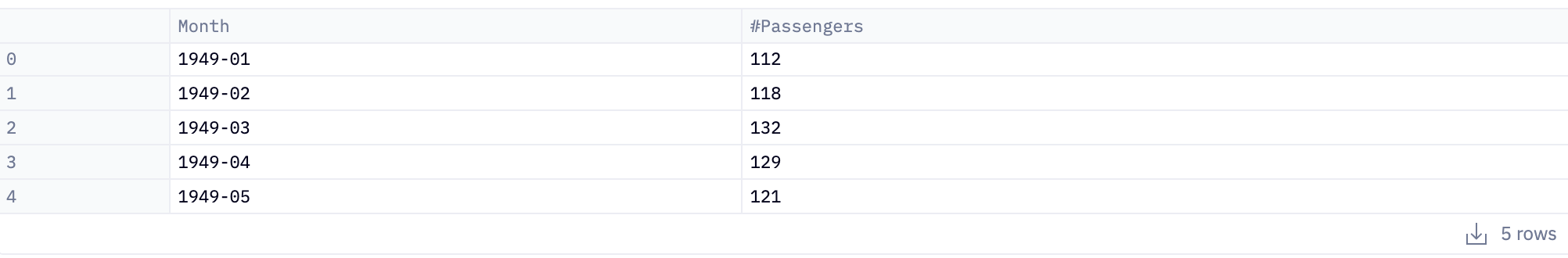
The read_csv() method from Pandas is used to read the dataset and head() method shows the first few rows of data (default 5 rows).
Now let’s take a look at the visual inspection methods for detecting seasonality.
Detect seasonality using Line Plots
A line plot helps in seasonality detection for time series data that is easy to implement but rather difficult to interpret. Here is how you do it using the Matplotlib library in Python:
# set month column as index
df.set_index('Month', inplace=True)
# plot the time series data
plt.figure(figsize=(30, 8))
plt.plot(df.index, df['#Passengers'], marker='o', linestyle='-')

# add metadata to plot
plt.title('Monthly Passengers Over Time')
plt.xlabel('Month')
plt.ylabel('Passengers)
plt.xticks(rotation = 90)
plt.grid(True)

# show plot
plt.show()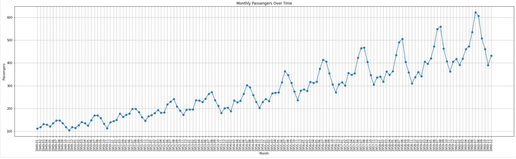
Line Plot
The plot() method from Matplotlib is used to create the line charts. You can also add other information to graphs such as title, xlabel, ylabel, grid, etc. to make graphs visually appealing. The above line plot shows that there is a strong increasing trend and presence of seasonality i.e. every year in July and August, the demand for flights is usually a lot higher than the rest of the months.
Detect seasonality using Seasonal Decomposition
Seasonal decomposition is a method used to separate a time series into its components, such as trend, seasonality, and residual (or noise).
- Trend: This component represents the long-term progression of the time series. Think of the trend as the long-term path your data is pursuing. If you imagine your data as a twisted road, the direction of the road is the trend. It helps you observe if the data is naturally decreasing, increasing, or holding steady and ignoring the short-term ups and downs. It is like comprehending the whole journey of the data.
- Seasonal: The seasonal feature apprehends repeating patterns or seasonality within the time series. These patterns may occur at specified intervals, like daily, weekly, monthly, quarterly, or annually.
- Residual: The residual element contains irregular or random fluctuations, not accounted for by the trend and seasonality. It depicts noise in your data.
You can use the Statsmodels library to perform seasonal decomposition. Let’s see how you can do it in Python:
# convert passenger column values to int
df['#Passengers'] = df['#Passengers'].astype(int)

# perform seasonal decomposition
result = seasonal_decompose(df['#Passengers'], model='additive', period=12)

# plot the original data
plt.figure(figsize=(30, 8))
plt.subplot(411)
plt.plot(df['#Passengers'], label='Original')
plt.legend(loc='best')
plt.xticks(rotation = 90)

# plot trend in data
plt.subplot(412)
plt.plot(result.trend, label='Trend')
plt.legend(loc='best')
plt.xticks(rotation = 90)

# plot seasonality in data
plt.subplot(413)
plt.plot(result.seasonal, label='Seasonal')
plt.legend(loc='best')
plt.xticks(rotation = 90)

# plot residual components
plt.subplot(414)
plt.plot(result.resid, label='Residual')
plt.legend(loc='best')
plt.xticks(rotation = 90)

# show plot
plt.tight_layout()
plt.show()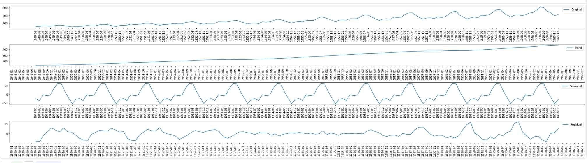
Seasonal Decomposition
To get the seasonal decomposition of the time series data, you need to create the datetime column (Month in this case) as the index. Then, you can use the seasonal_decompose() method from the Statsmodels library to get all three components of the time series. Finally, you can create line plots for all these components as explained above to visualize them easily.
The above plot contains graphs for each component, trend, seasonality, and residual (noise) along with the original data. It is clear from this plot that the trend is the same as we discovered in the line plot. Besides, the seasonal plot here indicates the positive peaks hence positive seasonality with the past data points. However, the data also contains noise as you can see in the residue plot. Hence you can say that seasonal decomposition gives more clearer picture of the relationship between the current data and past data points.
Autocorrelation Function (ACF)
The Autocorrelation Function (ACF) is a statistical function that measures the relationship between a data point and its past values within a time series. It quantifies how strongly the current value is associated with previous values at distinct time offsets. Essential purposes of ACF in time series analysis are:
- Seasonality and Pattern Detection: ACF helps understand repeating trends, patterns, and seasonality within the data. Peaks in the ACF at specific lags indicate when these patterns occur.
- Model Selection: ACF helps choose suitable models for time series forecasting by providing insights into the order of autoregressive and moving average duration in models like
- AutoRegressive Integrated Moving Average (ARIMA).
- Forecasting Accuracy: You can make additional accurate predictions regarding future values, as past connections help foresee future behavior by apprehending the autocorrelation structure.
- Quality Control: ACF enables quality control procedures to determine noise in time series data.
The Statsmodels library of Python provides the implementation of the ACF.
# define the lag value for ACF and PACF plots
max_lag = 12
# create ACF and PACF plots
fig, (ax1) = plt.subplots(1, 1, figsize=(10, 3))
# ACF Plot
plot_acf(df, lags=max_lag, ax=ax1)
ax1.set_title('ACF Plot')
# show plot
plt.tight_layout()
plt.show()
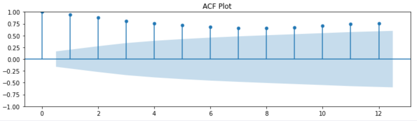
ACF Plot
The plot_acf() method creates the ACF plot, you can also add the additional information to the plot to understand it better. The ACF plot demonstrates the repeating peaks at certain lags which implies that the data does have the seasonality.
Identifying Lags and Periodicity
Identifying lags and periodicity is an essential task in creating ACF plots. Lags represent the time intervals between data points compared in the ACF plot, while periodicity refers to the concurring patterns in the data. The lag range choice depends on the data characteristics and your analysis purpose. Common practice is to explore lags up to half the length of your time series. For instance, if you have monthly data covering several years, you might set offsets from 1 (one month) to 6 (half a year).
When you observe regular, repeating peaks in the ACF plot at specific lags, this indicates the presence of periodicity or seasonality in the time series data. The lag at which these peaks occur corresponds to the length of the seasonal pattern. For instance, if you see a strong peak every 12 lags in monthly data, it suggests annual seasonality.
Partial Autocorrelation Function (PACF)
PACF measures the correlation between a data point and its past values, considering the impact of intermediate values. PACF determines the order of the autoregressive terms in time series models. It aids in identifying direct relationships between data points at different lags to allow for better accurate model choice.
The same Statsmodels library of Python provides the implementation of PACF as well.
# define the lag value for ACF and PACF plots
max_lag = 12
# create ACF and PACF plots
fig, (ax1) = plt.subplots(1, 1, figsize=(10, 3))
# PACF Plot
plot_pacf(df, lags=max_lag, ax=ax1)
ax1.set_title('PACF Plot')
# show plot
plt.tight_layout()
plt.show()
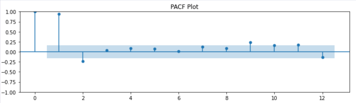
PACF Plot
The PACF plot indicates that data points at different lags have different relationships correspondingly. You should check significant spikes at specific lags in PACF plots. Typically, significant spikes beyond a specific lag indicate that you should include autoregressive terms in the model.
Strategies for Dealing with Seasonality
Dealing with seasonality in time series data is crucial for accurate modeling and forecasting. Three common strategies for addressing seasonality are Seasonal Differencing, Seasonal Decomposition, and Seasonal ARIMA Models. Here’s an overview of each strategy:
Seasonal Differencing
- What it is? Seasonal differencing involves taking the difference between a data point and data points from the previous season (e.g., the difference between a data point this October and the data points from last October).
- How does it work? You can use seasonal differencing to remove the seasonal component by creating a new time series with stationary, non-seasonal data. It can make the data more flexible to standard time series models.
Seasonal Decomposition
- What it is? Seasonal decomposition splits a time series into its components, such as trend, seasonality, and residual (noise).
- How does it work? Once you have isolated the seasonal component, you can analyze each component separately, dismiss it, or model it explicitly. This strategy yields a more transparent interpretation of the data’s underlying patterns.
Seasonal ARIMA Models
- What it is? Seasonal Autoregressive Integrated Moving Average (SARIMA or Seasonal ARIMA) models are advanced time series models that incorporate autoregressive and moving average components both for the seasonal and non-seasonal parts of the data.
- How does it work? SARIMA models capture trend, seasonality, and noise in the data. Therefore, you can use these models for forecasting and modeling time series with complex seasonal patterns.
The complete code and dataset used in this article can be found in this GitHub repo.
The Significance of Seasonality
Seasonality, whether in retail or finance, is an intricate pattern that plays a pivotal role in decision-making processes across various industries. Recognizing these recurrent patterns gives businesses a significant edge in forecasting, planning, and optimizing strategies.
As we've seen through this example, by effectively detecting and understanding seasonality, autoencoders allow you to extract meaningful insights from complex datasets. These tools efficiently reduce the dimensionality of data while preserving its crucial patterns. By doing so, they unveil hidden seasonality that might otherwise go unnoticed in vast datasets. This enhanced visibility empowers businesses to anticipate market changes, adjust their strategies accordingly, and ultimately, maintain a competitive edge in dynamic markets.