Blog
A Guide to Exploratory Data Analysis in Python
What comes before sophisticated data analysis and modeling?

Which of these plots has a line of best fit that can be described by y = 3 + 0.5x and an R2 of 0.67?
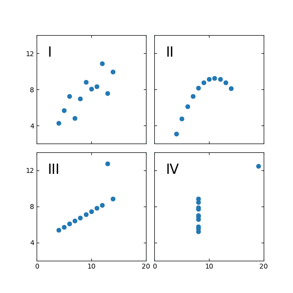
Trick question. It’s all of them.
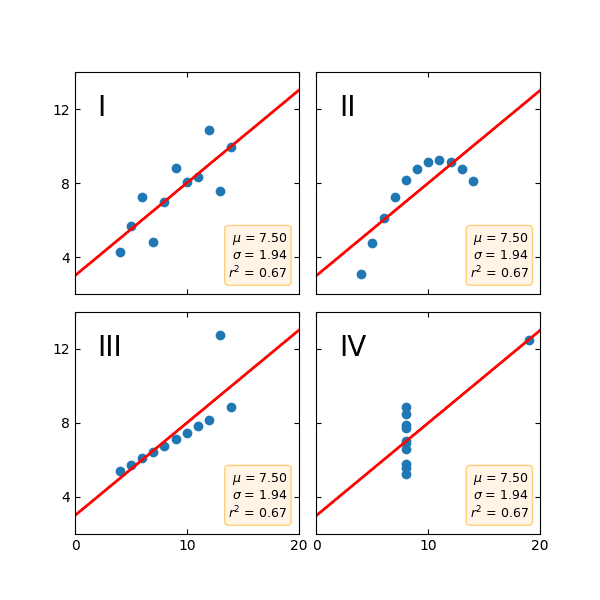
This is Anscombe’s Quartet, devised by statistician Francis Anscombe to show how easy it is to misunderstand data. All these datasets have the same mean, variance, and correlation as well as linear regression and R2. If you just tried to model this data, you’d get the same results with each dataset. But it is clear from visualizing the structure of each dataset that they are different, and will require different analytical techniques.
This is the basis of Exploratory Data Analysis, or EDA. EDA is an approach to data analysis that focuses on understanding the structure of your data. It lets you grok the data, building that intuition for the data so when it comes time to apply more sophisticated analytical techniques or models, we can select the correct ones, understand their outputs, and tell the right story.
Here we’re going to take you through the stages of EDA using the same dataset as in our Python notebooks post and in our churn monitor example project.
Inspecting your dataset with Pandas
How many rows of data do you have? How many columns? Is it all numbers, or bools, or strings? Are you missing data anywhere? Are the numbers integers or floats? Are the strings categorical? Are those categories nominal or ordinal?
This is all pretty basic stuff. But you genuinely might not know it. The data model could be huge, changed over time, or just old and forgotten. Or you could be pulling from sources you just have no initial insight into – EDA lets you get that insight.
So before we plot out our data, it’s a good idea to nail down what exactly is in our dataset. This will determine how we plot our data.
Loading the data
For any data analysis in python, the starting point is nearly always the same, Pandas:
import pandas as pdFirst, we need to get our data. In this example we have a csv, so we’ll load our data with .read_csv():
df = pd.read_csv("churndata.csv")Now we have a DataFrame containing our data. It would be good to know how big the dataset is. We can do that with .shape:
df.shapeOutput:
(2666, 19)We have 2,666 rows of data and 19 columns.
What are those columns? We can find out with .info():
df.info()Output:
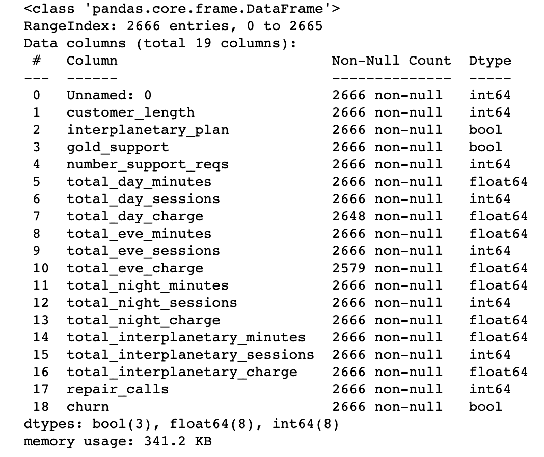
This gives us a ton of helpful information. We now know what the columns are called and the data type for each (in the last column. You can also get this information using .dtypes). We also know whether there are any null entries for each column.
Cleaning the data
Most columns have 2,666 ‘non-null’ entries. But total_day_charge and total_eve_charge don’t — They have some null values. We could do the math to figure out how many are in each column, but Pandas can do it for us:
df.isnull().sum()Output:
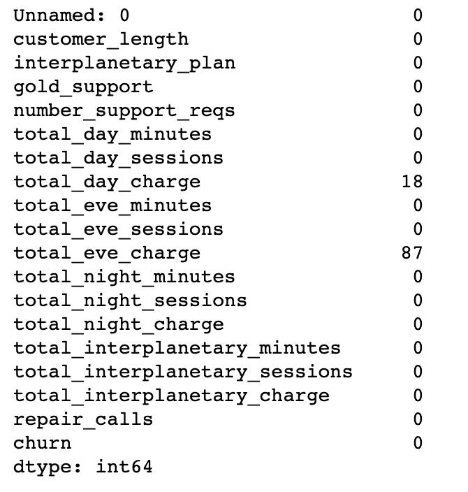
We’re missing 18 values for total_day_charge and 87 for total eve_charge.
Let’s unpack that code a little. isnull() will return a list of True/False bools for each row in each column, returning True when the value is null (or NaN or None depending on the data type). In our case, this would return a 2,666 by 19 array of Trues or Falses. Adding .sum() lets us sum up the Trues in each column.
Null values can seriously bork analysis. We have two options:
- Drop the data. Dropping data is easiest, but comes with an obvious downside: you are losing data. You can drop data with
.dropna()and choose whether to drop the rows with the missing data or the columns. - Replace the data. Replacing data means you won’t lose whole rows or columns, but it does mean you are inserting incorrect data into your dataset. If you know what the data point should be, you can use
.replace()and specify the replacement value. If not, you can use.fillna()which will use the values around the missing data to determine a new value.
Don’t do either of these lightly. If you have a lot of missing data it’s a systems issue and you should talk to your engineers. If you still need to deal with missing data, Pandas has a handy guide for how to deal with the problem.
Looking at the actual data values
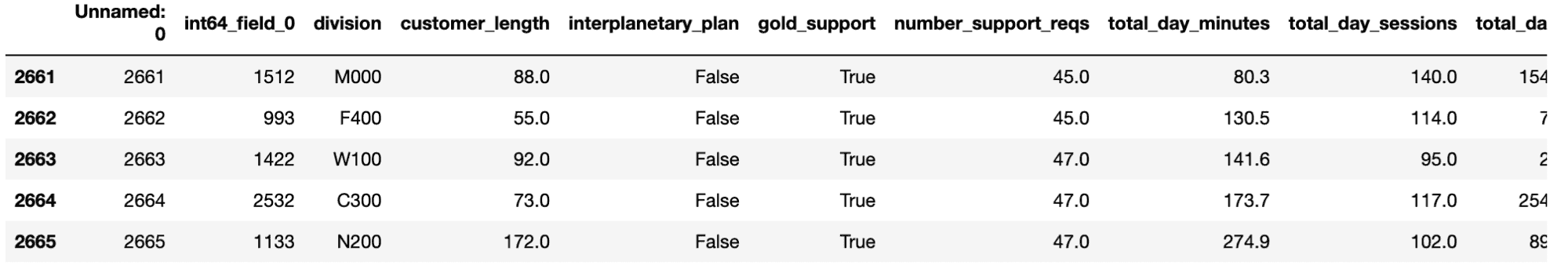
Next, we can see what the data looks like in each of these columns. We don’t want to print out all 2,666 rows, so we can use .head() and .tail() to see the first and last five rows of data:
df.head()Output:
This is the time for sanity checks. Are the data types and values what you’re expecting? For instance, if total_day_minutes in this example is above 1440, then something has probably gone wrong. Or if a column is full of NaNs or zeros, then you’ll need to check the original data (if the original data is good, then it could be an import problem. If not, then time to talk to the engineers to locate the issue).
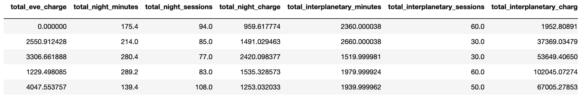
In this example, the first five number_support_reqs entries read 0.0. Something amiss? We can use .tail() to see if this is still true at the end of the dataset:
df.tail()Output:
No, the data looks good at the end of the dataset. In fact, it looks like the data might have initially been sorted by this field.
We can also use .describe() here to help us get a better understanding of the data:
df.describe()Output:
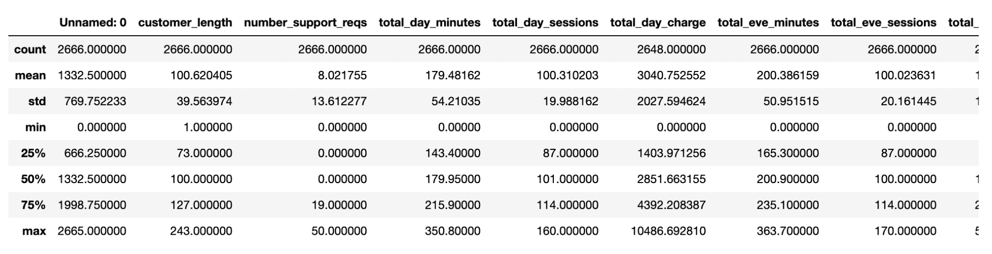
This is also where domain knowledge can really help. A data point might not look out of place to a layperson, but will to an expert. When exploring data on page bounce rates I noticed odd outliers that allowed us to find (and fix) weird analytics setups that were skewing data.
Finding some initial relationships
A final tabulation that can help us at this point is .corr(). This runs cross-correlations between all the variables:
df.corr()Output:
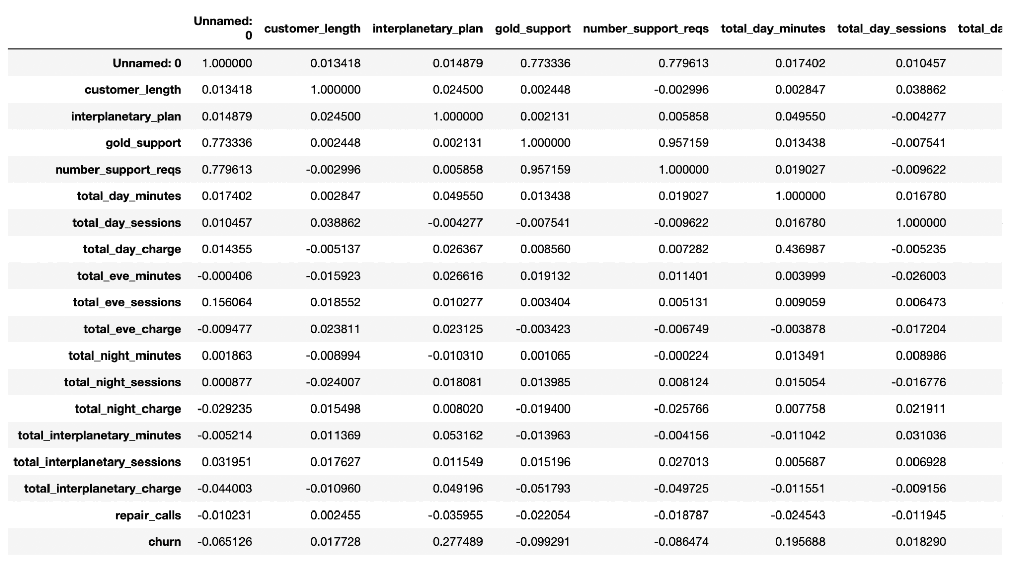
It’s a little hard to pick out specific numbers from this (though we’ll have a solution to that in a moment), but we can see a few interesting numbers such as the 0.28 correlation between interplanetary_plan and churn. This might be something worth investigating.
What have we learned about our data so far? We know:
- the size of the dataset (2,666 rows, 19 columns)
- the names of our columns
- the types of data we have (8 columns of integers, 8 columns of floats, and 3 columns of booleans)
- that two columns (total_day_charge and total eve_charge) have some missing data
- the rough values in each column, and their descriptive statistics
But more than that, we’re starting to get an understanding of the data. We know from .info() that churn is coded as a bool, so we’re probably doing some logistic regression somewhere down the line. We know from .describe() that most people put in zero support requests, but the max is fifty, which seems a lot. We know from .head() and .tail() what data will look wonky, and we know from .corr() that there are some interesting relationships between data.
Visualizing the data with Seaborn
Now we have a rough idea of the data, let’s get plotting. At this point we need a data visualization library. We’re choosing seaborn as it has several easy-to-use in-built plots.
import seaborn as snsWhy sns for seaborn? The library is named after The West Wing character Sam Seaborn, whose middle name is Norman, so sns. Is this the only python package with a middle name?
Plotting statistics with boxplots
We’re going to start with a boxplot as this was invented for EDA by Tukey (Tukey literally wrote the book on EDA. When he wasn’t doing that, he also invented the fast fourier transform, coined the terms ‘bit’ and ‘software’, and maybe designed the U2 spy plane. He was also married to Anscombe’s wife’s sister).
Let’s plot the data for the customer length column:
sns.boxplot(data=df,x="customer_length")Output:
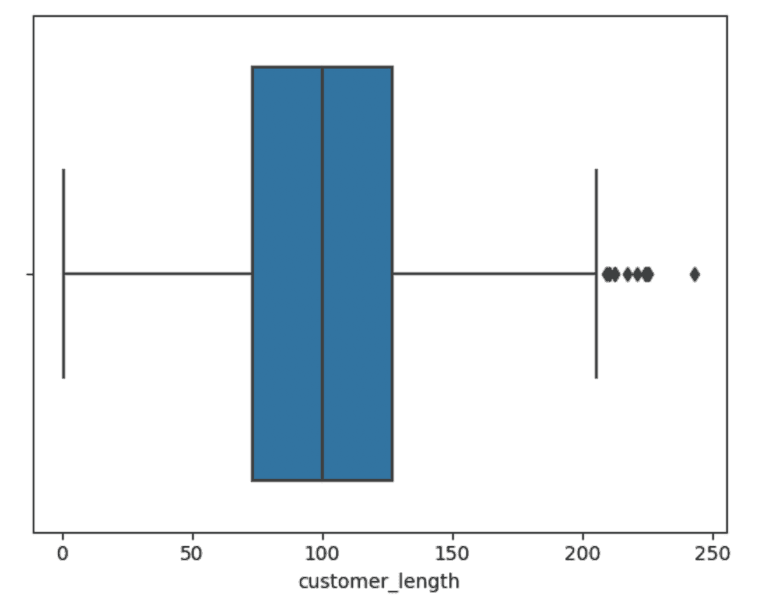
A boxplot is a visual representation of some descriptive statistics from the data. If we run .describe() for this data we can see the numbers:
df['customer_length'].describe()Output:
Boxplots plot the range of the data. The middle line in the blue box corresponds to the median, or the 50th percentile. In this case that lies at 100. The left and right bounds of the blue box are then the 25th and 75th percentile, respectively. They are at 73 and 127.
The two ‘whiskers’ protruding from either side denote, in this case, 1.5 times the interquartile range (IQR). The IQR is the 75th percentile data point minus the 25th percentile datapoint (in this example 127 - 73 = 54 * 1.5 = 81).
So the left whisker would go to 73 - 81 = -8 and the right whisker would go to 127 + 81 = 208. Whiskers have to land on a datapoint, so the left whisker is at 1 and the right whisker is at 205. Everything outside these whiskers are outliers. There are no low outliers, but 12 high outliers.
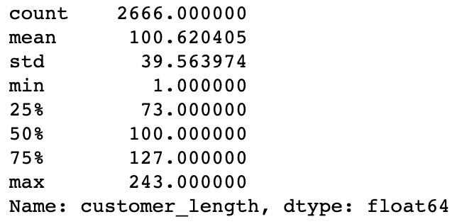
Let’s plot a few more of these for the other numeric data:
sns.boxplot(data=df,x="total_day_minutes")Output:
Here we have outliers at both ends of the range.
sns.boxplot(data=df,x="repair_calls")Output:
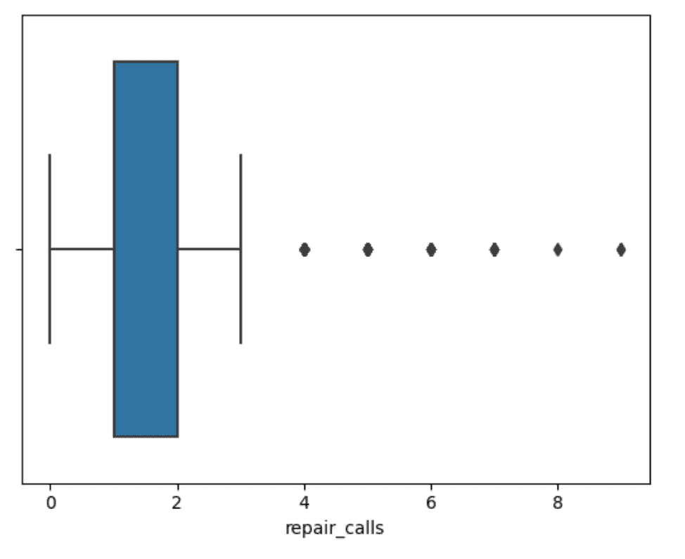
Here the median is the same as the 25th percentile and then we have several really high outliers at the high end of the range. The takeaway here is that most people have 0 or 1 repair calls, but some people have way more trouble and way more repair calls. Is that going to be related to churn?
Plotting basic data with bar charts, scatter plots, and histograms
Boxplots convey a lot of information, but you can also learn about the data using simpler plots. A most basic one would be a bar chart using .countplot() breaking down value counts for the bool variables, such as churn:
sns.countplot(data=df, x="churn")Output:
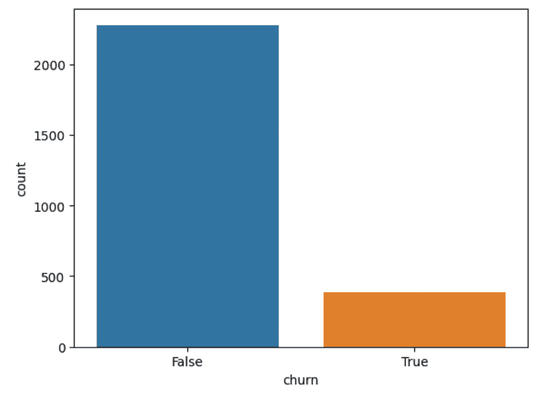
So we can see that most customers don’t churn. This will be important for the analysis phase as we’ll be dealing with less data in any churn model.
Scatter plots can be good for finding relationships between two variables (such as with Anscombe’s Quartet). Let’s see if there is a relationship between the length of time someone has been a customer and how many interplanetary minutes they flew last month:
sns.scatterplot(data=df,x="total_interplanetary_minutes",y="customer_length")Output:
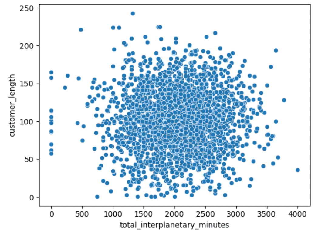
No obvious relationship there.
Histograms let us see the range of data as with a boxplot, but give us a better visual understanding of where the common values lie:
Output:
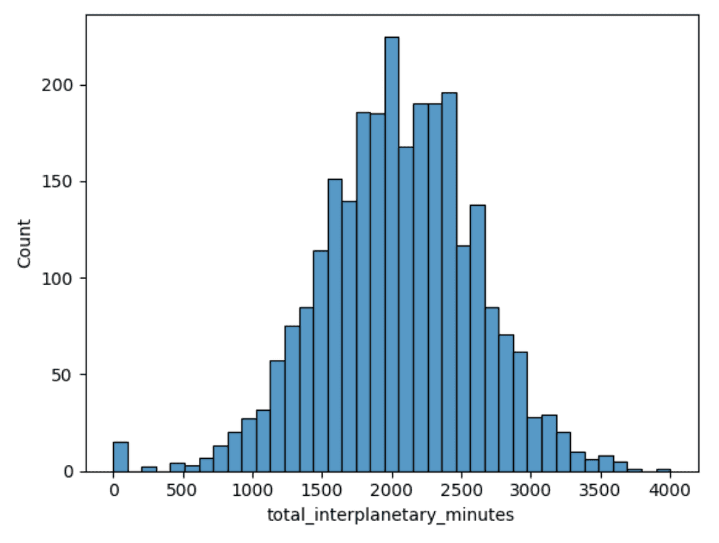
So with total_interplanetary_minutes, we can see the modal point around 2,000 minutes and a normal distribution. Again, this is useful for later analysis if we need to assume normality for any statistical tests.
This is just one example per plot. But if we were doing a full EDA, we would plot every variable to better understand it. The good thing with notebooks is that this is just a matter of swapping out the variable name and hitting run each time.
Plotting relationships with heatmaps
We can also use a heatmap to better visualize the data generated by .corr() above:
corr = df.corr()
sns.heatmap(corr, xticklabels=corr.columns, yticklabels=corr.columns)
Output:
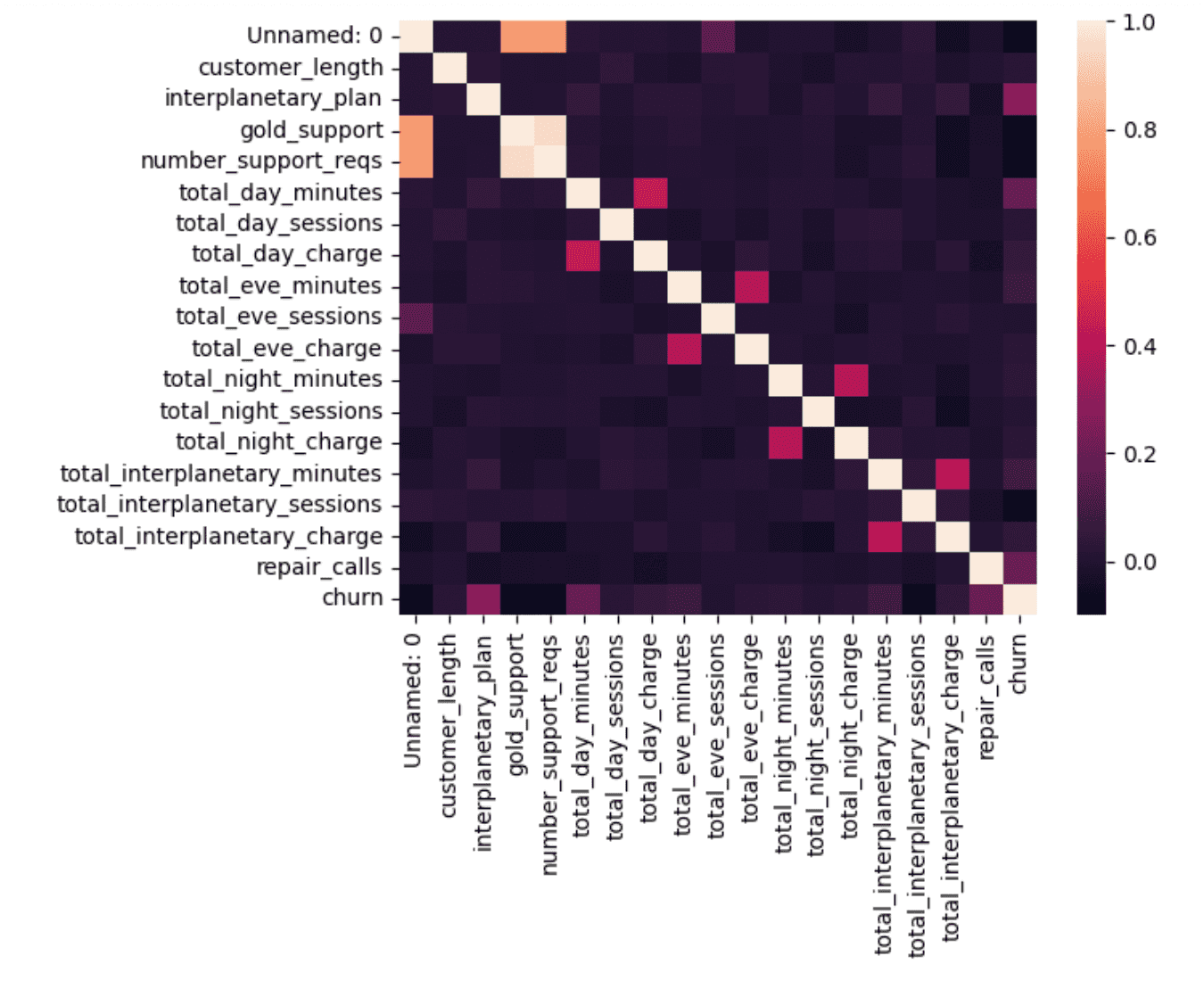
This assigns a color gradient from 0 to 1 and the color of each square corresponds to the pairwise correlation between the two columns. The diagonal is 1, as these are the autocorrelations. But there are a few others that stand out:
- The total_x_minutes and the total charges for day/evening/night/interplanetary are all closely correlated, as expected.
- There is a strong correlation between gold_support and number_support_reqs. This is a near-perfect correlation. If we go back to the
df.corr()numbers, we’ll see that it is 0.96. Is this a matter of almost all support requests coming from gold support members, not all gold support members making support requests, a data issue, or something else? - Interplanetary_plan, total_day_minutes, and repair_calls all have the highest correlation with churn. It would be good to investigate these variables first when modeling.
Plotting deeper relationships with grouped boxplots
We can use boxplots to investigate the data here a little more by slicing the plots by churn. Interplanetary_plan is a bool, so that won’t work with a boxplot, so let’s start with total_day_minutes:
sns.boxplot(data=df,y="total_day_minutes",x="churn")Output:
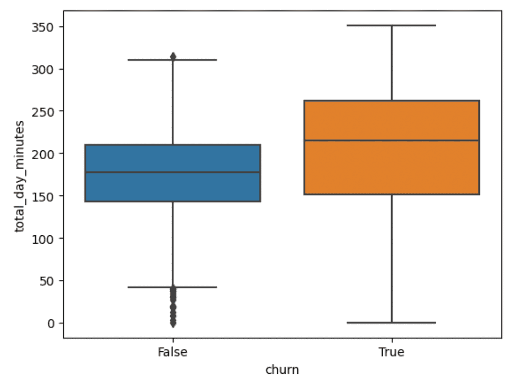
Churned customers have more rental minutes than non-churned customers, but the range is greater. Let’s look at repair_calls:
sns.boxplot(data=df,y="repair calls",x="churn")Output:
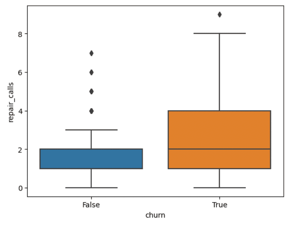
This one is more interesting. Churned customers seem to have a higher number of repair calls than non-churned customers, with the median number of calls for churned customers equalling the 75th percentile for non-churned customers. This is something we can use in later phases of the analysis.
Before we finish our EDA though, let’s see if we can figure out #2 above–the odd high correlation between gold support and support requests. We can use a .histplot() to plot out our data:
sns.histplot(data=df, x="number_support_reqs", hue="gold_support")Output:
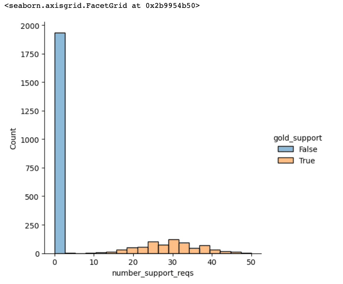
OK, so it looks like there have been no support requests from non-Gold Support customers. Let’s double-check that with Pandas:
df[df['number_support_reqs'] == 0].groupby('gold_support')['number_support_reqs'].count()This groups the number of zero support requests by gold support. It outputs:
False 1933So no gold support customers have zero support requests. Let’s check the other way, looking at all the customers with more than zero support requests:
df[df['number_support_reqs'] > 0].groupby('gold_support')['number_support_reqs'].count()Which outputs:
True 733So every gold support member has put in a support request and no non-gold support customer has put in a support request. So the answer to #2 above is ‘something else.’ In this case an artifact of trying to compute a correlation between a bool and numerical data.
So why do it? To quote John Tukey again:
To learn about data analysis, it is right that each of us try many things that do not work.
An unfortunate part of EDA is you are going to go down paths that lead nowhere. After all, it is exploration.
So what do we know now? We know:
- interplanetary_plan, total_day_minutes, and repair_calls all have a strong relationship to churn
- the strong correlation between gold_support and num_support_reqs is a red herring
- most customers don’t churn
- a lot of our numerical data is normally distributed
But more than that, we’ve now seen the data. With .boxplot() we’ve seen the range of data and our outliers. With .histplot() we’ve seen the distribution of our data. And with .heatmap() we’ve seen the relationships in our data.
We now know our data from the individual value level through the aggregate statistics and to the visualizations of the variables together.
Moving On From EDA
When do you move out of the EDA phase and into a more classical modeling phase of data analysis? You can think of both a quantitative and qualitative framework for making this decision:
The quantitative framework is dependent on whether you know what models to start building and what data to use. In this case, that might be logistic regression to look at churn or some other classification modeling, such as gradient boosting. We would also want to concentrate on the total_day_minutes and repair_calls variables to start as they seem the most related to churn.
The qualitative framework is more concerned with whether you can express knowledge about this data to your team. Can you tell its story to help others understand it and make the right decisions? You should be able to build a report on this data and explain it in a meeting. Importantly, you won’t be building a report on “the causes of churn.” That comes next. The culmination of EDA is understanding the data, not solving the problem.