
What is funnel analysis?
Funnel analysis is a way for businesses to analyze the chain of events that customers traverse on their way to completing a desired goal of the business. For example, say we run an online store. For any user that visits our site, they can also view items, add items to their cart, and purchase items from their cart. In this case, visits, items viewed, items added to cart, and items purchased are all milestones within the chain of events leading up to a successful purchase.
As a business, our primary goal is to maximize the amount of purchases per customer. Funnel analysis can help us understand what factors might be preventing customers from reaching this final step in the process.
The AIDA funnel
Andrea Wang at Amplitude has an excellent explanation of the standard funnel:
The archetypal funnel, known as the AIDA model, has four steps: awareness, interest, desire, and action. Each step is represented by a different user action, depending on your company’s industry.The goal of a funnel analysis is to identify friction points throughout the customer journey where users are struggling to get to the next stage. Once you recognize these roadblocks, you can experiment with possible solutions and get more users to the finish line.
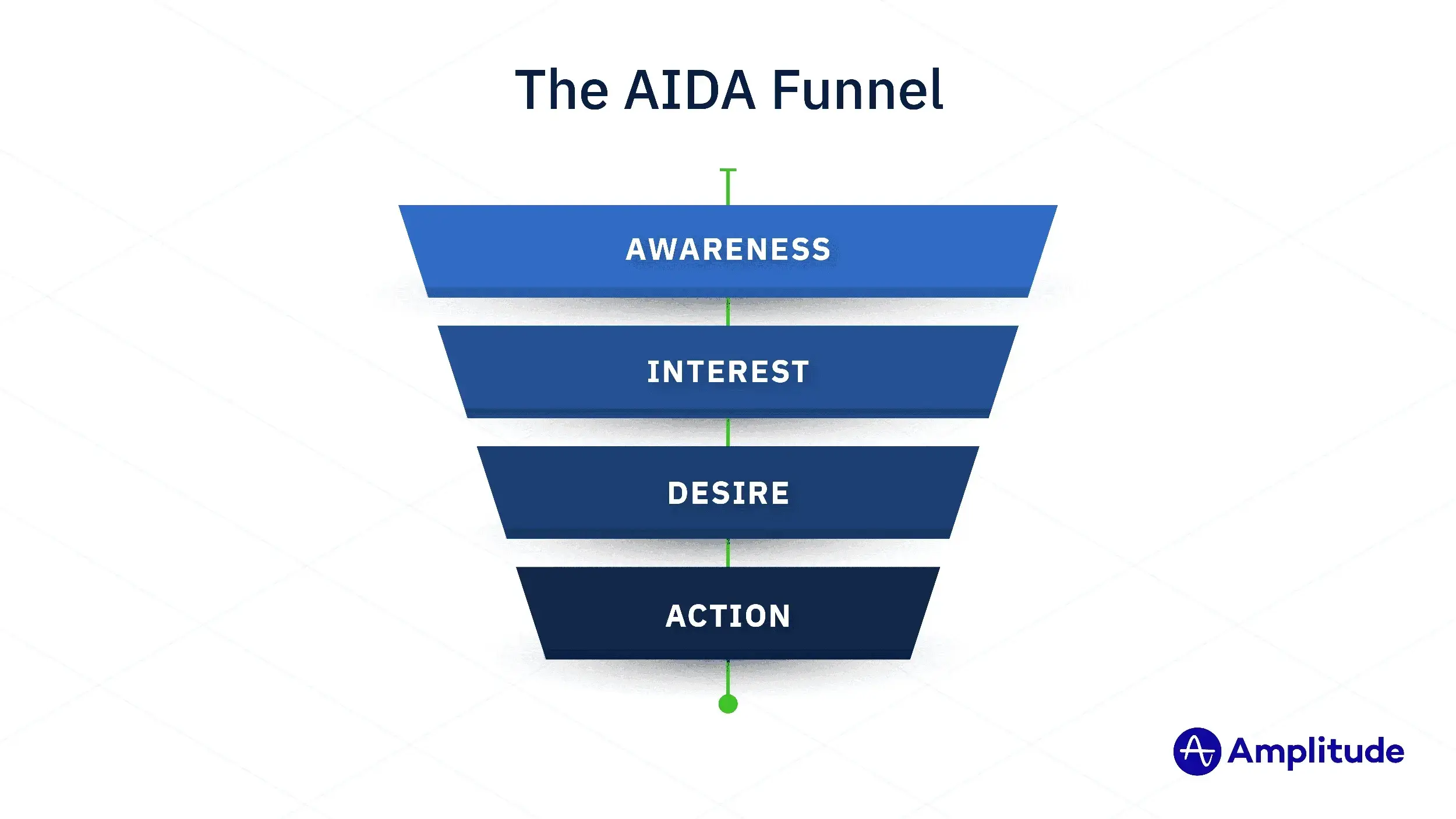
Thanks Andrea 🫡. The real reason this model is so helpful is that it lets us talk about the key steps in our funnel using standard language to communicate places that could use improvement. For example, consider the following mapping:
- Awareness --> site visits: When users know about our product, and we have their attention
- Interest --> viewing items: When users start interacting with our product in a meaningful way
- Desire --> add items to cart: When users experience the value of our product and are motivated to convert
- Action --> purchase product 🎉: When users convert
If we see a good amount of customers viewing items but then observe a large drop-off when adding items to the cart, we can reformulate that as, "Although customers show interest in our products, we observe a large drop-off when it comes to the desire for our products." Thinking about it this way gives a clear interpretation of the intent for each step in our process, which makes it easier to communicate that intent to others — or make changes to our products or marketing to fix the problems.
Building a funnel
In this tutorial, we will use a dataset that was generated to simulate the process of visiting an online store and purchasing products. The column that we will pay the most attention to is event_type. This column lets us answer a few key questions:
- How many total
visitsdoes the store have? - Out of all of the visits, how many customers
viewedan item? - Of those items viewed, how many were
added_to_cart? - Which customers completed the chain of events and made a
purchase?
Here's a snapshot of the data we're working with. You can download it using the download button in the bottom right of this embedded cell to play with the data yourself.
Since we're mainly concerned with the event_type column, let's take a look at the counts of each type of event in this column. This will give us a quick look at how many customers made it through to each step.
select event_type, count(event_type) as event_count from data
group by event_type
order by 2 desc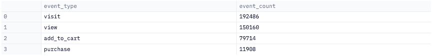
We can see that the highest frequency event is a site visit (~ 192k ), and the lowest frequency event is an actual purchase (~ 12k ). Although seeing these numbers by themselves is useful for understanding the frequency of events at each step, it doesn't really convey how many users are getting through to each step. This is where the funnel comes to the rescue!
Overall funnel 🌪
We'll start by making an overall funnel, which gives an 'at a glance' view of the distribution of customers at each step. We need to slightly reshape our data for this, so we'll create a list that holds the count of our users at each stage in our process.
flow_count = [
    data[data['event_type'] == 'visit'].shape[0],
    data[data['event_type'] == 'view'].shape[0],
    data[data['event_type'] == 'add_to_cart'].shape[0],
    data[data['event_type'] == 'purchase'].shape[0],
]
We can then feed that into Plotly to easily create a funnel visualization that gives a much more intuitive sense of where dropoff is happening.
stages = ['Visits', 'view product', 'add to cart', 'purchased product']
fig = go.Figure(go.Funnel( x=flow_count, y=stages, textinfo = 'value+percent initial'))
fig.show()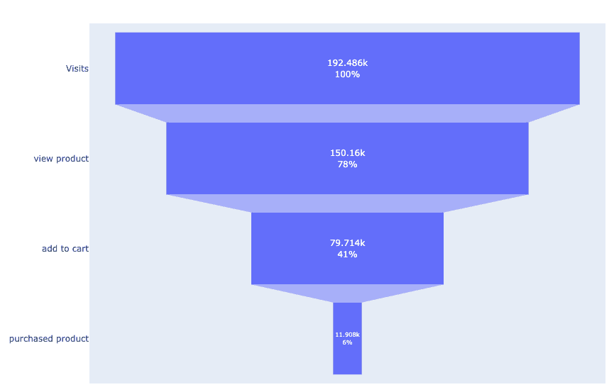
Initial takeaways
- 78% of the 192k visitors viewed a product
- 41% of them added products to their cart
- 6% of visitors purchased a product
You might see that 6% and think it's small, but the shape of this funnel actually looks pretty healthy. Generally, a healthy funnel is a funnel where we don't observe any extremely drastic changes from step to step. Quantitatively, a healthy funnel is one where the percent change between steps remains in-line with the industry-standard drop-off rate for your business— which varies widely depending on your industry. For example, if we wanted to define a healthy funnel for our business, we could say:
So long as we observe at least 40% of customers are making it to the next step and at least 15% are converting (purchasing products), we will consider the funnel healthy. (Note: what we define as healthy for one business may not be healthy for another business).
It'd be a lot more concerning if our funnel was shaped like this:
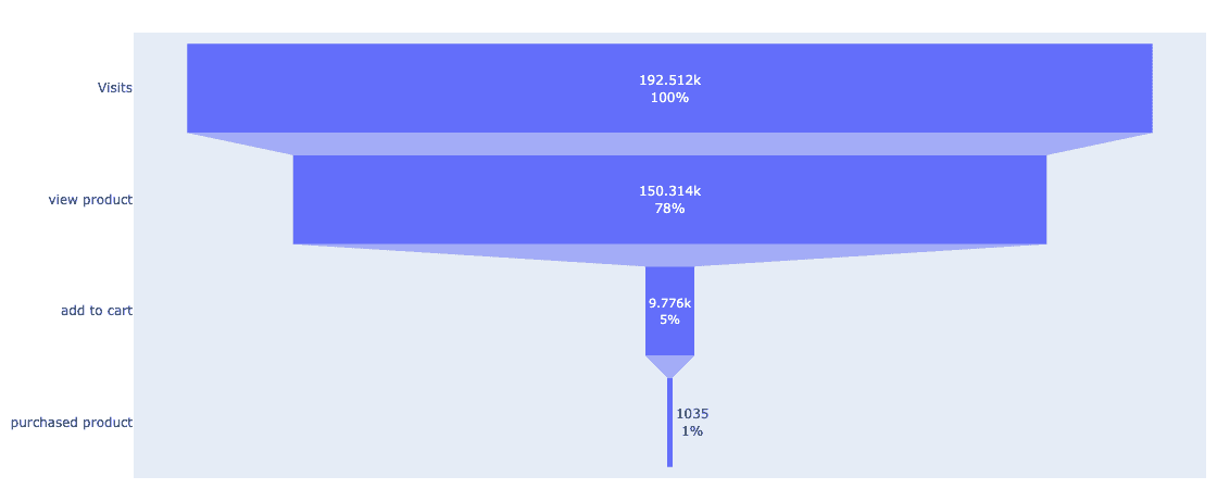
Funnel health
So what makes that funnel so unhealthy? Well, at first glance, we see very obvious drop-offs that leave no doubt we haven’t hit our (made up) 40% pass-through goal. To verify this, let's look at each observed pass through rate and compare them to our threshold.
- Visits -> Views - a 22% change, meaning we lost 22% of users at this step. This is great since 88% of users still made it to the next step, exceeding our 40% pass-through rate.
- Views -> Cart - a 93% change, meaning 93% of users who viewed products did not add them to their cart. This is pretty bad! Only 7% of the users in this stage made it to the next step, compared to our 40% goal.
- Cart -> purchase - an 89% change, meaning 11% of the users who had items in their cart actually purchased those items. Although we only wanted to hit 15% pass-through at this step, we still didn't achieve that goal.
When an individual step has an outsized drop-off, it's an easy place to begin looking at areas for further study and improvement. This becomes a bit tougher when multiple steps in our funnel fall short of the limit, meaning that multiple places in our customer journey need addressing.
Now let's look at what these changes look like in our original, healthier funnel.
- Visits -> Views - a 22% change, meaning we lost 22% of users at this step. Similar to our unhealthy funnel, this is really good since 88% of users still made it to the next step.
- Views -> Cart - a 47% change, so 47% of users who viewed products did not add them to their cart. This is also pretty good since 53% of the users in this stage made it to the next step, which is still above our 40% target.
- Cart -> purchase - an 85% change, meaning 15% of the users who had items in their cart actually purchased those items. This perfectly hits our 15% requirement at the final stage, yet we still observe the biggest percent change at this step and may want to dig deeper into reasons for this.
Isn't that more helpful than saying "huh, only 30 people bought things this week but 3,000 came to our website!" and leaving it there?
We can loosely define funnel health as the actual customer pass through rate when compared to an expected pass-through rate that's set by the goals of the business. A funnel can still be considered healthy if all but one (or more depending on the size of the funnel) step doesn’t meet the minimum pass through requirement. Steps that don't meet the pass through requirement should be investigated further, so that we can figure out what to do to improve customer conversion.
Now we'll actually do that investigation, giving an example of how to analyze a funnel to identify and interpret drop-off.
Interpreting drop-off
Below, we've defined a function that will calculate and report at which step we observe the largest customer drop-off. It iterates through the dataset, checking each row to see if the next observed change is greater than the previously observed change.
def stage_loss(df, show_all = False):
    df = df.copy()
    # convert the dataframe into a nested list [[event_type, event_count]]
    values = df.values.tolist()
    max_difference = 0

    # iterate through each row
    for index in range(len(values) - 1):

        # extract the current event and the next event
        start_event = values[index][0]
        next_event = values[index + 1][0]

        # extract the count of the current event and the next event
        start_event_count = values[index][1]
        next_event_count = values[index + 1][1]
        stage = f"{start_event} -> {next_event}"

        # find the change in users from stage to stage
        difference = start_event_count - next_event_count

        # check if the calculated difference is higher than the previous difference
        if difference > max_difference:
            # max_difference = difference
            max_difference =  difference / start_event_count
            at_stage = stage
        if show_all:
            print(f'The difference in users from {stage} is {round(100 * max_difference, 1)}%')

    return at_stage, max_difference

stage, percent = stage_loss(dataframe)
Running this on our data, we see that the majority of customers are leaving the funnel after putting items in their cart, dropping off before they actually purchase anything.

Remembering our AIDA model, 85.1% of the users who desired products never took action in fulfilling their desire by purchasing those products. This high drop-off rate is an indication that somewhere between these steps, customers are encountering points of friction that are worth investigating. Some drop-off here is normal, but 85% signals that something can be done to encourage more customers to complete their purchases.
So why this drop-off? Why don't our customers want to take action towards completing the funnel? We'll briefly turn away from the data and put on our business hat to look at some possible reasons why people aren't purchasing things:
Not knowing the value of our products
- We have a high quality product but the customers don't recognize it. Educating our customers about the quality of our products can go a long ways in gaining more loyal customers. Sometimes increasing prices will actually help convince consumers that our products are high-value. Alternatively, we might want to consider adding information about our products so that customers are more aware of their value.
Retention
- High customer retention means our customers are loyal to us and have to returned for repeat purchases. Lower customer retention may indicate that something about the user experience isn’t going well. Earning trust is not always quick or easy but initiatives like warranty programs or buy-back guarantees can create a positive first impression.
- Performing a cohort analysis can help us understand the behavior of our customers over time. Say we perform a cohort analysis and find that most of the users that come back for repeat purchases are buying products that were recommended to them. In this case, it may be beneficial to investigate if we can expand our recommendation engine and increase the number of customers who purchase items that way.
Promotions
- Promotions go a long way when wanting to get customers excited about items they can purchase from our store. Given the right promotional strategies, we could see a positive impact on the rate at which customers are purchasing. To understand if better promotional marketing would help convert users to buying our products we could set up an A/B test to see how a new promotion strategy affects purchase rate.
Ok, business hat off, data hat back on. Those are just a couple of reasons why people may not want to take action in a store, but the internet is saturated with articles that can give you more ideas for combating drop-off.
Time to purchase
The last funnel metric we'll look at is time to purchase: how long did it take a user to go from visiting our store to executing each step in the process?
Understanding how long it takes users to go from step to step lets us build confident revenue models and forecast pipeline— and lets us compare reality to how long our business would like each step to take.
For example, say we make a change to the way we promote our products and in turn we see a decrease in the time it takes to move from visiting to adding something to the cart. This could mean that we had a better week, or it could mean that the strategy we implemented actually decreased the time it takes for customers to move through the funnel. If we're good about looking at these funnels often, they can serve as a way to measure how fast customers make it through the funnel with each change that we make to our business.
Disclaimer: We've enforced a linear process to describe how customers can buy our products. This is a simplification of the natural progression customers tend to follow in reality. For example, a customer could visit the site, add products, remove products, visit the site again, etc. Often times, funnel analysis will require that you make some assumptions about reasonable user behaviors in order to 'clean up' the messy underlying data. Be mindful of the assumptions you make at this step, because you may miss some key insights into actual user behavior with the wrong assumptions.
Some quick Python code lets us tally up the days elapsed between each event, and then we'll plot each sequence's distribution:
# convert the unique event types into a list and remove the visit event type
distinct_events = data['event_type'].unique().tolist()
distinct_events.remove("visit")

# create a dataframe with only visits (used to compare against all other event types)
visits = data[data['event_type'] == 'visit'][['user_id', 'date', 'event_type']]
dataframes = []

# loop through each event type
for event in distinct_events:
    # extract data for the current event type
    other_event = data[data['event_type'] == event][['user_id', 'date', 'event_type']]

    # we want to see the dates for when the user visited and the current event, so let's join the data on the user_id
    comparison  = htk.query_dataframes("""select * from visits
    join other_event on visits.user_id = other_event.user_id""")

    # calculate the days elapsed by finding the difference between visit date and the next event date (ex. purchase_date - visit_date)
    comparison['days_elapsed'] = comparison['date_2'] - comparison['date']

    # Days elapsed will look like "4 days", this extracts just the number part so that we only get 4
    comparison['days_elapsed'] = comparison['days_elapsed'].apply(lambda value: int(str(value).split()[0]))
    dataframes.append(comparison)

views = dataframes[0]
cart = dataframes[1]
purchase = dataframes[2]

if event == "view":
    stats_frame = views
elif event == 'add_to_cart':
    stats_frame = cart
elif event == 'purchase':
    stats_frame = purchase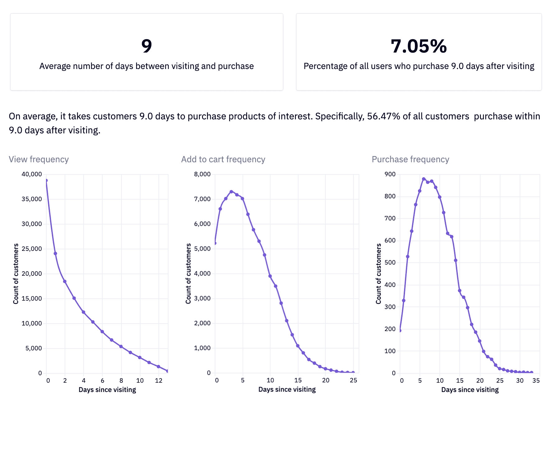
We see that as we move from step to step in our funnel, we observe a gradual increase in the time it takes to get to the next step, which is expected. However if we were to compare this to an expected time window, are we under or over our goal? While this answer will vary business to business, visualizations like these help track how close or far we are from that goal. They get even more useful when we make comparisons across different time frames, doing the same analysis 3 months after we've implemented some new strategies to see if they had an impact on the timeframes of our funnel.
Something to keep in mind is that different products will have different time windows. For example, someone who's purchasing a $1000 smartphone will probably be slower to checkout than someone buying a $5 toothbrush. However, providing enough information, such as good value education or good product images, you will help our users to make better decisions faster.
Conclusion
🥳 Congratulations, you've made it to the end! We have logged your arrival at this point in our funnel, and we're happy to report that you completed right on time per our model's prediction. Do you want to buy some sunglasses from our e-store now?
Sunglasses aside, you learned a lot in this tutorial today:
- What funnel analysis is and what you can do with it
- How to prep data and plot a funnel chart with Plotly
- How to measure funnel health
- How to identify and interpret user drop-off
- How to track the amount of time it takes for users to make it through a funnel.
Happy funneling!