Blog
Unveiling Patterns Using Time Series Visualization
The article uses a mock AirPassengers dataset to visually demonstrate trends and seasonal patterns in the airline industry.
Humans are primarily visual creatures. Over 50% of the human cortex is involved in vision processing. We just understand the world best when we can see it.
This makes us experts at detecting visual patterns. Sometimes our brain gets a little carried away and sees patterns where none exist (a phenomenon known as Pareidolia), but if you need to know whether there is a pattern in any of your data… often the best move is to look at it!
Extracting meaningful information from time series data hinges on our ability to recognize underlying patterns—trends, cycles, seasonality, and anomalies—that might otherwise remain obscured in tabulated figures. The importance of time series data visualization arises from this very need. Through graphical representation, complex datasets can become understandable visuals, allowing data analysts to intuitively grasp patterns, validate models, and make data-driven decisions.
Here, we want to go through some techniques you can use to visualize your time series data to uncover these insights yourself.
The Importance of Time Series Visualization
Any analyst worth their salt has to be comfortable with time series visualization, as the techniques will be used across most datasets you might run into. If you look at any business metrics, you are probably looking at them over time.
You might find yourself using time series visualization for:
- Rapid data interpretation. Textual or tabular representation of time series data, especially when voluminous, can be overwhelming. Visualization facilitates quick understanding, allowing professionals to discern patterns, trends, and deviations in moments.
- Pattern recognition. Time series charts accentuate cyclic behavior, recurring anomalies, seasonality, and underlying trends. Recognizing these patterns is foundational for further analysis, such as forecasting or anomaly detection.
- Anomaly detection. Visualization makes identifying irregularities or outliers in the data easier. Anomalous data points, which may indicate errors or significant events, can be immediately evident in a graphical representation, whereas they might go unnoticed in raw datasets.
- Data quality assessment. Before diving into intricate analyses or modeling, visualizing time series data can offer insights into data quality, highlighting missing values, inconsistencies, or other potential issues that might need addressing.
- Validation of analytical models. Once analytical or forecasting models are developed, visualizing their outputs against actual data provides an intuitive measure of their accuracy and reliability.
To do all this, you need methods that facilitate a clear understanding of your data's temporal progression, revealing patterns and anomalies. Here are some widely used techniques in time series visualization. They’re simple, but powerful!
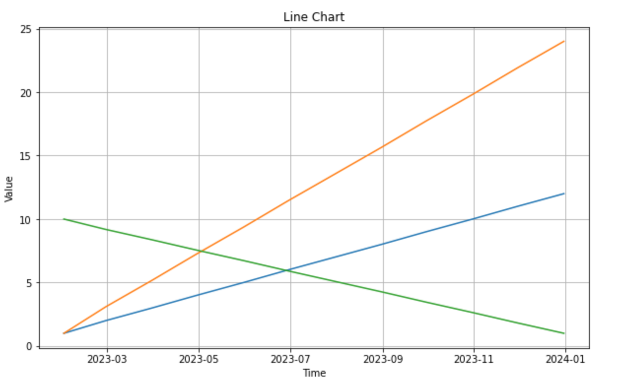
- Line charts. Line charts plot data points in sequential order, connecting them with lines. The x-axis typically represents time, while the y-axis represents the variable of interest. Line charts are ideal for visualizing single or multiple time series to identify trends and seasonality or compare different data series over the same timeframe.
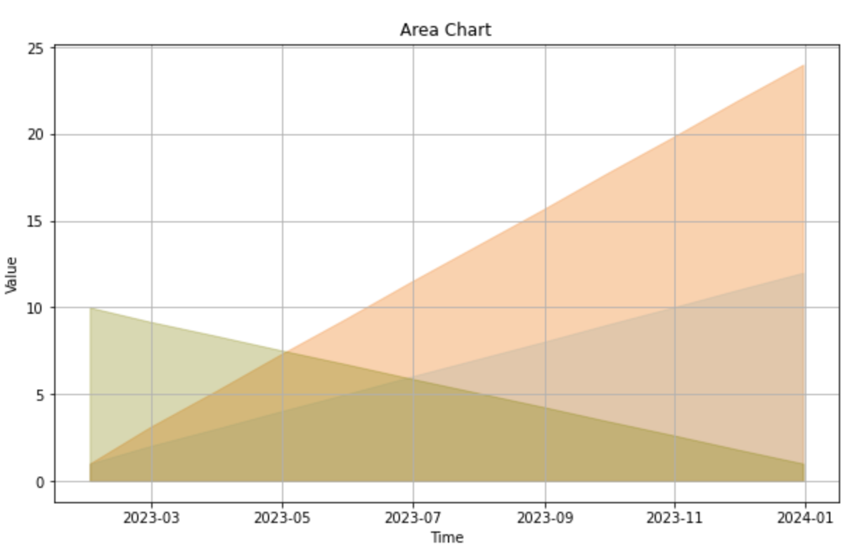
- Area charts. These charts are similar to line charts, but the area between the data line and the x-axis is filled with color or shading. They help emphasize the magnitude of changes over time or compare the cumulative value of multiple time series.
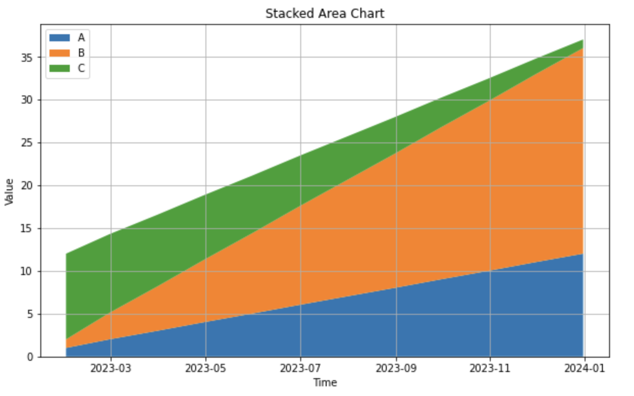
- Stacked area charts. Multiple time series are displayed on top of one another, showing the cumulative effect of each series. Stacked area charts are best suited for visualizing the composition of multiple time series and understanding their individual and collective impact.
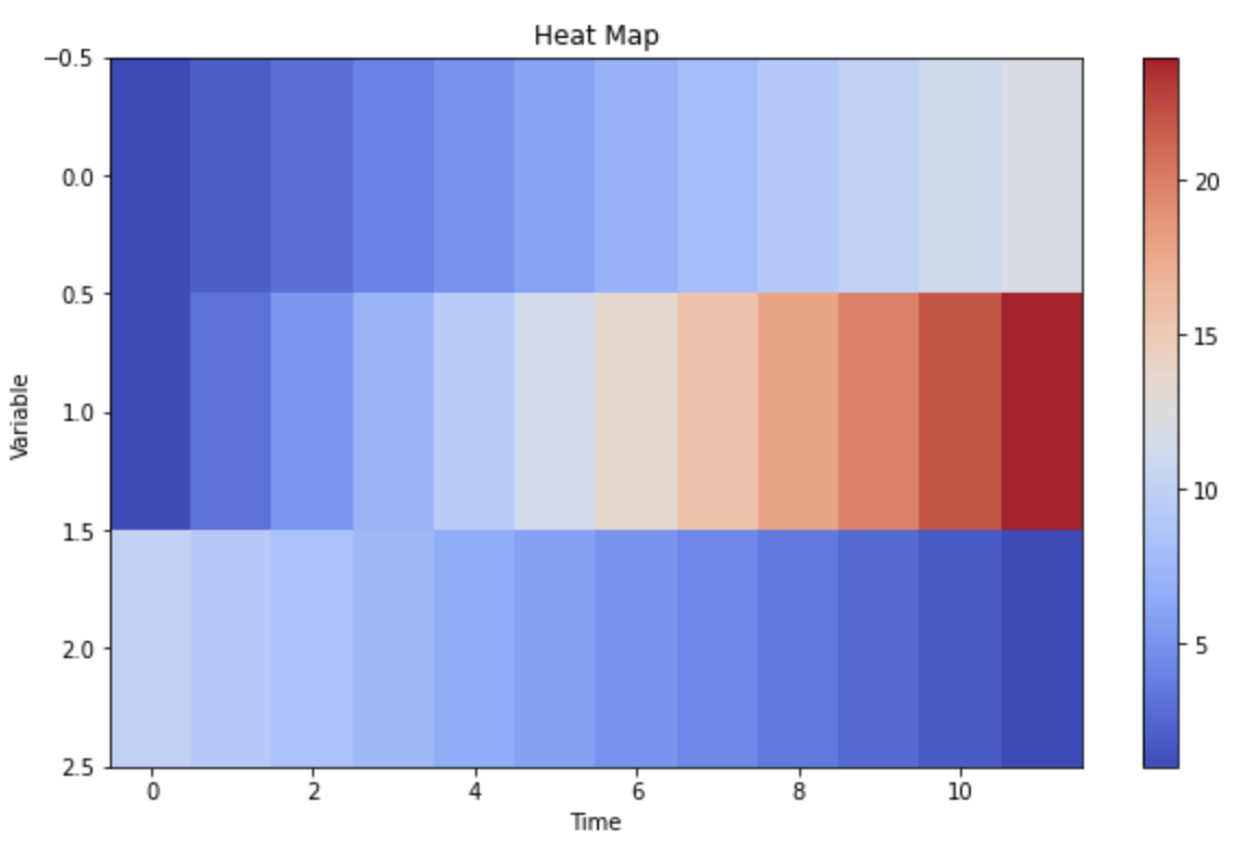
- Heat maps: Data values are represented as colors, usually in a grid format, where each row or column corresponds to a specific time interval. Heat maps are handy for large datasets to get a macro-level view and identify patterns or anomalies at a glance, such as daily patterns across several months.
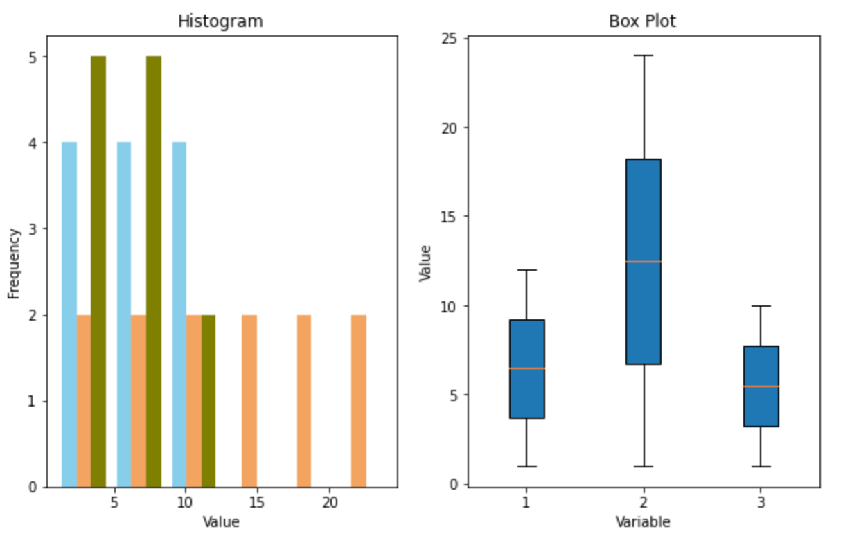
- Histograms and box plots. While histograms show the data's frequency distribution, box plots summarize its statistical properties like the median, quartiles, and potential outliers. Both are used to understand the distribution and variability of a time series, especially to identify skewness, kurtosis, or the presence of extreme values.
Employing the appropriate visualization technique is crucial. The choice depends on the specific attributes of the data and the insights one aims to extract. Combining multiple techniques often offers a comprehensive view of the time series data's characteristics and behavior. Let’s see that in action.
Using Time Series Visualizations
Let's walk through a time series analysis. We’ll use a mock version of the AirPassengers dataset. We’re mocking this to ensure the data has something to visualize. You can find the code for this analysis in a Hex notebook here.
Let's begin by generating this data.
import numpy as np
import pandas as pd
import matplotlib.pyplot as plt

# Generating synthetic AirPassengers data
np.random.seed(42)
t = np.arange(144)
trend = 2*t + np.random.normal(0, 10, len(t))
seasonality = 150 * np.sin(2 * np.pi * t / 12) + np.random.normal(0, 40, len(t))
data = trend + seasonality + 100

# Creating a DataFrame for better handling
date_rng = pd.date_range(start='1949-01-01', end='1961-01-01', freq='M')
df = pd.DataFrame(date_rng, columns=['date'])
df['passengers'] = data.astype(int)
df.set_index('date', inplace=True)
Then we can visualize it:
# Plotting the data
plt.figure(figsize=(14, 6))
plt.plot(df.index, df['passengers'], '-o', label='AirPassengers')
plt.title('Monthly Totals of International Airline Passengers (1949-1960)')
plt.xlabel('Year')
plt.ylabel('Number of Passengers')
plt.legend()
plt.grid(True)
plt.tight_layout()
plt.show()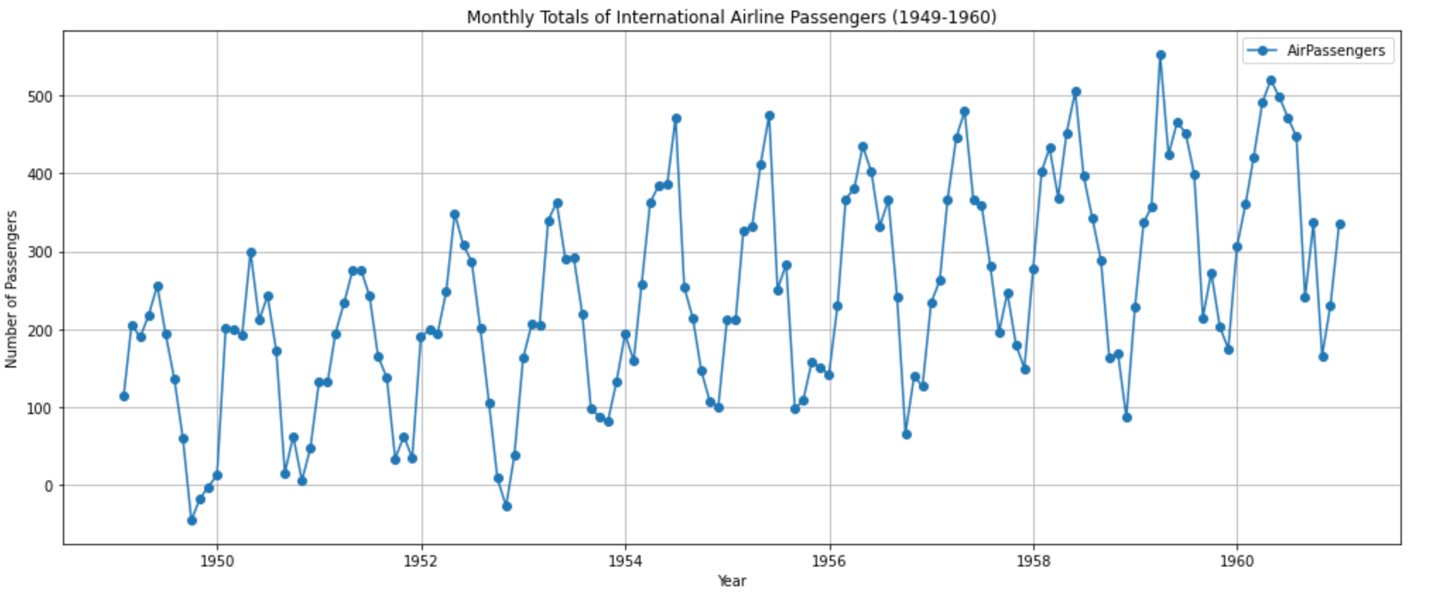
The plot displays monthly totals of international airline passengers from 1949 to 1960. You can observe a few things:
- Trend: There's a general upward trend over the years, indicating that the number of airline passengers increased over this period.
- Seasonality: There are clear cyclical patterns within each year, likely corresponding to popular travel months.
To better understand the components of our time series, we can decompose it into three main parts:
- Trend - The underlying direction the data is moving in.
- Seasonality - Cyclical patterns within the data.
- Residual - The remainder of the data after accounting for the trend and seasonality.
We can use the seasonal_decompose function from the statsmodels library to perform this decomposition. Let's see how our data breaks down.
from statsmodels.tsa.seasonal import seasonal_decompose

# Decomposing the time series
result = seasonal_decompose(df['passengers'], model='additive')

# Plotting the decomposed time series
fig, (ax1, ax2, ax3, ax4) = plt.subplots(4, 1, figsize=(14, 12))

# Original data
ax1.plot(df['passengers'], '-o', label='Original Data')
ax1.set_title('Original Time Series')
ax1.grid(True)

# Trend component
ax2.plot(result.trend, '-o', label='Trend Component')
ax2.set_title('Trend Component')
ax2.grid(True)

# Seasonal component
ax3.plot(result.seasonal, '-o', label='Seasonal Component')
ax3.set_title('Seasonal Component')
ax3.grid(True)

# Residual component
ax4.plot(result.resid, '-o', label='Residual Component')
ax4.set_title('Residual Component')
ax4.grid(True)

plt.tight_layout()
plt.show()
This outputs a graph with four subplots:
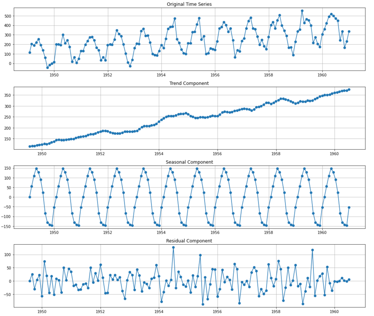
The first plot is the same as above to give us a reference for the overall data. The decomposition of the time series into its individual components gives us a clearer picture of its underlying patterns:
- Trend component. This captures the upward trajectory of the number of passengers over time. The trend is mostly linear, indicating a consistent growth in airline passengers from 1949 to 1960.
- Seasonal component. This captures the cyclical patterns within each year. We can see that there are months where the number of passengers peaks and valleys — this seasonality is consistent year after year.
- Residual component. After removing the trend and seasonality, the residuals show the unexplained variations in the data. Ideally, we want this to look like "white noise"—random fluctuations with no discernible pattern. If there are still patterns in the residuals, it might suggest that our decomposition hasn't fully captured all the underlying structures.
To get a better understanding of the seasonal patterns, we can average out the seasonal component for each month and visualize it. This will give us insight into which months typically have the highest and lowest passenger counts.
# Extracting the monthly patterns from the seasonal component
monthly_pattern = result.seasonal.groupby(result.seasonal.index.month).mean()

# Plotting the monthly patterns
plt.figure(figsize=(12, 6))
monthly_pattern.plot(kind='bar', color='skyblue')
plt.title('Average Seasonal Component by Month')
plt.xlabel('Month')
plt.ylabel('Average Seasonal Effect')
plt.grid(True, axis='y')
plt.tight_layout()
plt.show()
This gives us a bar chart showing the monthly seasonal component:
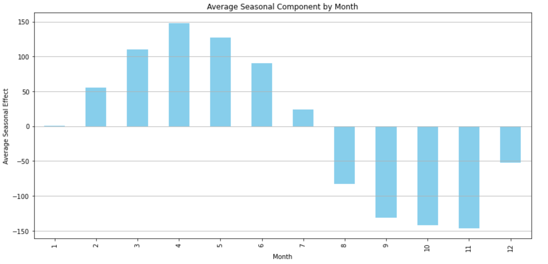
The bar chart provides insights into the average seasonal effects by month. The highest peaks are observed around mid-year, particularly in July. This suggests that July is typically the busiest month for international air travel in our dataset. Conversely, we see the lowest counts towards the beginning and end of the year, with November being particularly low. This suggests that November might be one of the least busy months for international air travel.
We can do the same by year to better understand the growth rate of passengers year by year by calculating the year-over-year percentage change. This will give us an idea of how rapidly the airline industry grew each year during this period.
# Calculating the year-over-year percentage growth
yearly_growth = df['passengers'].resample('Y').mean().pct_change() * 100

# Plotting the yearly growth rate
plt.figure(figsize=(12, 6))
yearly_growth.plot(kind='bar', color='lightcoral')
plt.title('Year-over-Year Percentage Growth in Passengers')
plt.xlabel('Year')
plt.ylabel('Percentage Growth (%)')
plt.grid(True, axis='y')
plt.tight_layout()
plt.show()
The bar chart displays the year-over-year percentage growth in passengers:
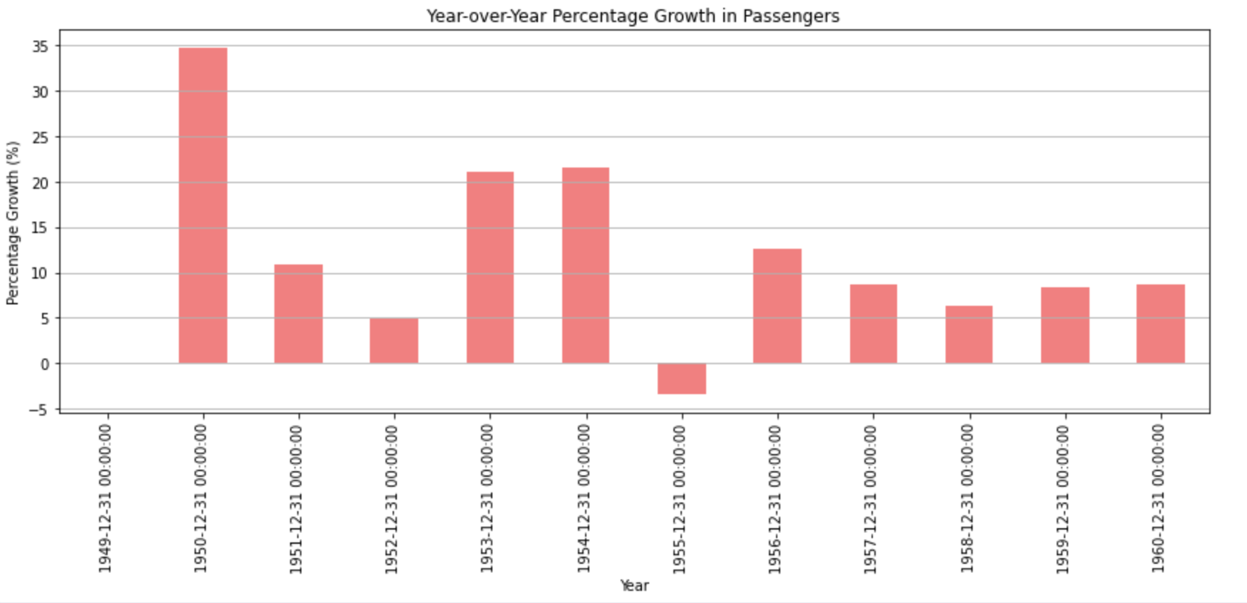
There's consistent growth every year, with some years experiencing higher growth rates than others. The most significant growth appears to have occurred in the mid-1950s, with a particularly high spike around 1954. This type of visualization can be helpful for businesses and industries to understand growth trends and make future predictions or decisions based on historical growth rates.
By visualizing the AirPassengers dataset, we’ve been able to identify:
- An upward trend indicating the growth of the airline industry.
- Seasonal patterns showing the busiest and least busy months for international air travel.
- Year-over-year growth rates, shedding light on the industry's expansion pace.
Advanced Time Series Visualization
You can glean a lot of insight from just the line and bar charts above. But sometimes you will have to dive deeper to learn more about a dataset.
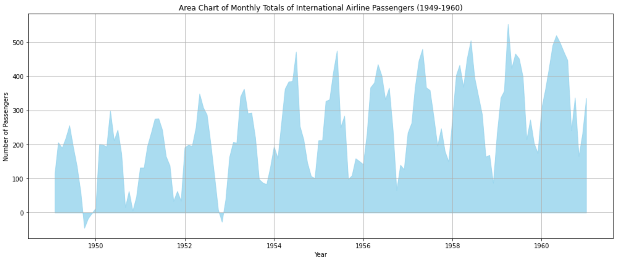
Let’s start with an area chart:
# Area Chart
plt.figure(figsize=(14, 6))
plt.fill_between(df.index, df['passengers'], color='skyblue', label='AirPassengers', alpha=0.7)
plt.title('Area Chart of Monthly Totals of International Airline Passengers (1949-1960)')
plt.xlabel('Year')
plt.ylabel('Number of Passengers')
plt.grid(True)
plt.tight_layout()
plt.show()
This visualization provides a sense of volume for the number of international airline passengers over time. The shaded area represents the number of passengers, and it's evident how it grows over the years.
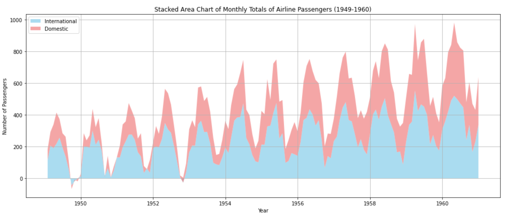
A stacked area chart can show different data points together. Here, we’ll mock some domestic flight data to go with the international data and stack them together:
# Generating synthetic data for Stacked Area Chart
np.random.seed(42)
domestic_flights = trend + 80 * np.sin(2 * np.pi * t / 12) + np.random.normal(0, 30, len(t)) + 50
df['domestic'] = domestic_flights.astype(int)

plt.figure(figsize=(14, 6))
plt.stackplot(df.index, df['passengers'], df['domestic'], labels=['International', 'Domestic'], colors=['skyblue', 'lightcoral'], alpha=0.7)
plt.title('Stacked Area Chart of Monthly Totals of Airline Passengers (1949-1960)')
plt.xlabel('Year')
plt.ylabel('Number of Passengers')
plt.legend(loc='upper left')
plt.grid(True)
plt.tight_layout()
plt.show()
By adding synthetic data for domestic flights, we can visualize both international and domestic flights' passenger counts. This chart provides a sense of how each category (international and domestic) contributes to the total volume over time. The total height of the filled area at any point in time represents the combined count of passengers.
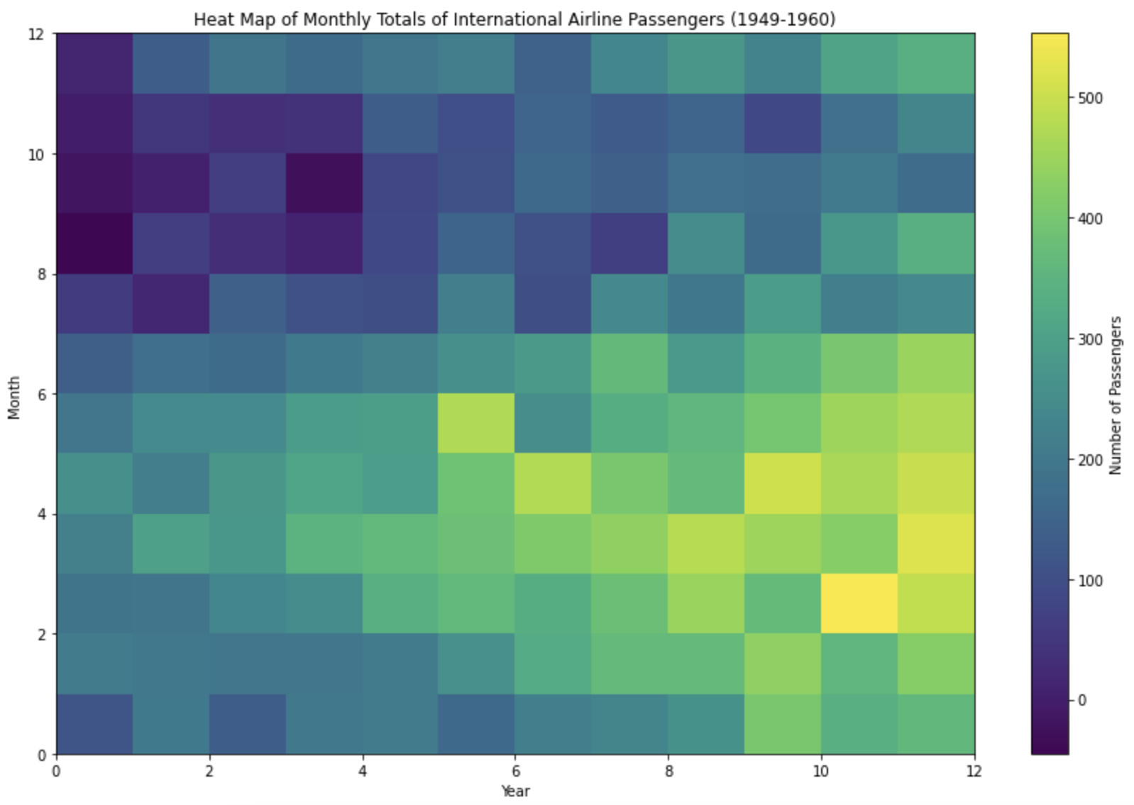
Heat maps are good for that bird’s-eye view of your data:
# Heat Map
heatmap_data = df.pivot_table(values='passengers', index=df.index.month, columns=df.index.year)
plt.figure(figsize=(12, 8))
plt.pcolormesh(heatmap_data, shading='auto', cmap='viridis')
plt.title('Heat Map of Monthly Totals of International Airline Passengers (1949-1960)')
plt.xlabel('Year')
plt.ylabel('Month')
plt.colorbar(label='Number of Passengers')
plt.tight_layout()
plt.show()
This visualization provides a quick overview of the monthly passenger counts for each year. Darker shades indicate higher passenger counts. This allows us to quickly identify patterns, such as which months tend to have the highest or lowest passenger counts across multiple years.
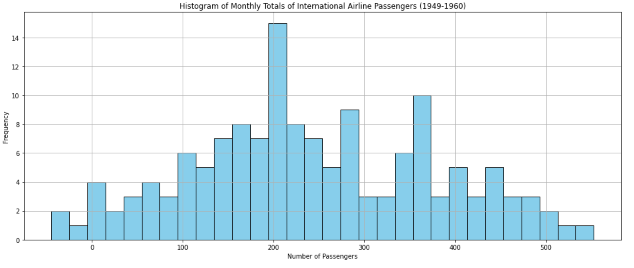
Histograms …
# Histogram
plt.figure(figsize=(14, 6))
plt.hist(df['passengers'], bins=30, color='skyblue', edgecolor='black')
plt.title('Histogram of Monthly Totals of International Airline Passengers (1949-1960)')
plt.xlabel('Number of Passengers')
plt.ylabel('Frequency')
plt.grid(True)
plt.tight_layout()
plt.show()
This chart shows the distribution of monthly passenger counts. Most months have passenger counts clustered around specific values, providing insight into the typical volume of passengers.
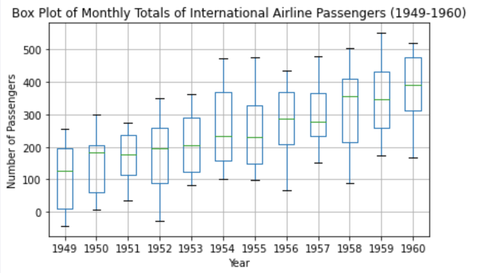
Finally, Box Plots.
# Box Plot
plt.figure(figsize=(14, 6))
df['year'] = df.index.year
df.boxplot(column='passengers', by='year', grid=True)
plt.title('Box Plot of Monthly Totals of International Airline Passengers (1949-1960)')
plt.suptitle("")  # Removes automatic title
plt.xlabel('Year')
plt.ylabel('Number of Passengers')
plt.tight_layout()
plt.show()
Each box represents the distribution of passenger counts for a specific year, giving us a sense of the variability and spread of the data. The box's central line indicates the median, while the box's top and bottom represent the third (Q3) and first (Q1) quartiles, respectively. The "whiskers" show the range of the data, and any points outside of these whiskers are considered outliers.
Next, let's explore some more advanced visualization techniques: Correlogram/Autocorrelation Plots. Correlogram/Autocorrelation Plots provide insights into how a time series is correlated with its past values.
from statsmodels.graphics.tsaplots import plot_acf, plot_pacf

# Correlogram/Autocorrelation Plots
fig, (ax1, ax2) = plt.subplots(1, 2, figsize=(16, 6))

# ACF plot
plot_acf(df['passengers'], lags=40, ax=ax1)
ax1.set_title('Autocorrelation Plot (ACF)')
ax1.set_xlabel('Lag')
ax1.set_ylabel('Correlation')

# PACF plot
plot_pacf(df['passengers'], lags=40, ax=ax2)
ax2.set_title('Partial Autocorrelation Plot (PACF)')
ax2.set_xlabel('Lag')
ax2.set_ylabel('Correlation')

plt.tight_layout()
plt.show()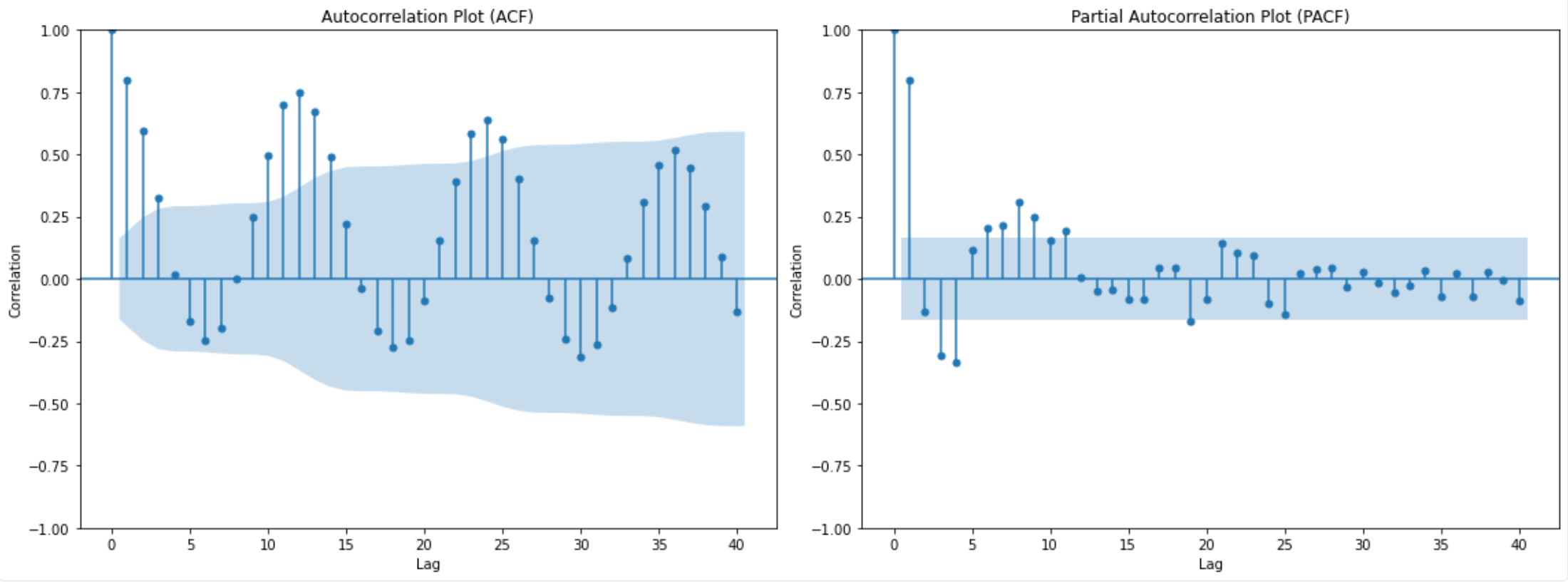
The autocorrelation plot (ACF) plot shows the correlation of the time series with its lags. The x-axis represents the lag (i.e., the number of time steps back), and the y-axis represents the correlation coefficient. For our dataset, we see a slow decline in correlation as the lag increases, which indicates that the time series has a strong memory effect. The shaded region indicates the confidence intervals, and values outside of this region are considered statistically significant.
The partial autocorrelation plot (PACF) displays the correlation of the time series with its lags, but after removing the effects of correlations at shorter lags. It provides a clearer picture of the direct relationship between the time series and its past values at each lag. We see significant spikes at lags 1 through 12, indicating that these lags might be particularly influential in predicting future values.
The Importance of the Analyst’s Eye
It can be tempting to want to reduce all analysis to numbers. To run some analysis, walk away for a few minutes and come back to answer saying “yes, this data is important.”
But being willing to explore data is a critical part of data analysis. Looking at data through visualizations means an analyst can use the billions of neurons in their brain that process visual stimuli to understand their data. With time series, this visualization is key because of how time series change over time and how they can be made up of all these different components. Be willing to use your eyes when analyzing data and not just leave it all up to the math—who knows what you might see.