Blog
Make data-driven decisions with KPI dashboards
Elevate your decision-making process by turning raw data into actionable insights and strategic outcomes

In 2013, MIT neuroscientists found that you can understand an image in just 13 milliseconds. That’s about ten times faster than the blink of an eye.
This is why dashboards make sense. OK, you probably don’t need to know your quarterly sales figures within 13 milliseconds, but your brain is wired for vision. Representing ideas and concepts visually is the best way to get that information across. Your brain just groks things like this:
Your brain has trouble with things like this:
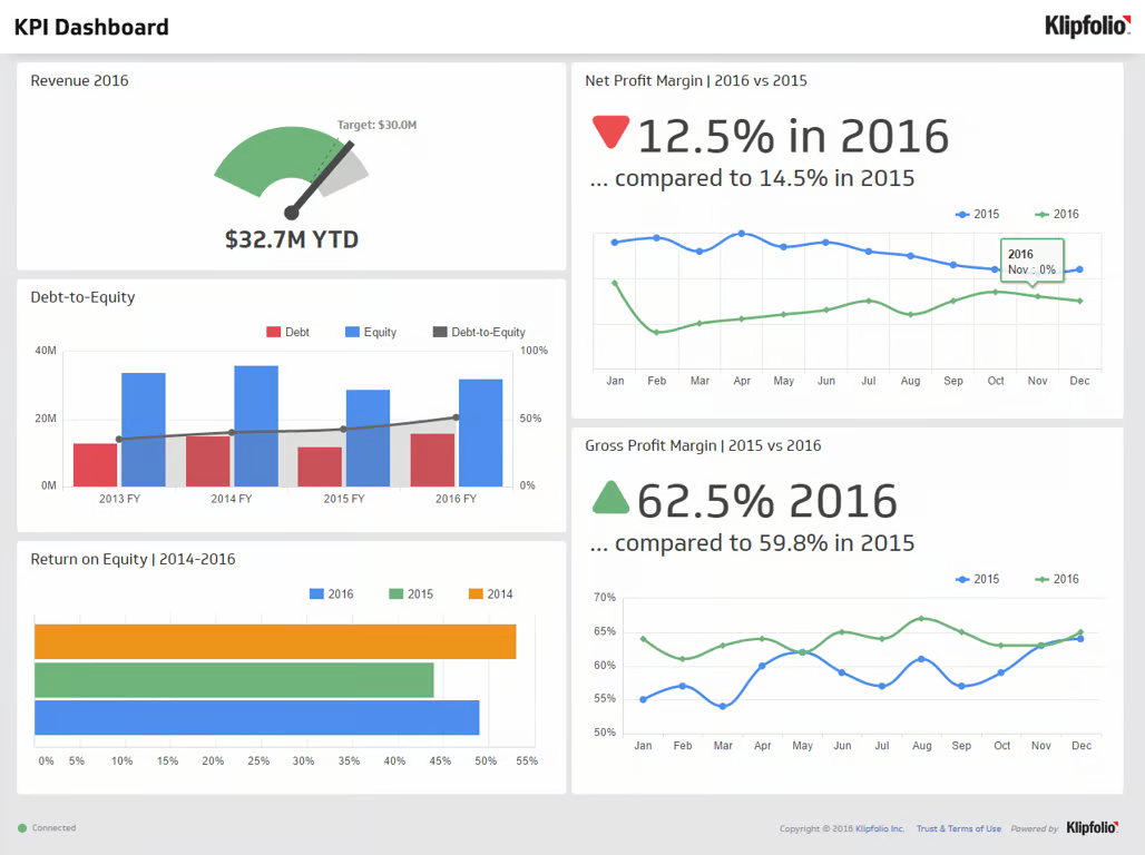
In 2016-to-date, our revenue is $32.7M, over our target of $30M. However, our net profit margin is down from 2015 from 14.5% to 12.5%, though our gross profit margin is up to 62.5% from 59.8% in 2015. Our return on equity is the lowest it has been in the past three years, at 49%, while our debt-to-equity ratio has been climbing and is now just over 50%.
You can understand the text description, but it takes longer and is less intuitive. If these numbers change every day, the numbers are all going to merge into a mess in your head.
Two other problems with the text version are:
- It doesn’t include the history. You can’t see the change, and often it’s the change that matters.
- It’s English only. If you can’t read English, it doesn’t make sense. The visual dashboard is universal.
But you can’t just slap some numbers into a visualization either– dashboards are hard to design as well. In fact, the one above isn’t very good:
- On first look, you’d think the target in the gauge chart is at the end of the gauge, whereas it's the faint dashed line. Presumably the end of the year is the end of the gauge.
- In the debt-to-equity and return-on-equity graphs, there is no way to understand whether these numbers are good or bad.
- In the net and gross profit margin line charts, the red/green arrows signify change, but the numbers next to them are absolute. So it looks like e.g., gross profit margin is “up 62.5%” whereas it is only actually up 2.7%
So let’s go through how you build a KPI (Key Performance Indicators) dashboard, from planning, through choosing the right deployment, to building one to fit your needs to get the right business insights.
What metrics matter
Every company runs on metrics. Metrics drive decision-making, and decision-making drives metrics.
There’s always a number you are trying to make go up, a ratio you need to go down, and a graph that needs to go up and to the right. KPI dashboards allow you to see that graph going up and to the right, and see those numbers change.
The first decision you need to make is, which numbers?
KPI performance dashboards aren’t about cramming every number in your business into a visualization. You need to think about:
- What metrics actually matter to your business? It might be a single number, a north-star metric, that you just want on a big screen in your office, or open in a tab on your computer.
- What is this dashboard for? Is it to highlight high-level financial numbers? To go through sales metrics? To show NPS and response times for customer success?
- Who is the audience? Are you summarizing data in a high-level executive dashboard or board members? Or are you showing the fundamental numbers to the team?
Each type of dashboard focuses on specific aspects of a business and tracks relevant metrics to provide insights and inform decision-making. Here are some KPI dashboard guidelines for different dashboards in an organization:
- Revenue Dashboard: Monitors the financial performance of a business by tracking key revenue metrics such as total revenue, revenue growth, average revenue per customer, revenue per product or service, recurring revenue, revenue by region or market segment, and churn rate.
- Sales Dashboard: Provides insights into the sales performance of a business by tracking key sales metrics such as sales volume, sales revenue, sales growth, average deal size, sales by product or service, sales conversion rate, sales pipeline, sales cycle length, and sales by salesperson or team.
- Marketing Dashboard: Focuses on the effectiveness of marketing efforts and campaigns by tracking key marketing metrics like website traffic, traffic sources, bounce rate, conversion rate, cost per acquisition (CPA), return on investment (ROI), social media metrics, email marketing metrics, and lead generation.
- Financial Dashboard: Tracks key financial metrics like revenue, expenses, net income, cash flow, and financial ratios. It helps organizations monitor their financial health and make informed decisions.
- Operations Dashboard: Focuses on the efficiency and effectiveness of business processes, tracking metrics like production rates, capacity utilization, inventory levels, and order fulfillment times.
- Human Resources Dashboard: Monitors employee-related metrics such as headcount, turnover rate, employee satisfaction, training effectiveness, and recruitment performance.
- Customer Service Dashboard: Tracks customer satisfaction and support performance, with metrics like first response time, resolution time, customer satisfaction score, and ticket volume.
- Project Management Dashboard: Provides an overview of project status, progress, and key performance indicators (KPIs) like project timeline, budget, tasks completed, and resource allocation.
- IT Dashboard: Monitors technology infrastructure performance, system uptime, security incidents, and other relevant metrics to ensure the smooth functioning of IT systems and services.
Each of these templates revolves around metrics that aid decision-making for teams.
Building vs buying your reporting tools
If you’ve decided you need a KPI dashboard, how are you going to build one?
There are a ton of options, ranging from the so-simple-you-probably-don’t-think-it’s-a-dashboard-but-it-is, through the SaaS tools that come up in sponsored ads when you google “KPI dashboard” to the build it from scratch with a team of engineers option.
Let’s go through each to see their benefits and the challenges with each.
1. Spreadsheet tools
So, yeah, Excel is really the OG dashboard. Microsoft Excel and Google Sheets are widely-used spreadsheet tools that allow you to create simple, but good, KPI dashboards. They offer basic data visualization options, like charts and graphs, and can be used for manual data entry or importing data from other sources. The main benefits of spreadsheet tools are:
- Accessibility: Most people are familiar with spreadsheet tools like Microsoft Excel or Google Sheets, making them easily accessible and widely adopted.
- Affordability: Spreadsheet tools are often included in standard office software packages or available for free, making them a cost-effective option.
- Flexibility: Spreadsheets can be easily customized to meet specific needs and can handle a wide range of calculations and data manipulations.
The problems that you might face using spreadsheets for your KPI dashboarding are:
- Limited visualization options: Spreadsheet tools typically offer basic charts and graphs, which may not be sufficient for more complex data visualization needs.
- Manual data entry and updates: Data integration capabilities are limited, often requiring manual data entry or time-consuming import processes.
Difficulty in sharing and collaboration: Sharing dashboards with other team members can be cumbersome with emailing flying back and forth.
2. Business intelligence (BI) tools
These are what you think of when you think of ‘dashboards.’ Enterprise-level tools like Tableau, Microsoft Power BI, and Qlik. They definitely provide more advanced capabilities for creating KPI dashboards:
- Advanced data visualization: BI tools can have sophisticated data visualization options, so you can create more engaging and informative dashboards.
- Data integration: These tools often support integration with various data sources, making it easier to create a comprehensive view of your organization and performance.
- Advanced analytics: BI tools often include advanced analytics capabilities, such as predictive analytics, data mining, and sometimes machine learning. These can help uncover business insights and inform decision-making.
But their problems are almost the inverse of a spreadsheet’s benefits:
- Learning curve: A Tableau KPI dashboard can be complex and require a significant amount of time to learn and master.
- Cost: They are expensive, especially for small businesses or those with limited budgets, and you can end up with vendor lock-in, unable to move all your data and dashboards to better value tools.
Hardware and software requirements: Some BI tools require specific hardware or software configurations, which may be a barrier to entry for smaller organizations.
3. Dashboard software
These are the SaaS versions of the tools above. They are dedicated dashboard software, but built more for smaller teams and startups. Think Klipfolio, Geckoboard, Domo, and Cyfe.
Whereas BI tools can be involved in all types of data analysis, these focus specifically on creating and managing KPI dashboards. They work well because they have:
- Ease of use: Dashboard software is specifically designed for creating and managing KPI dashboards, making it relatively easy to use for most users.
- Pre-built templates: Many dashboard software tools offer a variety of pre-built templates, which can help streamline the dashboard creation process.
- Data integration: Dashboard software often includes integrations with popular data sources, simplifying the process of incorporating data from various platforms into a single dashboard.
But they have some significant limitations:
- Limited customization: While these tools often offer pre-built templates, they may not provide the level of customization needed for more unique or specific dashboard requirements.
- Cost: Dedicated dashboard software can still be costly, especially with ongoing fees in a SaaS model.
Data integration limitations: Some dashboard software may not support integration with all the data sources your organization uses, requiring additional tools or manual data manipulation.
4. Data visualization libraries
All the previous options fit in the ‘buy’ bucket. You don’t have to build anything yourself. With data visualization libraries, you have to get your hands a little dirty.
For those with programming knowledge, using data visualization libraries, such as D3.js (JavaScript), Plotly (Python/R), or ggplot2 (R), can allow you to create highly customized and interactive KPI dashboards. The good things about these are:
- Customization: Using data visualization libraries allows for a high level of customization and flexibility, enabling you to create unique and tailored dashboards.
- Interactivity: Many data visualization libraries support interactivity, so you can create more engaging and dynamic dashboards.
- Open-source options: These libraries are open-source, so they are free to use and have a community of developers contributing to their ongoing development.
The bad news is:
- Technical expertise is required: Using data visualization libraries requires programming knowledge, which may be a barrier for non-technical users.
- Development time is longer: Building custom KPI dashboards using libraries can be time-consuming and resource-intensive.
- Maintenance is down to you: As with any custom development, ongoing maintenance and updates may be required to ensure the dashboard continues to function properly and meet the organization's evolving needs.
(you can read more about building dashboards in Python here.)
5. Custom development
The final option is to roll your own. You can choose to develop your own KPI dashboards using in-house engineers or by hiring external developers. This approach offers the highest level of customization but may also require significant time and investment. You get:
- Complete customization: Developing a custom KPI dashboard enables you to create a solution that perfectly meets your unique needs and requirements.
- Integration with internal systems: Custom development allows for seamless integration with existing internal systems and processes, providing a more cohesive solution.
- Competitive advantage: A custom-built dashboard can provide a competitive advantage by offering insights and visualizations not available through off-the-shelf solutions.
The downsides are:
- Cost: Custom development can be expensive, especially if external developers are required or if significant development time is needed.
- Time: The development process can be lengthy, delaying the availability of the dashboard for decision-making.
- Maintenance: Custom-built dashboards will require ongoing maintenance and updates, which can add to the total cost of ownership and put additional strain on internal resources.
Curated, code-free KPI dashboards
Let’s run through how you can make a KPI dashboard. We’ll be using Hex. You can use Hex to build flexible and modern KPI dashboards easily, as they have both built-in visualizations and allow you to fully customize your dashboard with Python. Additionally, you can directly query any database or data warehouse with SQL queries.
We’ll work through a brief introduction to the company metrics dashboard from our gallery:
In this case our dashboard is a sales dashboard. We’re using data from a restaurant to understand current sales performance and use this information to make decisions about what to add to the menu.
Notice that this does three things a good KPI dashboard does:
- It focuses on one aspect of the business–sales.
- It is built to drive decision-making–we want to know what to add to the menu.
- It sets the scene–dashboards shouldn’t be pure numbers. Contextualizing the data for the audience is important.
In our example, the data is in a Snowflake warehouse. We’ll use a SQL query to connect to the database and query the data:
SELECT o.order_id,
      o.user_id,
      o.status,
      o.created_at,
      o.returned_at,
      o.shipped_at,
      o.delivered_at,
      oi.product_id,
      oi.inventory_item_id,
      oi.sale_price
FROM demo_data.ecommerce.orders o
left join demo_data.ecommerce.order_items oi on oi.order_id = o.order_id
WHERE o.status != 'Cancelled'GROUP BY 1,2,3,4,5,6,7,8,9,10
Now we’ve pulled our data we can continue to use order_items to query against (we call this Chained SQL). This is simpler and less expensive than having to perform multiple queries to the warehouse or write subqueries.
Let’s go back and roll up the data for the last 30 days:
SELECT date_trunc(day,created_at) as day,
      count(distinct order_id) as orders,
      sum(sale_price) as sales
FROM orders_items
WHERE returned_at is null
 and created_at >= DATEADD(day,-30,CURRENT_TIMESTAMP)group by 1order by 1
And then do the same for the 30 days previous:
SELECT date_trunc(day, created_at) as day,
      count(distinct order_id) as orders,
      sum(sale_price) as sales
FROM orders_items
WHERE returned_at is null
 and created_at <= DATEADD(day,-60,CURRENT_TIMESTAMP) and created_at > DATEADD(day,-31,CURRENT_TIMESTAMP)group by 1order by 1
We can then sum up those values into variables:
orders_total = int(thirty_day_orders['ORDERS'].sum())
sales_total = thirty_day_orders['SALES'].sum()
prev_orders = int(prev_period_orders['ORDERS'].sum())
prev_total = prev_period_orders['SALES'].sum()
Then we can use built-in value visualizations to visualize orders_total and sales_total and work out the delta between this month and last month:

Two things to notice about this. Firstly, it is better UX than the Klipfolio example at the top. Here it’s clear what the headline number is and clear what the change since last month is.
Secondly, did you notice the switch in the code above? We went from SQL to pull and parse the initial data from our warehouse, to Python to analyze the data. Hex is polyglot, so you can work in SQL when it makes sense (usually when interacting directly with a database or warehouse) and Python when it makes sense (when analyzing and visualizing data). You don’t have to do any SQL-in-Python mashups to get data into a form that can be analyzed.
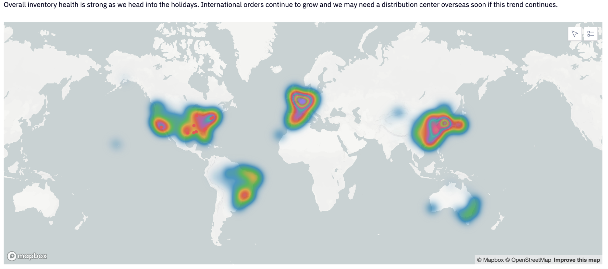
Once we‘ve pulled the data from our warehouse, we can easily graph it out to better understand it. For instance, graphing out sales through time pulls out a spike in sales around the holiday period (with a correlated spike in returns).
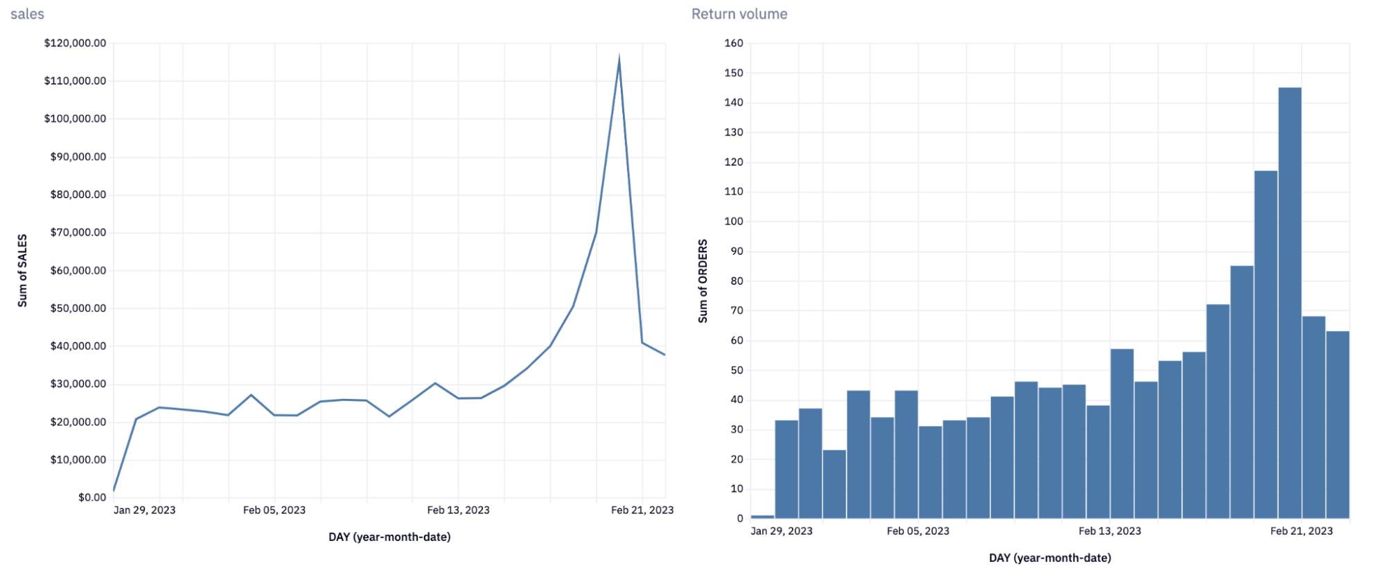
This is the kind of trend that it wouldn’t be as easy to spot if you were just tabling the data. Another example of difficult-to-comprehend data is location data. This type of data only makes sense when it’s mapped. We can do that with a built-in map visualization in Hex:
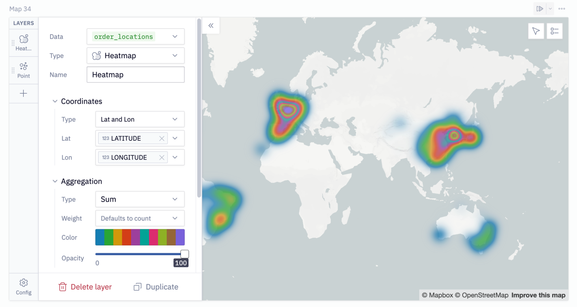
This actually shows the backend view, where you can choose the data to graph and customize it how you need. When you publish this app, it looks like this, along with the context:
An added bonus of using Hex to build a KPI dashboard is that you can easily publish it for your team to see. You can also easily refresh the data for each variable or chart for automated reporting.
Copy the app yourself to play around with this dashboard and use it as a KPI dashboard template for your own team.
Drive decisions with dashboards
It's easy to get caught up in pixel-perfection, but remember: dashboards are a decision-making tool.
They can be simple or complex depending on need, and as beautiful or sparse as you can make it. But the data always takes center stage. Your focus when building one should always be “does this help drive the organization forward?”
The best KPI dashboards do this well.