Blog
How to Build a Dashboard in Python
Turning your Python data visualizations into beautiful interactive dashboards

Imagine you’re a data scientist at a SaaS startup, and your sales team needs a basic dashboard that visualizes pipeline stages and growth. How do you build that in Python?
Python isn’t short of data visualization options. From the simplicity of Seaborn to the level of control of Matplotlib, if you want a graph, chart, map, table, plot, mesh, or spine, there’s a way to get it with Python. But a dashboard isn’t just data viz. You need to contextualize the data with titles, text, tables, and more plots. And you need to publish it so that people can act on the data and information.
In this post we are going to take you through how to set up a basic dashboard with the most common Python tools and libraries: Matplotlib, Seaborn, and Plotly for visualization, and Flask, Jupyter, Dash, and Hex for deployment.
Throughout the post, we'll be plotting a few variations on this sales pipeline dataset. Our goal is to visualize the data in a few ways: a bar chart, a line chart, a histogram, and a scatter plot. We'll also want to give our dashboard users the ability to change the data being displayed and change the data range we’re plotting.
Let’s go!
Building the basic visualizations of a dashboard
Matplotlib is the OG of Python data viz. And it looks like it. Modeled on the extortionately-priced but actually-kinda-awesome proprietary MATLAB language, Matplotlib puts data in first place and style way back in, like, nineteenth.
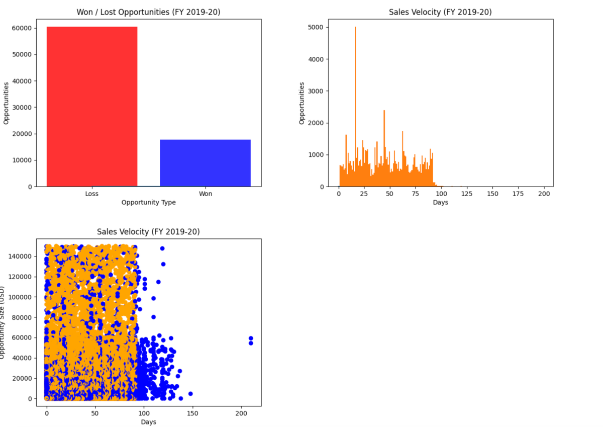
But it is powerful. Let’s plot some of that dataset. This code will give you a basic bar chart that splits deals by won and lost:
The bad news is that your sales team is losing a lot of deals.
The good news is how easy it was to plot that data with Matplotlib. But did we really plot it with Matplotlib? Yes and no. To create the plot we called a built-in Pandas plot() method working on the DataFrame, not a Matplotlib method. But the Pandas plotting methods are provided under the hood by… Matplotlib.
This is something you’ll see time and again in Python data visualization. Seaborn? Matplotlib under the hood. Cartopy? Matplotlib under the hood. Plotnine? Matplotlib under the hood. Here’s a list of all the other visualization tools using Matplotlib in some way.
To produce the same plot in pure Matplotlib, we’d replace:
sales_data['Opportunity Status'].value_counts().plot( kind='bar')with:
plt.bar(sales_data['Opportunity Status'].value_counts().index, sales_data['Opportunity Status'].value_counts())Note that to use Matplotlib directly, we’re passing our data as an argument to a Matplotlib function, rather than calling a method (.plot) that belongs to our Pandas data.
There are tons of different ways to “build” these kinds of Matplotlib visualizations, and they come in all shapes and sizes (sorry). Another popular one is using Figure:
from matplotlib.figure import Figuresales_data = pd.read_csv("Sales Dataset.csv")# Generate the figure **without using pyplot**.
fig = Figure()
ax = fig.subplots()
ax.plot([1, 2])
ax.title.set_text('Won / Lost Opportunities (FY 2019-20)')
ax.set_xlabel('Opportunity Type')
ax.set_ylabel('Number of Opportunities')
ax.bar(sales_data['Opportunity Status'].value_counts().index, sales_data['Opportunity Status'].value_counts(), color= ['red', 'blue'], alpha = 0.8)
fig.savefig("opportunities_won_lost.png", format="png")For the curious, Matplotlib's architecture consists of three layers:
- At the top is the scripting layer. Whenever you use the .plot() method like we did above, you are using the scripting layer. As Matplotlib was built as an open-source version of MATLAB and MATLAB is mostly used by scientists rather than developers, the idea of this scripting layer was to mimic how MATLAB worked and give scientists a less verbose way of creating plots.
- In the middle sits the artist layer. This is where the heavy lifting of Matplotlib is performed. Using this layer you can call each component, or Artist instance, that makes up a plot: the Figure, Axes, Line2D, y-label, xticks… With this layer you can finely control what appears in the final render, which is what we’re doing with the Figure calls above.
At the bottom is the backend layer. This is the low-level rendering interface that is controlling where pixels go on the screen. The idea here is that this is detached from the higher-level APIs that can then be application-specific. It is this layer that Seaborn, Plotnine, etc. build on.
For our dashboard, we’ll stick with the Figure method, as using the scripting layer has been known to cause memory leaks when used on a server.
Back to some charts: our sales team wants to understand how quickly opportunities are getting handled (also called sales velocity). Let’s build a line chart:
It looks like the vast majority of opportunities are dealt with in less than 100 days, though there are a few significant outliers.
This plot won’t be very helpful in a dashboard – it should probably be a histogram. To produce a histogram we only need to change one line:
ax.plot(sorted(sales_data['Sales Velocity']))Becomes:
ax.hist(sales_data['Sales Velocity'], np.arange(1, 200))(I guess two lines as you probably want to save it with a different filename!)
Which produces:
This is much more useful. Now we can see clearly that there is a definite spike in sales velocity of deals around the day 20 mark, and the stark dropoff just before 100 days.
The same goes for the scatter plot, with the expectation that a) we need another variable, color, to map the color of the points to, and b) we’re going to plot against opportunity size:
This is good, but all we have so far is a bunch of individual pngs. For it to be a dashboard, we need to start contextualizing and get it deployed somewhere.
Publishing to the web
Flask is the simplest way to get your Python code onto the web – it’s a bare bones server that can serve HTTP requests. Flask comes as a Python package like everything else so you can just pip install flask. The “Hello, World” (literally) for Flask is just this:
from flask import Flaskapp = Flask(__name__)@app.route("/")
def hello_world():
return "<p>Hello, World!</p>"Each individual page in your Flask app is defined by a route (this one is just the root directory, /) and a function that returns the HTML for the page. Very simple.
Save the above file as “hello.py” (not “flask.py”, as this would cause a conflict with Flask internals), run flask --app hello run, and you’ll have a web page that you can easily pop on a server somewhere. Neat.
The Flask app has two parts: (1) all the logic to manipulate the data and create the charts, and (2) a return HTML to the page. Let’s get our charts in there.
We’ll start, as always, by importing our libraries:
from flask import Flask
import pandas as pd
from matplotlib.figure import Figure
Import numpy as np
import base64
from io import BytesIO
The first three imports you’ve seen before. NumPy is the main data analysis library for Python, for working with numerical data. We are only going to use one method, .arange(), to just output a range of numbers, but NumPy is one of the most powerful libraries you can use with Python.
Base64 lets us encode binary data as ASCII and BytesIO gives us an in-memory binary stream. We’ll see these in practice in a moment.
Next, we’ll create an instance of the Flask class, which is the core of the Flask program. It runs the WSGI (web server gateway interface) server that runs your app:
app = Flask(__name__)We need to use the route() decorator next. Decorators are a fantastic “syntactic sugar” for Python. When you add a decorator above a function, you add functionality to your function. Here, we add a simple @app.route() decorator that tells Flask knows which route it uses in this function. In this case, the home page:
@app.route("/")We’re mostly going to copy and paste the code we’ve written for our two charts. But since this code will be running on a server, we need a little middleware to make sure the output of the plots is optimized for web. This is where base64 and BytesIO come in. We create an in-memory buffer with BytesIO and then save our plot in that buffer. We then use base64 to take that binary data and encode it as ASCII so we can render it on the page.
Let’s remove the def hello_world() and replace it with this def dashboard() function:
def dashboard():
sales_data = pd.read_csv("Sales Dataset.csv") # Generate the figure for the Won / Lost Opportunities.
fig = Figure()
ax = fig.subplots()
ax.plot([1, 2])
ax.title.set_text('Won / Lost Opportunities (FY 2019-20)')
ax.set_xlabel('Opportunity Type')
ax.set_ylabel('Opportunities')
ax.bar(sales_data['Opportunity Status'].value_counts().index,
sales_data['Opportunity Status'].value_counts(), color=['red', 'blue'], alpha=0.8)
bar_buf = BytesIO()
fig.savefig(bar_buf, format="png")
bar_data = base64.b64encode(bar_buf.getbuffer()).decode("ascii") # Generate the histogram for Sales Velocity.
fig = Figure()
ax = fig.subplots()
ax.plot([1, 2])
ax.title.set_text('Sales Velocity (FY 2019-20)')
ax.set_ylabel('Opportunities')
ax.set_xlabel('Days')
ax.hist(sales_data['Sales Velocity'], np.arange(1, 200))
fig.savefig("velocity_histogram.png", format="png")
hist_buf = BytesIO()
fig.savefig(hist_buf, format="png")
hist_data = base64.b64encode(hist_buf.getbuffer()).decode("ascii") # Generate the scatter plot for Sales Velocity.
fig = Figure()
ax = fig.subplots()
ax.plot([1, 2])
ax.title.set_text('Sales Velocity (FY 2019-20)')
ax.set_ylabel('Opportunity Size (USD)')
ax.set_xlabel('Days')
colors = {'Won': 'blue', 'Loss': 'orange'}
ax.scatter(sales_data['Sales Velocity'], sales_data['Opportunity Size (USD)'],
c=sales_data['Opportunity Status'].map(colors))
scatter_buf = BytesIO()
fig.savefig(scatter_buf, format="png")
scatter_data = base64.b64encode(scatter_buf.getbuffer()).decode("ascii")The last thing we need to do is return each chart data within its own html <img> tag to render it to the browser:
return f"""<img src="data:image/png;base64,{bar_data}" />
           <img src="data:image/png;base64,{hist_data}" />
           <img src="data:image/png;base64,{scatter_data}" />"""
And you have the foundation of a decent dashboard!
Now that we have some starting plots, we need to help the viewer understand what they are about.
Adding contextual information
At the moment we have some charts on a page. We want to add a title, some text, and a table of some of the data.
We can do all of these using Flask, with just a few changes to the code above. The main change is that instead of returning image elements (plus now all the text and table as well), we’re going to create a template for all this using jinja2. Jinja is a templating engine that allows you to pass variables into html. Create a /templates directory in the same directory as your Flask app, then add a dashboard.html file in that directory containingsome basic jinja code:
<html>
 <body>
   <h1>{{page_title}}</h1>
   <p>{{introductory_text}}</p>
   <div>{{ table | safe }}</div>
   <p>{{bar_text}}</p>
   <div>
     <img src="data:image/png;base64,{{ bar_data }}" />
   </div>
   <p>{{hist_text}}</p>
   <div>
     <img src="data:image/png;base64,{{ hist_data }}" />
   </div>
   <p>{{scatter_text}}</p>
   <div>
     <img src="data:image/png;base64,{{ scatter_data }}" />
   </div>
 </body>
</html>
Back in our “hello.py” file, those five text variables are declared exactly how you would normally in Python:
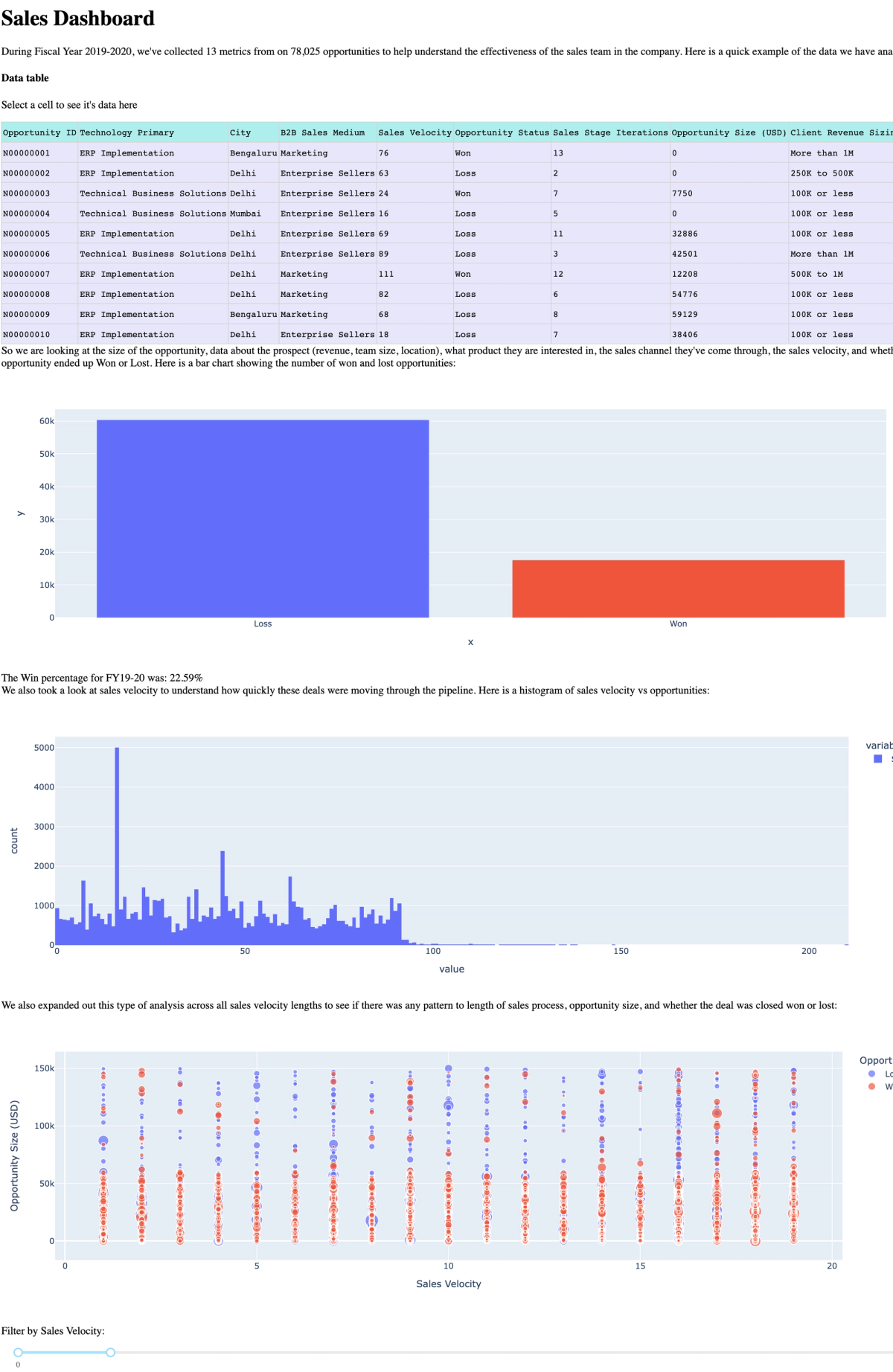
page_title = "Sales Dashboard"
introductory_text = "During Fiscal Year 2019-2020, we've collected 13 metrics from on 78,025 opportunities to help understand the effectiveness of the sales team in the company. Here is a quick example of the data we have analyzed:"
bar_text = "So we are looking at the size of the opportunity, data about the prospect (revenue, team size, location), what product they are interested in, the sales channel they've come through, the sales velocity, and whether the opportunity ended up Won or Lost. Here is a bar chart showing the number of won and lost opportunities:"
hist_text = "We also took a look at sales velocity to understand how quickly these deals were moving through the pipeline. Here is a histogram of sales velocity vs opportunities:"
scatter_text = "We also expanded out this type of analysis across all sales velocity lengths to see if there was any pattern to length of sales process, opportunity size, and whether the deal was closed won or lost:"
So we have a page title, an initial text paragraph, then a table. To create a table from the first N rows of our data, we can use .to_html():
table = sales_data.to_html(index=False, max_rows=10)We can then return all of this using the render_template() method in Flask with the name of our template file (‘dashboard.html’):
return render_template(
    "dashboard.html",
    bar_data=bar_data,
    hist_data=hist_data,
    scatter_data=scatter_data,
    page_title=page_title,
    introductory_text=introductory_text,
    bar_text=bar_text,
    hist_text=hist_text,
    scatter_text=scatter_text,
    table=table)
With all that code, you’ll end up with something like this:
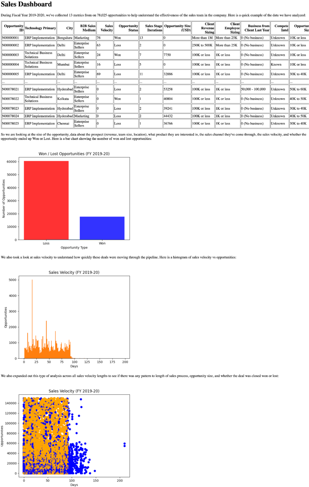
OK, so it does look like a dashboard from 1993. But it is a dashboard, and one built entirely in Python, using just built-in methods, Pandas, Matplotlib, and Flask. It’s running locally right now, but it would be no sweat to get this up on a server and make it accessible to your broader team.
Next steps for this dashboard
At this point, there are a few more things we’d want to do to move this into a more production-ready state:
- Add some styling. Flask outputs html, so you can style all this output through CSS. Now that we are using a template, we can also pull in a css file in the head of the template and add classes to each element.
- Deploy it. Currently, this is just on localhost. If you want your team (or the waiting world) to see it, it has to be deployed to the web. The easiest way to do that for Flask is something like Heroku or fly.io.
- Connect to a database. In a production environment, it’s more likely that data for a dashboard is going to come from a database, rather than from a csv. Piping data from a db into Python is easy as long as you have the right library and you can even write sql in Python with Pandas directly to query your data.
Using Matplotlib and Flask like this is the lowest level and trickiest way to build a dashboard in Python. It gives you maximal control but maximal headaches. So if you have very specific customizability needs, need to make several external API calls, or are already committed to Flask, this is probably the right option for you. If not, you should definitely read on.
Adding interactivity to our dashboard with Dash
You can, with some magic (and several hundred StackOverflow searches), make that Flask dashboard interactive with Matplotlib. But purpose-built Python tools like Dash, Streamlit, and Hex will make this much easier. Frameworks built for dashboarding give you control over your data and charting of regular libraries but remove (most) of the headache of adding interactivity and pushing those dashboards to production.
Let’s start with Dash. Dash is basically a pro version of what we built initially. How do you get it up and running? Lo and behold, you pip install dash.
Here are the imports we’ll need:
from dash import Dash, html, dcc, Input, Output, dash_table
import plotly.express as px
import pandas as pd
These functions from Dash that will help us with adding plots, text, and interactivity to our dashboard. plotly is the visualization library we’ll be using here (plotly built Dash). You can use plotly entirely independently of Dash, and, as we’ll see, it is extremely similar to Matplotlib.
Next create an instance of the Dash class:
app = Dash(__name__)You can see how similar this is to Flask–in fact, it is Flask under the hood.
Plotting basic charts is pretty much the same as with Flask, except we use px.bar(), px.line(), px.histogram(), and px.scatter.
Instead of rendering everything to a template, we build the html within our app.py file using the helpers we imported. To create the initial text, table, and first graph:
sales_data = pd.read_csv('Sales Dataset.csv')
sales_data_table = sales_data.head(10)sales_bar = px.bar(sales_data, x=sales_data['Opportunity Status'].value_counts().index, y=sales_data['Opportunity Status'].value_counts(
), color=['red', 'blue'])app.layout = html.Div(children=[
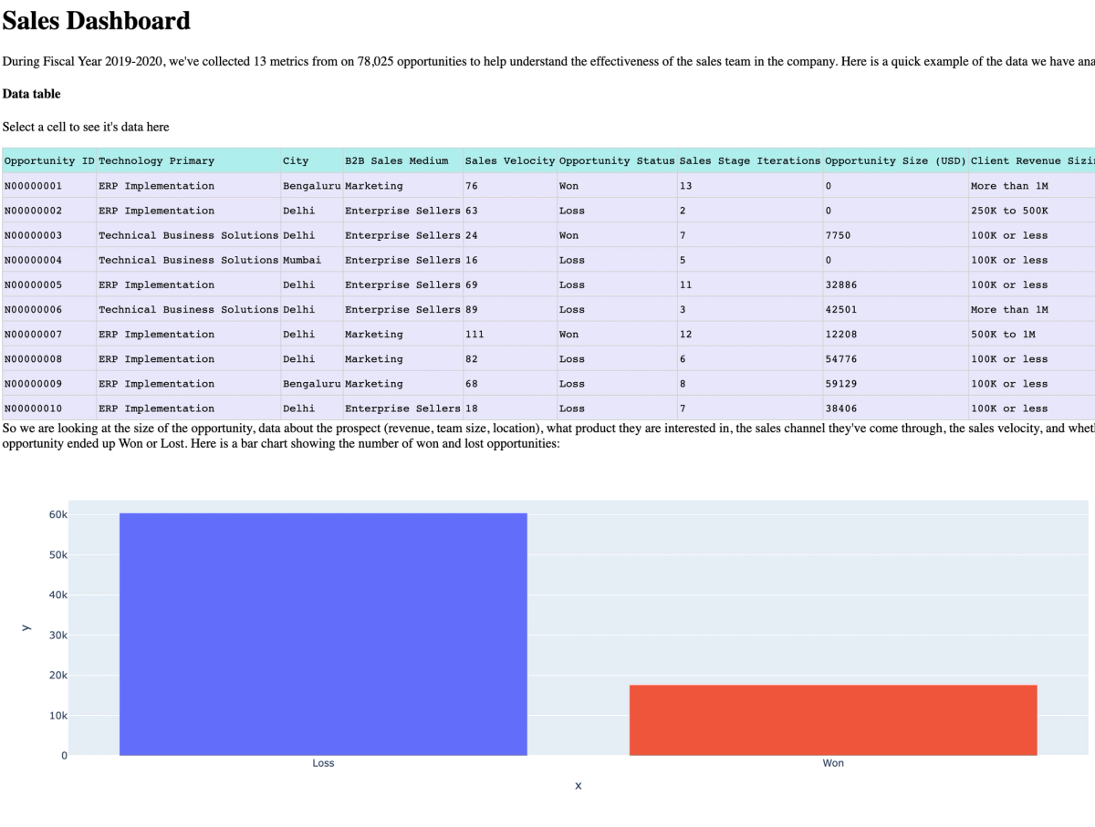
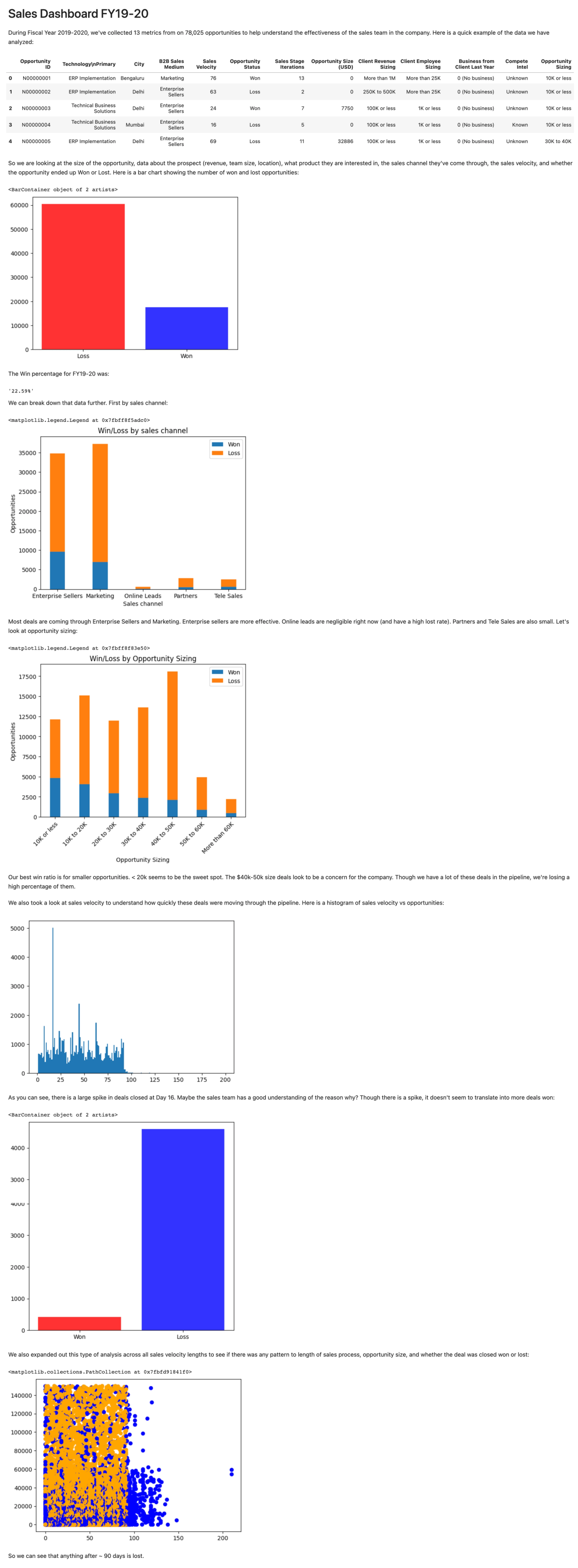
html.H1(children='Sales Dashboard'), html.Div(children='''During Fiscal Year 2019-2020, we've collected 13 metrics from on 78,025 opportunities to help understand the effectiveness of the sales team in the company. Here is a quick example of the data we have analyzed:
'''), html.H4('Data table'),
html.P(id='table_out'),
dash_table.DataTable(
id='table',
columns=[{"name": i, "id": i}
for i in sales_data_table.columns],
data=sales_data_table.to_dict('records'),
style_cell=dict(textAlign='left'),
style_header=dict(backgroundColor="paleturquoise"),
style_data=dict(backgroundColor="lavender")
), html.Div(children='''
So we are looking at the size of the opportunity, data about the prospect (revenue, team size, location), what product they are interested in, the sales channel they've come through, the sales velocity, and whether the opportunity ended up Won or Lost. Here is a bar chart showing the number of won and lost opportunities:
'''), dcc.Graph(
id='sales-bar',
figure=sales_bar
),
])The html components create the basic html elements for the page, dash_table creates the table, and dcc.Graph creates the plots. Then, a simple python [filename].py runs the server.
Here is what that looks like:
That table is interactive. When you click on a cell, you can display its data:
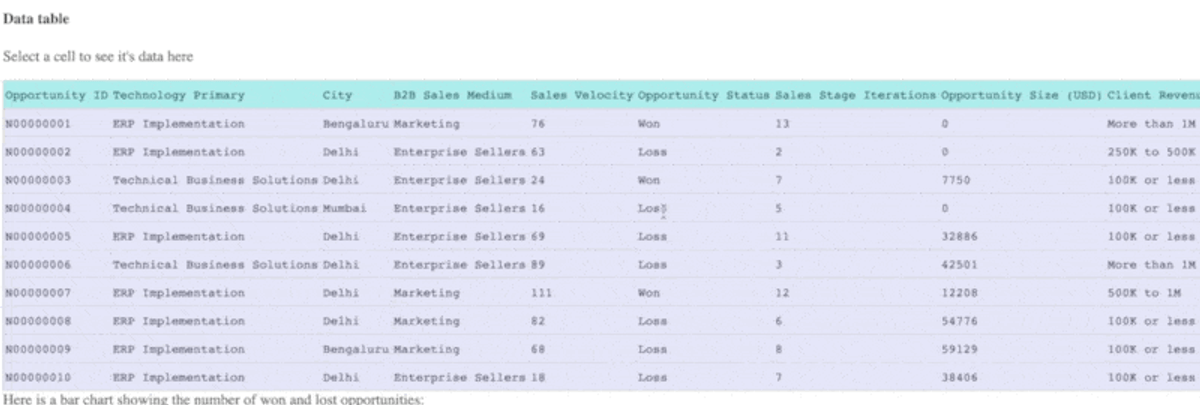
You do this in Dash with callbacks. These are simple functions that manipulate the html rendered. Here is the callback function for that table:
@app.callback(
   Output('table_out', 'children'),
   Input('table', 'active_cell'))
def update_graphs(active_cell):
   if active_cell:
       cell_data = sales_data_table.iloc[active_cell['row']
                                         ][active_cell['column_id']]
       return f"{active_cell['column_id']}: {cell_data}"
   return "Select a cell to see its data here"
The @app.callback is a decorator for callbacks. Output() and Input() are Dash functions that let you select what the input and output of the callback are, and then you can write a simple function that updates the text.
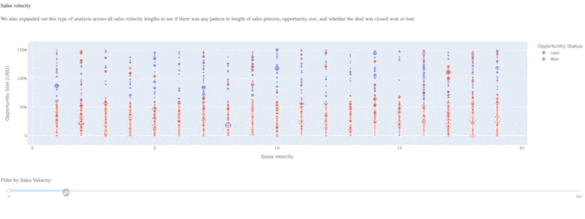
But we want more than just the table to be interactive–we want the charts to be interactive as well. In our Flask deployment, the scatter plot is busy. We can add a slider to narrow down the amount of data we show in the window:
px.scatter(This would plot sales velocity against opportunity size, with the color of each data point decided by the opportunity status (Won/Loss). Plotly plots have some built in interactivity, so you can hover over each data point and see information about the opportunity.
sales_data, x="Sales Velocity", y="Opportunity Size (USD)",
color="Opportunity Status", hover_data=['Opportunity ID'])
But we can wrap this inside a callback to add further functionality. Say we wanted to inspect sales velocity a bit and narrow down opportunities to certain velocities. Creating the html is much like above:
app.layout = html.Div([
   html.H4('Sales velocity'),
   dcc.Graph(id="scatter-plot"),
   html.P("Filter by Sales Velocity:"),
   dcc.RangeSlider(
       id='range-slider',
       min=0, max=200, step=1,
       marks={0: '0', 200: '200'},
       value=[0, 20]
   ),
])
Only here we have also added a RangeSlider so we can control the range of our sales velocity selection. The callback is:
@app.callback(
   Output("scatter-plot", "figure"),
   Input("range-slider", "value"))
def update_bar_chart(slider_range):
sales_data = pd.read_csv('Sales Dataset.csv') low, high = slider_range
mask = (sales_data['Sales Velocity'] > low) & (
sales_data['Sales Velocity'] < high)
fig = px.scatter(
sales_data[mask], x="Sales Velocity", y="Opportunity Size (USD)",
color="B2B Sales Medium", size="Sales Stage Iterations", hover_data=['Opportunity ID'])The input to the callback is the range slider and the output is the plot itself. We can then create a mask that will be just our data selection depending on where the slider is. All we have to do is pass that mask into the DataFrame in the scatter plot and it will only plot that specific data. Here’s what it looks like:
When we put all this together, we get:
Like the Matplotlib/Flask option, this is missing styling, but you can add it via a CSS file as you are outputting HTML. You can deploy this via Heroku/Fly.io, or use the Dash Enterprise platform.
A couple of other ways to build a dashboard
Because this is Python, there aren't just two ways of doing this, there are probably 200. Here’s a couple of other ways to get a dashboard up and running quickly.
Creating a dashboard from a notebook
You're probably already familiar with Jupyter Notebooks. All of the code above will work in a Jupyter notebook. We’ve put together a full .ipynb notebook here.
You can then turn that report into a dashboard with Voila:
Now we’re dashboarding. It’s not perfect, but the text and data is clearer. If you are already using notebooks, this is a great option. If you need your dashboard to be seen wider, you can publish Voila notebooks using Binder.
Creating a Python dashboard in the cloud
A cloud notebook like Hex means you can completely remove all the manual set up–the dashboard will be available to share with your team by default.
As it’s a notebook, all the plotting and text work the same as in Jupyter. In fact, I can just directly upload my .ipynb file and the dataset and have the notebook ready to go.
Here we’ve also added a Hex chart cell at the end for some interactivity:
Choosing the right Python dashboard
You have a ton of options when you are creating a dashboard with Python, both in terms of the data viz libraries you use, but also in the way you can deploy them.
- If you want to do everything from scratch (or it’s just for you), Matplotlib and Flask work.
- If you want a professional dashboard for sharing widely, Dash works.
- If you are already familiar with notebooks and use them for analysis, Voila works.
- If you need to get something shared with your team quickly, Hex works.
The power of Python is that you can use any and all visualization with any of these methods. You can mix and match to show your data the best. All of this is Python, so it all works well together. Don’t feel constrained to just one way of doing dashboarding–experiment and play until you get the best solution for your data.