Blog
Introducing: an all-new, interactive visualization experience for Hex
Point-and-click visual filtering, an all-new chart cell, custom color palettes, and more

Charting is one of - if not the - most important part of the analytics workflow. Humans are visual creatures, and a well-built chart can make the difference between confusion and comprehension.
Building beautiful charts, however, can be challenging, especially in code-based environments like notebooks, where the only option is to write verbose Python code. Building charts this way can feel clunky, and is inaccessible to many data practitioners.
Our original chart cell in Hex made this workflow far more accessible, providing a point-and-click way to construct visualizations, and has been used by thousands of users to bring data to life.
Today we’re taking this experience further, introducing three big steps forward: interactive visual filtering, an all-new editor UI, and custom color palettes.
Interactive visual filtering
Let’s say you have built a report in Hex with some charts, and want to allow users to filter down to specific time frames and see just those records. Previously, you’d have to wire up input parameters for start and end times, reference them in a SQL, filter, or code cell, and then into a new display table. It’s a pretty tedious workflow, both for creators and consumers, who really just want to point-and-click on the data that looks interesting.
Enter: visual filtering. Now, Hex chart cells allow users to to select datapoints of interest, creating new filtered sets of results.
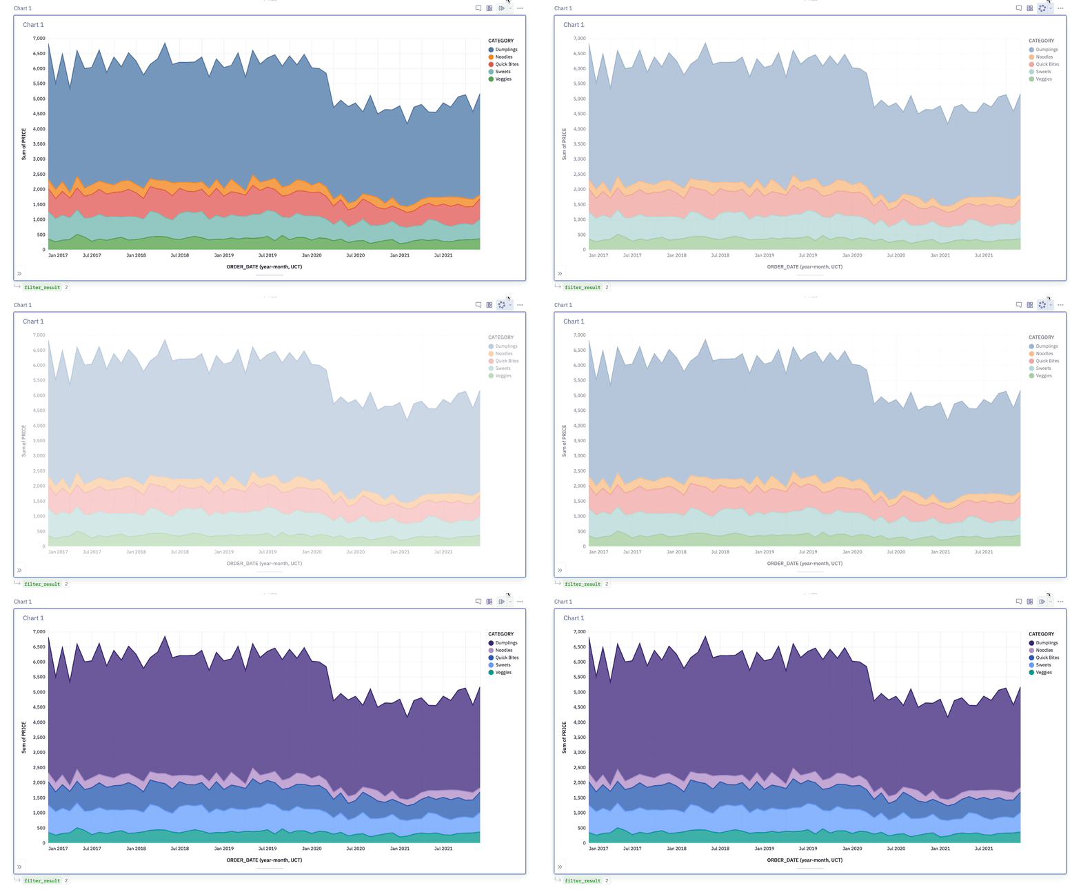
On the editor side: each cell returns a dataframe, just like our no-code Filter cells. The dataframe is responsive to chart selections — click and drag across a range of values, individually select columns of interest, or interact with the legend to filter the data. This turns charts into a tool for interactive, visual exploration: you can display the resulting records in a table, or further slice-and-dice them in another visualization.
Visual filtering shines in app mode, allowing end-users to directly interact with reports, dashboards, or tools you publish in Hex. This can completely replace complex workflows with multiple input parameters and filter steps. Just point, click, and go.
… built on top of a new, intuitive UI for editors
Part of the magic of Hex is that things Just Work — the UI should feel intuitive, yet extensible.
Unfortunately, our old chart cell didn’t live up to this promise. It let users create basic charts without writing code, but often required a lot of configuration to get the visualization you wanted. Some basic plots, like a grouped column chart or a histogram, were way more frustrating to build than they should have been.
Our new chart cell is a complete, from-scratch rebuild. In every part of the UI, we’ve strived to provide an intuitive interface, and sensible default behaviors. It’s easier than ever to build the chart you want, with fewer clicks.
The new chart cell also provides finer-grained styling options, letting user configure specific colors for each series, switch the order of these series, and customize the axes, legends, gridlines and tooltips to make things feel polished.
We could tell you more about it, but honestly you should just try it and see for yourself.
… and styled with your brand colors.
And finally, one of our most-requested features: custom color palettes. Admins can configure a color palette that gets picked up by our new chart cells, creating on-brand charts by default.

...powered by the Vega ecosystem
We did keep one thing from our old chart cell: it's backed by Vega-Lite, which has provided us flexible, beautiful building blocks for visualization.
Behind the scenes, we're also using VegaFusion to power orders-of-magnitude larger data scale for visualization. By generating the aggregated data server-side, we avoid client-side rendering limitations, and allow users to plot near-infinite size dataframes in Hex. We're looking forward to sharing more about how we're doing this - and where we're taking it next! - soon.
We can't wait to see all the beautiful visualizations you build with this. May your charts be ever up and to the right 📈!