Blog
How to perform an A/B test
Compare versions of a product/service in order to observe which one performs the best.

What is an A/B test 🤨
Imagine you've put a new game up on the app store and so far it's doing amazing with 20k active users. You're planning on pushing out a new UI update, however, you want to choose the design that will perform the best with your users and you don't know which one to choose. You could flip a coin to choose the final design, but then that leaves everything up to chance. Instead you decide to perform an A/B test and let your users inform you on which version performs the best. You take a sample of your users, let's say 16k, and you split them into two groups. One group sees version_A of the new UI update and the other group sees version_B. After a week, you compare the retention of each group to see which group yields a higher retention rate, and whichever group "wins" will determine the final UI design that you go with.
This is essentially what an A/B test is -- A way to compare two (in some cases more) versions of something to figure out which performs better. There's a lot more that goes into an A/B test so let's dive in and see how it works!
import pandas as pd
import numpy as np
import matplotlib.pyplot as plt
import seaborn as sns
from scipy.stats
import chi2_contingency, chisquare
plt.style.use('seaborn')
The dataset 📊
The dataset we will be using is from the game Cookie cats and can be downloaded from Kaggle . Cookie cats is a colorful mobile game where the goal is to collect cookies (in a connect 4 style) and feed them to cats. If you're familiar with Candy Crush, the game is very similar. A gate is a pause in the game where the user can either make an in-app purchase or wait a set amount of time before progressing to the next level.
This dataset includes A/B test results of the Cookie Cats game to examine what happens when the first gate in the game was moved from level 30 to level 40. When a player installs the game, they are randomly assigned to either gate 30 or gate 40. The column, version , lets us know whether the player was put in the control group (gate 30 - a gate at level 30) or the treatment group (gate 40 - a gate at level 40).
data = pd.read_csv("cookie_cats.csv")Understanding hypothesis and testing metrics 🧐
Before we go any further, we need to understand the methods used to compare the groups to each other in order to determine which group performs best. You may have heard of this concept in statistics called a hypothesis, which is defined as
An assumption, or an idea that is proposed for the sake of argument so that it can be tested to see if it might be true.
In other words, we have an assumption about an outcome that we want to test in order to verify the validity of our assumption. This is especially useful in an A/B test because we assume that one version will perform better than the other, and we can test and verify if our assumption is supported or not.
Hypotheses come in two flavors, the null hypothesis, and the alternative hypothesis. The null and alternative hypotheses are two competing claims that we will weigh the evidence for and against using a statistical test .
- Null hypothesis: There is no effect on what we are trying to test
- Alternative hypothesis: There is an effect on what we are trying to test
Using a hypothesis to measure success
A successful product is one that can attract new users while also being able to satisfy existing ones. One way to know if our customers are satisfied or not is to look at the customer retention rate. Retention is the desire to want to continue using a product or service, and it's the perfect metric to use when designing an A/B test. Specifically, higher retention helps us maintain:
- Loyalty: Retained customers often engage/spend more than new customers since they value the product.
- Affordability: It's cheaper to retain existing customers than to acquire new ones.
- Referrals: Loyal customers are more likely to spread the word about your product.
A significant change in retention can either mean that customers value your product and are providing a sustainable source of revenue, or that you are losing customers leading to a decrease in product growth.
For our hypothesis test, we will measure and test the difference in retention between our two groups. Here, retention is defined as how many users came back to play the game after a certain time period. For example, If we have 10k users playing on release day and 4k users playing the next day, that means 40% of users are still engaging with our app 24 hours later.
In our case, we want to test how user retention is affected by shifting the timing of the first gate in our game. We'll look at user retention for these two groups at two time periods -- 1 and 7 days after a new player hits their first gate. We can write our null and alternative hypotheses as the following:
- Null hypothesis 1: being in the group that sees the first gate at level 40 has no effect on retention after 7 days
- Alternative hypothesis 1: being in the group that sees the first gate at level 40 affects user retention after 7 days
- Null hypothesis 2: being in the group that sees the first gate at level 40 has no effect on retention after 1 day
- Alternative hypothesis 2: being in the group that sees the first gate at level 40 affects user retention after 1 day
Before we can start testing our hypotheses, let's explore our data a bit to make sure it's in a condition to be tested on.
Exploratory data analysis 🔎
First, let's take a look at the distribution of our data and check if there is any sample ratio mismatch (SRM) present.
print(data['version'].value_counts())
data['version'].value_counts().plot(kind = 'bar');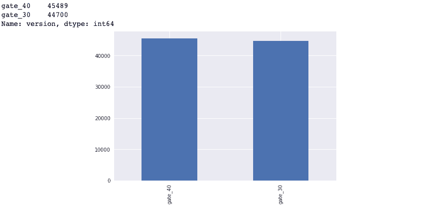
Checking for SRM 🤏🏾
Although our data looks fairly balanced, we want to confirm this mathematically before putting it through a statistical test.
In this section, we will determine if our data set has any signs of sample ratio mismatch or SRM for short. A sample ratio is the ratio between the expected number of samples per group in an experiment. This ratio becomes mismatched if the sample difference between both groups is large enough such that the groups are no longer balanced.
For example, say my app gets 20k visitors per month and I have 2 variations that I want to show to my visitors. How much traffic should I expect to receive if traffic is equally distributed between variations?
Ideally, the split would be 50/50 meaning 10k visitors per variation, however, this split isn't always perfect and it could really be something such as 9,942/10,058. Due to randomness, observing a slight variation is normal but if one variation were to receive 8k visitors and the other 12k, how do we know if this mismatch is large enough to justify discarding some observations?
This is where SRM comes in. A test for sample ratio mismatch uses a Chi-square test to tell us if the mismatch in visitors is considered normal or not. By comparing the number of actual observations against the number of expected ones, we can check if there is a significant mismatch by comparing our resulting p-value from the chi-square test to a set significance level of 0.01. If the p-value is less than the significance level, then SRM may be present in our dataset and we will need to introduce some balance.
def SRM(dataframe):
    gate_30 = dataframe["version"].value_counts().loc["gate_30"]
    gate_40 = dataframe["version"].value_counts().loc["gate_40"]

    print("Number of players in group A (gate_30):",gate_30)
    print("Number of players in group B (gate_40):",gate_40)

    observed = [ gate_30, gate_40 ]
    total_player= sum(observed)
    expected = [ total_player/2, total_player/2 ]

    chi = chisquare(observed, f_exp=expected)
    print(f"p-value: {round(chi[1], 4)}\n")
    if chi[1] < 0.01:
        print('SRM detected')
    else:
        print('No SRM detected')

SRM(data)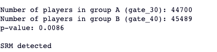
Looks like our SRM function is indicating that there's a significant difference in the distribution of our two groups. Thankfully, we know how to handle this! We are going to randomly sample from each group in our original dataset to obtain a new dataset with balanced groups. In this case, each group will have 44k observations.
control = data[data['version'] == 'gate_30']
treatment = data[data['version'] == 'gate_40']
balanced_data = pd.concat([
    control.sample(n = 44000, axis = 'index', random_state = 222),
    treatment.sample(n = 44000, axis = 'index', random_state = 222)
], ignore_index = True)
If we call our SRM function on the new group distributions, we see that our SRM has disappeared.
SRM(balanced_data)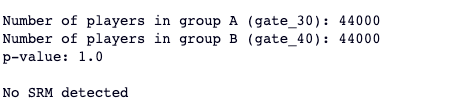
Visualizations 👁
Now that we've addressed the SRM in our data, we can further investigate what the retention is like across each of our groups. First, we will take a look at the average retention after 1 and 7 days for both the control and treatment groups.
retention_rate = round(balanced_data.groupby('version')[['retention_1', 'retention_7']].mean() * 100, 4)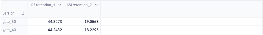
Based on this table, we can see that both groups performed pretty similarly with our control group (gate 30) tending to have a higher retention rate after both 1 and 7 days. Everything is always better with a visual so let's create some bar charts to give us a visual representation of the differences in retention between both of our groups.
plt.figure(figsize=(8,6))

sns.barplot(x=balanced_data['version'], y=balanced_data['retention_7'], ci=False)

plt.ylim(0, 0.2)
plt.title('Retention rate after 1 week', pad=20)
plt.xlabel('Group', labelpad=15)
plt.ylabel('Average retention', labelpad=15);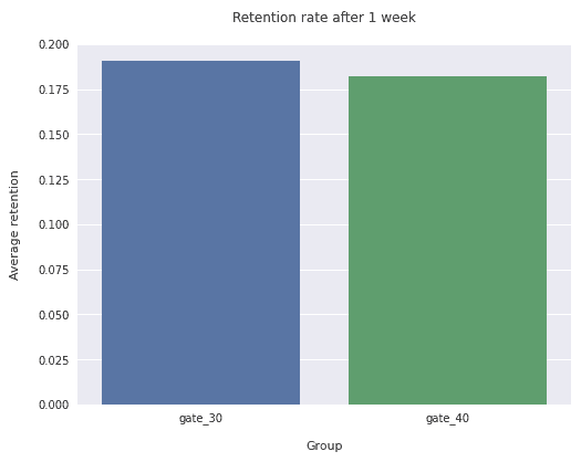
A bar chart may not be the best visualization to use in this case, so let's try a different visualization to see if we can get a better grasp of what's going on. We'll sample our dataset 1000 times and calculate the average retention rate for each sample. We're doing this is so that we can use a kernel density estimation plot to visualize the distribution in a way that can give us a different perspective on the difference in retention between both groups. A KDE plot is analogous to a histogram and is used to visualize the distribution of observations in a dataset using a continuous probability density curve. In simpler terms, a KDE plot helps us visualize the overall shape of our distribution.
def bootstrap_distribution(group, limit = 1000):

    # function borrowed from https://www.kaggle.com/code/serhanturkan/a-b-testing-for-mobile-game-cookie-cats
    bootstrap_retention = pd.DataFrame(
        [
            balanced_data.sample(frac=1, replace=True).groupby("version")[group].mean()
            for i in range(limit)
        ]
    )

    sns.set(rc={"figure.figsize": (18, 5)})
    bootstrap_retention.plot.kde()
    plt.title(
        "KDE Plot of the 1 day retention's bootstrap distributions"
        if group == "retention_1"
        else "KDE Plot of the 7 day retention's bootstrap distributions",
        fontweight="bold",
    )
    plt.xlabel("Retention rate")
plt.show()bootstrap_distribution("retention_1")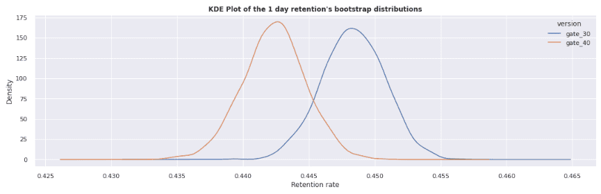
bootstrap_distribution('retention_7')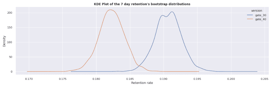
In this visualization, it is much more apparent that there is a difference between both the control and treatment groups for 1-day retention and 7-day retention. Notice that the gap between the groups in the 7-day retention chart is much larger than in the 1-day retention chart. Here, we also see that the treatment group retention is slightly lower than the control group. The remaining question is, how can we tell if the difference between the two groups is significant or not? In the next section we'll perform a statistical test to give us our answer!
Conducting the test 🧪
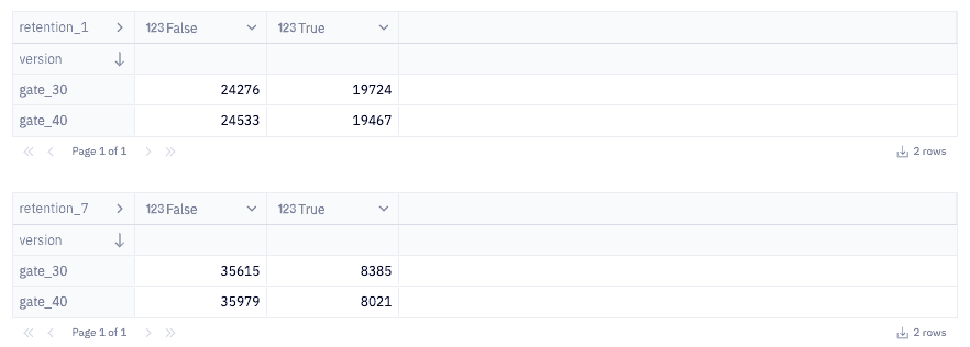
First let's create contingency tables of our data, which represents the frequency differences in retention between our groups. Then we will conduct a Chi-square test to verify if the difference between groups is statistically significant or not, which will determine the results of our hypotheses.
day_retention = pd.crosstab(balanced_data["version"], balanced_data["retention_1"])
week_retention = pd.crosstab(balanced_data["version"], balanced_data["retention_7"])
Let's quickly inspect what each table looks like so we have an understanding of the data being fed to the chi-square test.
Next, we'll define a function that will run our test and tell us the results. Our test will calculate a p-value which is a statistical measurement used to validate a hypothesis against observed data. This means that if we take the assumption "there is no difference in retention between the two groups" to be true (our null hypothesis), what is the likelihood that this assumption is supported by our data? The smaller the p-value, the stronger the evidence is in favor of there being a significant difference in retention between the groups (our alternative hypothesis).
We compare this value against a significance level, which tells us whether or not to support or reject our null hypothesis. For this test, we will set a significance level of 0.05 which means that we must observe a p-value that is equal to or less than this to consider our results as being statistically significant.
def chi2test(data):
    _, p, _, _ = chi2_contingency(data)
    significance_level = 0.05

    print(f"p-value = {round(p, 4)}, significance level = {significance_level}")
    if p > significance_level:
        print('Two groups have no significant difference')
    else:
print('Two groups have a significant difference')chi2test(day_retention)
In this test, we observe a p-value of 0.08 which is higher than our significance level. This means there is not a significant difference in the retention of our control and treatment groups after 1 day.
chi2test(week_retention)
In this test, we observe a p-value of 0.001 which is lower than our significance level. So there is a statistically significant difference in retention after 7 days between the control and treatment groups.
What do these results mean 🤔
Based on our results from the first chi-square test, we conclude that being in the group that sees the first gate at level 40 has no effect on retention after 1 day , meaning we failed to reject our null hypothesis. This may be because 1 day is too short of a time period to properly capture the way user engagement does or does not change. Or it may mean that the users who play our game on a daily basis are indifferent to when a gate is located!
Based on our results from the second chi-square test, we conclude that being in the group that sees the first gate at level starting at gate 40 does affect user retention after 7 days , meaning we can reject our null hypothesis. These results show that users who play our game on a weekly basis have lower overall user retention if the first game gate is moved up to level 40. In this case, it may be best to keep the gate where it is rather than move it since we observed a negative change in user retention.
However, because we saw no significant change in retention after 1 day yet we saw one after 7 days, it may be beneficial to run this type of experiment over longer time periods. For example, testing how retention changes after 7 and 14 days.
Conclusion 🤝
You've made it to the end of this tutorial 😮💨, give yourself a pat on the back.
Today you learned what an A/B test is and how to structure a statistical test to support or reject a hypothesis. We also covered how to balance a dataset to prepare it for A/B testing and what the results of the test mean. I encourage you to use these concepts on your own datasets to see what type of comparisons you can make and expand on some topics we didn't cover like:
- Different types of statistical tests
- Using different metrics to measure performance
- Testing different hypothesis
Hope you had fun learning something new and see you in the next tutorial!