Blog
Making AI charts go brrrr
How we made AI charts generate 8x faster, going from an average response time of 10.3s to 1.3s

Last year, we added a first version of AI charts to Hex: you could ask a question with natural language, and Hex would run the necessary SQL queries to retrieve relevant data, prep it with Python if necessary, and then build a visualization using a native chart cell.
A few seconds after asking your question, you’d be able to point and click to explore or reconfigure an interactive chart, and keep iterating manually or with AI.
The only problem… it took a little more than just “a few seconds”. The first version of AI charts took an average of 10.3s to generate a visualization — long enough to dull the magic of having AI build a chart in the first place.
This is the story of how we made AI charts generate 8x faster, going from an average response time of 10.3s to 1.3s.
Why are we playing on hard mode?
Before we get into the performance story, let's address an immediate elephant in the room: why was it so important that our AI tools create fancy native Hex chart cells rather than just rely on generated Python code for visualizations? Anyone who’s asked ChatGPT to make a chart knows it will happily generate matplotlib or plotly code right out of the box.
The thing that makes our suite of AI tools (called Magic) so useful is their depth of integration into the place you’re already doing data work. The actual base model we use isn’t inherently more intelligent than good old ChatGPT (we use GPT-4 under the hood), but we put a massive amount of work into appropriately guiding that model, providing it with relevant context about your data and your projects, and giving it tools to more intelligently use the Hex workspace.
Our ethos for building helpful AI assistance tools can be roughly condensed into two opinions:
- AI assistance should be be seamlessly available within a users existing workflow. This means no switching tabs, no opening some chatbot sidebar you’ll copy/paste code back and forth from, and so on.
- AI-generated work should be easy for users to evaluate, edit, and accept. This means AI responses should use the same tools that a human user would, and crucially, use them in the same way. In Hex, this means a big SQL query should be broken up into multiple chained SQL cells instead of one complex CTE, and that SQL query should have the casing and comma conventions the user prefers. Of course, it also means the AI should use the same native and interactive chart cells a user would!
Following these principles leads to a user experience where relying on AI for assistance feels seamless, efficient, and most importantly: not frustrating. It also makes AI-generated outputs significantly easier to evaluate for accuracy and edit if necessary.
But hoo boy was it more complex to build than just returning some raw Python code and executing it! We’re going to write a bunch more behind-the-scenes blog posts about how we��’ve built this system in general, but for now, let’s get back to focusing on charts.
The Hex Chart Spec
Hex uses Vega-Lite for charts, a grammar of graphics that makes it easy to create beautiful, interactive, and surprisingly complex visualizations— like the one embedded below! This simple viz intuitively displays 3 dimensions at once (Genre, Gross, and Rating) and if you mouseover, you get a fourth (Title).
From the very beginning, we chose to build all our viz around Vega-Lite and over the years we’ve invested deeply in the ecosystem, including through our VegaFusion open source project. We used it in the first v0001 of our chart cells, and we still use it today.
But as the Hex chart cell became more full-featured over the years, we developed our own internal chart spec on top of Vega-Lite. We realized our user-facing config options were essentially becoming a UI representation of the raw Vega-Lite spec, which is pretty verbose. We didn’t want to force our users to think in Vega-Lite to configure charts through the UI, so we built a simpler abstraction on top of it that was more ergonomic and flexible, but still compiles down to Vega-Lite.
Looking at the raw spec for the above movies chart compared to our Hex chart spec, you can see the simplifications. Our chart spec is actually 5x fewer lines than the full Vega-Lite code, which means it also requires 5x fewer LLM tokens to represent!
We made this change before AI features were on our radar, but it turned out to be a great efficiency improvement for working with LLMs. You can see this visually in the OpenAI Tokenizer— here's the same chart represented in our chart spec (on the left) and the original Vega-Lite (on the right):
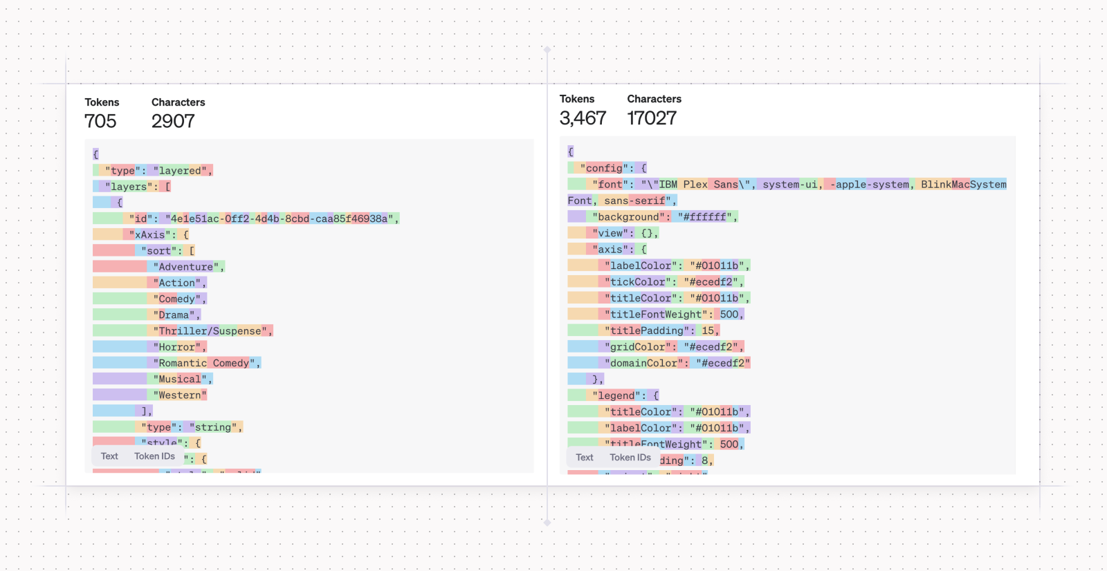
Tokens are common sequences of characters that LLMs use to process text. They're often, but not always words. "simplification", for example, is represented by 2 tokens "simpl" and "ification"— and sometimes more, depending on the context. You can explore and play with the OpenAI tokenizer at https://platform.openai.com/tokenizer.
The important thing to know for this article is that tokens are the unit of measurement that affect price and latency of LLM calls. More tokens = more money and more time.
But there's a complication: Vega-Lite is extremely widespread and has made its way into GPT-4’s pretraining data. This means that “vanilla" GPT-4 is quite good at generating Vega-Lite charts without much prompt engineering. Unfortunately, it knows nothing about our chart spec, which meant it proved unable to reliably generate Hex charts despite valiant efforts at prompt engineering.
This, dear reader, is essentially where our story for today begins.
- We had decided that our AI integration must generate native Hex chart cells.
- GPT-4 could generate Vega-Lite spec, but due to performance reasons we ruled it out (the above spec could take minutes to stream back from GPT-4).
- GPT-4 could not reliably generate our native chart spec.
- We needed to find a way for GPT-4 to reliably and performantly represent our visualization config!
Chapter 1: Chart Stubs
Even if we had been able to elicit our chart spec from GPT-4 reliably, it was still just too big. Despite our simplifications, the number of tokens required to successfully represent a full Hex chart would take 30+ seconds to stream back from GPT-4. Way, way too long to blend effortlessly into someone’s existing workflow. Regardless of what else we did, we had to figure out a way to improve overall latency.
LLM latency can be a super hardcore, low-level network engineering and GPU optimization problem... It can also be as simple as just reducing the number of tokens you need to return!
If you cut the number of response tokens in half, without any kind of actual optimizations, you’ve basically also cut latency in half. That’s just math.
It’s not really this simple. Because of network latency, model acquisition, and input-token overhead, reducing the number of response tokens doesn’t have a perfect 1:1 mapping on entire request latency. But you know what we mean.
So the very first thing we did was turn our chart spec into a smaller “chart stub”. We wanted to create a subset of our spec that included the optimal number of commonly used features (like time units, group-by, and aggregations) and dropped the long tail of config options that aren’t commonly needed (like point opacity and legend position).
This posed an interesting optimization problem. What’s the right number of features to include that balances the number of common chart configs with as small a token burden as possible?
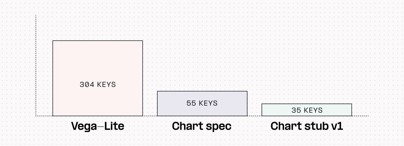
After quite a lot of experimentation and testing many permutations, we found we could accurately represent 90% of the chart features that Hex users regularly leveraged with just 35 configuration keys from our chart spec.
But how could we find out if this “stub” would work as well in the real world as we hoped?
Interlude: A word about evals
At Hex we do almost all of our AI research, from validating initial hunches to testing proposed features, using Hex! Our custom LLM evaluation framework, Spellgrounds (more on this in an upcoming blog post), lets us use Hex’s full production infrastructure to run real-world scenarios against variations in our model configuration.
With Spellgrounds we can set up experiments that run as if a real user is making real requests, capture the response, and ‘evaluate’ if it matches our assumptions. We intentionally built this framework to run as closely to production as possible, so we never wind up in a “but it works on my computer!” situation where our models aren’t performing as well in production as they did during experiments.
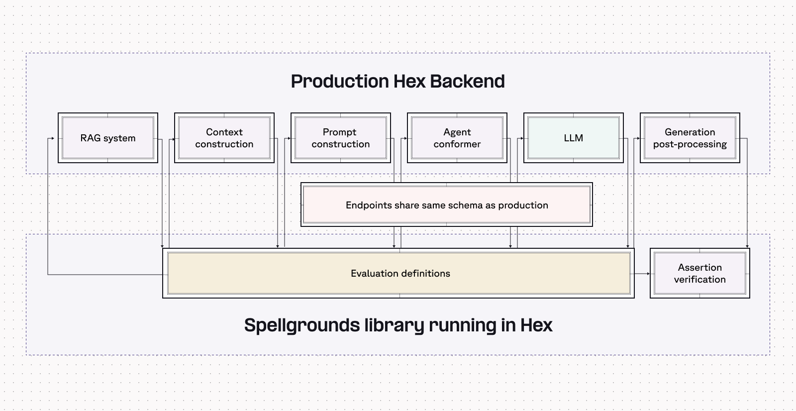
These tests are called evaluations (”evals” in the industry), and they’re a little different than traditional unit tests: we want to test the weakest possible conditions about a response, rather than looking for an exact string match of a response. We call these relaxations — inspired by a similar concept in constrained optimization — and it means that instead of checking for a precise response match from the model, we’re looking instead to verify certain assumptions about that response.
These assumptions can be obvious: If a user says “Provide a visual of orders over time using a line chart”, we’d obviously look to verify that chart-type: line in the response. But they can also be fuzzier: if a user says “Show how order volume varies over different segments”, we’d need to verify that the chart-type chosen by the model is an acceptable choice for the problem, in absence of a explicitly requested type.
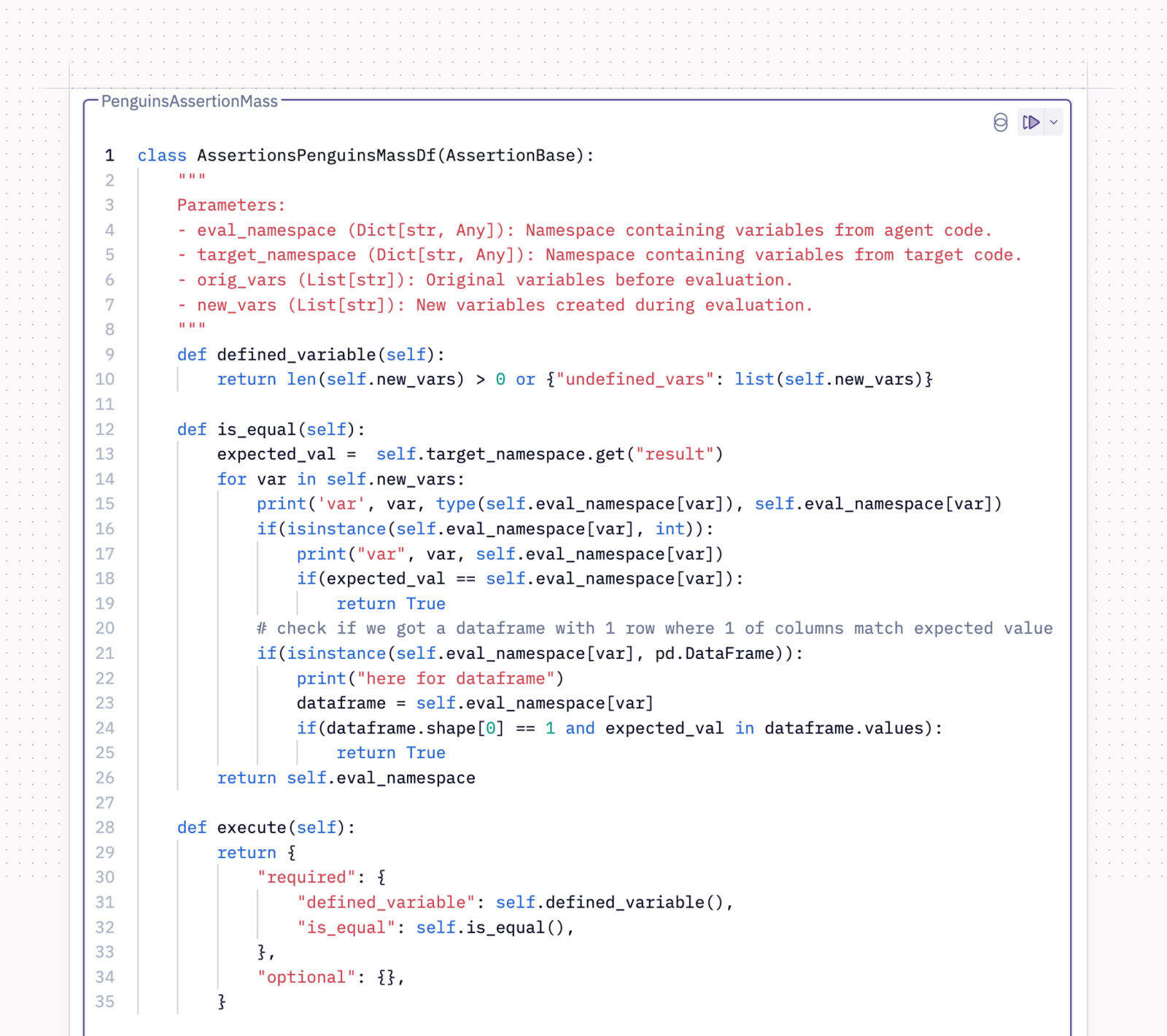
That’s a lot of complex words to rationalize the approach we wound up taking: hand-writing a bunch of evals 🤠. Luckily Spellgrounds makes this pretty quick, and we hand-wrote a test set of 100 evals for our chart stub. As we iterated on hunches and promising directions, we were able to run this eval suite to see how changes to the chart stub impacted accuracy and latency.
Ultimately with our 35 feature stub and GPT-4 Turbo, we were able to get a correct response 90% of the time, in less than five seconds.
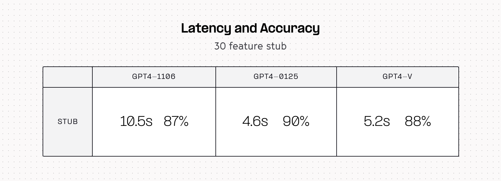
This accuracy was acceptable, and the latency was low enough that we felt comfortable starting to test these features in production. Five seconds is definitely faster than how long it’d take to create a chart manually, so we felt good about that.
But it’s still a long time to wait for someone (or something) else to create a chart for you, and we wanted to do better.
Chapter 2: A faster model?
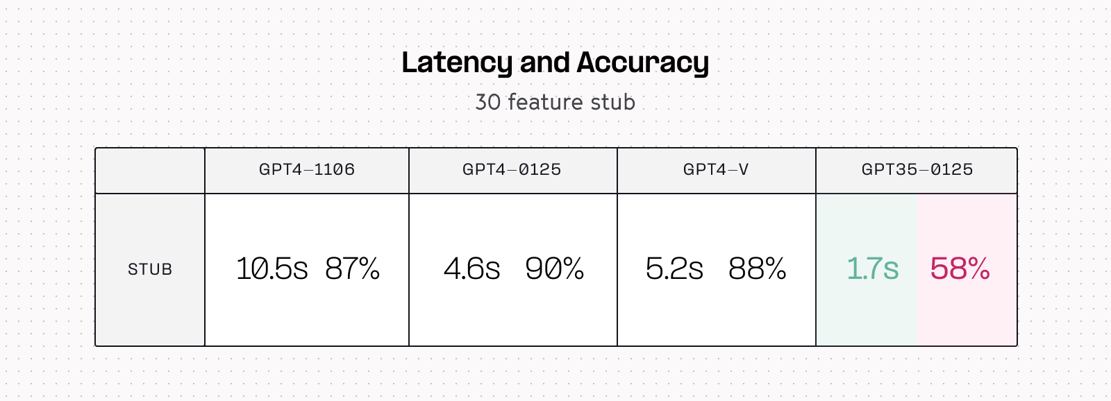
There were two obvious ways to reduce latency even further: stream even fewer tokens, or use a smaller, faster model like GPT-3.5. We ultimately explored both of these options, but started by swapping in the 3.5 model and re-running our eval set.
Luckily for us (yay, reproducible science!) the results were very obvious to interpret. The gpt35-0125 model streamed all its tokens in 1-2 seconds: a roughly 5-10x improvement on the GPT-4 family. But it came at a huge accuracy cost, tanking the probability of a correct response down to barely better than a coin flip: not acceptable.
Chapter 3: Why waste time say lot word when few word do trick?
At this point our priors were thus:
- We had successfully demonstrated that it was possible to simplify our full chart spec into a smaller “stub” that captured a reasonable amount of potential charts.
- We had also demonstrated that GPT-3.5 was 5-10x faster than GPT-4 for this task, at the cost of being approximately twice as dumb.
So our next move was obvious. Instead of trying to just make an even smaller chart stub, what if we made a chart stub that was so simple even GPT-3.5 could master it?

Since we’d had this in production for a little while now, we looked at features used in actual generated charts and observed that we could generate ~90% of these charts using only 10 out of the 35 stub features.
We also found that we could add even more guardrails by enumerating full options for 3 of those features (like ‘kind’, which is either ‘bar’, ‘grouped_bar’, ‘stacked_bar’, etc.). This basically reduces the amount of "thinking" that the model has to do: it's a multiple choice question instead of a free response one.
This is the current stub, straight from the Hex source code:
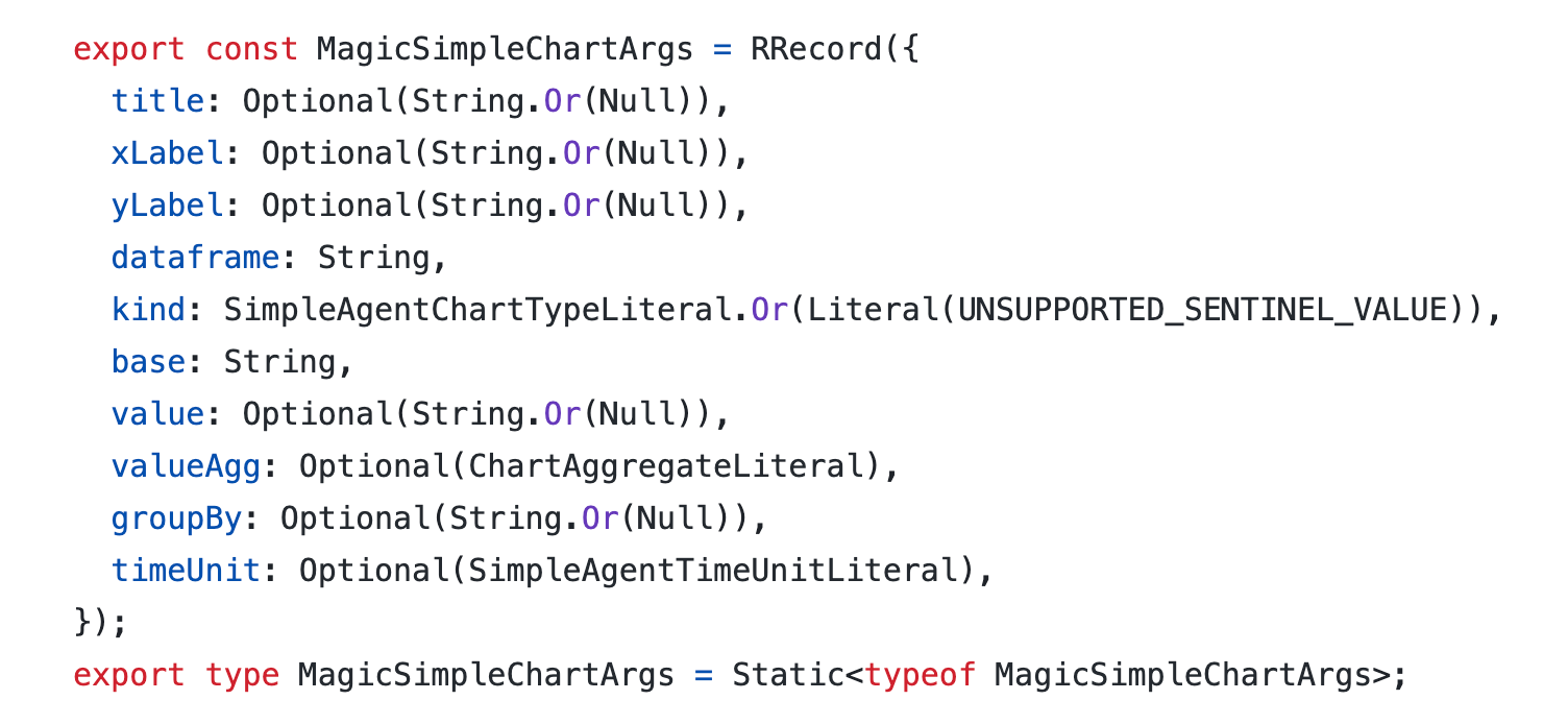
In our evals this stub resulted in another small reduction in response time for GPT-3.5, but most importantly a huge accuracy boost. 80% accuracy with an average response time of around 1 second feels much better.
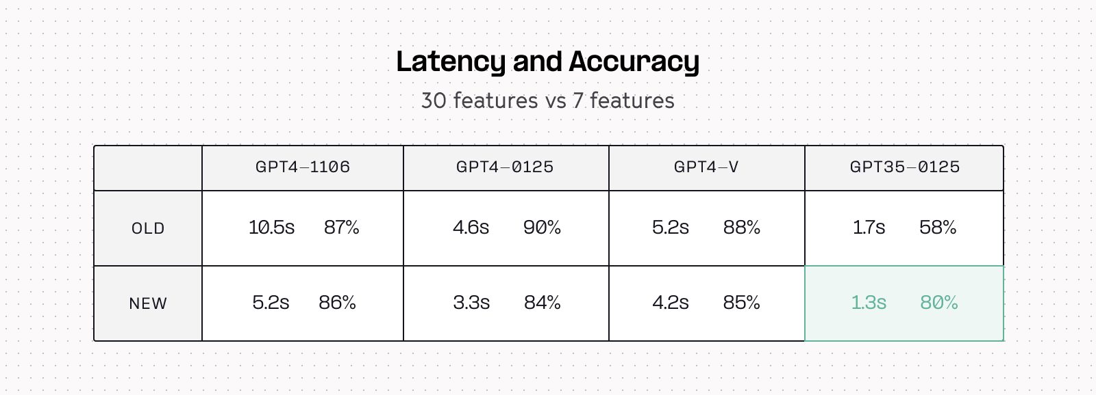
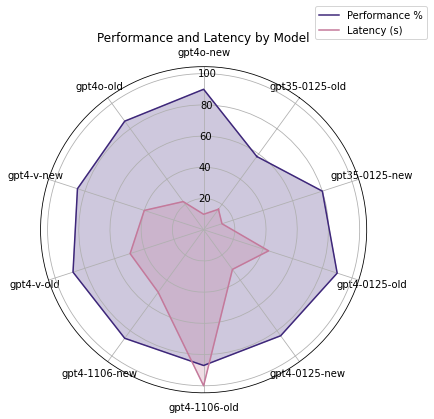
Also looking at overall model performance before & after the new stub, we can see that every model got a bit faster, but GPT-3.5’s accuracy improved radically.
We can also clearly see these latency improvements reflected in the number of tokens required to generate charts. Interestingly we see more consistency in token count in the new chart stub in addition to the overall reduction — the second peak present in the old version is gone.
This is the version we are currently running in production! Chart generations on the order of 1 second are fast enough to feel almost seamless, especially when your mind is comparing them against the couple second runtime of a warehouse SQL query, or some pandas transformation code. Regardless of what complex stuff may be happening under the hood, we’ve found the brain just intuitively thinks generating a chart should be faster than running a quick select *.
And now it is!
Honorable mention: Chart titles
Something we thought would be an easy performance win was removing AI generated chart and axis titles from our stub. These are responsible for 3 out of 10 stub features, and significantly more than 30% of response tokens since as full plain language, they’re more verbose than other config keys. They were obvious candidates for removal as part of the stub work.
We ran an experiment with these removed, and while it dropped streaming time down to 0.7s, it also had a major impact on accuracy, dropping 8 percentage points to 72%. This was below our accuracy bar, so we kept them in at the cost of an extra 0.5s.
Our hypothesis is that due to the autoregressive nature of LLMs, having chart and axis titles as the first part of the stub acts as a sort of “chain of thought lite”, giving the model some tokens to think and to inform other parts of the spec. This may be the same reason that parallel generation for structured output (think hundreds of tiny LLM calls that run concurrently, each filling out one key in a JSON) is neat on paper but doesn’t always perform well.
Next up
We’re pretty pleased with an 8x performance improvement, and satisfied that we were able to achieve these gains in AI charts with fairly practical engineering: being scientific and pragmatic about reducing the overall size of our chart config and cleverly relying on a smaller LLM where it was the better choice.
But performance work is never over, so we’re going to keep noodling on this and running experiments. GPT-4o was recently released and performed quite well in our initial tests so we may migrate to that instead of 3.5 😈
Also, charts are just one part of our AI stack, and we learned a lot from this performance work that we’re eager to apply across the rest of the platform. SQL generation is our most complex AI feature (more interesting articles on that soon!) and we’re pointing our performance microscope over at that engine next. Hopefully soon we’ll be able to share some exciting and interesting results there, too!
If this is is interesting, click below to get started, or to check out opportunities to join our team.