Blog
How To Use Univariate Analysis in Your Data Exploration
Learn how to describe, summarize, and find patterns in the data from a single variable.

If univariate analysis were a meme, it would be that one where it’s standing in the corner thinking “nobody knows I’m foundational to statistics” while modeling and multivariate analysis dance around it.
The techniques involved in univariate analysis initially seem a little mundane: calculating means, frequencies, and skews. But everything you do here is the basis of almost all other types of analysis. Without a core understanding of each individual variable in your dataset, you can’t go on to analyze correlations or time series, or perform factor analysis, exploratory data analysis, or build models. If you don’t perform univariate analysis, you are building any other analysis on shaky foundations.
Let’s go through how you can use univariate analysis in your initial data exploration to build that solid foundation for the rest of your analysis.
What is univariate analysis?
Univariate analysis is the simplest form of quantitative data analysis. It's used to describe, summarize, and find patterns in the data from a single variable. Unlike multivariate or bivariate analyses, it’s not about looking for causal relationships between variables–it focuses entirely on what you can learn from a single variable.
This is a crucial first step in all analysis. You want to understand the distribution, central tendency, and variability of your data before you move on to analyzing variables against each other. The primary components and techniques used in univariate analysis are:
- Frequency Distribution: Frequency distribution is the number of occurrences (frequencies) of different values within a dataset, often divided into categories or bins. It helps in understanding the distribution of the data points and allows for easy identification of patterns, trends, and anomalies within a dataset.
- Measures of Central Tendency: Measures of central tendency refer to the statistical metrics used to identify the center of a data set. The three main measures of central tendency are the mean, median, and mode, which respectively represent the average, the middle value, and the most frequently occurring value in a dataset.
- Variability: Variability measures describe the spread or the extent to which the data values vary in a dataset. Standard deviation, variance, range, and interquartile range are common measures of dispersion, helping to quantify the degree of uncertainty and the reliability of the mean, providing insights into data stability and consistency.
- Distribution Shape: Distribution shape refers to the appearance or the shape of the data distribution, which can be visualized using histograms. The distribution can be symmetric or skewed, and it is characterized by features such as peaks (called modes), tails, and symmetry, providing insights into the nature and the structure of the dataset.
There are also two other important concepts in univariate analysis. The first is visualization. Visual techniques in univariate analysis involve using graphical representations such as histograms, box plots, and pie charts to better understand the distribution, central tendency, and spread of the data. These visuals aid in interpreting complex datasets by revealing patterns, trends, outliers, and anomalies in an intuitive manner.
The second is outlier identification. Outlier Identification helps you detect abnormal values in a data distribution that deviate significantly from the majority of data. Identifying outliers is crucial as they can significantly impact the results of the analysis and may indicate errors in data collection or entry, or reveal important, albeit rare, information.
Using Univariate Analysis in Exploratory Data Analysis
Let’s actually load up a dataset and use some of these analyses to understand that data. Here, we’ll take the dataset from our exploratory data analysis use case and start exploring it. This dataset contains information about visits to different chain restaurants in different US cities, and the weather during the visits. Ultimately, we want to understand how weather affects the visits or choice of the chain. But before we get to that, we want to understand what each variable in the dataset shows using univariate analysis.
We’ll use a Jupyter notebook to make this analysis easy. Let’s first set up a virtual environment to compartmentalize our packages:
python3 -m venv env
source env/bin/activate
Then we can install jupyter:
pip install jupyterThen start up a notebook:
jupyter notebookThis will launch a Jupyter server and you can create a new notebook. In the first cell, install the libraries you’ll need for this analysis:
!pip install pandas matplotlib seabornFor our main code we need to start by importing the libraries:
import pandas as pd  # Import the pandas library
import matplotlib.pyplot as plt
import seaborn as sns
Then you can load in the dataset:
data = pd.read_csv('customer_data.csv')Now we can start our analysis. For numerical features, we want to calculate summary and central tendency statistics including the mean, median, standard deviation, minimum, and maximum. We also want to plot histograms to visualize the distribution of the data.
For categorical features we want to calculate the frequency of each category and then represent this information visually using bar plots.
Let's start with the numerical features first:
import matplotlib.pyplot as plt
import seaborn as sns
# Set the style of the visualization
sns.set(style="whitegrid")
# Identify numerical columns
numerical_columns = data.select_dtypes(include=['float64', 'int64']).columns
# Drop the unnamed index column, as it's likely not relevant for analysis
numerical_columns = numerical_columns.drop(data.columns[0])
# Summary statistics for numerical columns
numerical_summary = data[numerical_columns].describe()
# Plot histograms for numerical columns
fig, axs = plt.subplots(len(numerical_columns), 1, figsize=(10, 20))
fig.subplots_adjust(hspace=0.5)
for i, col in enumerate(numerical_columns):
sns.histplot(data[col], kde=False, ax=axs[i], bins=30)
axs[i].set_title(f'Distribution of {col}')
axs[i].set_xlabel(col)
axs[i].set_ylabel('Frequency')
plt.tight_layout()
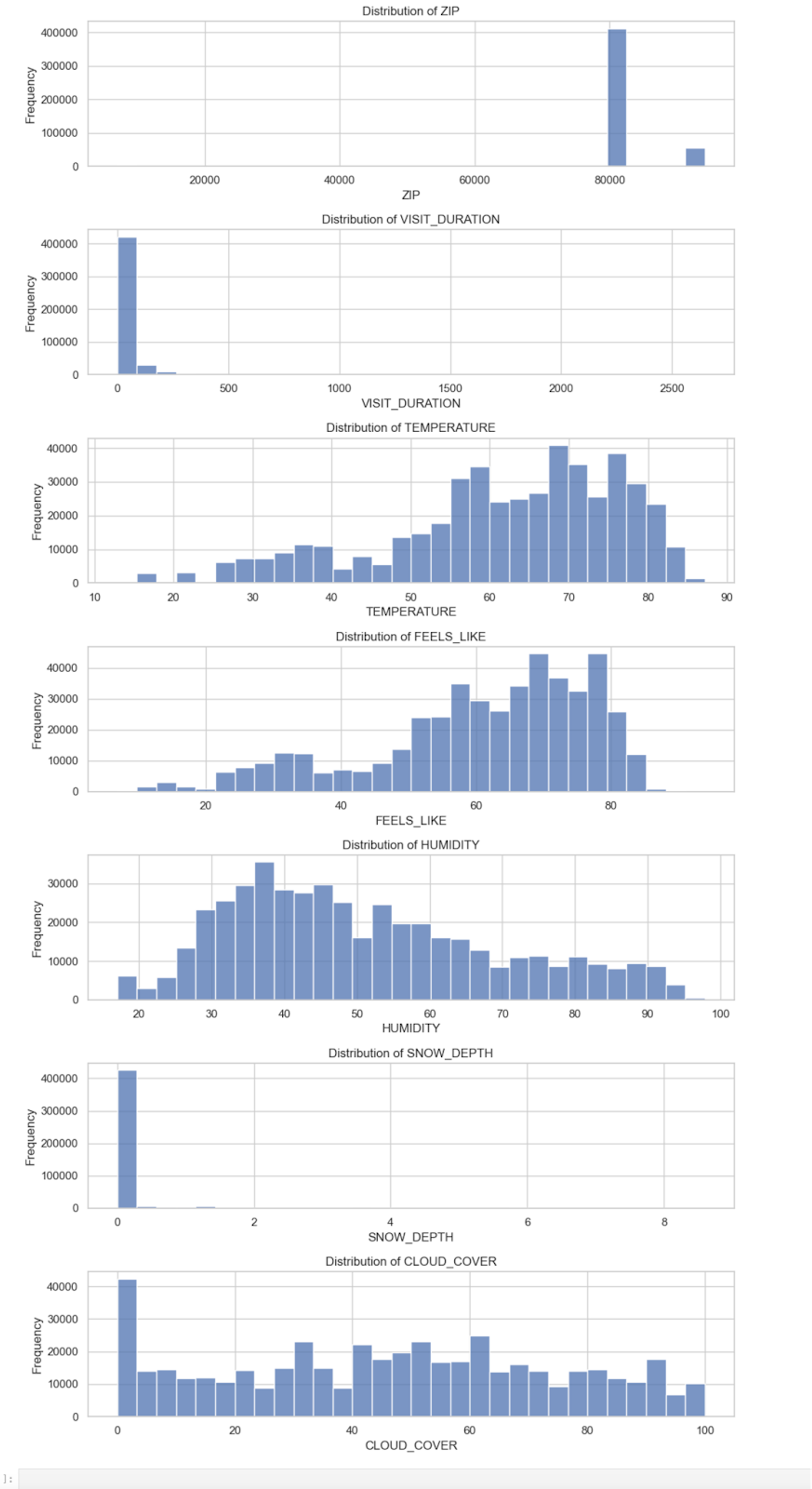
numerical_summaryThis code outputs histograms for each variable:
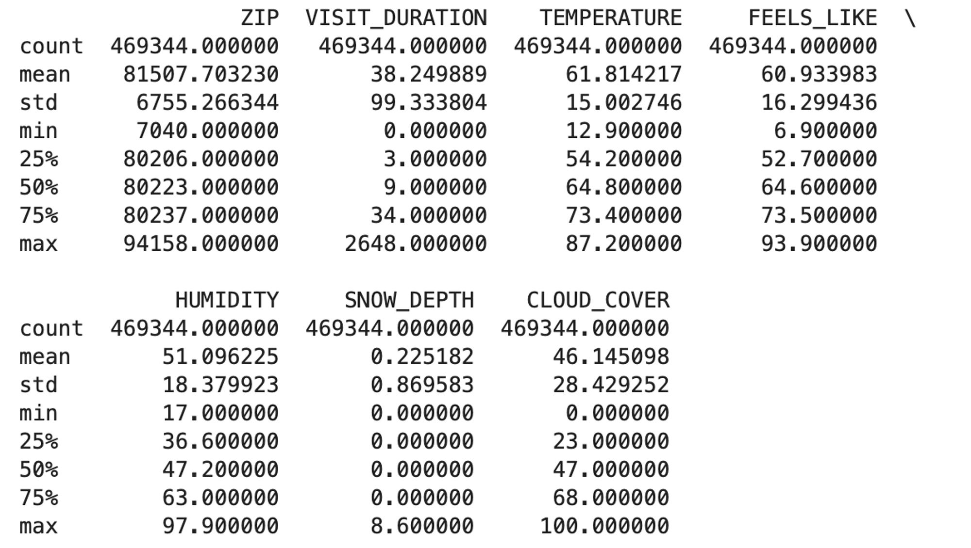
It also gives us a table with the summary statistics:
These graphs and summary statistics are a great example of how univariate analysis should be the first step in any larger analysis pipeline. We can see clearly from the graphs that some of these variables are highly skewed. From the graphs and the statistics, we can start to make some assumptions about the data:
ZIPappears to be a categorical variable representing different ZIP codes. The data is numerical, but it shouldn’t be treated as such.VISIT_DURATIONhas a 0 to 2648 minutes, a mean of ~38.25 minutes, and a standard deviation of ~99.33. This variable has a right-skewed distribution with a majority of visits having a shorter duration. The higher numbers must be outliers–2648 minutes is about 44 hours.TEMPERATURE,FEELS_LIKE, andHUMIDITYall have somewhat uniform distributions, though each with a slight skew.SNOW_DEPTHhas a range from 0 to 8.6 inches, but the median is 0, indicating no snow depth for most records.- Finally,
CLOUD_COVERranges mostly uniformly from 0 to 100, though with a strong peak at zero.
So, from just a few lines of analysis, we know not to treat ZIP as numerical, the VISIT_DURATION will need some preprocessing before we do any further analysis, that SNOW_DEPTH is probably not going to be useful for any further analysis, and the others all follow a uniform distribution, though with some peaks that might warrant further exploration.
Next, let's move on to the categorical features. We will compute the frequency of each category and visualize them using bar plots:
# Identify categorical columns
categorical_columns = data.select_dtypes(include=['object']).columns
# Exclude the 'DATE' column as it will be handled separately
categorical_columns = categorical_columns.drop('DATE')

# Compute frequency counts for each categorical column
categorical_summary = {}
for col in categorical_columns:
    categorical_summary[col] = data[col].value_counts()

# Plot bar plots for categorical columns with a manageable number of unique values
fig, axs = plt.subplots(len(categorical_columns), 1, figsize=(10, 20))
fig.subplots_adjust(hspace=0.5)

for i, col in enumerate(categorical_columns):
    # Limiting the number of categories displayed to avoid cluttered plots
    top_categories = categorical_summary[col].head(10)
    sns.barplot(x=top_categories.index, y=top_categories.values, ax=axs[i])
    axs[i].set_title(f'Distribution of {col}')
    axs[i].set_xlabel(col)
    axs[i].set_ylabel('Frequency')
    axs[i].tick_params(axis='x', rotation=45)

plt.tight_layout()
categorical_summary
Here we have a set of bar charts to visualize the data:
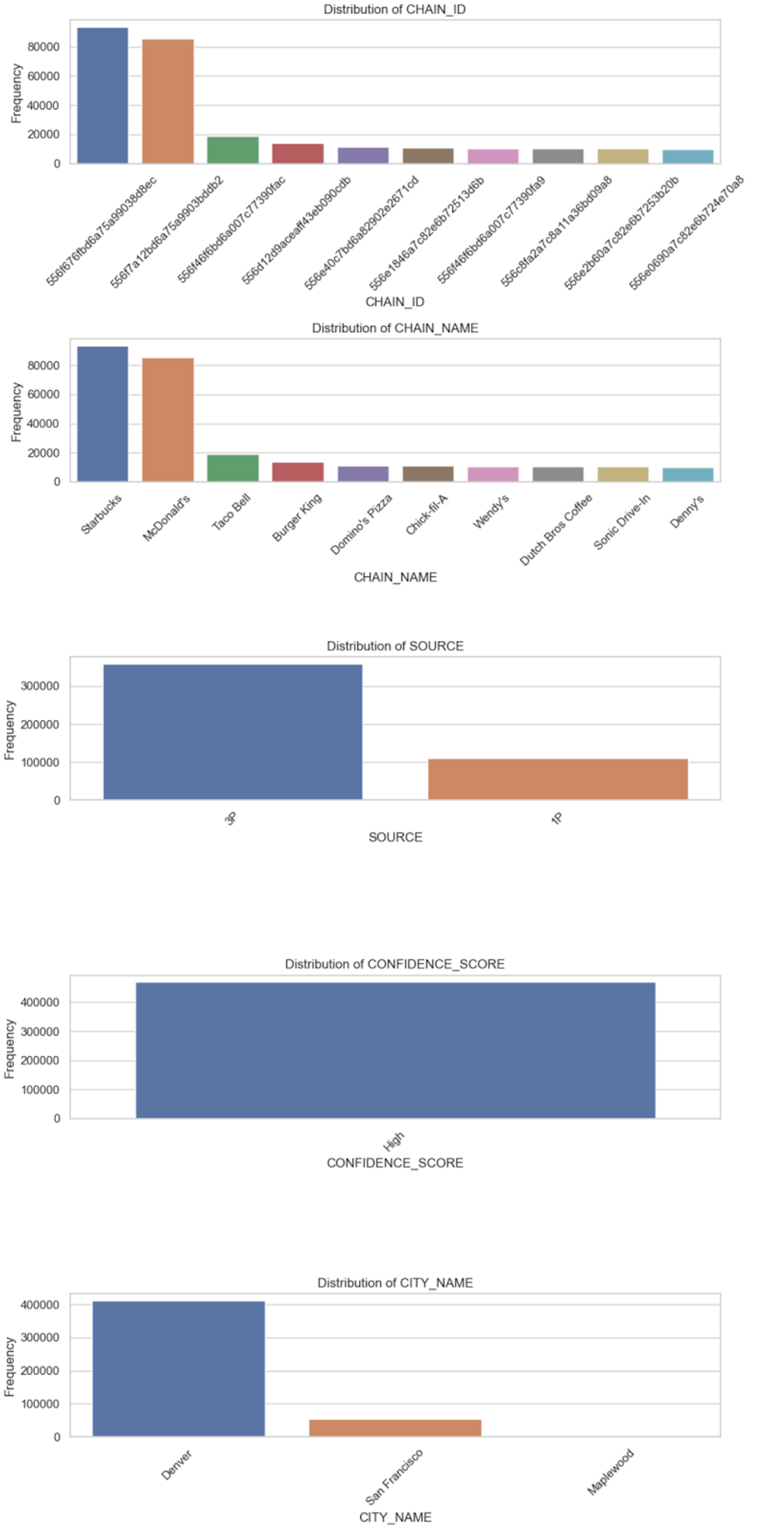
Our analysis tells us:
- We have 234 unique
CHAIN_IDs andCHAIN_NAMEs, suggesting that eachCHAIN_IDcorresponds toCHAIN_NAME. - There are two
SOURCEs for the data, with most coming from 3P (presumably third-party). - The
CONFIDENCE_SCOREfor every entry is “High.” This variable does not provide any variability, and it might not be useful for further analysis or modeling. - There are three unique
CITY_NAMEs, with Denver being the most frequent.
What can we learn from this? Firstly, we can discount CONFIDENCE_SCORE. It won’t be useful going forward. We can use just CHAIN_ID or CHAIN_NAME for any further analysis as they are interchangeable. SOURCE might be an interesting variable, just to see whether there is any reporting difference between first-party and third-party data. Incorporating CITY_NAME into the analysis will be important, but we’ll have to remember we are mostly looking at data from a single area.
Building on univariate analysis
Univariate analysis has now given us a good understanding of the dataset. We know the good variables, the bad variables, and what needs cleaning and preprocessing.
We can then build on this with bivariate and multivariate analysis, and modeling.
For instance, we might look at pairwise correlations between the numerical features. We would calculate the pairwise correlation coefficients between all numerical variables in the dataset, such as VISIT_DURATION, TEMPERATURE, FEELS_LIKE, HUMIDITY, SNOW_DEPTH, and CLOUD_COVER. Then we could visualize the correlation matrix using a heatmap to easily identify strong correlations between variables.
We could also use correlation to investigate how numerical features vary across different categories of the categorical variables. For example, analyze the average VISIT_DURATION across different CHAIN_NAMEs or CITY_NAMEs, then visualize the results using bar plots or box plots to compare the distribution of numerical features across categories.
With modeling we could use regression models such as linear regression or decision trees to predict numerical features (e.g., VISIT_DURATION or TEMPERATURE) given other variables. Or use classification models to predict categories (e.g. CHAIN_NAME or CITY_NAME).
But the benefits of univariate analysis for deeper analytical exploration go further. Because univariate analysis provides insights into the distribution, central tendency, and spread of each variable, it helps in checking the assumptions (like normality) for tests involving two variables, like the t-test. Thus, if you need a genuine statistical understanding of the relationship between different variables, you must start with univariate analysis to know whether the data fits the tests.
Furthermore, multivariate techniques often require data normalization, the need for which is identified during univariate analysis. Handling missing values during univariate analysis ensures the reliability of multivariate models and prevents bias.
With time series analysis, univariate analysis helps in initially identifying trends, seasonality, and cyclicity in time series data, crucial for building accurate time series models. Assessing and attaining stationarity, often identified through univariate analysis, is a prerequisite for many time series models.
In predictive modeling and feature selection, understanding the distribution and relationships of individual features with the target variable is the first step in building predictive models. Insights from univariate analysis aid in creating new features and transforming existing ones to improve model performance. The same for machine learning. Univariate analysis helps in identifying important features and the need for preprocessing (scaling, encoding) essential for machine learning models. Identifying class imbalances during univariate analysis is crucial for applying corrective measures before model training. Initial insights and patterns identified during univariate analysis can serve as a basis for deploying more complex machine learning algorithms and analytical models.
Always start with the univariates
Univariate analysis acts as the stepping stone for every subsequent level of analysis. It paves the way by elucidating individual variable characteristics, identifying anomalies, validating assumptions, and providing foundational insights, all of which are indispensable for ensuring the robustness and reliability of more complex analytical procedures and models. It is the starting point that shapes the path for exploring intricate relationships, building sophisticated models, and extracting profound insights from the data.