Blog
Getting started with logistic regression
Implementation of a binary classification algorithm in Python


What is Logistic Regression
Today we will be diving into one of the most popular categories of machine learning problems, the task of classifying data. The goal of a classification model is to predict discrete classes from a set of observations. For example, trying to predict if a patient has a heart disease or not.
A common model used for this, and the model used in this tutorial is the logistic regression model. You can think of logistic regression as being a Linear regression with a threshold, where values above the threshold belong to one class while values under the threshold belong to another class. To keep it simple, we will leave most of the math out of this tutorial, however, here are the mathematical prerequisites for all of the math enthusiasts out there.
We'll start by importing the Python libraries that hide those scary math equations from us.
import pandas as pd
import numpy as np
import seaborn as sns
import matplotlib.pyplot as plt
from sklearn.model_selection import train_test_split
from sklearn.linear_model import LogisticRegression
from sklearn.metrics import confusion_matrix, accuracy_score, precision_score, recall_score
Our dataset
The dataset we will be using is the Heart failure dataset that can be downloaded from Kaggle.
df = pd.read_csv('heart.csv')Data preprocessing
The goal of our model is to predict whether a patient has heart disease or not. We can use a 1 to represent the presence of heart disease, and 0 for the absence. These representations are known as the class labels, with the class itself being the value we want to predict. By looking at the distribution of our classes, we can check to see how balanced our data is and if we need to introduce tactics to combat any imbalance.
df['HeartDisease'].value_counts().plot(kind = 'bar');
plt.xlabel('Class');
plt.ylabel('Frequency')
plt.title('Distribution of Heart Disease');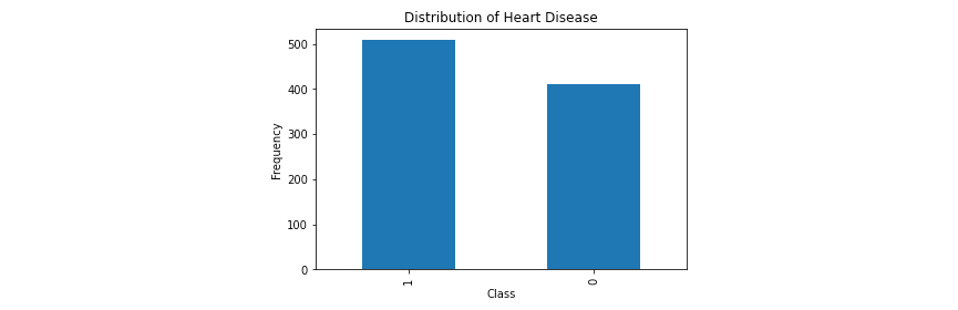
Although we don't see an equal distribution of our classes, having a little bit of imbalance is common and won't be a problem in this case. However, if your data is very imbalanced, a common way to handle this problem is to use resampling techniques.Next, let's look at the distribution of our numerical columns.
numerical_cols = [col for col in df.columns if df[col].dtype in (float, int)]
numerical_cols

# output
['Age', 'RestingBP', 'Cholesterol', 'FastingBS', 'MaxHR', 'Oldpeak', 'HeartDisease']numerical = df[numerical_cols]
plt.figure(figsize=(15, 5))
for i, (k, v) in enumerate(numerical.items(), 1):
plt.subplot(2, 4, i) # create subplots
plt.hist(v, bins = 50)
# p.legend_.remove() # remove the individual plot legends
plt.title(f'{k}')
plt.tight_layout()
plt.show();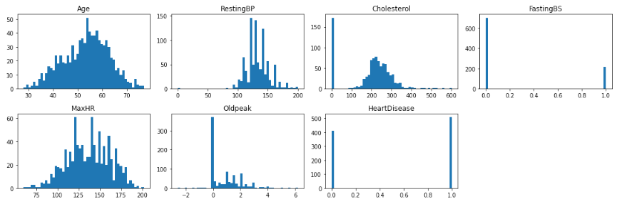
Here we can see that there are some anomalies that we're going to have to handle. First, there's an unusual number of patients who have a cholesterol of 0, which is not physically possible for a living person. The normal range is between 100-200, anything higher is extreme. Second, there are a few patients with a resting blood pressure of 0, which is also not good at all 😬. These records do not reflect accurate measurements and we'll walk through removing these in a later step.
The next thing we'll want to do is to encode our categorical features. Encoding is the process of converting categorical or textual data into a numerical format. We do this because numbers are the language of machine learning models and they don't play nicely with text. An example of what encoding might look like is converting ['yes', 'no'] into [1, 0]. There are many encoding methods, but in this tutorial we will focus on binary encoding and one-hot encoding.
First let's inspect the cardinality of our categorical variables. The cardinality of a categorical variable is just the number of unique categories that variable contains.
categorical = df[[col for col in df.columns if df[col].dtype == 'object']]
categorical.nunique()

# output
Sex               2
ChestPainType     4
RestingECG        3
ExerciseAngina    2
ST_Slope          3
Since cardinality is a measure of how many unique categories are present per categorical variable, you can handle the encoding process of these variables differently based on the cardinality of each. Let's try to understand this better with an example. Say I have 3 categorical variables:
color: [red, blue, green, black, purple, yellow, teal, lavender, pink, scarlet, turquoise, gray, orange, blood orange, violet]size: [small, medium, large]temp: [rare, medium-rare, medium, medium-well, well]
The total number of categories present for just these 3 categorical variables is 24 categories. Let's say we were to one-hot encode each of these variables, we would be adding another 24 columns to our dataset! In most cases, this is not ideal and because of this, different encoding methods should be used for each variable such that we can keep the amount of columns we add to our dataset to a minimum.
The cardinality is relatively low for the majority of our variables so one-hot encoding works just fine here. The variables with more than 2 unique categories will get one-hot encoded and we'll binarize the rest.
binary = df[[col for col in df.columns if df[col].dtype == 'object' and df[col].nunique() == 2]]
onehot = df[[col for col in df.columns if df[col].dtype == 'object' and df[col].nunique() > 2]]

# Binary encodingbinary['Sex'] = binary['Sex'].apply(lambda row: np.where(row == 'F', 1, 0))binary['ExerciseAngina'] = binary['ExerciseAngina'].apply(    lambda row: np.where(row == 'Y', 1, 0))

# One-Hot encodingonehot = pd.get_dummies(onehot)

# recombine into an encoded dataframe
encoded = pd.concat([binary, onehot], axis = 1)
This is what the final encoded dataframe looks like.
Now that we have a numerical dataframe and an encoded dataframe, we can recombine them in order to obtain our main dataframe.
numerical = df[[col for col in df.columns if df[col].dtype in (float, int)]]
dataset = pd.concat([numerical, encoded], axis = 1)
Lastly, we are going to remove all of the rows that contain the extreme/unnatural values we mentioned earlier.
print(f"Shape before removal of outliers: {dataset.shape}")
dataset = dataset[dataset['Cholesterol'] > 0]
dataset = dataset[dataset['Oldpeak'] >= 0]
dataset = dataset[dataset['RestingBP'] > 80]
print(f"Shape after removal of outliers: {dataset.shape}")

# output
Shape before removal of outliers: (918, 19)
Shape after removal of outliers: (745, 19)Determining a baseline
In classification tasks, it is useful to compare your model's performance to a baseline score. A baseline is a non predictive/basic model solution that you essentially want to improve. The baseline model we will use in this case is as simple as predicting the most common class. In other words, "If we were to predict the majority class 100% of the time, what would our accuracy score be?"
total = sum(dataset['HeartDisease'].value_counts())
majority = dataset['HeartDisease'].value_counts().max()

baseline = majority / total
Training the model
In the following cells we will split our dataset into a training and testing set, train the model, then predict the labels of our testing set.
target = dataset["HeartDisease"]
features = dataset.drop("HeartDisease", axis=1)
x_train, x_test, y_train, y_test = train_test_split(    features, target, train_size=0.7, random_state=444)

model = LogisticRegression()
model.fit(x_train, y_train)

predictions = model.predict(x_test)
probabilities = model.predict_proba(x_test)
Model evaluation
To evaluate our model, we'll look at a confusion matrix which summarizes the prediction results of a classification model. It shows the number of correct (True Positives and True Negatives) and incorrect (False Negatives and False Positives) predictions per class.
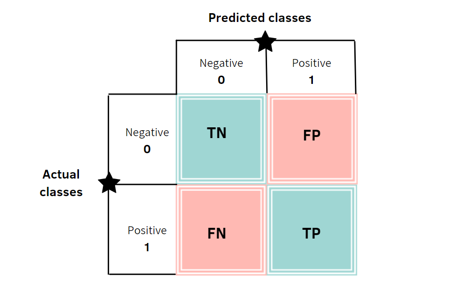
image from towards ai
Let's break down some of the terminology
- True: Made a correct prediction.
- False: Made an incorrect prediction.
- Positive: In this context, means present or observed. (the heart disease is present)
- Negative: In this context, means absent or not observed. (the heart disease is absent)
- True Positive: Correctly predicts the presence of the outcome. (Predicted heart disease and actually had one)
- False Positive: Incorrectly predicts the presence of the outcome. (Predicted heart disease and didn't have one)
- True Negative: Correctly predicts the absence of the outcome. (Predicted no heart disease and didn't have one)
- False Negative: Incorrectly predicts the absence of the outcome. (Predicted no heart disease and actually had one)
matrix_of_confusion = confusion_matrix(y_test, predictions)
fig, ax = plt.subplots(figsize = (10, 8))
sns.heatmap(matrix_of_confusion, annot=True ,fmt='g');
ax.xaxis.set_label_position("top")
plt.title('Confusion matrix', y=1.1)
plt.ylabel('Actual class')
plt.xlabel('Predicted class')
plt.show();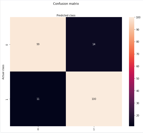
Next, let's look at some metrics to assess the success of our model: precision, recall, and accuracy.
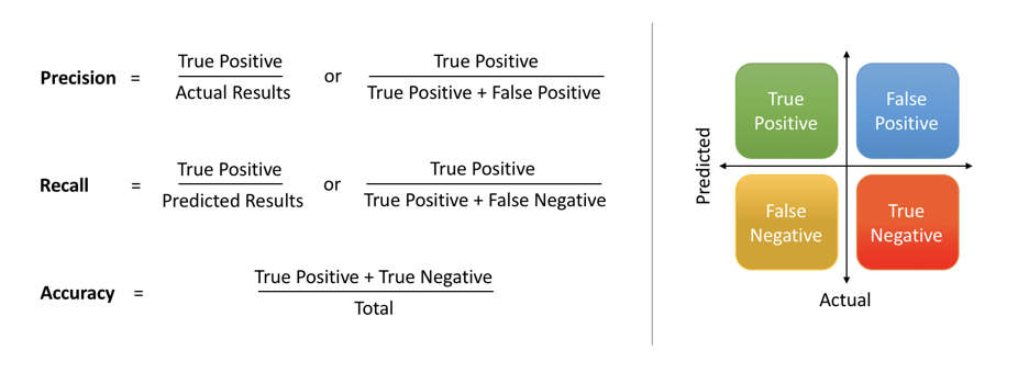
image from medium
accuracy = round(accuracy_score(y_test, predictions), 3)
precision = round(precision_score(y_test, predictions), 3)
recall = round(recall_score(y_test, predictions), 3)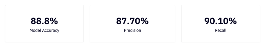
Interpreting our results
To quickly summarize precision, recall and accuracy from this article:
- Precision: What proportion of positive classifications were actually correct. In other words, when it predicts that a patient has heart disease it is correct 87.7% of the time.
- Recall: What proportion of actual positives were classified correctly. In other words, it correctly identifies 90.10% of all patients with heart disease.
- Accuracy: The proportion of correct predictions out of the total number of predictions. In other words, it correctly identifies 88.8% of heart disease diagnoses.
Conclusion
Today you learned how to prepare, encode, and fit data to a logistic regression classification model. We went over some basic evaluation metrics like accuracy, precision, and recall, and learned how to interpret these results in the context of our model. Although we covered a good amount in this tutorial, there are some things we left out for simplicity that we encourage you to investigate on your own to deepen your understanding.
Thank you for reading this tutorial and happy (machine) learning!