Blog
Comprehensive Guide to Visualizing Data in Jupyter
Learn how to create charts using Matplotlib, Plotly, and Seaborn

Jupyter empowers data scientists to perform interactive data visualization seamlessly with the help of cells, each cell contains the business logic (code chunk) that you want to test or visualize. It supports programming languages like Python and R and also enables visualizations, and explanatory text as markdowns in a single interface. This capability enhances the visualizations by enabling dynamic data exploration.
Three of the most frequently used Python libraries for data visualization are Matplotlib, Plotly, and Seaborn that you will further explore in this article.
In this article, you will learn data visualization by performing Exploratory Data Visualization on the House Credit Default Risk Dataset.
Getting Started with Data Visualization in Jupyter
For this article, we will use the House Sales Dataset from Kaggle. You can see how to get started with Jupyter in our Exploring Data in Jupyter with Python and Pandas article
Installing and Importing Matplotlib, Plotly, and Seaborn
Once you are up and running with Jupyter, you need to install the necessary libraries for reading the data and visualization. You can use PIP to install these requirements as follows:
$ pip install pandas matplotlib seaborn plotlyThe above command will install all the required libraries into your environment:
- Pandas is an open-source data manipulation and analysis library for Python. It provides data structures like Series and DataFrame to handle and analyze structured data seamlessly. Its powerful and flexible tools make it a top choice for data preprocessing, cleaning, and exploratory data analysis.
- Matplotlib is a fundamental plotting library for Python that provides a wide array of static, animated, and interactive visualizations. It is known for its versatility, allowing users to generate plots, histograms, power spectra, bar charts, error charts, scatterplots, and more with just a few lines of code.
- Seaborn is a statistical data visualization library based on Matplotlib. It offers a higher-level interface, with themes and visualizations tailored for statistical analysis. Seaborn simplifies the process of producing attractive visualizations and works well with pandas DataFrame structures.
- Plotly is an interactive graphing library for Python (as well as for R, JavaScript, and more). It enables the creation of visually appealing web-based interactive plots and dashboards. Plotly's visualizations are rendered using a web browser, allowing for intricate interactivity, and can be easily integrated into web applications or shared online.
Now import these libraries into Jupyter Notebook by typing the below code in the notebook cell.
import pandas as pd
import numpy as np
import matplotlib.pyplot as plt
import seaborn as sns
import plotly
The as keyword creates the alias for these libraries. It reduces the typing effort and makes the code look clean. You can now run the cell by clicking on the Run button on the panel or by pressing the Shift+Enter keys together.
Now load the dataset into the notebook using pandas:
# Load the data from CSV using the Pandas library
df = pd.read_csv(file, low_memory = False)df.head()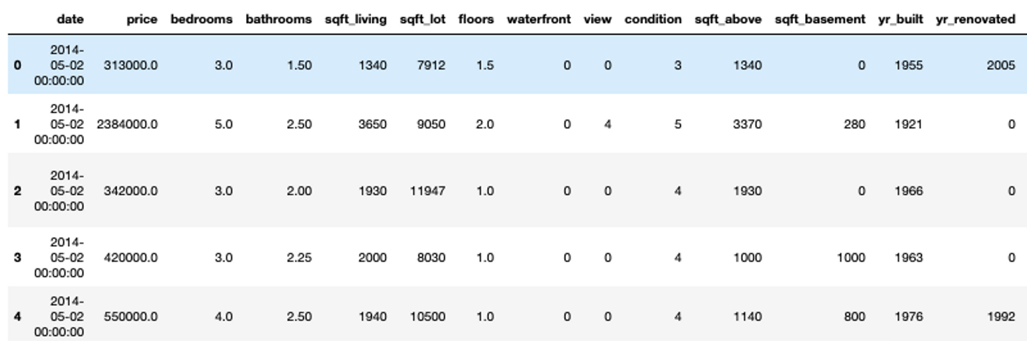
Note: You don’t need to use print statement for the last line variable in Jupyter cell, just mention the name and jupyter will print it automatically.
Exploring Data with Matplotlib
Matplotlib is a very basic yet features-rich visualization library that provides you with options to create different plots and charts including line plots, distribution plots, bar charts, scatter plots and advanced viz like geographical heat maps. It is the Ur visualization library in Python—everything comes from Matplotlib.
Creating a Simple Line Plot Using Matplotlib
To create a simple line plot, you can use the plot() method from matplotlib. You can create a plot with either X-axis values and Y-axis values, or just the X-axis alone. This graph is widely used to establish a relationship between two or more variables. A simple line plot for 100 house prices from the dataset can be plotted as follows:
# line plot
with matplotlibplt.plot(df['price'][:100])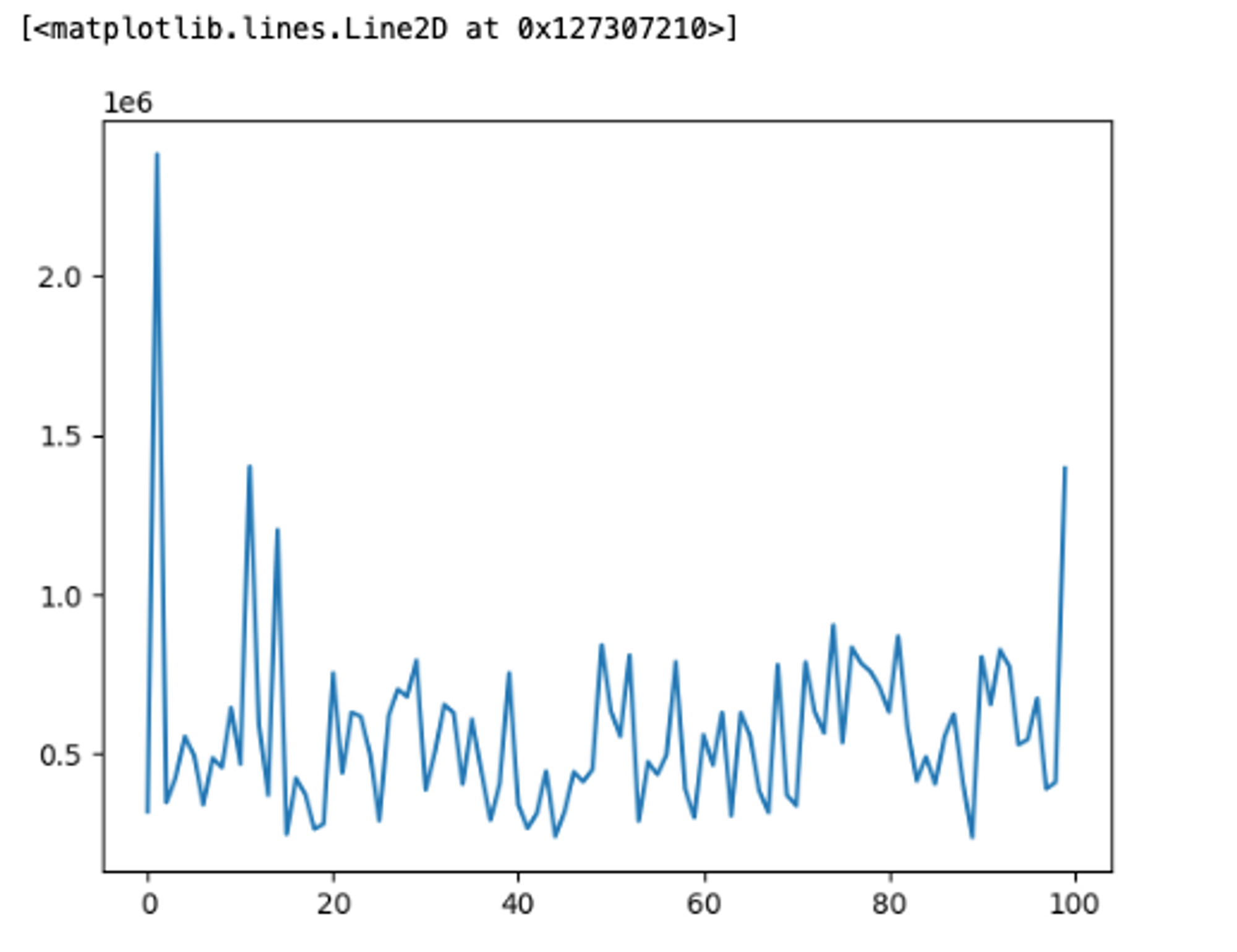
You can customize this graph further with markers, colors, x labels, y labels, titles, and so on as matplotlib supports all these functionalities.
# customize the line plot
plt.plot(df['price'][:100], marker = 'o', color = 'orange', label = '100 House Prices')
plt.title('House Prices of 100 Houses')
plt.xlabel('House Price')
plt.legend()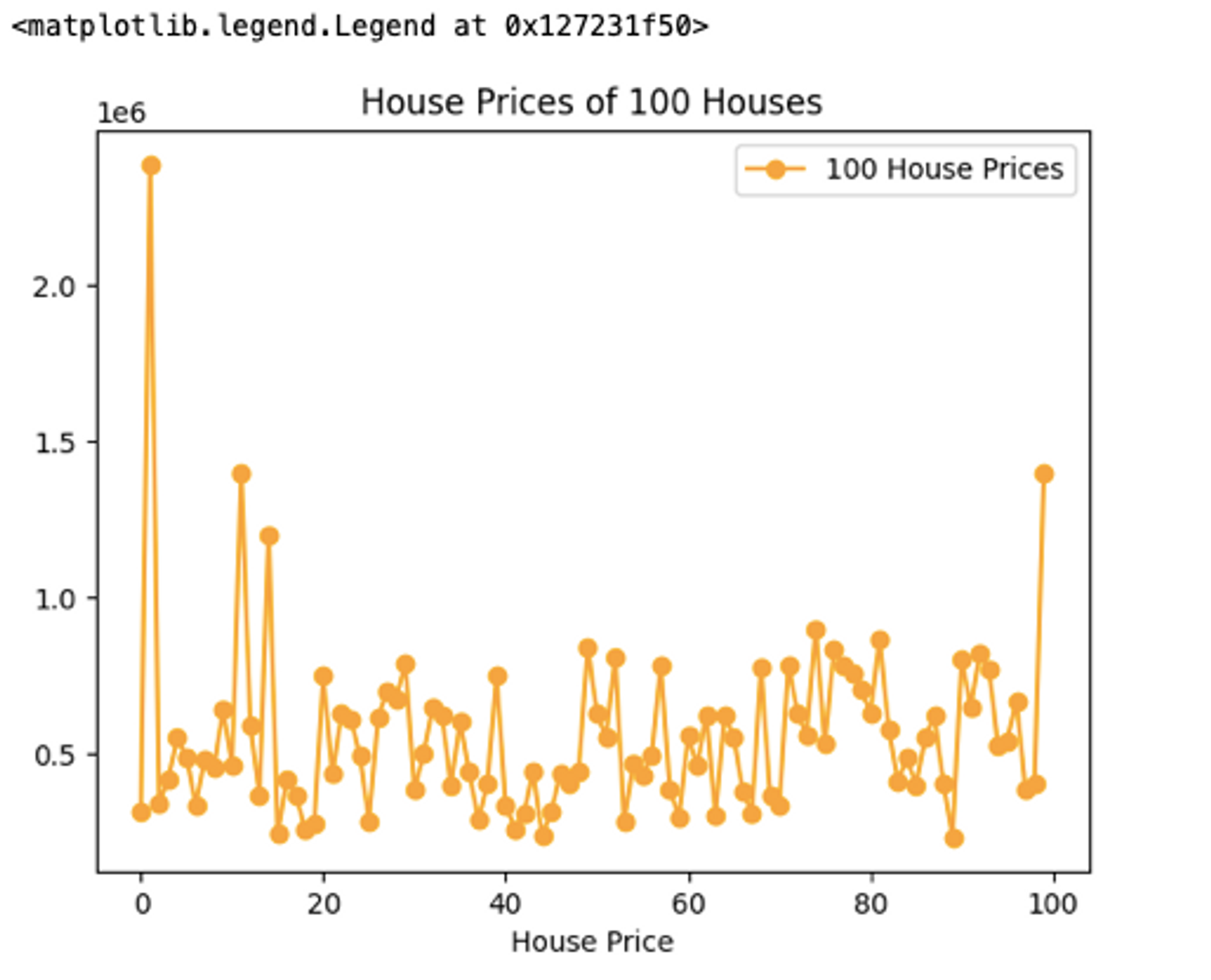
To learn more about line plots in matplotlib you can check out the official docs.
Scatter Plots for Visualizing Relationships and Patterns
You can create a scatter plot using matplotlib’s scatter() method. This plots different scatter points between the Y-axis and X-axis. These plots identify the relationship, correlation, and trend between two variables. A simple scatter plot between floors and price features from house data can be plotted as follows:
# scatter plot
plt.scatter(df['price'], df['floors'], marker = 'o', color = 'green', label = 'Price of House as Per Floors')
plt.title('Number of Floors vs Price')
plt.xlabel('House Price')
plt.ylabel('Number of Floors')
plt.legend()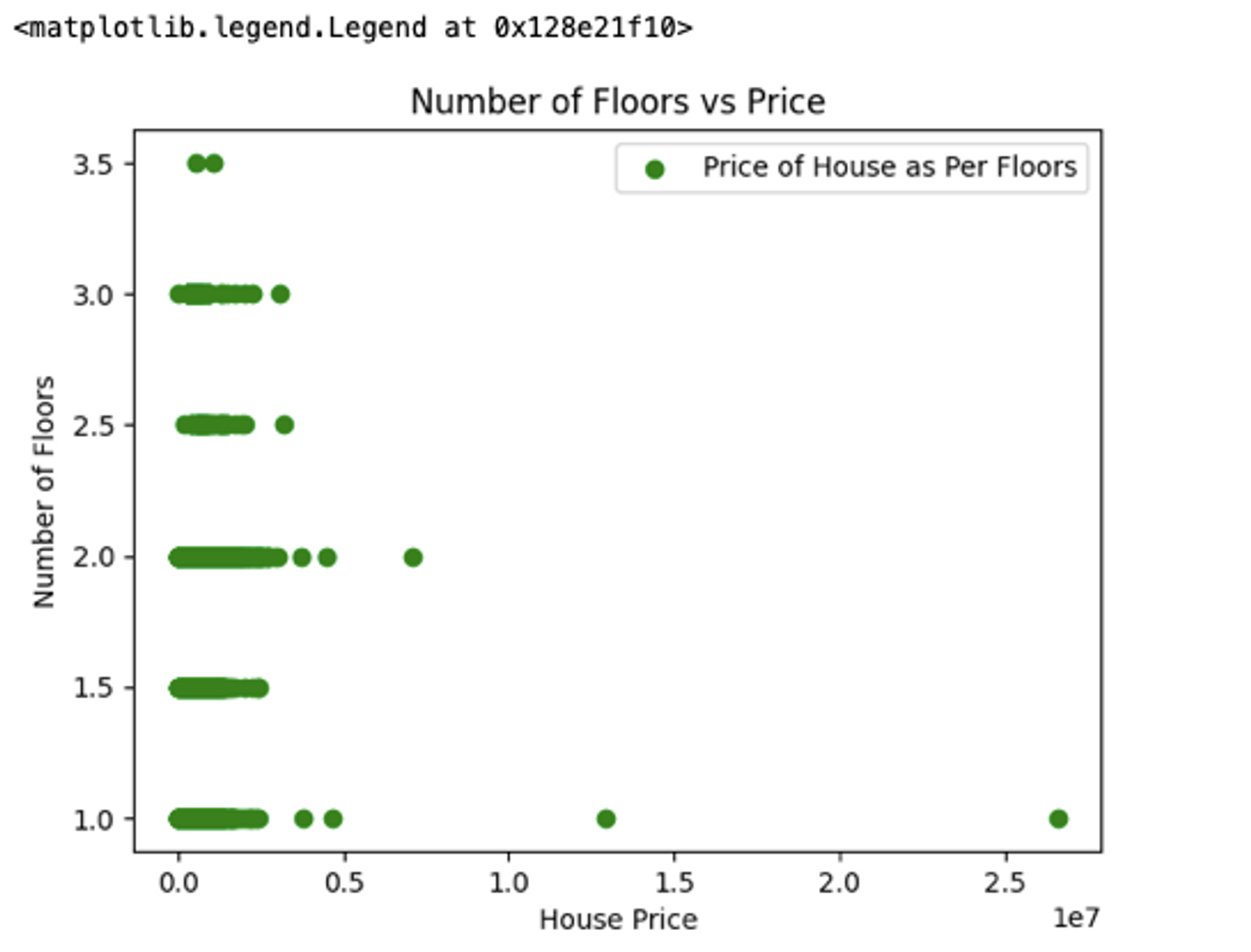
The above figure depicts the correlation between two numeric variables, the number of floors and house price.
Bar Plots and Histograms for Categorical and Numerical data
Line plots and scatter plots are limited to the numerical data, so if you want to visualize categorical data, bar plots are where it’s at. You can use the bar() method from matplotlib to represent the categorical data. Let’s plot a bar graph for house sales prices per city.
# Adjust figure size
plt.figure(figsize=(10,5))
# Create a bar chart with a cyan color
plt.bar(df['city'][:10],df['price'][:10], color='cyan')
# Adding labels and title
plt.xlabel('Year')
plt.ylabel('Sales Price')
plt.title('Selling Price Per Year')
# Display the chart
plt.show()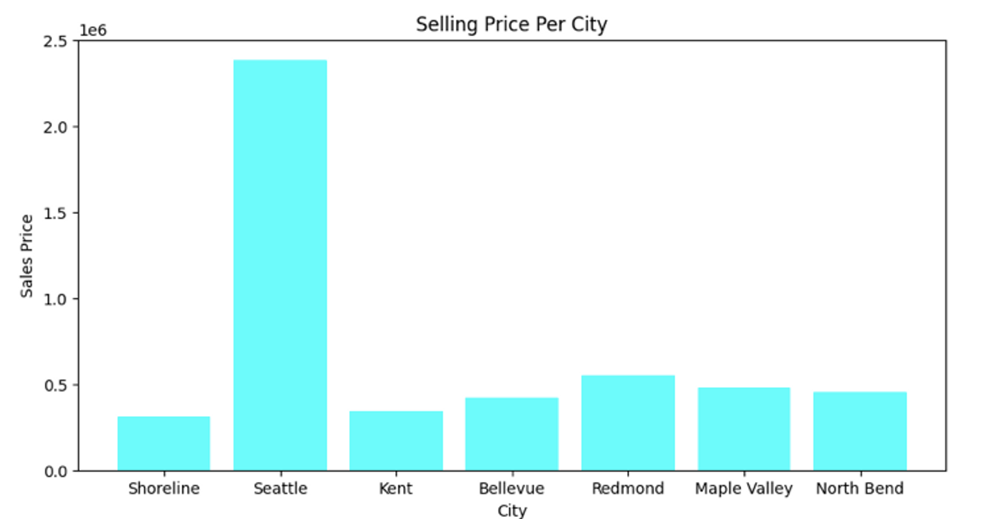
Seattle is expensive. The first line of the code, figsize() lets you control the canvas where the plot is represented, you can adjust the size of that canvas based on your requirements. To learn more about bar graphs, check out this link.
A similar graph that represents quantitative is a histogram. This type of graph helps you identify the frequency distribution in the data and can be plotted with the hist() method from the matplotlib:
# Create a histogram with a cyan color
plt.hist(df['price'][:1000], color='red', bins = 100)
# Adding labels and title
plt.ylabel('Sales Price')
plt.title('Distribution of Sales Price')
# Display the chart
plt.show()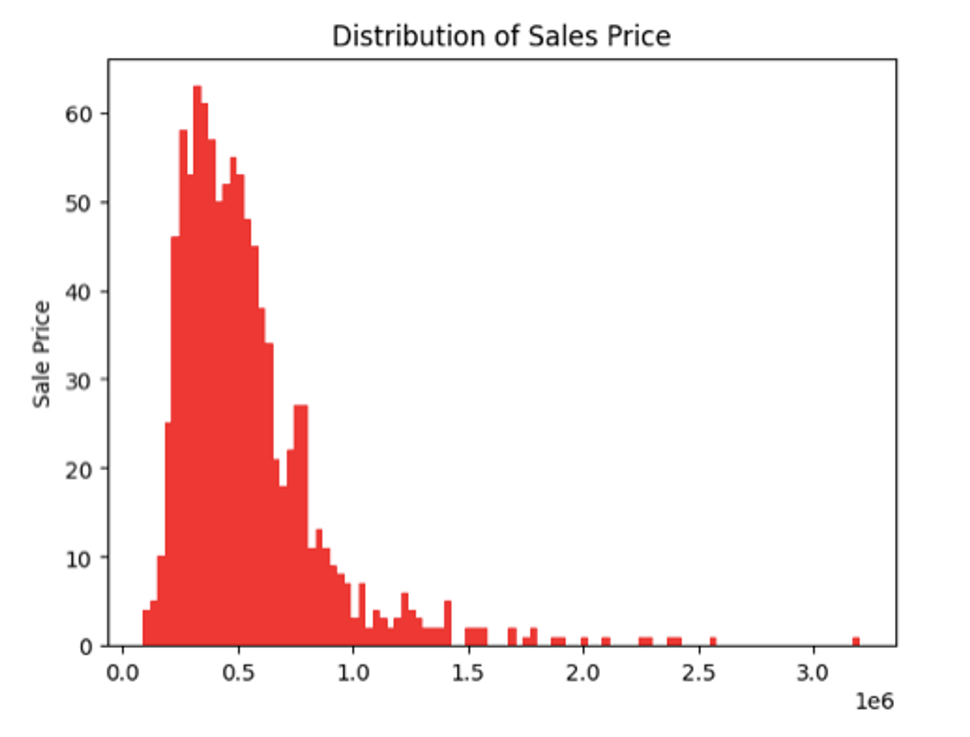
The bin argument in the hist() method represents the intervals in the graph, the higher the bins lower the intervals. To learn more about the histograms, check out this link.
Creating Subplots and Multi-axis Visualizations
If you are creating visualizations for analysis or reporting, sometimes you need to create multiple plots together to visualize and compare different categories. Subplots helps you define a grid of plots (in rows and columns) and lets you create graphs in these grids. To do so you need to use the subplot() method from the matplotlib to create the grid (m X n) and then using a multi-axis plot you can create the subplots:
# Create a figure with multiple subplots
fig, axs = plt.subplots(1, 2, figsize=(10, 5)) # 1 row, 2 columns
# First subplot (left)
axs[0].scatter(df['bedrooms'],df['price'], color='blue')
axs[0].set_title('Price Per Number of Bedrooms')
axs[0].set_xlabel('Number of Bedrooms')
axs[0].set_ylabel('Price')

# Second subplot (right)
axs[1].scatter(df['bathrooms'],df['price'], color='red')
axs[1].set_title('Price Per Number of Bathrooms')
axs[1].set_xlabel('Number of Bathrooms')
axs[1].set_ylabel('Price')

# Adjust the spacing between subplots
plt.tight_layout()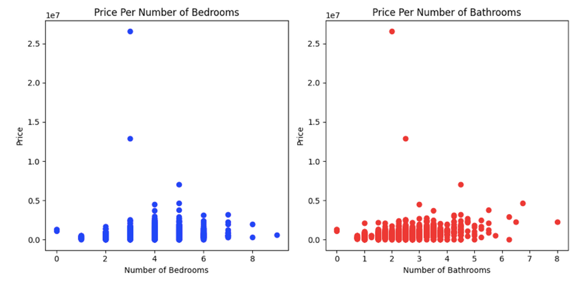
This creates a subplot with 1 row and 2 columns, and then using the axs object you can create any type of graph you within each subplot.
Mapping and Geographical Visualization Using Matplotlib
Working with geographical data can be hard if done with the visualization tools like Tableau. In Python, you can visualize the geospatial data (comprised of Longitude and latitude) with the help of matplotlib along with an extension called cartopy. You can install it using the following command:
$ pip install cartopyTo create a simple geographical plot, let’s start with importing the necessary libraries and creating sample data.
# import dependencies
import cartopy.crs as ccrs
import cartopy
import numpy as np

# Sample data: longitude and latitude coordinates
cities = {
	'New York': (40.7128, -74.0060),
	'Los Angeles': (34.0522, -118.2437),
	'Chicago': (41.8781, -87.6298),
	'Houston': (29.7604, -95.3698),
	'Miami': (25.7617, -80.1918)
}
Next, write the following code to generate a simple geoplot of this data:
# Create a figure and axis with a map background
fig, ax = plt.subplots(subplot_kw={'projection': ccrs.PlateCarree()})

# Add map background
ax.add_feature(cartopy.feature.LAND, edgecolor='black')ax.add_feature(cartopy.feature.COASTLINE)

# Plot cities on the map
for city, (lat, lon) in cities.items():
	ax.plot(lon, lat, marker='o', markersize=10, label=city, transform=ccrs.PlateCarree())

# Set title and legend
ax.set_title('Geographical Visualization with Map Background')
ax.legend()

# Display the map
plt.show()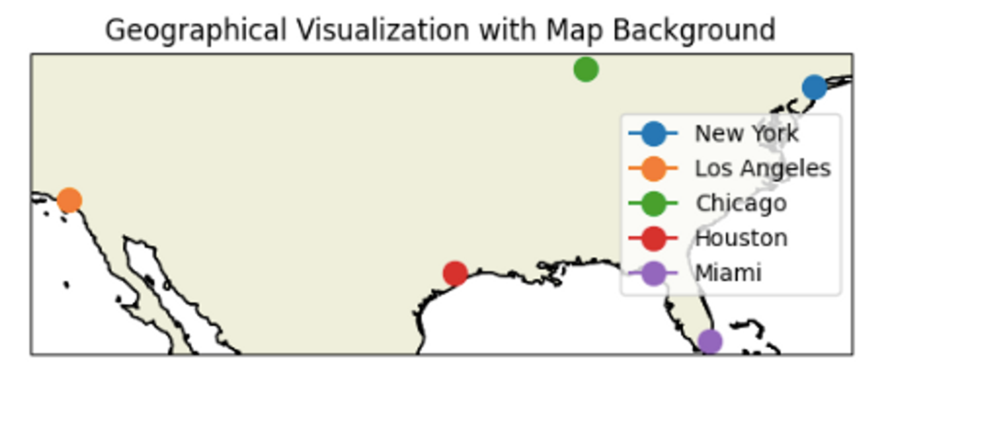
In the above code, We imported cartopy.crs from the Cartopy library to specify the map projection ccrs.PlateCarree() for our plot. Then we created a figure and axis with the specified projection using subplot_kw={'projection': ccrs.PlateCarree()}. We added map features (land and coastlines) to the axis using ax.add_feature(). This creates a map background. When plotting city markers, we added transform=ccrs.PlateCarree() to ensure that the longitude and latitude coordinates are properly transformed to the chosen projection. To know the details of cartopy and how it helps in creating geoplots, you can read their official page.
Interactive Visualizations with Plotly
Plotly is a versatile and powerful data visualization library that empowers users to create interactive graphs, charts, and dashboards. Plotly is user-friendly and can transform complex datasets into engaging visual narratives.
Creating Interactive Line and Scatter Plots
The Plotly Express library (plotly.express) can create interactive line and scatter plots. For this, it uses the line() method to create an interactive line plot while the scatter() method to create an interactive scatter plot. A simple line chart for house prices can be created as follows:
import plotly.express as px

# Create an interactive line plot using Plotly Express
fig_line = px.line(df['price'], title='Interactive Line Plot')

# show figure
fig_line.show()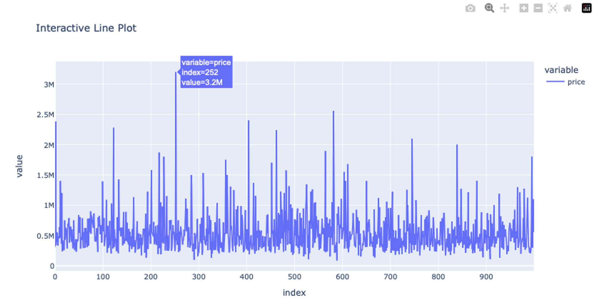
The line method of Plotly is very similar to Matplotlib’s line method the only difference is that it generates interactive plots i.e. if you hover over the graphs, the data points will be shown.
To create a scatter plot is as simple:
# Create an interactive scatter plot using Plotly Express
fig_scatter = px.scatter(df, x='price', y='floors', title='Interactive Scatter Plot')

# Display the plots
fig_scatter.show()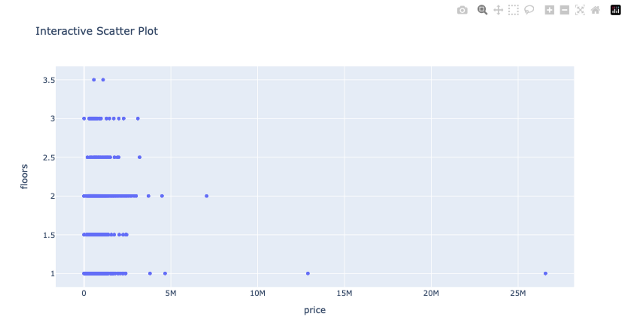
These line and scatter plots will be interactive allowing you to zoom in, hover over data points for more information, and interact with the plot in various ways. Check out more details about plotly line plots and about scatter plots.
Building Bar Charts and Histograms with Interactivity
To create a bar chart using plotly and a Pandas DataFrame, you can pass the DataFrame name, X values column, and Y values column to the bar() method. You can also choose different color schemes and labels for the data based on your requirements.
# Create an interactive bar chart using Plotly Express
fig_bar = px.bar(df[:10], x='city', y='price', color='yr_built',title='Interactive Bar Chart')

# Display the plots
fig_bar.show()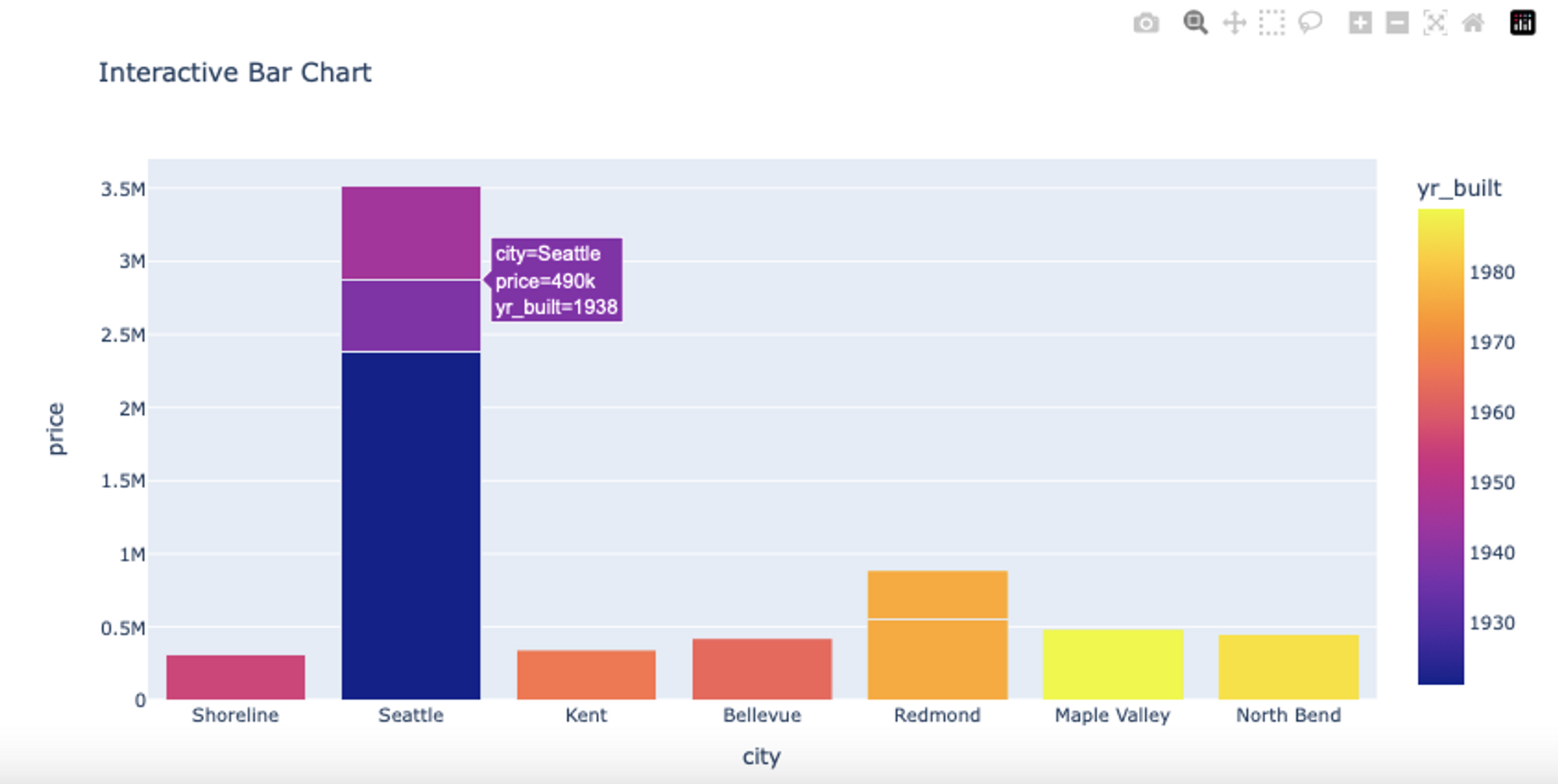
Similar to matplotlib, plotly provides the histogram() method to check the data distribution of different columns and provides additional functions to interact with the graphs.
# Create an interactive histogram using Plotly Express
fig_hist = px.histogram(df, x='price', nbins=100, title='Interactive Histogram')

# Display the plots
fig_hist.show()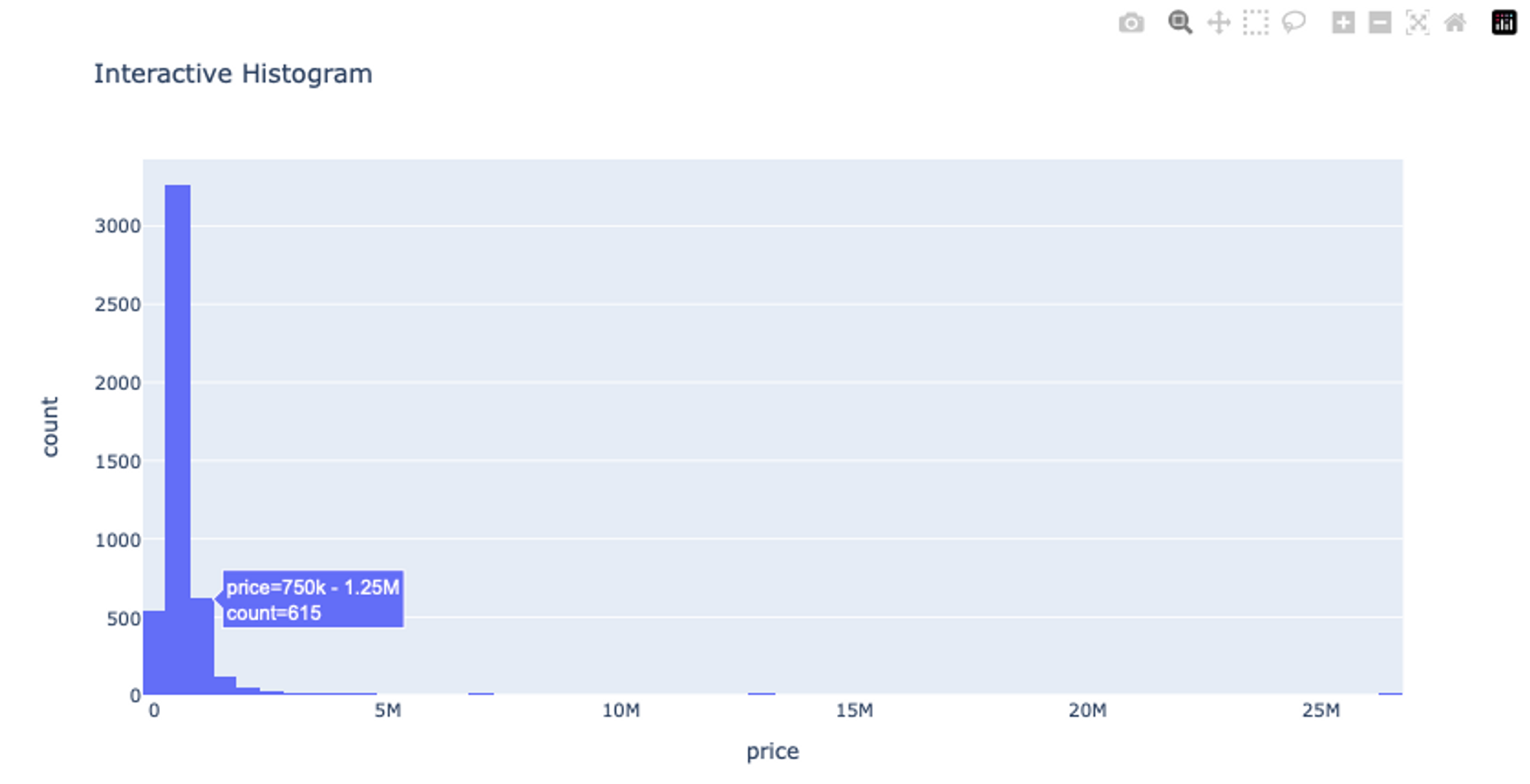
As you can see the histogram visualization provides the lasso select option to crop a specific region from the plot as part of the user interactivity. Check out more details about histograms on the official plotly page.
Advanced 3D Plots in Plotly
Creating 3D plots and surface plots using Plotly is a powerful way to visualize data in three dimensions. These types of plots are particularly useful when you’re dealing with data that has multiple variables and you want to explore the relationships. Here’s an example of how to create 3D plots using Plotly in Python:
# import dependency
import plotly.graph_objects as go

# Create a 3D scatter plot
x = np.random.rand(100)
y = np.random.rand(100)
z = x**2 + y**2

# Generating a z-value based on x and y
scatter_plot = go.Scatter3d(x=x, y=y, z=z, mode='markers', marker=dict(size=6))
layout = go.Layout(title='3D Scatter Plot')
fig_scatter = go.Figure(data=[scatter_plot], layout=layout)

# Display the plots
fig_scatter.show()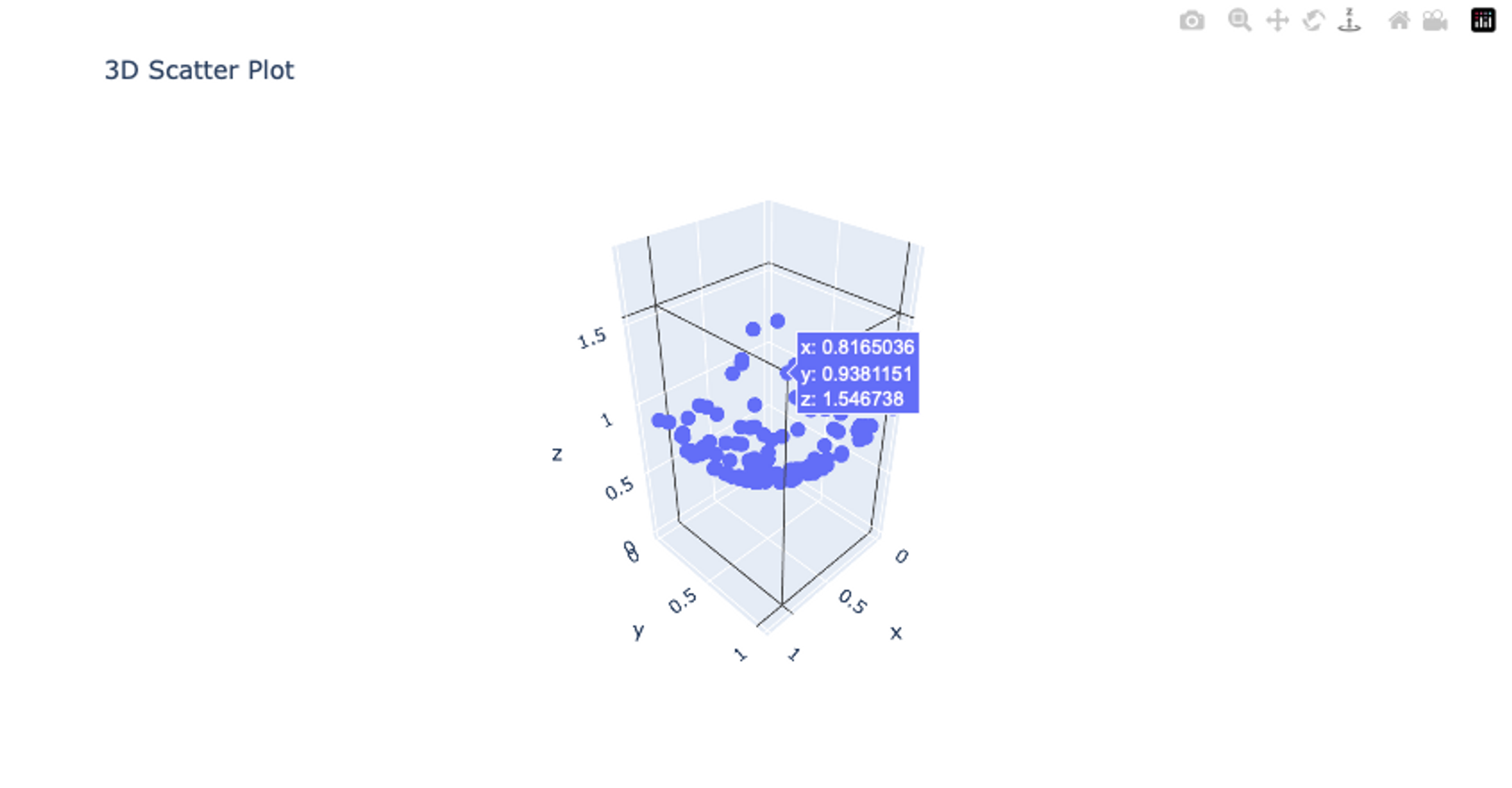
In this example, we use the plotly.graph_objects module to create a 3D scatter plot. We first generate random x and y values, and then calculate a corresponding z value using a simple equation. The go.Scatter3d() method is used to create the 3D scatter plot with the x, y, and z data. The mode parameter is set to markers to indicate that we want markers for each data point. Then We create a layout using go.Layout and set a title for the plot. The go.Figure() method combines the data and layout to create the plot.
Incorporating Plotly Maps and Geographical Visualizations
Plotly provides a convenient way to create interactive geographical visualizations, including choropleth maps, scatter plots on maps, and more. Here’s an example of how to incorporate Plotly maps and geographical visualizations in Python:
import plotly.express as px

# Sample data for a choropleth map
data = {
	'Country': ['USA', 'Canada', 'Mexico', 'Brazil', 'Argentina'],
	'Value': [10, 20, 15, 25, 30]
}

# Create a choropleth map using Plotly Express
choropleth_map = px.choropleth(
	data_frame=data,
	locations='Country',
	locationmode='country names',
	color='Value',
	title='Choropleth Map Example'
)

# show plot
choropleth_map.show()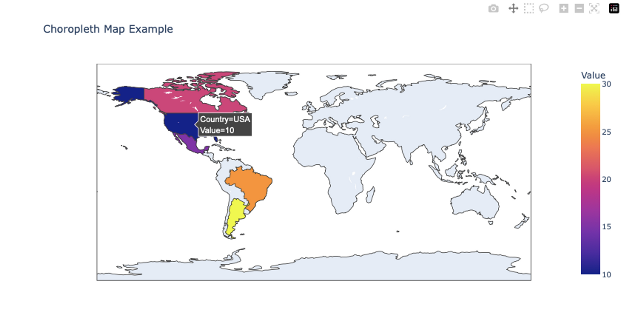
For the choropleth map, We define sample data with countries and corresponding values. The px.choropleth() function creates a choropleth map. We provide the data frame, specify the locations and location mode, set the color based on the Value column, and set the title. Finally, the plot is shown using the show() method. To learn more about different types of maps and plots with plotly, you can refer to this page.
Stylish Visualizations with Seaborn
Seaborn, a popular data visualization library built on top of Matplotlib, and is known for its aesthetic capabilities that simplify the process of creating great-looking plots.
By offering beautiful default styles, versatile color palettes, easy customization options, statistical visualizations, facet grids, and more, Seaborn helps analysts craft professional-quality visuals that effectively communicate insights and patterns within their data.
Creating Visually Appealing Scatter and Line Plots with Seaborn
To create a simple scatter plot between the house price and number of floors, you can use this code:
# Set Seaborn style
sns.set(style='whitegrid')

# Create a scatter plot
plt.figure(figsize=(8, 6))
sns.scatterplot(x='price', y='floors', data=df, color='blue', label='Scatter Plot')
plt.title('Visually Appealing Scatter Plot')
plt.legend()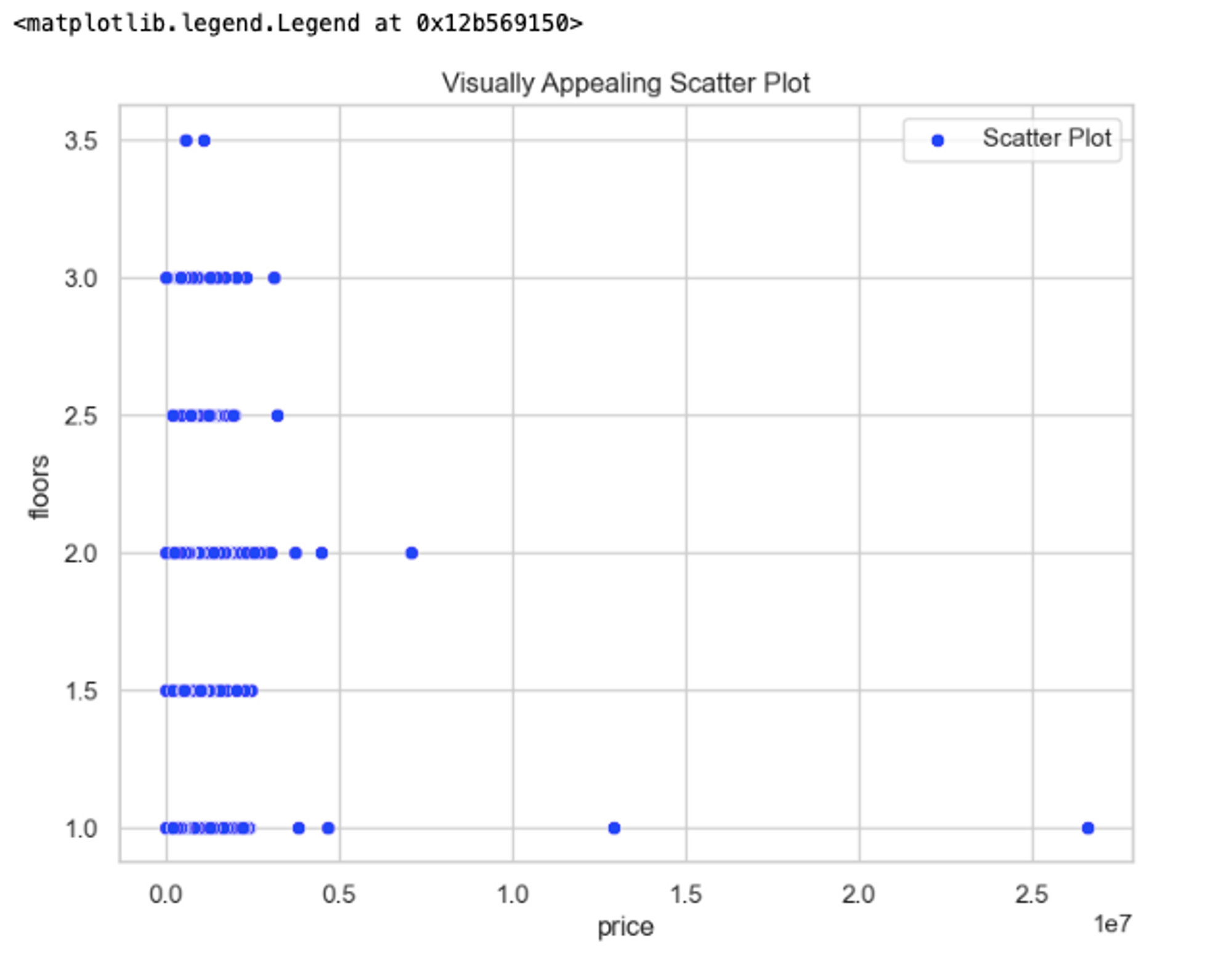
In the above code, we set the Seaborn style using the set(style='whitegrid') method to enhance the aesthetics of the plots. The we use scatterplot() method to create a scatter plot by providing x and y columns from the DataFrame, and we set the color and label for the plot. We customize the title and add a legend using regular Matplotlib functions, this is it. Check the official page of seaborn to know more about scatter plots.
Similarly, you can use the lineplot() method to create customized line plots with seaborn.
# Set Seaborn style
sns.set(style='whitegrid')

# Create a line plot
plt.figure(figsize=(8, 6))
sns.lineplot(df['price'][:100], color='red', label='Line Plot')
plt.title('Visually Appealing Line Plot')
plt.legend()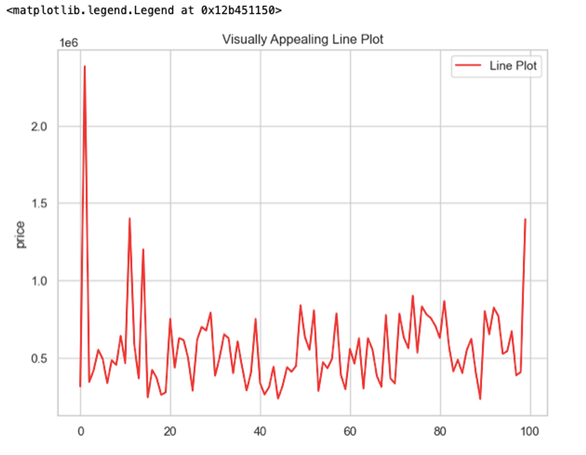
Check out more on customizing the line plots with Seaborn here.
Using Seaborn for Statistical Data Visualization
You can also customize different distribution plots such as KDE Plots or histograms with Seaborn. For example, you can create both a histogram and a KDE plot in the same figure by calling both histplot() and kdeplot() methods.
# Set Seaborn style
sns.set(style='whitegrid')

# Create a combination plot with histogram and KDE
plt.figure(figsize=(8, 6))
sns.histplot(df['price'][:1000], bins=20, kde=True, color='blue')
sns.kdeplot(data, color='red', linewidth=2)
plt.title('Distribution Plot (Histogram + KDE)')
plt.xlabel('Value')
plt.ylabel('Frequency / Density')
plt.show()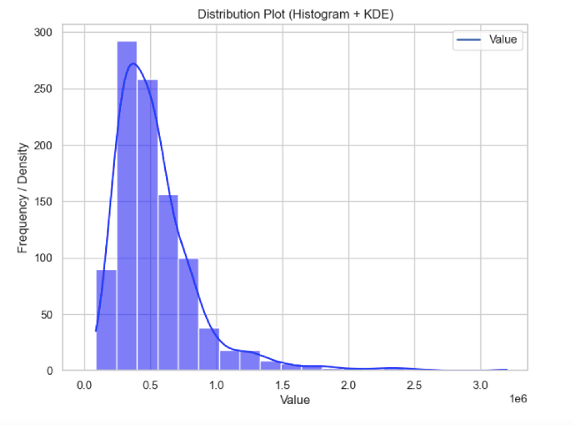
Pair Plots and Heatmap Visualizations for Correlation Analysis
With a pair plot, each numerical variable in the data is shared across the y-axes in a single row and the x-axes in a single column. This helps you to check the pairwise relationship in the data. To create a pairplot, use the pairplot() method and pass your dataframe to it and it will generate a graph for all numerical columns.
# Set Seaborn style
sns.set(style='whitegrid')

# Create a pair plot
sns.pairplot(df)

# Add a title above the plot
plt.suptitle('Pair Plot', y=1.02)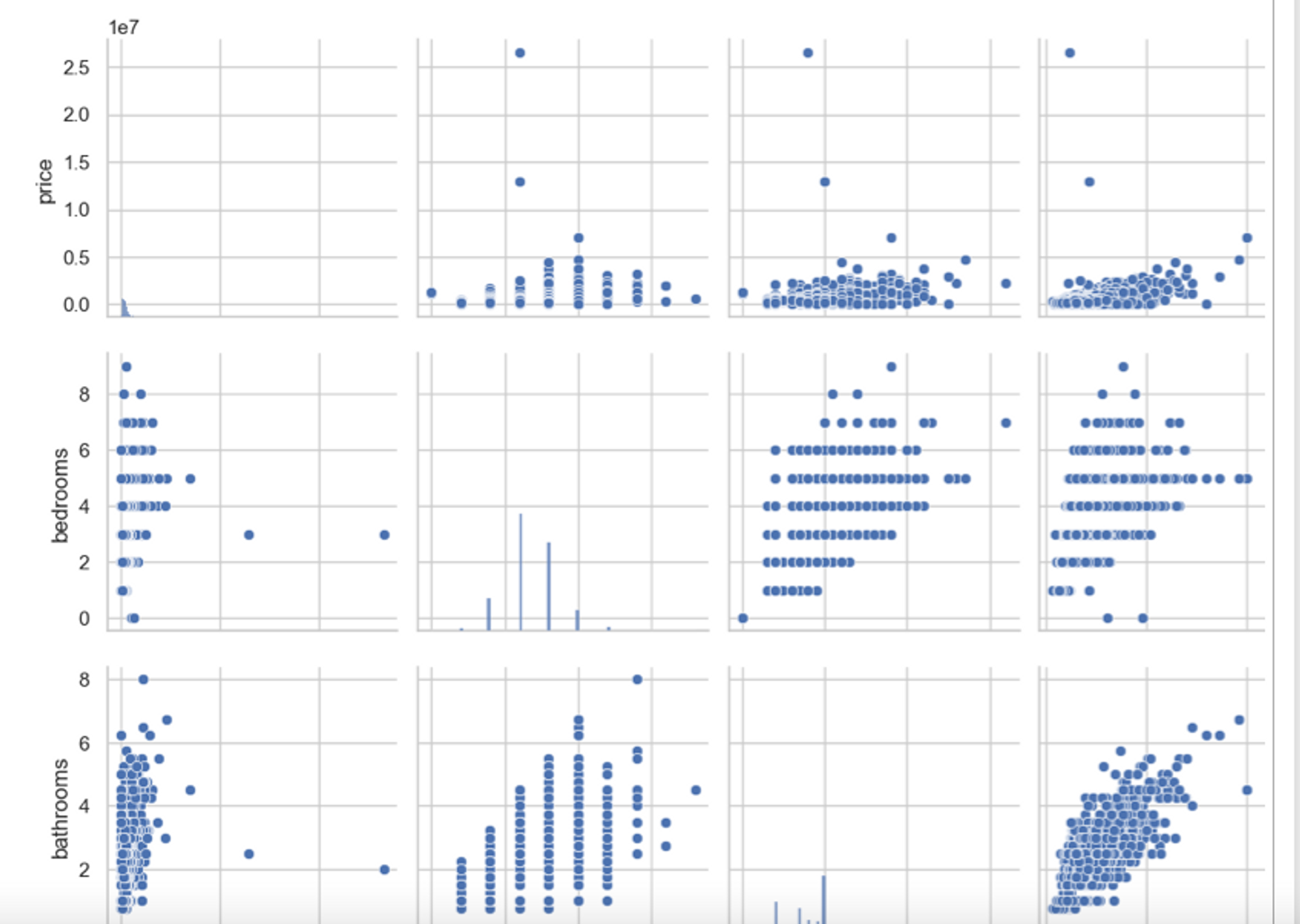
You can see that there is a huge plot created that represents the relationship of each variable with others.
Another great option for exploring the relation among different columns in the dataset is a heatmap. This plot shows the correlation among different variables in the dataset and can be plotted using the heatmap() method of Seabron.
# Calculate correlation matrix
correlation_matrix = df.corr()

# Create a heatmap of the correlation matrix
plt.figure(figsize=(12, 5))

# Create heatmap with annotations and colormap
sns.heatmap(correlation_matrix, annot=True, cmap='coolwarm', center=0)
plt.title('Correlation Heatmap')
plt.show()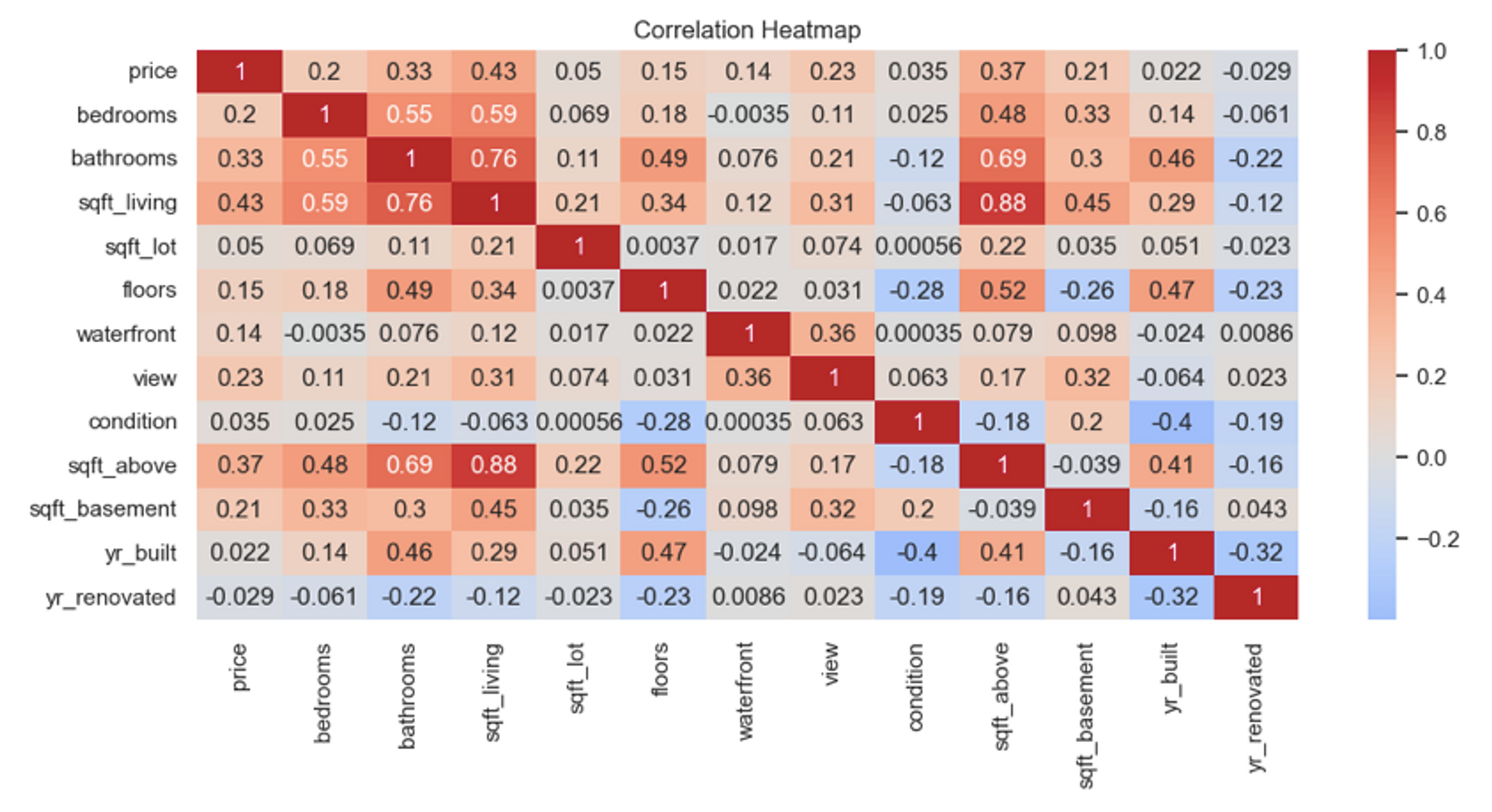
In the above code, we first calculated the correlation of variables using the corr() method and then plotted the heatmap with the heatmap() method by passing the correlation matrix. To know more customization options for seaborn, check this official page.
Best Practices for Effective Data Visualization
Choosing the Right Visualization for Your Data and Message
Selecting an appropriate visualization is crucial for drawing insights from data. Consider the nature of your data (categorical, numerical, time-series), the relationships you want to highlight, and the message you intend to communicate.
For Example, Bar charts are ideal for comparing categorical data, while line charts show trends over time. Scatter plots reveal correlations and pie charts represent parts of a whole. Understand your data’s characteristics and the story you want to tell to make an informed choice. Avoid overloading visualizations with unnecessary details; clarity and relevance are key.
Design Principles for Clear and Impactful Visualizations
Designing clear visualizations involves adhering to principles like simplicity, consistency, and hierarchy. Minimize clutter by removing non-essential elements. Use a consistent color scheme and labeling across visuals for ease of interpretation. Establish a clear visual hierarchy, emphasizing the most important information. Appropriate font sizes, contrast, and alignment improve readability. Applying Gestalt principles like proximity, similarity, and continuity helps viewers perceive patterns effortlessly.
Optimizing Visualizations for Presentation and Publication
Optimizing visualizations for different contexts enhances their impact. For presentations, prioritize clarity and simplicity, using minimal text and emphasizing visuals. Ensure labels, legends, and titles are readable even from a distance.
On the other hand, for publications, include more details and context, possibly adding annotations or supplemental explanations. Pay attention to color choices, as some colors may not translate well in print. Tailor the visual’s resolution and format to the medium, considering the specifics of projectors, screens, or printing.
Handling Large Datasets and Performance Considerations
Visualizing large datasets requires strategies to prevent overwhelming visuals and slow rendering. Aggregating data or using sampling techniques can provide a more manageable view without sacrificing insights. Interactive elements, such as zooming and filtering, enable users to explore details dynamically.
Choose appropriate chart types; for instance, heatmaps can represent dense data effectively. Implement efficient coding practices and consider using libraries optimized for large datasets, like plotly. Regularly test performance to ensure a smooth user experience.
Sharing Jupyter Notebooks with Interactive Visualizations
Jupyter notebooks allow the sharing of data analysis along with interactive visualizations. Leverage libraries like Plotly, Bokeh, or mpld3 to create dynamic plots directly within notebooks. When sharing notebooks, consider the audience’s technical familiarity and the tools they use to view notebooks (Jupyter, GitHub). Use clear explanations, headings, and markdown cells to guide readers through the analysis. Ensure dependencies and libraries are well-documented, and code cells are organized. Consider exporting notebooks to various formats (HTML, PDF) for wider accessibility, enabling non-technical stakeholders to benefit from your insights.
Seeing More With Jupyter Visualization
Matplotlib, Plotly, and Seaborn each offer unique advantages in data visualization within Jupyter notebooks. Matplotlib provides extensive customization, Plotly focuses on interactivity, and Seaborn simplifies aesthetically pleasing statistical visualizations. The choice of library depends on the specific needs of the analysis and the desired level of interactivity and customization.
Visualizing data opens doors to new perspectives on your data and allows you to tell more compelling stories. As with any storytelling medium, the best visualizations are those that resonate with viewers, providing clarity and insight, and guiding them towards data-driven decisions or understandings.
Want to learn more about Jupyter notebooks?
Here are some of our other articles:


