Network analysis

Izzy Miller
This project demonstrates a simple network graph analysis using data from the Silk Road forums, the igraph package, and Hex. Most network analyses and community data anal...
How to build: Network analysis
In the field of data science and analysis, it is critical to comprehend intricate relationships and interactions. Network graph analysis, which provides a visual depiction of the links between items, is one effective method for this. Analyzing network graphs entails looking at the structures and relationships found in networks that are shown as graphs. These graphs are made up of edges, which show connections between nodes representing different entities. Researchers can find patterns, pinpoint central nodes, and comprehend the influence or information flow within a network by examining these connections.
Applications for network analysis can be found in many different fields, such as biological networks, transportation networks, social networks, and more. It facilitates the identification of significant people or groups in social networks. It helps to increase efficiency and optimize routes in transportation networks. It helps to understand gene regulatory networks and protein interactions in biological networks. it also provides deep insights into a variety of industries, including business and healthcare.
In this article, you will learn about network graph analysis, various network graph analysis techniques, and how to visualize them. You will also see a practical implementation of network graphs with Python and Hex, and finally, you will see a set of best practices for network graph analysis.
Basics of Network Analysis
Now let's explore some fundamental network metrics that aid in our comprehension of the architecture of networks. We'll first go over the basic ideas of nodes and edges and investigate how to give them attributes. Lastly, we will explore how these qualities might be visualized to help us understand our networks.
Node and Edge Attributes
The terms "edge" and "node," which are sometimes referred to as "link" and "connection," are used in network analysis to describe the interconnections between things. Anyone, wherever, anything can be represented by a node, and the relationships between them are represented by an edge. An illustration of this would be nodes standing in for people and edges for friendships in a social network. An attribute is supplementary data that are connected to nodes and edges. The nodes and edges in our network are further contextualized by these features. Examples of features that nodes in a social network might have are age, gender, or occupation, whereas edges might have something like the degree of friendship.
Degree Centrality and Other Basic Network Metrics
A key measure in network analysis, degree centrality indicates a node's significance according to the number of connections it possesses. Higher degree centrality nodes are frequently seen as more important or central inside the network. We can discover important nodes that significantly contribute to connecting others inside the network by calculating degree centrality.
In addition to degree centrality, the following additional fundamental network metrics shed light on the composition and dynamics of networks:
Average Degree: The typical quantity of connections made by each network node.
Density: The ratio of the number of possible connections in the network to the total number of possible connections.
Clustering Coefficient: The clustering coefficient shows how much a network's nodes tend to group together.
Visualization of Basic Network Properties
Understanding networks' structures and characteristics intuitively requires visualizing them. Python provides robust libraries for basic network property visualization, such as Matplotlib and NetworkX. We may see network patterns, examine the distribution of node degrees, and draw attention to nodes that have a high centrality through visualization. Node size, color, and layout algorithms are examples of graph visualization techniques that enable us to effectively express network properties visually. We can learn more about the underlying structures of our networks and find hidden patterns by presenting them in aesthetically pleasing ways.
Advanced Network Analysis Techniques
Community Detection Algorithms
The goal of community discovery algorithms is to find node groups that have a high degree of internal connectivity among themselves but a low degree of external connectivity. These methods provide light on cohesive groupings of nodes with comparable characteristics or roles by revealing hidden structures and communities inside networks.
Modularity-based Methods
Modularity-based techniques measure how strongly a network is divided into communities. These techniques divide the network into communities with sparse connections between them and dense connections within by optimizing a modularity score. This method helps recognize coherent node clusters and comprehend the modular structure of the network.
Spectral clustering
Spectral clustering is a method that divides the nodes into clusters based on the eigenvalues of matrices obtained from the adjacency or Laplacian matrix of the network. Spectral clustering, especially when traditional clustering approaches may not perform well, reveals meaningful partitions in the network by studying the eigenvectors associated with the greatest eigenvalues.
Centrality Measures Beyond Degree Centrality
Even though degree centrality is crucial, centrality measurements offer more information about the significance and effect of nodes in a network. Moving past degree centrality, the other two types of centrality are:
Betweenness Centrality
Betweenness centrality indicates how important a node is in promoting communication or information flow by measuring how far it is along the shortest paths between other nodes.
Closeness Centrality
Closeness centrality Indicates a node's proximity to every other node in the network, emphasizing those that have a short path to travel between them.
Shortest Path Analysis
A key idea in network theory is the shortest path analysis, which looks for the most effective path between two nodes in a network. Understanding communication channels, maximizing transportation networks, and locating significant nodes inside a system all depend on this study.
Dijkstra's Algorithm
In a weighted network, the shortest path between two nodes can be found using the well-known Dijkstra algorithm. Iteratively examining the nodes that surround the initial node and updating the shortest path to each node along the way is how it operates. Widely employed in routing algorithms and network optimization issues, Dijkstra's approach ensures finding the shortest path in a graph with non-negative edge weights.
A* Algorithm
The A* algorithm is a refined version of Dijkstra's algorithm that uses heuristic data to better direct the search. The A* method cleverly prioritizes nodes to explore, concentrating on the most promising paths first, by employing a heuristic function that calculates the cost of getting to the goal node from any given node. Because of this heuristic assistance, the search space is much reduced, which makes the A* algorithm especially effective in locating shortest paths in large-scale networks.
Visualization of Network Graphs
An effective method for comprehending the dynamics and structure of intricate networks is network visualization. This section will cover many tools and resources for network graph visualization, such as well-known tools like NetworkX, igraph, and Gephi, as well as ways to improve and personalize visualizations.
Network visualization libraries
NetworkX: A Python library called NetworkX is used to build, examine, and display intricate networks. To arrange nodes and edges in the display, it includes several layout techniques in addition to a simple interface for creating network graphs.
igraph: This flexible library is accessible in Python and R among other computer languages. It provides sophisticated graph analysis and visualization features, such as community discovery methods and excellent visualization capabilities.
Gephi: An open-source program for network exploration and visualization is called Gephi. It offers an easy-to-use interface for importing data, using alternative layout algorithms, and personalizing visualizations by adjusting the nodes and edges colors, forms, and sizes.
Customizing and Enhancing Network Visualizations
Customization is frequently necessary for network visualization to convey insights efficiently. Extensive customization options are provided by NetworkX and igraph, enabling users to modify the colors, sizes, and shapes of nodes and edges according to characteristics or centrality measurements. Users can also change the graph's layout to highlight particular network topologies or attributes.
Interactive Network Visualizations With Tools Like Plotly
A robust Python package for building interactive visualizations is called Plotly. Users can generate dynamic and interactive network visualizations by integrating Plotly with network analysis packages such as NetworkX. Functions like panning, zooming, hovering over nodes to see more details, and filtering according to node properties can be included in these visualizations.
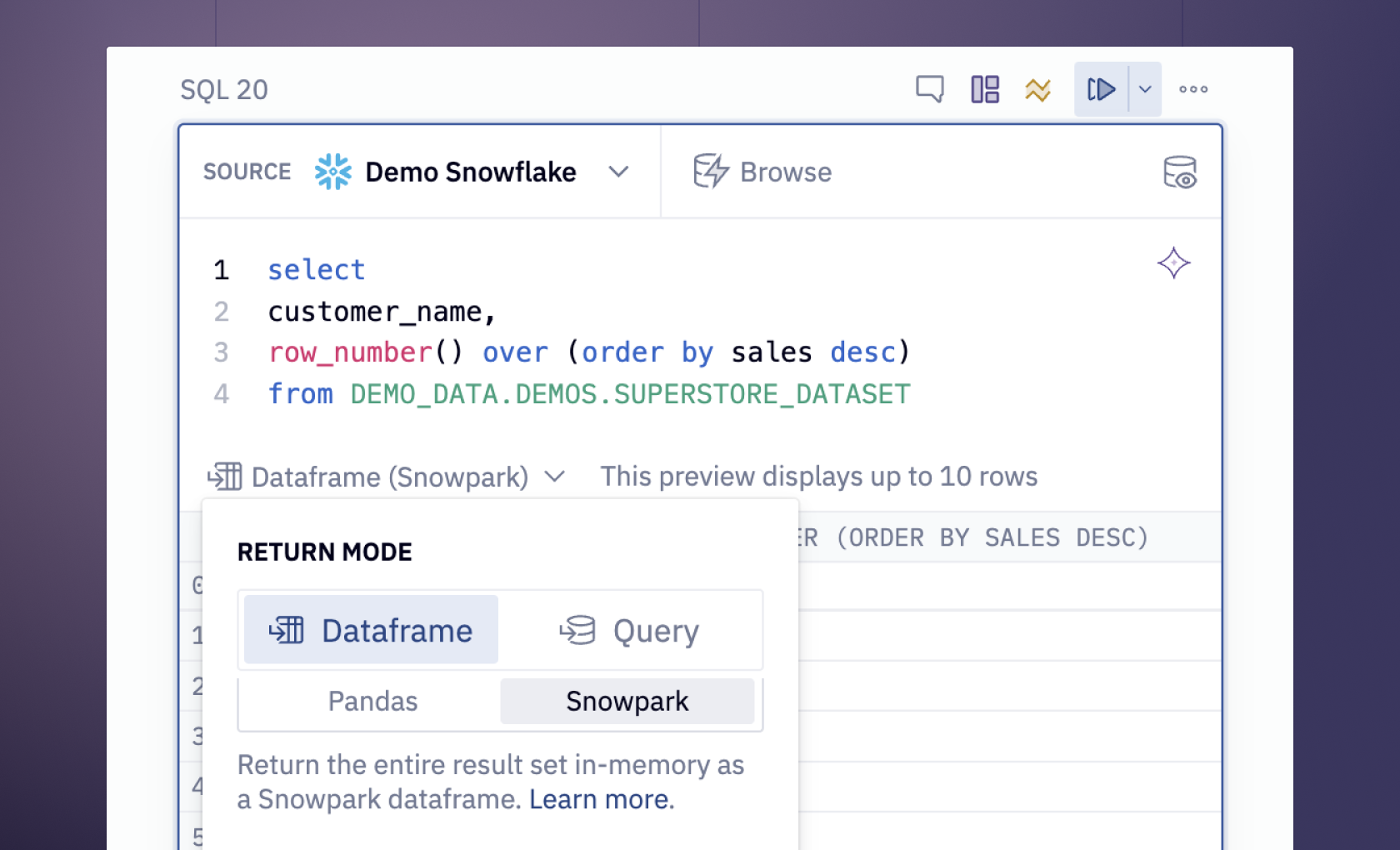
Network Graph Analysis with Python and Hex
It is time to see a practical implementation of network graph analysis. For this section, we will be using the data from the Silk Road forums, Python language, the igraph package, and Hex. Hex is a popular development environment, that can be used to develop and deploy the Python application quickly. It provides the connection to various data sources including databases, data warehouses, and cloud storage. You can also use the polyglot functionality from Hex to write the code in different languages in the same development environment. Hex makes it easy to visualize the graphs with its no-code cells. Most network analyses and community data analysis projects are done as static point-in-time analyses, but Hex makes it easy to provide an interactive window into the data and let users explore the network graph themselves.
Note: This dataset from Silk Road forums contains information about illegal activity as well as a lot of bad language. Explore the raw data at your own risk!
Let's start with the implementation of network graph analysis.
Install and Load Dependencies
For this article, we will be using Python 3.11 and its respective packages for network graph analysis. Although most of the Python packages come preinstalled in the Hex environment, if you want you can install them with Python Package Manager (pip) as follows:
$ pip install igraph
$ pip install pandas
$ pip install numpy
$ pip install matplotlib
$ pip install plotly
Once the libraries are installed, you can load them with the help of os import statement in Python as follows:
import igraph as ig
import matplotlib.pyplot as plt
import plotly.graph_objects as go
import datetime
import pandas as pd
import numpy as np
The pandas and the numpy libraries help read and manipulate the data, and matplotlib and plotly are widely used for visualization. Finally, the igraph library can implement different graph operations for network graph analysis.
Load and Preprocess Data
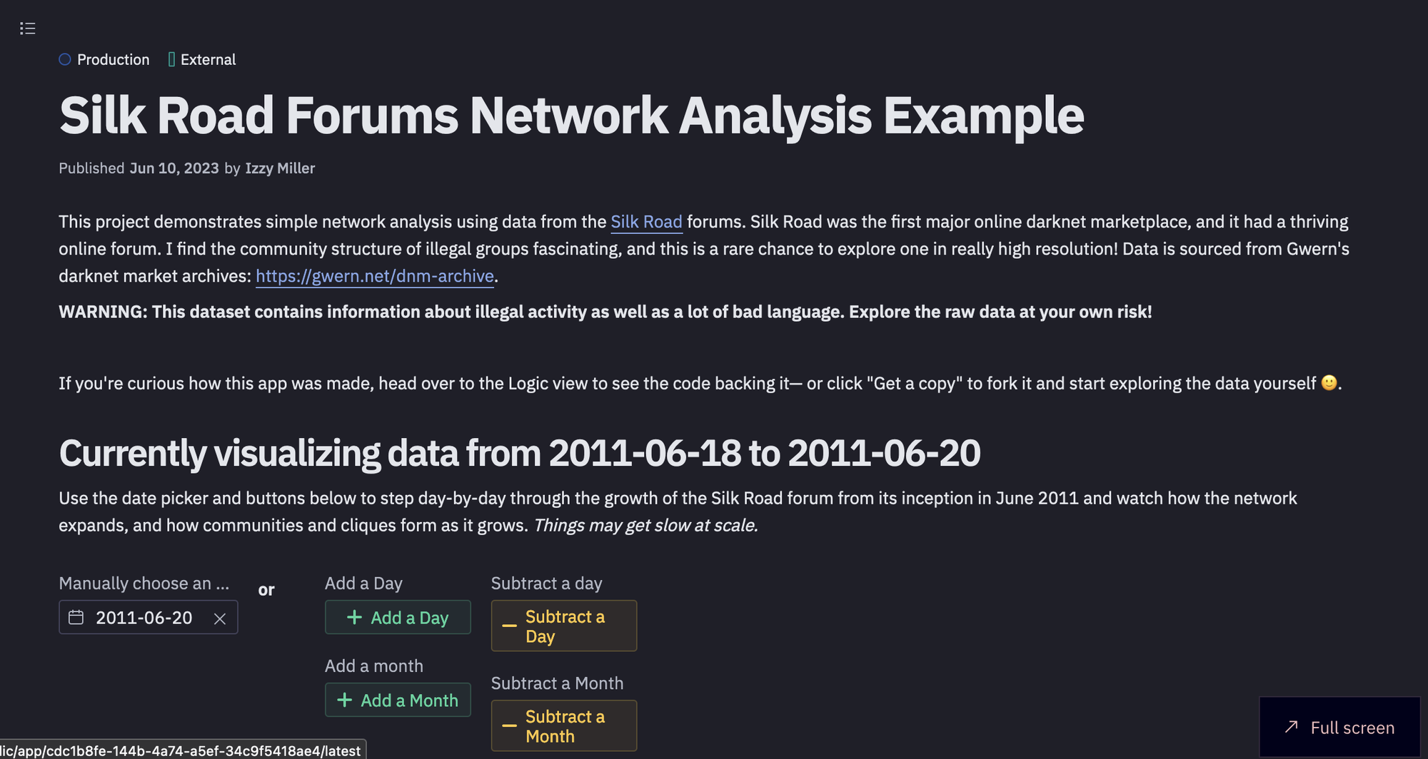
The data that we are going to use for this article is from the Silk Road forums. Silk Road was the first major online darknet marketplace, and it had a thriving online forum. I find the community structure of illegal groups fascinating, and this is a rare chance to explore one in really high resolution! Data is sourced from Gwern's darknet market archives: https://gwern.net/dnm-archive. This data is stored in the data warehouse linked to Hex.
Note: Network analysis is a very complex subject and this example app is just a simple demonstration of the kinds of things you can visualize and identify about a community or network!
Now that you know about the data, to load it in the Hex environment, we will use the SQL select statement as follows:
select * from DEMO_DATA.DEMOS.SILK_ROAD_POSTS_1M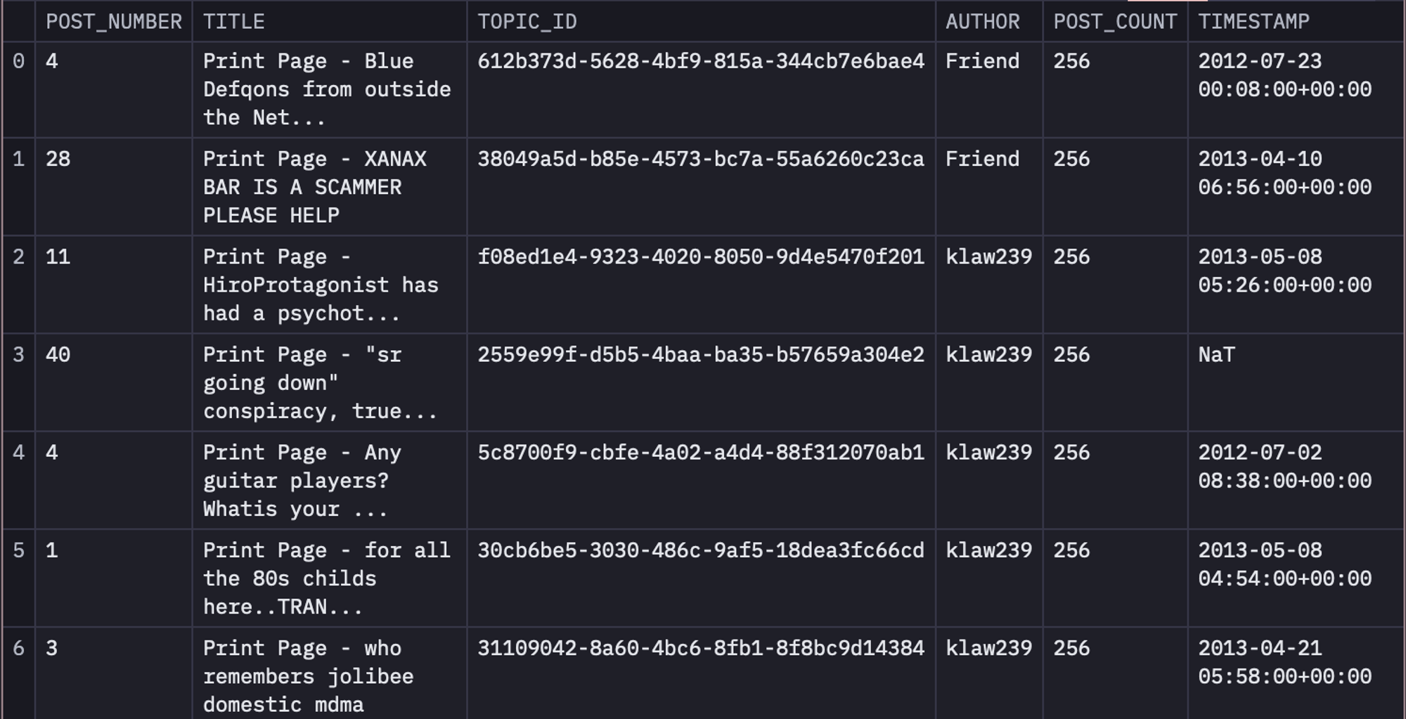
Hex cells let you accept user input, and return a variable you can reference in SQL or Python code to add interactivity and make any app dynamic. For example, you can define the buttons and date pickers as input parameters as follows:
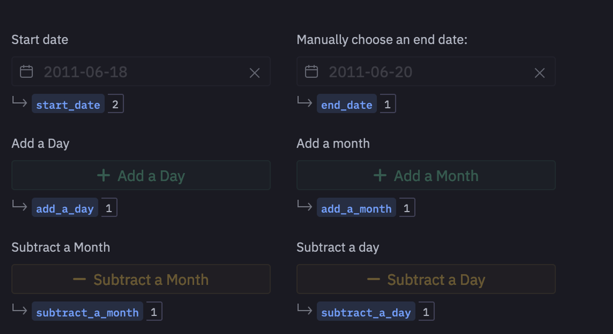
Now, using these variables, we will apply some datetime operations to increment the size of our dataset based on user input.
if(add_a_day):
	end_date = end_date + datetime.timedelta(days=1)
if(subtract_a_day):
    	end_date = end_date - datetime.timedelta(days=1)
if(add_a_month):
	end_date = end_date + datetime.timedelta(days=30)
if(subtract_a_month):
    	end_date = end_date - datetime.timedelta(days=30)
Note: You can notice that just after the SQL cell, we have defined a Python cell, which works perfectly. This is because Hex works in a cascade manner i.e. the variables initialized in earlier cells can easily be used in the upcoming cells.
Work on Data From 2011-06-18 to 2011-06-20
We will use the date picker and buttons to step day-by-day through the growth of the Silk Road forum from its inception in June 2011 and watch how the network expands, and how communities and cliques form as it grows. Things may get slow at scale. To filter the data for the same, you can use the following SQL statements:
select * from dataframe WHERE timestamp <= {{ end_date}} AND timestamp >= {{ start_date }}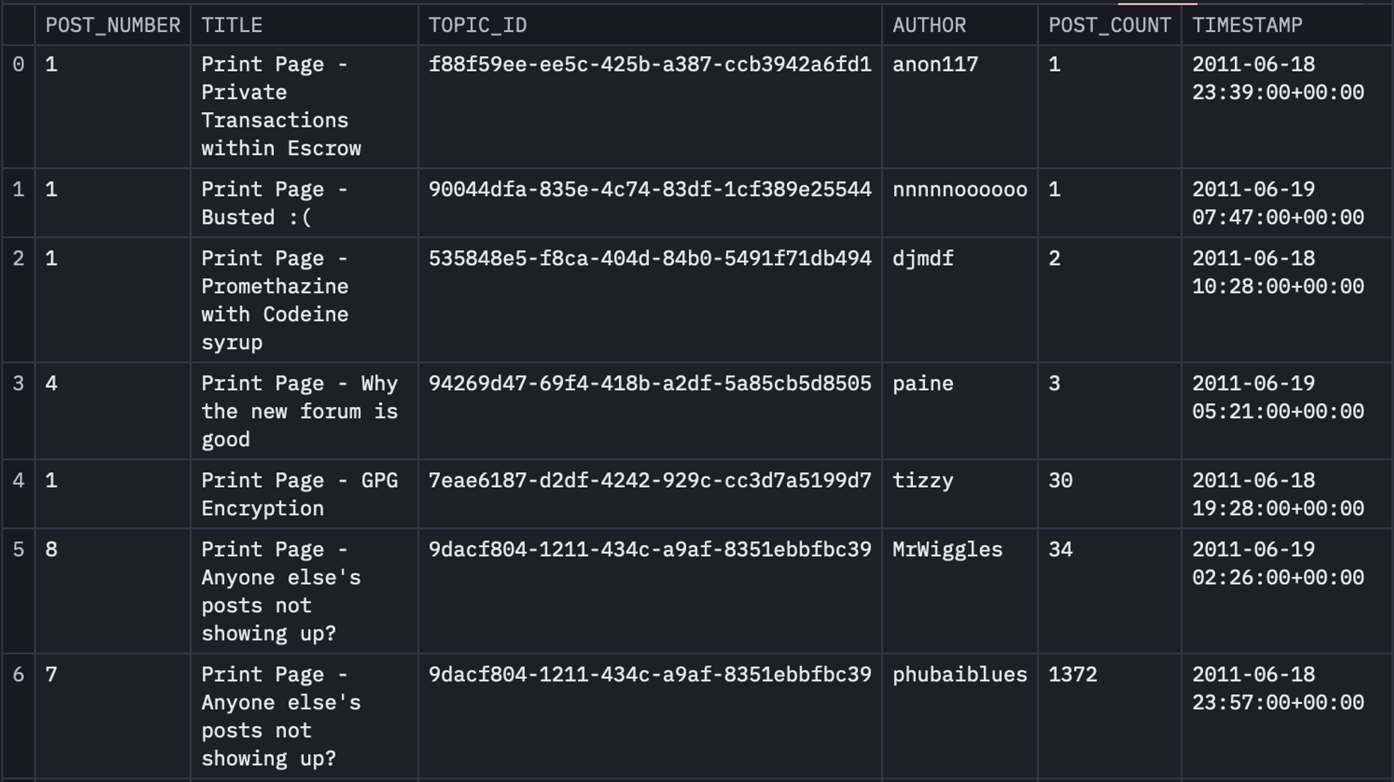
Next, we will create three different columns named SOURCE, target, and weight from the original dataset. For this, we are going to create a table named topic_authors from table time_filtered that will contain the topic_id and author columns. Then we will use this topic_authors table and will join it with the time_filtered table to obtain a table named unioned that will contain SOURCE, target, and weight columns. Finally, we will groupby the data in the unioned table based on SOURCE, and target to get the final version of the data.
WITH topic_authors AS (
  SELECT
	topic_id,
	author AS topic_author
  FROM time_filtered
  WHERE post_number = 1
  group by 1,2
),

unioned AS (
  SELECT
	HASH(topic_authors.topic_author) AS SOURCE,
	HASH(p.author) AS target,
	COUNT(*) AS weight
  FROM topic_authors
  LEFT JOIN time_filtered p ON topic_authors.topic_id = p.topic_id
  GROUP BY 1, 2
  UNION ALL
  SELECT
	HASH(topic_authors.topic_author) AS target,
	HASH(p.author) AS SOURCE,
	COUNT(*) AS weight
  FROM topic_authors
  LEFT JOIN time_filtered p ON topic_authors.topic_id = p.topic_id
  GROUP BY 1, 2
)

SELECT
  SOURCE,
  target,
  SUM(weight) AS weight
FROM unioned
-- inner join top_posters on top_posters.hash = unioned.SOURCE
GROUP BY 1, 2 ORDER BY 3 DESC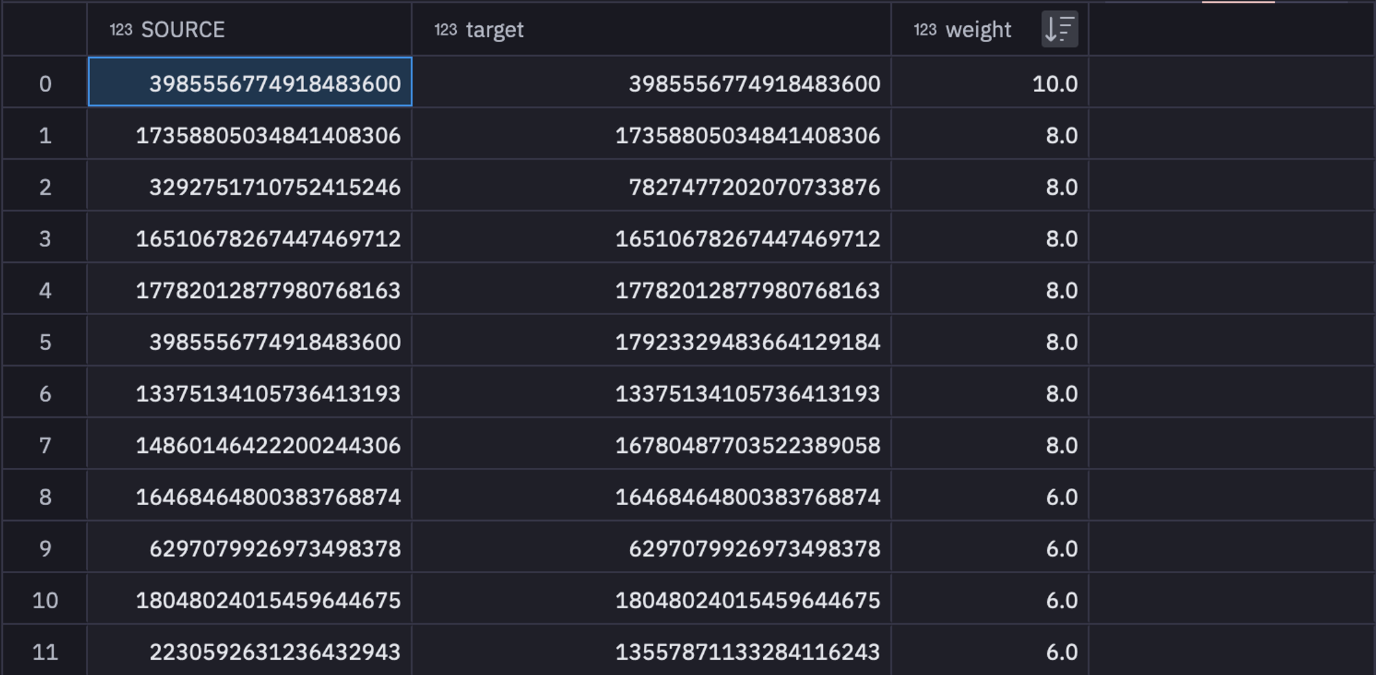
These filtered and grouped values can be stored in a variable named sr_edges to use them further. As you might have guessed, these feature values will be used as edges in our network.
Then we will filter out other details like authors and post_count from the time_filtered table that will work as the nodes in our network.
SELECT hash(time_filtered.author) as author, time_filtered.author as author_2, COUNT(*) AS post_count
FROM time_filtered
GROUP BY 1,2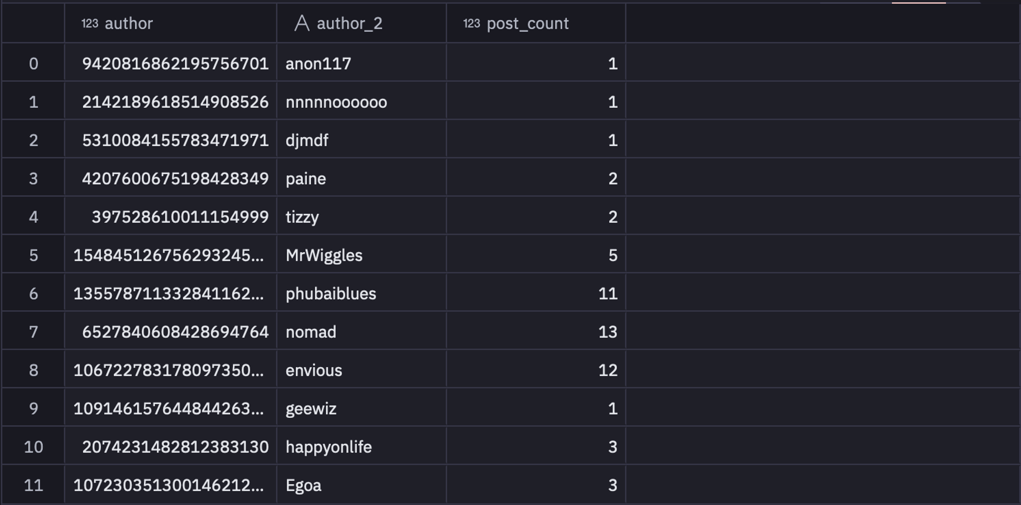
You can store this data in the sr_nodes variable for further use. You can check the number of nodes in the network with the help of the following lines of code:
num_authors = len(sr_nodes['author'])Now, that you have your edges and nodes details, it is time to create the network graph using the Graph.DataFrame() method from igraph that allows you to create the graph with the help of pandas DataFrame.
G = ig.Graph.DataFrame(sr_edges, directed=False,vertices=sr_nodes)As you can see in the above code, we have just passed the edges and nodes variables and stated the graph to not be a directed graph.
There are a lot of lonely folks in this forum without many connections. That's sad, but we don't have the time (or screen space!) to visualize them so we'll remove any vertex from the dataset here with less than 3 connections.
G.delete_vertices(G.vs.select(_degree_le=3))
# G.es["width"] = 1
G = G.simplify(combine_edges={"weight": sum})
# G.delete_vertices(G.vs.select(_degree=0))
As you can see in the above code, delete_vertices() can be used to delete the nodes with degrees less than and equal to 3.
Detect Community Membership
Members of the Silk Road forums are automatically split into "communities" based on a technique called Fast Greedy. Technically for a network like this, the best metric is edge betweenness, which is useful specifically for identifying dense sub-networks (communities) within a larger, sparsely connected network.
However, that can be a very computationally expensive process at high network sizes, so we use fast greedy here to maintain interactivity. We'll name each community after its most well-connected member, the "Leader". They're marked with a ⭐ in the graph.
To use the fast greedy algorithm you simply need to call the community_fastgreedy() method on your created graph as follows:
communities = G.community_fastgreedy()
communities = communities.as_clustering()
In the above code, the first line produces the communities in the form of VertexDendrogram which is then converted into a clustering.
You can check the number of communities with the help of the len() method as follows:
num_communities = len(communities)Next, we will iterate over different communities and will identify the data related to different communities that include community, potential leaders (nodes with the highest connections in a cluster), and the community name.
community_data = []

community_leaders = {}
for community in set(communities.membership):
	nodes_in_community = [
    	node
    	for node, membership in enumerate(communities.membership)
    	if membership == community
	]
	max_degree = -1
	leader = None
	for node in nodes_in_community:
    	degree = G.degree(node)
    	if degree > max_degree:
        	max_degree = degree
        	leader = node
	community_leaders[community] = leader

for i, community in enumerate(communities):
	for v in community:
    	is_leader = True if v == community_leaders[i] else False
    	G.vs[v]["is_leader"] = is_leader
    	G.vs[v]["community"] = i
    	community_data.append(
        	{
            	"Community": i,
            	"Author": G.vs[v]["author_2"],
            	"IsLeader": is_leader,
            	"communityName": G.vs[community_leaders[i]]["author_2"],
        	}
    	)
As you can see in the above code, the first for loop iterates over all the communities and identifies the potential leaders. Then, the next for loop again iterates over communities and gets the other relevant information from different clusters.
You can then create a dataframe from the extracted community data as follows:
community_df = pd.DataFrame(community_data)Visualizations
It is time to visualize the communities that we have created using igraph. To do so, we will create a value picker named separate_communities_visually using Hex as follows:
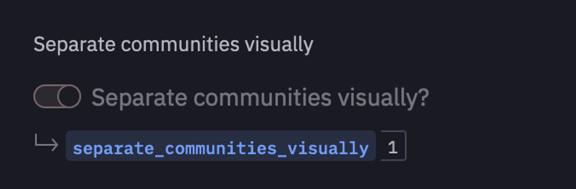
If this value is set to 1 then you will able to visualize the separate communities in the network otherwise all communities will be shown together.
import numpy as np
import plotly.graph_objects as go

if separate_communities_visually:
	# Create a layout dictionary to store coordinates for each node
	layout_dict = {}

	# Generate a separate layout for each community
	for community_idx, community in enumerate(communities):
    	subgraph = G.subgraph(community)

    	# Apply layout algorithm to the subgraph
    	layout = subgraph.layout('fr', weights=subgraph.es["weight"])

    	# Calculate center for this community in the overall layout space
    	theta = 2 * np.pi * community_idx / len(communities)  # for circular arrangement
    	community_center = [50 * np.cos(theta), 50 * np.sin(theta)]  # adjust radius as needed

    	# Assign coordinates to nodes in the community, shifted to the community's center
    	for idx, node in enumerate(community):
        	layout_dict[node] = (layout[idx][0] + community_center[0], layout[idx][1] + community_center[1])

	# Extract labels, nodes, and edges for plotting
	labels = list(G.vs['author_2'])
	N = len(labels)
	E = [e.tuple for e in G.es]

	Xn = [layout_dict[k][0] for k in range(N)]
	Yn = [layout_dict[k][1] for k in range(N)]
	Xe = []
	Ye = []
	for e in E:
    	Xe += [layout_dict[e[0]][0], layout_dict[e[1]][0], None]
    	Ye += [layout_dict[e[0]][1], layout_dict[e[1]][1], None]
else:
	layout_dict = {}

	for community_idx, community in enumerate(communities):
    	subgraph = G.subgraph(community)

    	layout = subgraph.layout('fr',weights=subgraph.es["weight"])

    	for idx, node in enumerate(community):
        	layout_dict[node] = (layout[idx][0], layout[idx][1])

	labels = list(G.vs['author_2'])
	N = len(labels)
	E = [e.tuple for e in G.es]

	Xn = [layout_dict[k][0] for k in range(N)]
	Yn = [layout_dict[k][1] for k in range(N)]
	Xe = []
	Ye = []
	for e in E:
    	Xe += [layout_dict[e[0]][0], layout_dict[e[1]][0], None]
    	Ye += [layout_dict[e[0]][1], layout_dict[e[1]][1], None]

edge_trace = go.Scatter(
	x=Xe, y=Ye,
	line=dict(width=0.5, color='#888'),
	hoverinfo='none',
	mode='lines')

node_trace = go.Scatter(
	x=Xn, y=Yn,
	mode='markers',
	hoverinfo='text',
	marker=dict(
    	showscale=True,
    	colorscale='YlGnBu',
    	reversescale=True,
    	color=[],
    	size=10,
    	colorbar=dict(
        	thickness=15,
        	title='Node Connections',
        	xanchor='left',
        	titleside='right'
    	),
    	line_width=2))
The above code looks complex and lengthy but when you will iterate over each line you will realize it is quite easy to comprehend. For example, if the separate_communities_visually variable is set to 1 then we will iterate over each community (graph), apply the layout algorithm to the subgraph, calculate the center for this community in the overall layout space, assign coordinates to nodes in the community, shifted to the community's center, and finally will extract labels, nodes, and edges for plotting. Then, using the Scatter() method, the network plot is created.
You can also get the information for a node with the help of the following line of code:
node_adjacencies = []
node_trace_markers = []
node_text = []
node_communities = []

for node, adjacencies in enumerate(G.get_adjacency()):
	ad = len([adj for adj in adjacencies if adj == 1])
	node_adjacencies.append(ad)
	community = G.vs[node]["community"]
	is_leader = G.vs[node]["is_leader"]
	node_trace_markers.append("star" if is_leader else "circle")
	node_text.append(f"{labels[node]}, # of connections: {ad}, Community: {community}")
	node_communities.append(community)

node_trace.marker.color = node_communities
node_trace.marker.size = np.log10(np.array(node_adjacencies) + 1) * 10
node_trace.text = node_text
node_trace.marker.symbol = node_trace_markers
Finally, to visualize the plot using plotly, you can use the Figure() method as follows:
fig = go.Figure(data=[edge_trace, node_trace],
         	layout=go.Layout(
            	showlegend=False,
            	hovermode='closest',
            	margin=dict(b=0,l=0,r=0,t=20),
            	annotations=[ dict(
                	text=" ",
                	showarrow=False,
                	xref="paper", yref="paper",
                	x=0.005, y=-0.002 ) ],
            	xaxis=dict(showgrid=False, zeroline=False, showticklabels=False),
            	yaxis=dict(showgrid=False, zeroline=False, showticklabels=False))
            	)
fig.show()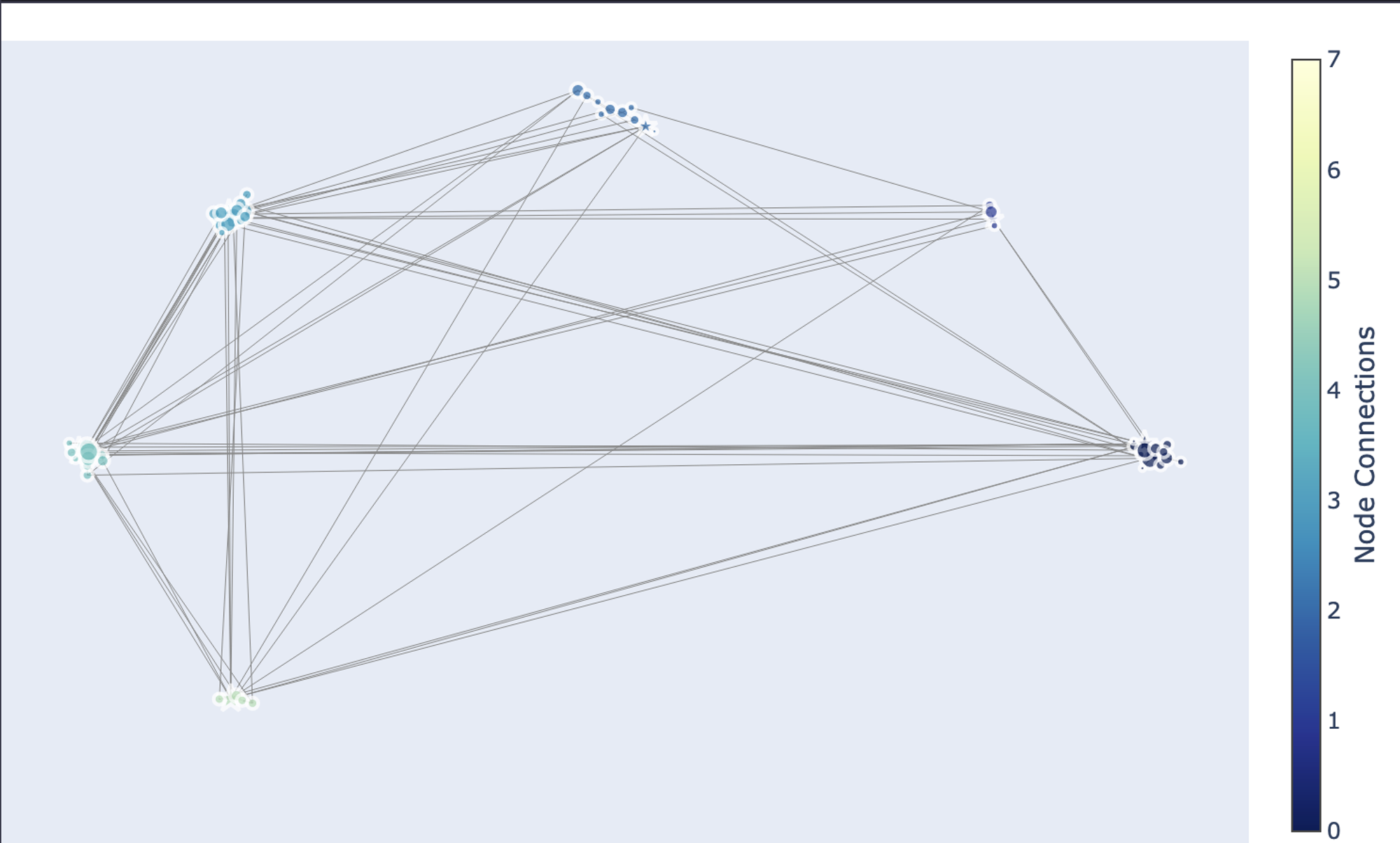
As you can see in the above graph, there are a total of 8 communities that are identified in the network graph.
This is it, you have now created a network graph, identified different communities, and finally visualized them. Hex also provides the feature to convert the code that you have written to a dashboard. You just need to head over to the App builder section and you will see a dashboard already prepared for you. You can adjust the components of this dashboard as per your need and once done you can click on the publish button to deploy this dashboard with ease.
Best Practices in Network Graph Analysis
Analyzing network graphs is a potent method for concluding intricate relationships. Throughout the analytical process, it is crucial to adhere to best practices to guarantee accurate and significant results. Here, we highlight important factors to take into account while choosing network metrics, representing networks, preprocessing and evaluating data quality, and visualizing and interpreting results.
Data Quality and Preprocessing
Data Cleaning: To begin, purge your data of any errors, duplication, or missing values. Make sure the node and edge characteristics are consistent.
Normalization: To standardize attributes and guarantee comparability between nodes and edges, normalize data as needed.
Managing Missing Data: Depending on how handling the missing data would affect the analysis, come up with techniques like imputation or exclusion.
Data validation: Verify that your data is accurate in representing the real-world network by checking its integrity.
Network Representation
Select the Proper Representation: Decide the weighted or unweighted, directed or undirected representation of your network.
Node and Edge qualities: Think carefully about which qualities to add to your network representation and how best to do so.
Graph Format: Select an appropriate graph format, such as an adjacency matrix or an edge list, based on the volume and complexity of your data.
Network Metrics Selection
Establish Analysis Goals: To help you choose the right network measurements, clearly state your analysis goals.
Think About Context: When choosing metrics, take into account the particulars of your network as well as the context of your research.
Balance Complexity and Interpretability: Select metrics that balance interpretability (to aid in understanding) and complexity (to capture nuances).
Validate Results: Whenever feasible, compare the analysis's findings with domain expertise or with those obtained using different techniques.
Visualization and Interpretation
Choose Effective Visualization Techniques: The structure and insights of your network can be successfully communicated by using the visualization approaches that you have chosen.
Emphasize Important Insights: To make interpretation easier, use visualization to draw attention to important network traits like clusters or center nodes.
Analyze Results in Context: Take into account both quantitative measurements and qualitative insights while interpreting your results, keeping in mind the network's domain and aims.
Iterative Process: Handle network analysis as an iterative process, fine-tuning visualization and interpretation in response to comments and additional research.
You can make sure that your network graph analysis is solid, perceptive, and useful by following these best practices.
See what else Hex can do
Discover how other data scientists and analysts use Hex for everything from dashboards to deep dives.
Ready to get started?
You can use Hex in two ways: our centrally-hosted Hex Cloud stack, or a private single-tenant VPC.