


Don't see what you need?
We're always expanding our collection of examples and templates. Let us know what you're working on, and we'll whip up an example just for you.
A quick guide to KPI Dashboards
Key Performance Indicators (KPIs) serve as vital signposts for businesses to measure their performance and guide their decision-making process. So KPI dashboards act as centralized platforms displaying the most critical information that assists in evaluating the overall health and success of a business.
A KPI dashboard is a visual interface that presents real-time data related to business KPIs. It presents complex data in an easily digestible and understandable format. From tracking sales performance to monitoring customer satisfaction or operational efficiency, KPI dashboards provide an at-a-glance view of the business's progress towards its defined objectives.
Building an effective KPI dashboard requires a strategic approach:
Define Your Goals and Objectives: Before you even start designing your dashboard, you must establish clear business objectives. What are you aiming to achieve? How can you measure success? The answers to these questions will help determine which KPIs are most pertinent to track.
Identify Relevant KPIs: Once the objectives are established, identify the KPIs that align with these goals. KPIs should be Specific, Measurable, Achievable, Relevant, and Time-bound (SMART). For instance, if your objective is to increase sales, a relevant KPI could be 'monthly sales growth'.
Design Your Dashboard: Design your dashboard in a way that is intuitive and easy-to-understand. Use visual elements like charts, graphs, and color-coded indicators to differentiate between various data points. Remember, the primary goal is to simplify data interpretation, so avoid clutter and prioritize data that offers valuable insights.
Integrate Data Sources: Connect your dashboard to the necessary data sources. These could range from internal systems like CRM or ERP software to external tools like Google Analytics. Ensure the data is updated in real-time to maintain the accuracy of insights.
Test, Refine and Update: Finally, after setting up your KPI dashboard, it's crucial to test it, refine it based on feedback, and keep it updated. A useful dashboard is not a one-time setup but requires constant refining to stay relevant.
Building a notebook dashboard
Building KPI dashboards within notebook environments provides a robust platform for data analysis, visualization, and exploration. With powerful capabilities of Python coupled with libraries like Matplotlib, Seaborn, and Plotly you can create dynamic and interactive KPI dashboards right within your notebook.
The first step is to load your data into your notebook. Data can be imported from various sources such as CSV files, databases, or even API endpoints. Once the data is loaded, perform necessary data cleaning and preprocessing. Python libraries like Pandas can be incredibly helpful in this stage.
With KPIs defined from your strategic process above, you can now use a visualization library to plot your data. Each KPI may require a different visualization method - line charts for trends, bar graphs for comparisons, pie charts for proportions, etc. Interactive libraries like Plotly or Bokeh can help add a layer of engagement to your KPIs, allowing users to explore data through hovering, zooming, and clicking.
Remember, a good dashboard tells a story. Arrange your visualizations in a logical, intuitive manner, guiding your users through your data narrative. A well-constructed KPI dashboard is more than just a data display. It provides businesses with insights that inform strategic decisions, identify opportunities for improvement, and highlight any areas of concern. By focusing on the most relevant and impactful KPIs, a dashboard becomes an essential tool for steering the business towards its objectives.
See what else Hex can do
Discover how other data scientists and analysts use Hex for everything from dashboards to deep dives.
FAQ
To create a dashboard, start by defining your business objectives and identify the relevant KPIs. Select a suitable dashboard creation tool, and then connect it to your data sources. Choose the right types of data visualizations to represent your data effectively. Design your dashboard in a user-friendly way, avoiding clutter and focusing on clarity. Finally, test your dashboard, refine it based on feedback, and keep it updated to ensure its ongoing relevance.
Well-designed dashboards are characterized by simplicity, clarity, and user-friendliness. For example, Mailchimp's dashboard is known for its straightforward design and clear data presentation. Shopify's e-commerce dashboard offers a real-time view of sales and customer data.
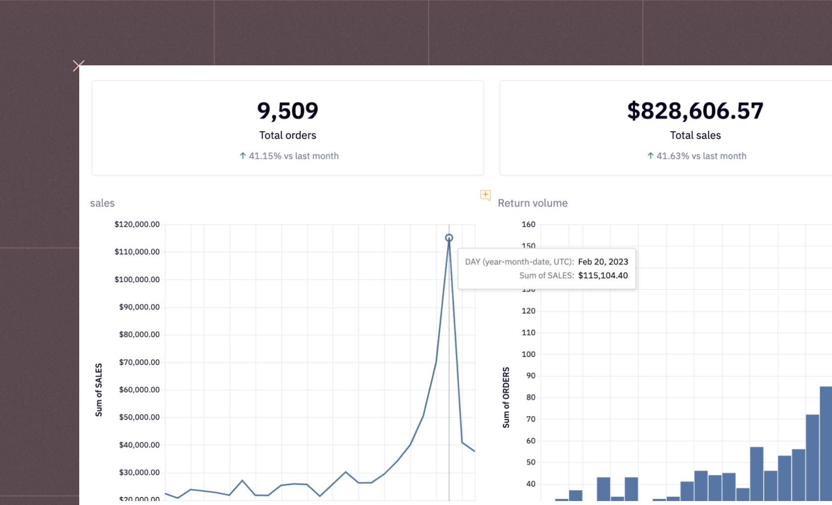
Sales dashboards typically display data related to key sales metrics. This can include the number of deals closed, sales revenue, sales by product or region, sales funnel stages, customer acquisition cost, customer lifetime value, and more. The goal is to provide a real-time view of sales performance to help guide decisions and strategy.
Creating a data visualization dashboard involves several steps. First, define your objectives and identify the relevant data. Next, choose a suitable dashboard tool, such as Hex. Connect this tool to your data sources, then select the types of visualizations that best represent your data. Organize your dashboard logically and intuitively, then refine and adjust based on feedback and ongoing needs.
A dashboard typically consists of several key components: data visualizations (charts, graphs, tables), KPI metrics, filters or controls for data manipulation, and often time-period selectors. The layout is typically broken into sections, with each section dedicated to a specific topic or objective. Additionally, dashboards often have a navigation or menu for switching between different views.
Data dashboards provide real-time insights, enabling timely decision-making. They visualize complex data in a user-friendly manner, promoting understanding and engagement across the organization. Dashboards also promote data-driven culture, align teams around common goals, and help in identifying trends, opportunities, and issues promptly.
To create meaningful dashboards, start by defining your key objectives and identifying relevant KPIs. Design your dashboard for clarity, using suitable visualizations and limiting the amount of data to avoid clutter. Regularly review and refine your dashboard to ensure it continues to deliver valuable insights and aligns with your changing business objectives.
Salesforce's dashboards are well-regarded for managing sales metrics and CRM. HubSpot offers excellent marketing and sales dashboards, and Shopify's dashboard is good for its e-commerce insights. Additionally, Google Analytics provides a comprehensive web analytics dashboard.
Yes, there are numerous dashboard generators available, including Tableau, Power BI, Google Data Studio, and Hex. These platforms facilitate users in creating customizable dashboards without needing extensive technical expertise.
Web-based dashboards include Google Data Studio that provides SEO and marketing dashboards, Geckoboard for business metrics tracking, and Cyfe for all-in-one business dashboards. Check out the Hex use cases above for examples of web-based dashboards.
Interactive dashboards are created by utilizing visualization and analytical tools which allow users to interact with the data. This process involves choosing the right software, integrating data sources, selecting appropriate visual representations (charts, graphs, etc.), and adding features for users to manipulate the data, such as filters, drop-downs, and sliders.
Can't find your answer here? Get in touch.