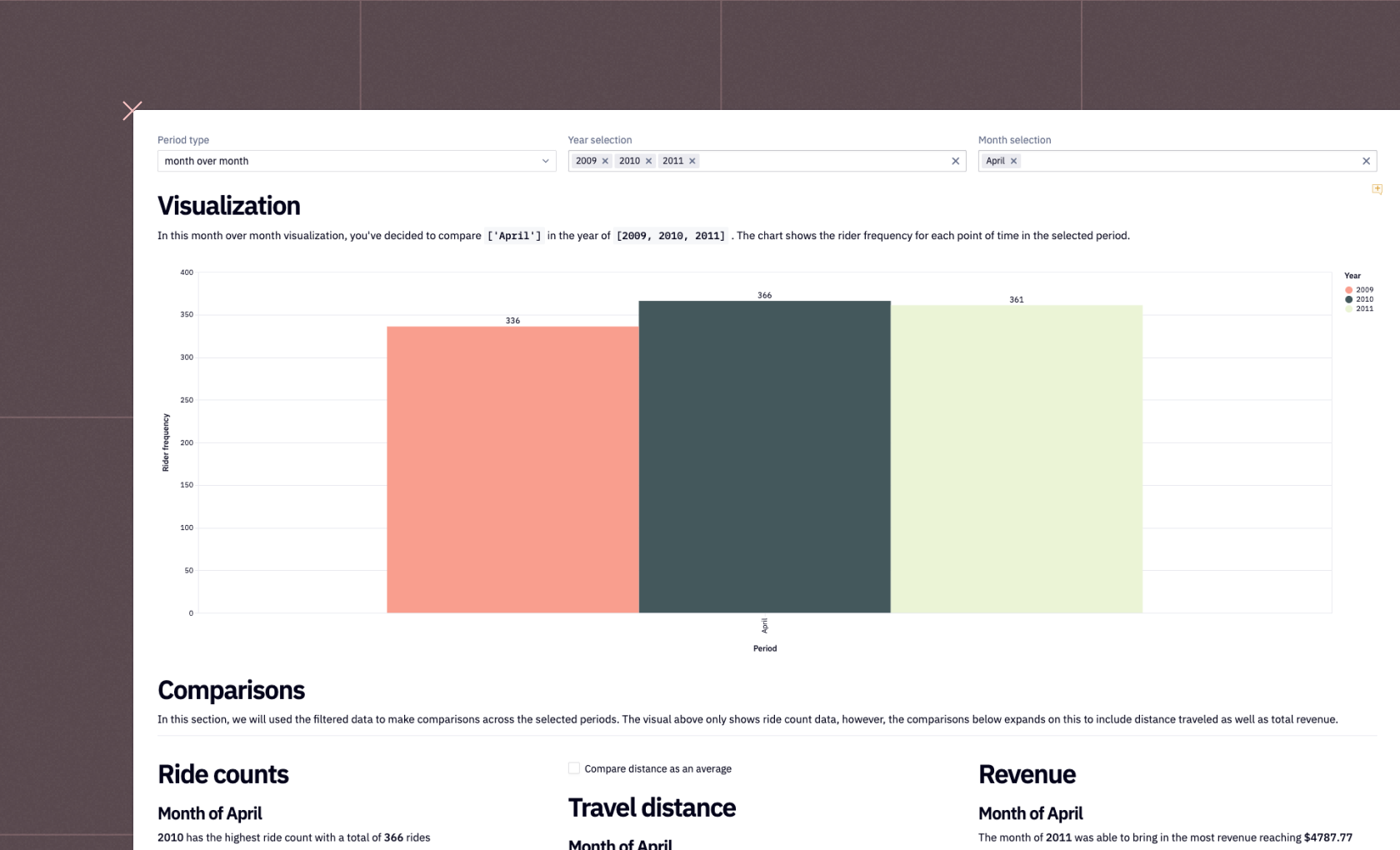
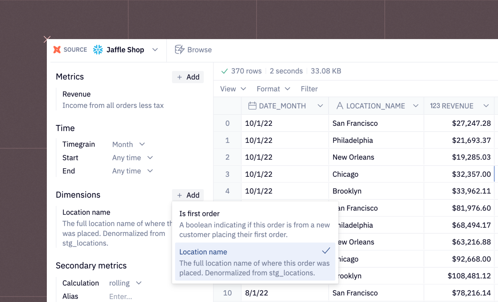
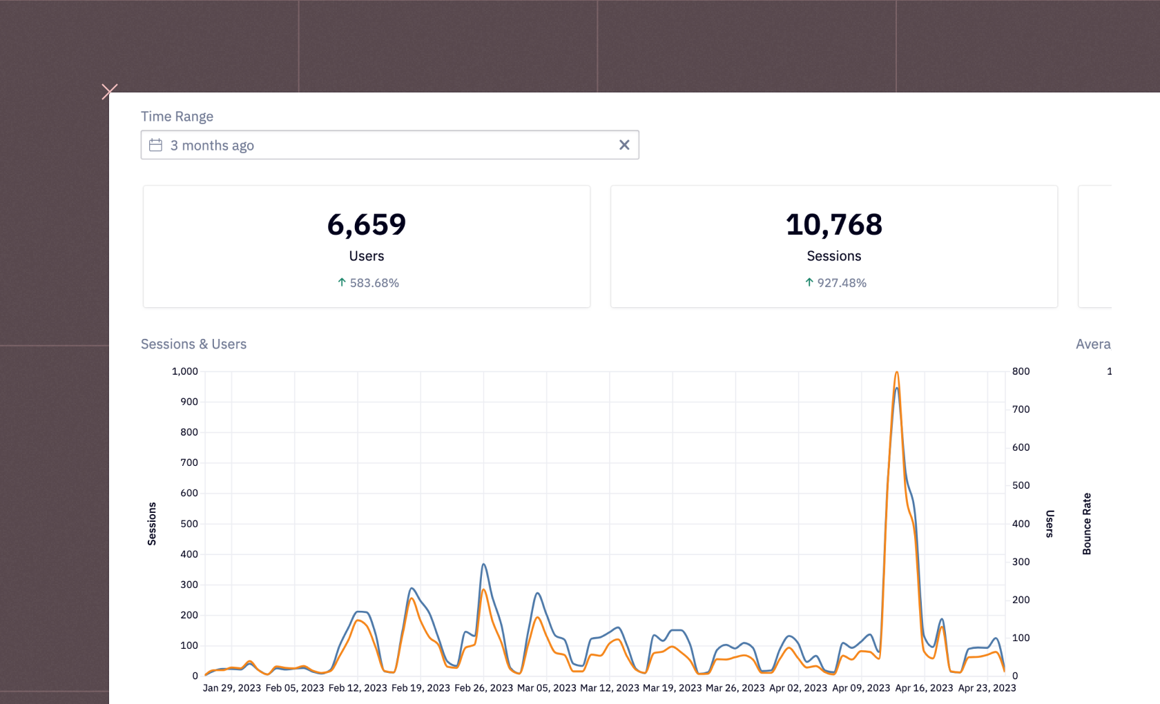
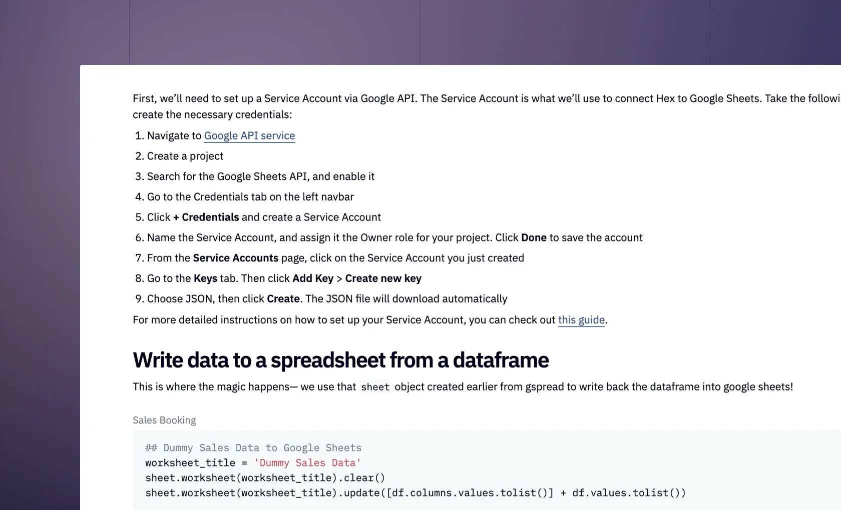
Don't see what you need?
We're always expanding our collection of examples and templates. Let us know what you're working on, and we'll whip up an example just for you.
A quick guide to Reporting
In the universe of business data, great reporting is the powerful telescope that brings distant constellations into focus. It's not just about having your finger on the pulse of data—it's about understanding the rhythm of your business and using that knowledge to your advantage. Think dashboards that offer a panoramic view of your business, business intelligence tools that turn data into actionable insights, and key business metrics that serve as your guiding north stars.Whether it's a KPI dashboard that highlights your entire company's health, an interactive report dissecting market reach for each sales team, or a visually stunning data story that breathes life into your quarterly review, reporting forms the backbone of informed decision-making.
Consider these typical scenarios:
- You need to discern whether your latest marketing campaign is bearing fruit.
- You want to know which products are stellar performers and which need a boost.
- You're curious about how your customer engagement rates have evolved over the past year.
The reporting framework is the same for all of these:
- Collect and curate the most relevant data
- Distill it into applied insights that make contextual sense and don't have unnecessary information
- Present these insights in a way that directly answer business questions
- And most importantly: tell a compelling data story that encapsulates the essence of your business narrative.
And that last piece really is the most important. The power of great reporting doesn't lie just in the data— it's also (mostly, even!) about how you present it. Just like with any great story, it's the delivery that drives the point home.Explore this page to see various examples of reporting done right. From dynamic dashboards to insightful data stories, every example maps to a real business problem faced by paying customers of Hex. If you see something that looks useful, click "Get a copy" to fork the example and get it running on your own data.
See what else Hex can do
Discover how other data scientists and analysts use Hex for everything from dashboards to deep dives.


FAQ
Can't find your answer here? Get in touch.