


TL;DR: last year, we launched Explore — a visual UI for analyzing data without writing a single line of code. Since then, it’s grown into a feature-rich tool with best-in-class capabilities for digging into data and building beautiful viz – including some new things we’re introducing today.
When we first introduced Explore, it gave Hex users a new way to visually analyze their data without requiring code. Just feed a warehouse table straight into Explore — no SELECT * necessary — and instantly start slicing, dicing, and visualizing charts and pivots based on the data.
A few months later, we added support for semantic models in the Explore UI, making it easy to build analyses on top of DRY, curated models. With governed metrics, teams could feel confident in the accuracy and consistency of their insights.
Since then, we’ve continued to double down on building powerful no-code tools in Explore. This means more folks than ever before outside of the data team can self-serve their way to answers — no SQL or Python needed.
But Explore features aren’t just for non-technical users; data teams can benefit from no-code, too! We've brought these new capabilities to visualization cells in your projects, sparing you from doing repetitive data transformations or scrolling through docs to find that one elusive parameter in your favorite Python charting lib.
Here’s a quick changelog-style roundup of the features we’ve shipped recently. All the features listed below can be found both in Explore and in chart and pivot cells within notebooks!
Explore is available on Team and Enterprise plans. Contact Sales to add the Explorer role to your workspace.
🔝 Top N
The classic question: “Who are our top 10 revenue-generating customers?”
It sounds like a simple question, but to actually build out the answer to a “top n” question like this requires some forethought. You could always slap a “limit 10” at the end of your query, but this will inevitably lead to follow-up questions that require adjustments to the underlying code: “What about the top 15?” “How much revenue are we generating from the rest of our customer base?” “Now can I see the top 10 customers by gross margin?”
Now, you can specify the top (or bottom!) n values in a chart or pivot, simplifying the work required to produce visualizations and enabling stakeholders to answer their own follow-up questions to their hearts’ desire. Our agents also have the ability to generate charts that use top n, so expect this to be leveraged when prompting Threads or the Notebook Agent.
Choose whether you limit results to the top/bottom n, and whether the “other” values are bucketed and included in the viz. App users can follow up on their own questions by drilling into the underlying data for any of the top n values, inspect the underlying data that makes up the “other” bucket, and change the measure that’s being sorted by.
🧮 Aggregate calculations
The classic question: “What’s our conversion rate?”
This one’s for the spreadsheet lovers. Hex’s charts and pivots have long had built-in aggregations that allow you to aggregate over raw data in a visualization — things like sum, count distinct, median, etc.
Before, any analysis that required more complex aggregation logic, like a ratio of sums or a weighted average, required upstream code in the notebook and was simply not possible in Hex’s Explore UI. Now with our aggregate calculations, you can represent any type of aggregation with formulas that use Hex’s excel-like calculation language.
Since all the underlying data is maintained and not transformed upstream, aggregations will automatically recompute based on how you’ve grouped and shaped the data. Of course, it’s also possible to write non-aggregative formulas to define dimensions that can be grouped by.
🟰 Pivot table totals & subtotals
The classic question: “What’s the total revenue across this whole data table?”
The headline here speaks for itself: we built the ability to add totals and subtotals to pivots. Previously, downstream code was required to aggregate over the pivot results, and Python was needed to render pivot tables that supported this stylistically. Now, you can do it all in one place in the pivot cell.
🪛 Drilling into underlying data
The classic question: “What does this segment look like broken down by region?”
To answer a quick follow-up question or sanity-check a surprising trend, you can drill into data from published apps, within Explore, or even in a notebook using a chart or pivot cell. Just click on the bar (or point, or slice) you’re curious about, choose how you want to break it down, and Hex will take you straight into a drilled-down exploration.
From there, you can keep drilling to get more granular — then, drill up to return to a higher-level grouping. No need to add filters, replace axes, or wrestle with your data. It’s a delightfully quick way to explore and inspect your data, even for SQL and code writers.
🔽 Filtering on aggregates and measures
The classic question: “Can you only show customers over 100k ARR in this viz?”
Have you ever found yourself wanting to filter out rows after they have been grouped and aggregated? Now you can, by adding a filter based on a measure or an aggregated dimension from within a chart or pivot.
Filtering on a semantic measure or an aggregated dimension is equivalent to using a "HAVING" clause in a SQL query. It’s a faster, easier way to slice your data and hone in on what matters, without writing any code.
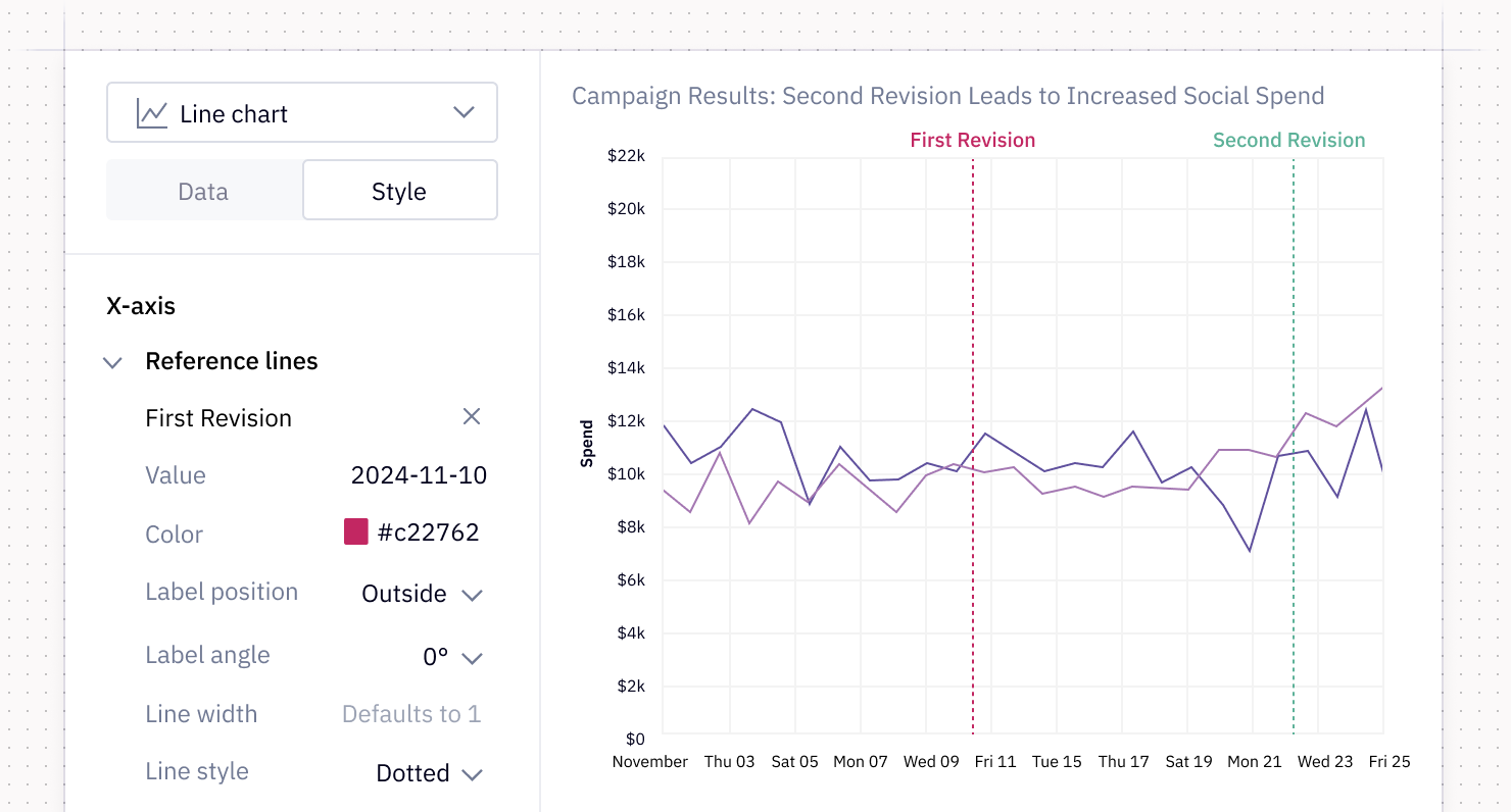
📈 Reference lines
The classic question: “How’s our campaign performing post-launch?”
A long-standing feature request for our chart cells was the ability to add a reference line to denote things like launch dates, revenue goals, and projected targets. Previously, users had to turn to charting libraries to render these context-rich charts in Python cells. We’ve since built the ability to define vertical and horizontal reference lines straight into our visualization editor - available for you to style them however you please!
Stay tuned for more
These updates are just the latest step toward making visual analysis in Hex more powerful, flexible, and accessible. We’re constantly shipping updates to our visualizations, so keep the feedback coming — your input helps us decide what to build next!