Blog
How smart teams simplify cohort analysis (and how you can, too)
Cohort analysis explained: purpose, types, and how to use
If you’re losing existing customers to churn, or not reaching some of your customers at all, your personalization tactics may be static, rather than dynamic and responsive. We recommend defining cohorts. Think of it as grouping people who behave the same (kind of like sorting friends who always order the same thing at dinner), and then watching how their behavior changes over time. It’s similar to clustering, but with a temporal aspect. You go beyond the basic demographics of your customers and instead get granular with their choices, and how and when they make them.
It’s a smarter way to segment your users, see what’s working, and double down on what drives your retention rate and revenue. In this guide, we’ll walk through how cohort analysis can unlock these insights. We’ll also show you how to run one.
What is cohort analysis?
We already know that a cohort is a group of users who share similar characteristics.
Cohort analysis performs data analysis techniques on these cohorts to track their behavior over a specific time period. Time is key here because every customer cohort is tied to when something happened, like a sign-up date or a first purchase.
Students who graduate in the same year or customers who buy in the same month form a cohort, for example. Analyzing them together reveals patterns you’d miss by looking at your entire user base all at once.
What is the difference between segmentation and cohort analysis?
Cohort analysis segments data based on a specific period of time. Customer segmentation, in contrast, is not tied to time. It groups customers by shared traits like location, behavior, or purchase history.
For example, customer segmentation might show who your top spenders are overall. Cohort analysis shows who spends the most in a specific month or which month drives the highest conversion rates in a year. It’s the difference between knowing who buys the most and when they buy the most.
Pro tip: Use this ready-made template to build strategic customer segments and unlock the full potential of your customer behavioral analytics.
Key benefits of cohort analysis
It’s no secret that a cohort analysis report allows businesses to gain a deeper understanding of their customer lifecycle. Here are a few more standout benefits that make it a game-changer:
- Personalized marketing strategies: Cohorts create more focused customer segments so you can craft targeted marketing campaigns. A personalized strategy for each specific cohort leads to better satisfaction, sales, or user retention. Ultimately, it improves the customer experience.
- Churn reduction: When a customer stops using your product or service, you’re experiencing churn. It’s like someone walking out of your store and never coming back. Let’s say your cohort analysis shows users who signed up in March are dropping off faster than others. That could mean a buggy feature, a confusing onboarding process, or a broken email flow that month. With this info, you don’t just react to churn; you prevent it.
- Effective fundraising: Instead of sticking to the usual metrics like total user count or gross revenue, use cohort analysis to tell a deeper story that investors actually care about. Show them how customers behave over time: Are they coming back? What actions lead to higher customer lifetime value? Which month brought in the most loyal buyers? When your data highlights real customer journeys, not just vanity metrics, it builds trust. And trust opens checkbooks.
Types of cohort analysis
Ready to form a cohort, but not sure where your customers or users belong? There are a few flavors of cohort analysis for us to choose from:
Time-based cohorts
Time-based cohorts group customers who made a purchase or interacted with your product for the first time during a specific time period. For instance, all customers who buy in January, February, etc. are a time-based cohort because they’re grouped by month.
Behavior-based cohorts
Behavioral cohorts group users by their actions or how they interact with your brand.
For example, a behavioral cohort could be customers who engaged with Instagram profile and ads in the same week, but hardly spent any time on your website. This might suggest that your Instagram content that week was more engaging than your website experience
Or maybe it’s just a Gen Z-heavy audience that prefers Instagram over landing pages.
Another simple example of a behavior cohort is users who interacted with your new product feature within a week of its launch.
Remember: you can’t really label a group as a behavior cohort unless it draws a meaningful or actionable insight tied to a KPI. For example, if the retention rates of a behavioural cohort (users who interacted with your new product feature) are higher than the rest, this indicates you should promote customers to use your new feature. But if it doesn’t give any useful insight, then it’s not a true behavioral cohort.
Size-based cohorts
Size-based cohorts group customers based on size, such as how much they spend or the size of their business.
For example, you might create one cohort of users who upgraded to an enterprise plan within 90 days of using your product, and another for those who remain on the base plan. From there, you can analyze their behavior separately, like feature usage patterns, and tailor your strategy:
- If you see more customers upgrading to the enterprise plan within the first 90 days, that’s your cue to promote the enterprise tier earlier in the customer journey.
- If your base plan cohort is exploring advanced features, that’s a signal they might be scaling. You can actively promote higher-tier plans in this case.
Similarly, if the enterprise users in your cohort have more budget and are actively seeking advanced features, you should work with your team on expanding your product features and customization options.
Event-based cohorts
These cohorts group customers based on a specific event or action they take within a set timeframe. For example, a cohort could include all users who made a purchase during your Black Friday sale.
By studying these cohorts, you uncover how specific events affect user activation, engagement, and customer retention.
How to perform cohort analysis
So, what does the actual cohort analysis look like in practice? Let’s first understand the different tools used to build it, and then build one.
SQL for time-based cohort analysis
SQL is your trusty sidekick when it comes to grouping users based on shared characteristics within a specific time period.
To align timestamps, you can use data truncation. For example, use `MONTH` to truncate each timestamp to the first day of the respective month. This way, you can easily group customers who signed up in the same month.
Now, when you want to dive deeper and see what those cohorts are actually doing, it’s time to bring in the events data. You can use join queries to combine cohort data with event data. For those unfamiliar, event data refers to specific actions that users perform. For example, an event might be a user subscribing to a plan, making a purchase, or clicking on a specific ad.
By combining cohort and event data, you can uncover insights like: "The January cohort made more purchases than the February cohort."
From there, you can use SQL select statements, aggregate and window functions to perform advanced analysis and uncover meaningful insights.
Best for: structuring cohorts directly from raw data, especially when working in data warehouses.
Python libraries for end-to-end cohort analysis
When it comes to cohort analysis, Python’s more flexible tools outpace SQL. Pandas is its go-to library for working with datasets.
With pandas, you can easily create and manipulate cohort tables by grouping your data based on specific time periods or customer behaviors. For instance, use `groupby()` to segment customers by their sign-up month, then apply `pivot_table()` to summarize their actions.
Matplotlib steps in to help visualize that data, with heatmaps and line charts often taking center stage for cohort representation.
If you're handling large datasets and need a speed boost, Polars is a high-performance alternative to pandas, built to optimize processing speed.
Best for: advanced analytics, flexible transformations, and visualizing cohorts from start to finish.
R packages for cohort analysis
R has a dedicated `cohort library` with pre-built functions for cohort analysis. These functions are designed to create cohort tables directly from raw data, making the process simpler.
Just like matplotlib in Python, R uses ggplot2 to visualize cohort behavior over time, helping you track trends. For handling dates and times, R offers lubridate, a package that makes working with date and time data a breeze.
Best for: fast cohort analysis using built-in functions.
Now you know you can use Python, SQL, or R to run cohort analysis. But what if your team uses a mix of them? Some might prefer SQL while others like Python. Switching between tools slows things down and makes communication harder.
That’s where Hex comes in. It streamlines cohort analysis by combining SQL, Python, and visualizations in a single, collaborative workspace. You can write SQL to build your base cohorts and switch to Python to manipulate the data, all in the same notebook.
Building cohort tables from raw data
Let’s walk through a practical example using event-based cohort analysis.
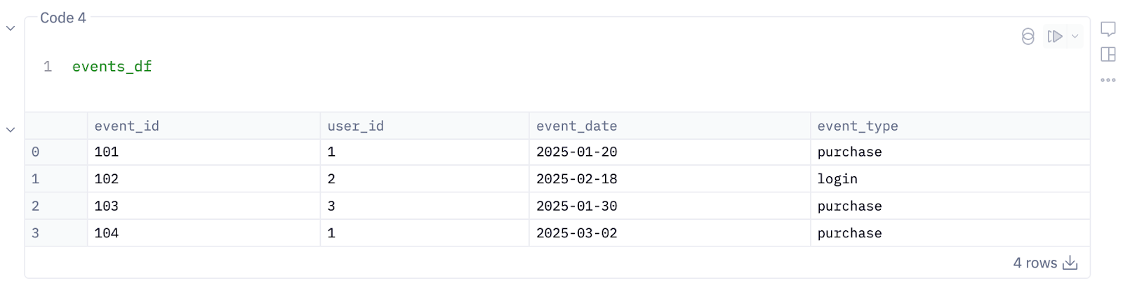
Say you’ve got two tables: “users” and “events” as shown in the images below. These help track what users are doing and when — the perfect setup for building cohort tables and spotting trends.
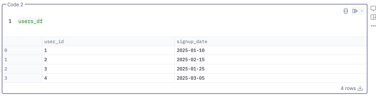
1. Define cohorts
Let’s start by assigning each user to a cohort based on when they first interacted with your product. In other words, we define a user’s first sign-up month as their cohort month.
You can do this using Python in a new Hex cell like this:
# Convert 'signup_date' to datetime
users_df['signup_date'] = pd.to_datetime(users_df['signup_date'])

# Extract the cohort month by truncating to the month
users_df['cohort_month'] = users_df['signup_date'].dt.to_period('M')

# Show the cohort month for each user
print(users_df[['user_id', 'cohort_month']])
3. Generate event-based cohorts
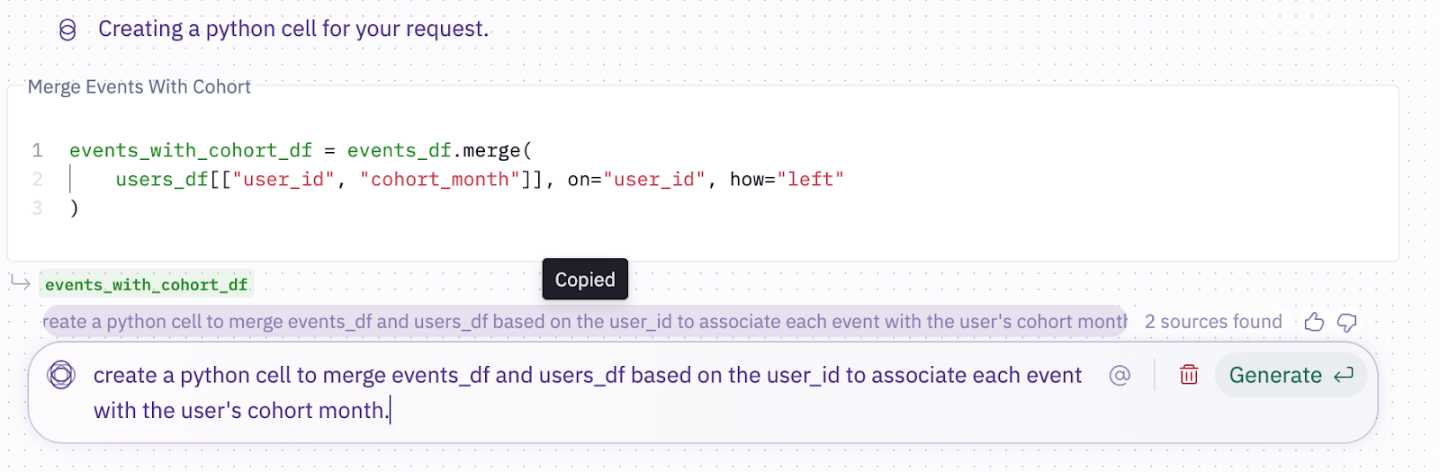
Now, we merge “events_df” and “users_df” based on the “user_id” to associate each event with the user's cohort month.
If you don't know how to write it in Python, ask Hex AI to “create a python cell to merge events_df and users_df based on the user_id to associate each event with the user's cohort month.”
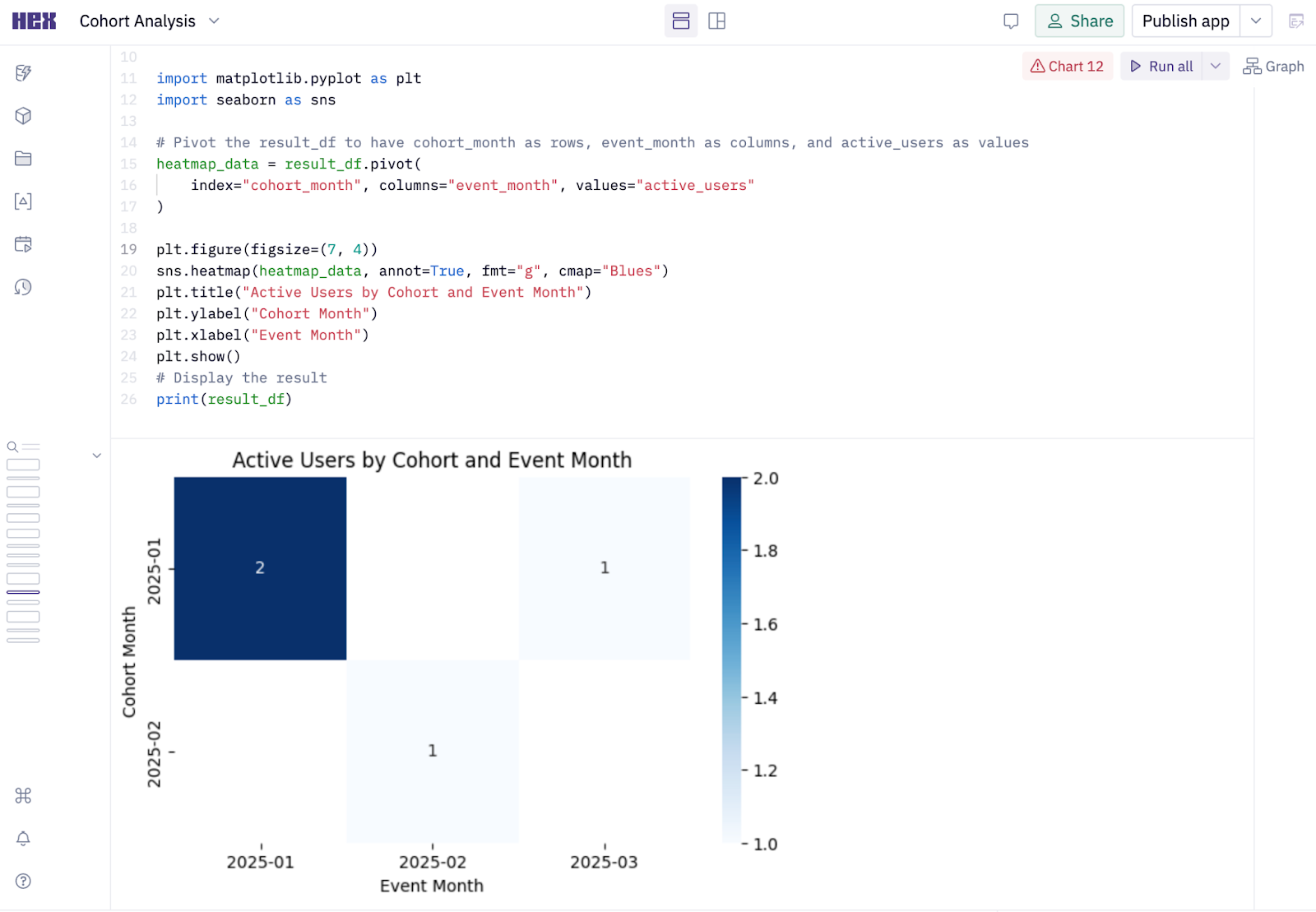
4. Extract actionable insights
Count how many distinct users from each cohort are active in each month:
result_df = events_with_cohort_df.groupby(['cohort_month','event_month'])['user_id'].nunique().reset_index()

# Rename the 'user_id' column to 'active_users'
result_df.rename(columns={'user_id': 'active_users'}, inplace=True)

# Display the result
print(result_df)
Then, we ask Magic AI to generate a heatmap from the results.
It generates:
If you're running this on a larger dataset, your output might look something like this:
Here’s what this tells you:
A hundred and fifty users who signed up in January stayed active that same month. By February, only 30 of them are still showing up. Come March, that number drops to just 10.
It’s like watching foot traffic in your store shrink, and you know when and where it happens. From here, you start asking why. Is user engagement slipping? Did something break in February? This is exactly the kind of insight cohort analysis is built for.
Cohort analysis simplified
Cohort analysis often requires both SQL and Python. However, juggling different tools and platforms can frustration-inducing bottlenecks. A modern workspace like Hex frees up your team and your data so they can flow.
With Hex, you can run Python and SQL in the same notebook. Just plug it into your data warehouse, pull in your data, run your analysis using whichever language fits best, and bring it all to life with data visualization using libraries like matplotlib.
Here’s the cherry on top: say you’ve got non-technical teammates who want insights but can’t write SQL or code. Hex Magic has your back. It takes plain English prompts and converts them into SQL queries, building cohorts based on exactly what users request.
And that’s not all; Hex automates common product analytics tasks, so your teams can move faster. Here is how Kong, an API management SaaS company, uses Hex to automate business reviews and A/B testing.
“Despite my 15 years of experience with various BI tools, Hex stands out as one of the most accessible platforms I’ve used and has a hands-on support team that understands our challenges in real-time, enabling precise answers and faster resolutions to any issues."
— Snehal Karanjkar, Product Analytics at Kong
To further streamline your cohort analysis, check out our free-to-use cohort analysis template and get started with analyzing your customer groups faster.
If this is is interesting, click below to get started, or to check out opportunities to join our team.