Python Data Visualization

Izzy Miller
With Hex, effortlessly visualize data from your SQL data warehouse using Python's robust tools like Matplotlib, Seaborn, Altair, and Plotly, ensuring a seamless transition from data storage to insightful visuals.
How to build: Python Data Visualization
How to Perform Python Data Visualization with Hex
Data visualization is a key skill for data analysts. Visualization allows you to take what can be mundane numerical data and transform it into beautiful graphs and charts to wow your audience. It can turn complex insights into easily understandable and actionable information, making it an indispensable tool for communicating data-driven stories effectively.
There are a huge variety of tooling options for visualizing data. Any BI tool will offer built-in visualizations for your data. BUt if you want to be able to play with your data and graphics better, and have more control over your design, you have to turn to programming languages like Python, R, Javascript, or Julia for creating advanced and interactive visualizations. While BI tools provide a powerful and user-friendly interface for data visualization, programming languages provide a higher degree of flexibility, customization, and control for data scientists, analysts, and developers.
Python has a rich ecosystem of libraries for creating different kinds of charts and plots. Charts created in different Python IDEs or Jupyter notebooks work exactly the same. Python is also flexible and extensible as it allows you to create custom visualization, combine multiple libraries, and integrate visualization code into larger applications or workflows. Code written in Python language is also cross-compatible i.e. visualization created in one system works similarly on other systems, the only condition is that Python and library versions should match in all the systems. Finally, Python provides great documentation and community support so that you are never stuck on your data visualization journey.
In this article, you will learn about Python data visualization, the most popular Python data visualization libraries, and some widely used graph types in the space of data science and machine learning. Finally, you will see how you can create different and interactive visualizations with the help of Python and Hex.
Python Data Visualization Libraries
Python offers a range of libraries for creating interactive data visualizations, each with unique features and capabilities:
Matplotlib
A foundational library for creating static, animated, and interactive visualizations in Python. Matplotlib is versatile, supporting a wide range of plot types and customization options. It integrates well with Numpy for handling complex numerical data and allows exporting visualizations in various formats.
Seaborn
Built on top of Matplotlib, Seaborn simplifies the creation of beautiful, informative statistical graphics. It offers enhanced support for themes and color palettes and integrates seamlessly with Pandas for structured data visualization. Seaborn is ideal for users seeking attractive default styles and color schemes.
Plotly
A library for making interactive, publication-quality graphs online. Plotly's strength lies in its ability to create complex, interactive plots that are web-friendly. It offers a high level of interactivity, with features like zooming and panning, and supports a variety of plot types, including 3D and statistical charts.
Altair
Focused on declarative statistical visualization, Altair is built on Vega-Lite and allows for concise, intuitive plot creation. It supports a wide range of interactive features and is designed to work well with Jupyter Notebooks and Pandas DataFrames, facilitating easy embedding of visualizations into web pages.
Bokeh
Targets web browsers for output, offering interactive, web-ready visualizations. Bokeh is suitable for creating interactive plots, dashboards, and data applications. It provides both high-level and low-level interfaces, enabling detailed control over plot elements and supporting real-time data streaming.
GeoPandas
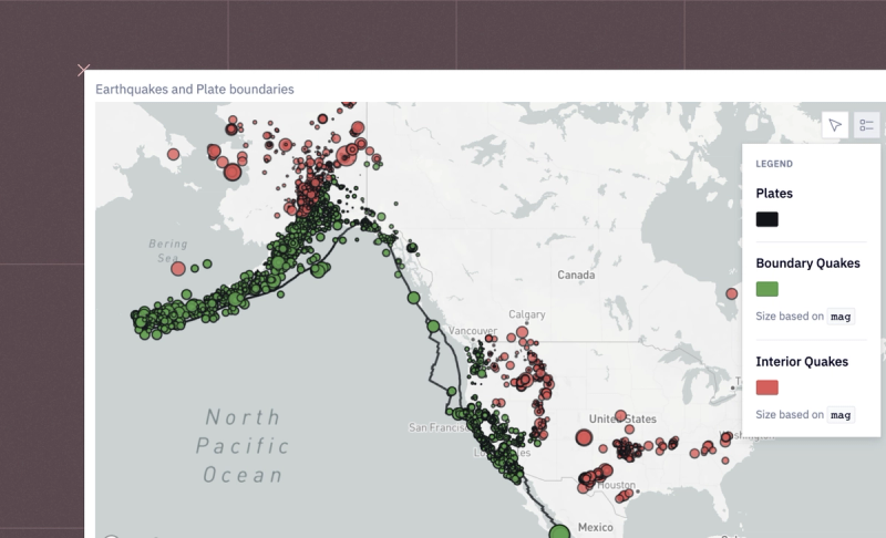
Extends Pandas for working with geospatial data, integrating with libraries like Shapely and Fiona for geometric operations and file access, respectively. GeoPandas facilitates the visualization of spatial data and operations, making it a powerful tool for map-based visualizations.
These libraries cater to different visualization needs and preferences, from static charts to interactive web plots and geospatial mapping, making Python a versatile tool for data visualization tasks.
Python Data Visualization with Hex
In this section, you will see a practical implementation of creating different types of plots using Python and Hex. Hex is a popular polyglot development environment that allows you to write code in multiple languages in the same environment. With Hex you read the data from one of the many data sources and write the code in different languages to visualize it. Hex also provides native chart cells that support almost all kinds of plotting requirements but if you want to work on graph customization that is not native-supported, you can choose a language like Python to create graphs using multiple libraries including Matplotlib, Seaborn, Altair, and Plotly. The best part about native chart cells is that you need not write a single line of code, all the complex graphs can be created by choosing a combination of details from the dataset.
For implementation, we will use Python 3.11 for writing the code and Hex as a development environment. Hex already come up with a set of popular libraries preinstalled. But, if you want to install any external library, you can use the Python Package Manager (PIP) for the same. We will be using the most popular dataset iris for creating different types of plots using multiple Python libraries.
Install and Load Dependencies
To begin with, we will need the Python libraries matplotlib, seaborn, plotly, and altair. These libraries come preinstalled in the Hex environment but in case they are not present you can install them using PIP as follows:
$ pip install matplotlib
$ pip install seaborn
$ pip install plotly
$ pip install altair
Once the libraries are installed, you can load them into the Hex environment with the help of the following lines of code:
import matplotlib.pyplot as plt
import seaborn as sns
import plotly.express as px
import altair as alt
Once the dependencies are loaded, the next step is to load the iris dataset. Luckily, Seaborn comes up with a set of dataset configurations which also includes the iris dataset. You need to use the load_dataset() method from Seaborn to download the iris dataset as follows:
# Load the Iris dataset
iris = sns.load_dataset('iris')
iris.head()
The dataset is loaded as a Pandas DataFrame which makes it easy to utilize further for analysis and visualization. The head() method shows the first few rows (default 5) from the dataset.
Matplotlib
Now, we will use the matplotlib library to create different types of graphs in Python.
Line Chart
To create a line chart using matplotlib, you can use the plot() method. This method accepts the input and plots the Y-axis vs X-axis plot. You can also define some additional arguments such as the color of the line or markers. Apart from the plot() method, matplotlib also provides methods to increase the visibility of graphs such as figure() to set the canvas size, title() to set the title for the plot, xlabel() and ylabel() to set the labels for your axis and finally a show() method to visualize your graphs. A simple line plot for the sepal_length feature of the iris dataset can be created as follows:
# Simple Line Plot
plt.figure(figsize=(10, 6))
plt.plot(iris['sepal_length'])
plt.title('Sepal Length')
plt.xlabel('Index')
plt.ylabel('Sepal Length (cm)')
plt.show()
As you can observe in the above graph, sepal lengths are represented on the y-axis while the index is shown on the x-axis.
Scatter Plot
To create scatter plots using matplotlib, you can use the scatter() method that expects the X-axis feature and Y-axis feature. To create a scatter plot for the sepal_length and sepal_width features in the iris dataset, you can write the following lines of code:
# Scatter Plot
plt.figure(figsize=(10, 6))
plt.scatter(iris['sepal_length'], iris['sepal_width'])
plt.title('Sepal Length vs Sepal Width')
plt.xlabel('Sepal Length (cm)')
plt.ylabel('Sepal Width (cm)')
plt.show()
As you can see, the relationship between these two features is easily represented by the scatter plot.
Histogram
You can easily create histograms in the Hex environment with the hist() method from matplotlib. You can also control the number of bins to specify various intervals. To check the distribution of the sepal_length feature, you can create a histogram as follows:
# Histogram
plt.figure(figsize=(10, 6))
plt.hist(iris['sepal_length'], bins=20)
plt.title('Distribution of Sepal Length')
plt.xlabel('Sepal Length (cm)')
plt.ylabel('Frequency')
plt.show()
As you can see, there is no specific distribution that can be observed in the data for the given feature.
Multifigure Plots (Subplots)
Matplotlib also allows you to create different types of graphs in a single plane (canvas). You need to use the subplot() method from matplotlib to do so. In this method, the only thing that you need to be careful about is the axes details. The subplots are created in a grid-like structure. For example, if you define a grid of 2X2, you could create 4 different graphs, here first value defines the rows while the second one represents the columns. If you want to analyze the relationship among all the features in the iris dataset, you can create a 2X2 grid with the help of the following lines of code:
# Complex Multi-Figure Plot
plt.figure(figsize=(14, 10))

plt.subplot(2, 2, 1)
plt.scatter(iris['sepal_length'], iris['sepal_width'])
plt.title('Sepal Length vs Sepal Width')

plt.subplot(2, 2, 2)
plt.scatter(iris['sepal_length'], iris['petal_length'])
plt.title('Sepal Length vs Petal Length')

plt.subplot(2, 2, 3)
plt.scatter(iris['petal_length'], iris['petal_width'])
plt.title('Petal Length vs Petal Width')

plt.subplot(2, 2, 4)
plt.scatter(iris['sepal_width'], iris['petal_width'])
plt.title('Sepal Width vs Petal Width')

plt.tight_layout()
plt.show()
In the above code, the
tight_layout()method takes care of the padding around the figure.
Seaborn
Now let's have a look at different graphs that can be created using Seaborn. Seaborn simplifies many tasks with Matplotlib, offering more visually appealing plots and easy-to-use interfaces for complex statistical visualizations.
Box Plot
Box plots are great to get an understanding and summarization of a set of data. They convey some of the most important information about data such as measures of central tendency and outliers. To know more about them, you can refer to this [link](https://www.ncl.ac.uk/webtemplate/ask-assets/external/maths-resources/statistics/data-presentation/box-and-whisker-plots.html#:~:text=A box and whisker plot,than one boxplot per graph.). To create a boxplot using Seaborn, you can use the boxplot() method. This method can accept a single feature or entire Pandas dataframe to create boxplots for individual features. To create a boxplot for the iris dataset, you can use the following lines of code:
# Box Plot
plt.figure(figsize=(10, 6))
sns.boxplot(data=iris)
plt.title('Box Plot of Iris Features')
plt.show()
Violin Plot
Violin plots are an advanced version of box plots and kDE plots. They are also helpful in understanding the underlying nature of the data. Violin plots are capable of depicting summary statistics and the density of each variable. To know more about it, you can refer to this link. To create a violin plot between sepal_length and species features in the iris dataset, you can use the violinplot() method.
# Violin Plot
plt.figure(figsize=(10, 6))
sns.violinplot(x=iris['species'], y=iris['sepal_length'])
plt.title('Violin Plot of Sepal Length by Species')
plt.show()
Pair Plot
Pairplots are a great means to identify the relationship among different variables as they allow you to create different graphs in one single canvas. You can choose among different plot categories in the pair plot. The most important point of paiplots is that it only covers the numerical variables for analysis. To know more about them, you can refer to this link. To create a pairplot, you can simply pass the entire dataset to the pairplot() method and a visualization for all numerical features will be created for you.
# Pair Plot
sns.pairplot(iris, hue='species')
plt.show()
Heatmap
Heatmap is a great way to identify the correlation among different features in the dataset. Seaborn allows you to create a heatmap that can easily depict if two features in a dataset are highly dependent or not. To create it, you need to use the heatmap() method from Seaborn and you can pass a correlation matrix to it to visualize the dependencies easily.
# Heatmap
corr = iris.corr()
sns.heatmap(corr, annot=True, cmap='coolwarm')
plt.title('Heatmap of Correlation Matrix')
plt.show()
Plotly
Unlike matplotlib and Seaborn, plotly is an interactive visualization tool. You can create graphs that can easily be customized with just a few clicks.
Scatter Plot
To create an interactive scatter plot using plotly, you need to use the scatter() method. You can provide an X-axis feature and a Y-axis feature or an entire dataframe to create the plot. You are also provided with a lot of customization features in Plotly. A sample code for creating a scatter plot may look like this:
import plotly.express as px

# Interactive Scatter Plot
fig = px.scatter(iris, x='sepal_length', y='sepal_width', color='species', title='Sepal Length vs Sepal Width')
fig.show()
Scatter 3D Plot
Plotly also provides features to create 3D plots in which an additional axis (Z-axis) is introduced. A sample scatter plot created in three dimensions may look like this:
# 3D Scatter Plot
fig = px.scatter_3d(iris, x='sepal_length', y='sepal_width', z='petal_length', color='species', title='3D Scatter Plot of Iris Species')
fig.show()
Network Graph
Another popular category of graphs is network graphs which are widely useful for geospatial data and other data categories where interdependency in the data points matter. These plots consist of multiple nodes and edges connecting them. To create a simple network graph in plotly, you can use the graph_objects function.
import plotly.graph_objects as go

# Network Graph
edge_x = [0, 1, 1, 2]
edge_y = [0, 0, 1, 1]
edge_trace = go.Scatter(x=edge_x, y=edge_y, line=dict(width=0.5, color='#888'), hoverinfo='none', mode='lines')

node_x = [0, 1, 2]
node_y = [0, 1, 0]
node_trace = go.Scatter(x=node_x, y=node_y, mode='markers', hoverinfo='text', marker=dict(showscale=True, colorscale='YlGnBu', reversescale=True, color=[], size=10, colorbar=dict(thickness=15, title='Node Connections', xanchor='left', titleside='right'), line=dict(width=2)))

node_trace.marker.color = [1, 2, 3]
node_trace.text = ['Node 1', 'Node 2', 'Node 3']

fig = go.Figure(data=[edge_trace, node_trace], layout=go.Layout(title='Network Graph', showlegend=False, hovermode='closest', margin=dict(b=20,l=5,r=5,t=40), xaxis=dict(showgrid=False, zeroline=False, showticklabels=False), yaxis=dict(showgrid=False, zeroline=False, showticklabels=False)))
fig.show()
As you can see the above graphs are interactive as you can hover over different nodes and edges.
Plot with Interactive Tooltips
You can also increase the interactivity of different plotly graphs by adding functionality such as hovers, panning, and zooming.
# Plot with Interactive Tooltips
fig = px.scatter(iris, x='sepal_length', y='sepal_width', color='species', title='Sepal Length vs Sepal Width with Interactive Tooltips', hover_data=['petal_length', 'petal_width'])
fig.show()
Altair
In this section, we will create a scatter plot, a bar chart, and a line chart using Altair.
Scatter Plot
To create an interactive scatter plot, you can use the mark_circle() method from altair. For example, a plot between sepal_length and sepal_width can be created as follows:
import altair as alt# Scatter Plot
alt.Chart(iris).mark_circle(size=60).encode(
x='sepal_length',
y='sepal_width',
color='species',
tooltip=['sepal_length', 'sepal_width', 'species']
).interactive()

Bar Chart
To create bar charts, you can use the mark_bar() method from altair. You can also define the additional columns based on which the colors of the specified features should be represented. For example, a sample bar graph in altair can be created with the following lines of code:
# Bar Chart
alt.Chart(iris).mark_bar().encode(
	x='species',
	y='average(sepal_length)',
	color='species',
	tooltip=['species', 'average(sepal_length)']
).interactive()
Line Chart
You can also create interactive line plots with the help of the mark_line() method from the altair method as follows:
# Line Chart
alt.Chart(iris).mark_line().encode(
	x='sepal_width',
	y='sepal_length',
	color='species',
	order='sepal_width',
	tooltip=['sepal_length', 'sepal_width', 'species']
).interactive()
Now that you have seen multiple libraries and how they can easily be implemented with Python and Hex. You must be glad to hear that Hex also provides the option to create a dashboard from the code that you have written in the development environment. You can head over to the App builder section and a dashboard will be ready for you. You can adjust the components of the dashboard accordingly and once done, you can click on the publish button to deploy your dashboard with ease.

Note: You can use other visualization libraries of Python to visualize your data in Hex and can also use the chart cells if you do not want to code for these plots.
Data visualization is going to be one of the core tools you’ll use as a data analyst. It is so key to good data analysis that you should consider learning elements of design and style to make sure your visualizations are always visually appealing. Doing so means you can effectively communicate complex data insights in a way that is accessible and engaging to your audience, ultimately driving informed decision-making and storytelling with data.
See what else Hex can do
Discover how other data scientists and analysts use Hex for everything from dashboards to deep dives.


Ready to get started?
You can use Hex in two ways: our centrally-hosted Hex Cloud stack, or a private single-tenant VPC.