Interactive Data stories

Izzy Miller
Like Google Docs, but fully interactive and synced to your data in real time. Build long-form analysis using SQL, Python, or No-Code, and publish beautiful reports that end users will love.
How to build: Interactive Data stories
As a data scientist or machine learning engineers we always emphasize generating insights from data. It could be predictions made for the future, visualizations used for analysis, or technical documents explaining our approach.
Data storytelling is a powerful technique to communicate these insights in compelling and meaningful ways. It focuses on creating interactive visualizations, narratives, and engaging presentations to convey the most complex information to technical and non-technical audiences.
When the data is presented as a visualized story, it makes the whole decision-making process easier. Moreover, effective data storytelling often encourages audience engagement as they are more likely to actively participate, ask questions, and explore the data further. Finally, the ultimate goal of any analysis, report, or story is to allow businesses to take action based on the insights. As business people understand data stories and visualization well compared to a bunch of code, data storytelling influences decision-making.
This page will teach you to build an interactive data storytelling dashboard using Python and Hex. More specifically, you will perform long-form analysis using SQL and Python to publish beautiful reports that end users will love.
Basics of Effective Data Storytelling
Now that you know a little about data storytelling and its importance, it is time to check some of the most important things that can influence your data storytelling.
Understanding the Audience
Understanding your audience is the most prominent part of effective data storytelling. Before tailoring your data stories you must identify the knowledge of your audience, their interest, and finally, their ability to comprehend technical concepts. Once you know about the audience, you can adapt the language according to that. For example, avoid technical jargon if the audience is not technical. Data story is not something you get to decide what you will convey, it’s what the audience requires. Also, you must understand the preference of the audience; some people like visualizations, while others like short pieces of text to grasp the information easily. Keeping all these things in mind can help you tailor a good data story that can surely impact the audience.
Identifying the Storytelling Objective
Identifying the data storytelling objective helps you understand the purpose and goals. You must know the business objective and clarify the call to action with data storytelling. Your analysis must align with the business objective and deliver the core information and insights from the data. You must also identify the type of story such as a problem-solving story, a case study, a journey, or a vision for the future. Keeping all these things in mind, you can enhance the way you do data storytelling.
Importance of a Clear Narrative Structure
Telling the story with data is not enough, this story should be molded in a way that makes sense for the audience. Your message will be clearer, and your audience will be more engaged with a well-structured narrative. Your story must simplify the complex information, highlight key points, and provide a sense of closure so that users are well aware of the entire message that you want to convey.
Data Storytelling Tools and Platforms
Jupyter Notebooks are a good way to explore and analyze data, as they can preserve both code and explanatory text. However, they are more biased toward the technical audience as they allow you to run each cell individually to analyze the results. If you are presenting the analysis results in a board meeting or to your stakeholders, Jupyter Notebook might not help you in that area. Although Jupyter’s environment allows you to create a lot of visualization plots with the help of various Python methods, creating a plot is not the end goal, you must present the insights obtained from them in a way that will make sense to the audience. This is where various tools like Hex, Tableau, Domo, or Google Data Studio help you.
Implement Interactive Data Story with Python and Hex
This section will teach you to build an interactive data story dashboard with Python and Hex. You will be building a data-driven pricing model for a product, using the fictional Spice Melange manufactured in the Dune universe as an example. We have named this example as What is the Price of Spice?. By the end of this section, you will learn to turn complex analysis into long-form analytical documents or whitepapers, complete with end-user interactivity with the help of Hex.
Setting the Scene
Before diving into the actual implementation, let’s set the context. Imagine you are a data analyst at Atreides Corporation, the (fictional) producer of Spice Melange in the Dune universe. The business is not making as much money as expected, so you have been tasked with developing a new pricing model for the product. The data that you will be using is stored in the Bigquery database. Your end goal is to create an interactive long-form analytical document that will improve the existing or develop a new pricing model for the product.
Prerequisites
We are going to use Python 3.11 and SQL language for development. Also, Hex will be our development environment, as it supports multiple language cells in the same working environment. So we can use both Python (code cells) and SQL (SQL cells) in the same environment. We will use Python Package Manager (PIP) to install the necessary Python dependencies. Finally, the data we will use is stored in the BigQuery database.
Install and Load Dependencies
Let’s start with installing the necessary Python dependencies with the help of PIP as follows:
$ pip install pandas numpy
$ pip install altair
The Pandas and Numpy libraries help us manipulate the data while altair will be used for data visualizations. Once the libraries are installed, you can import them into the Hex environment as follows:
import pandas as pd
import numpy as np
import altair
import json
Load and Explore the Data
Since we have data on purchases and customers in our BigQuery warehouse, we will use the SQL command in SQL cells to access data in the Hex environment. SQL cells connect directly to our data warehouse to let us write SQL queries with rich autocomplete, caching, formatting, and more. The data is always fetched as a Pandas DataFrame for easy manipulation and processing. To pull the data, you can use the following command:
SELECT * FROM atreides.spice_purchases
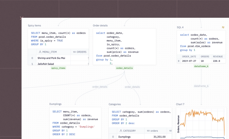
Once the data is loaded, we would want to explore it a bit to know more about it. In Hex, you can run another SQL query against the results of the previous SQL query. This pattern is called Chained SQL in Hex. This feature allows you to create complex and iterative queries without creating messy and buggy CTEs or subqueries.
We will now check the total number of sales based on the dates in our dataset. You need to write the following SQL query for the same:
select CREATED_DATE, COUNT(*) from spice_purchases GROUP BY 1
Similarly, you can use some other SQL commands to explore the data in detail.
Baseline
98% of Atreides Corp.’s revenue is attributed to spice production and sale. In the last 3 months alone, 447182 decagrams of spice were produced and sold, netting 189293145274.0 solari on the Imperial Market.
Let’s check out the total revenue and the average price based on the dates in the data.
SELECT CREATED_DATE,
   	COUNT(*) AS count,
   	SUM(price_per_g*grams_spice) AS revenue,
   	AVG(price_per_g) AS avg_price
FROM spice_purchases
GROUP BY 1
Now, one of the most important features that Hex provides is Chart Cells. These cells allow you to create different charts without writing any code. Also, they automatically guess the kind of chart you want to create and provide the full flexibility to change the chart type and reformat it to suit whatever you have in mind.
For example, a line plot for data based on each purchase day might look something like this:

Problems with The Current Pricing Model
Currently, Atreides Corp sets contractual, fixed prices with each of the buyers and entities that they do business with. These prices range fairly drastically depending on volume and relationship.
To check the minimum and maximum price per gram values, you can now use the Python cell.
min_price = spice_purchases['price_per_g'].min()
max_price = spice_purchases['price_per_g'].max(
The cells that you see above are the single value visualizations. They’re great on dashboards but also work well as part of an interactive document like this one. They can be resized and reoriented in the published app.
Now, let’s check out the facts that make this pricing model problematic.
Note: Since we are creating a report, the next section will first have the results and then the plots so that out end report will look good.
1. Prices are Fairly Static Over Time
Prices are locked at the initial time of contract and they have not been changed since. It’s difficult to renegotiate these prices. Fluctuations in the daily average sold price are due to different prices for customers.

2. Customers Have Different Prices
Negotiated prices range broadly based on the initial deal size. There are nearly as many transactions done at the lowest price tier (s21,000) as there are at the highest (s60,000+).

Note: Chart cells have a built-in Histogram type to make binned visualizations easy to build. We’re adding a lot of charts and data to this study, but we’re not going to worry about resizing and organizing them neatly until it comes time to build the finished app view.
Now we’ll pull data on our production costs, and use this to build a profit margin model. Notice how we use one database SQL query to pull in a new dataset, and then join it into the results of the earlier query using dataframe SQL.
Here, we’re using the same database, but this pattern works for joining datasets across databases or even joining data from a .csv or Google sheet with data from a database.
SELECT CREATED_DATE,
   	production_cost_per_g,
   	shipping_cost_per_g
FROM atreides.daily_spice_production_costs
Next, let’s select the average details from the dataset based on the dates as follows:
SELECT
	s."CREATED_DATE",
	AVG(s.price_per_g) AS price,
	AVG(d.production_cost_per_g) AS prod_cost,
	AVG(d.shipping_cost_per_g) AS ship_cost,
	AVG(d.production_cost_per_g + d.shipping_cost_per_g) AS total_cost,
	AVG(
    	s.price_per_g / (d.production_cost_per_g + d.shipping_cost_per_g)
	) AS avg_margin
FROM
	spice_purchases AS s
LEFT JOIN daily_spice_costs AS d ON cast(d."CREATED_DATE" as date) = cast(s."CREATED_DATE" as date)
GROUP BY 1
3. Production costs are highly variable.
Production costs change unpredictably and constantly based on climatic variables, fuel cost, and politics— in contrast to the price at which we can sell the product. We don’t know the cost of production until after all the numbers are run at the end of the day.

4. Top Customers and $$ left on the table
In this section, we will run a query to see the most frequent purchasers and use Conditional Formatting to turn the table of results itself into a visualization that highlights some outliers. The query will look something like this:
SELECT buyer_name, associated_entity,
   	SUM(total_cost) AS total_spend,
   	COUNT(*) AS total_transactions,
   	SUM(grams_spice) AS grams_purchased,
   	AVG(price_per_g) AS average_price
FROM spice_purchases
GROUP BY 1,2
ORDER BY 3 DESC
Now, we’re going to make this document interactive by adding an Input Parameter. This multi-select is populated with options from the above SQL query, so a reader of the final document can select a customer to drill into.
When a new selection is made by a user, the relevant code cells below will automatically re-execute using the new values. This is powered by the Reactive Execution model, so only necessary cells will be re-run— not the whole project.

Next, we will define a JSON schema to show our results in the end report as follows:
config = json.loads("""
{
	"width": 500,
	"height": 400,
	"$schema": "<https://vega.github.io/schema/vega-lite/v4.json>",
	"layer": [
    	{
        	"data": {
            	"name": "layer00"
        	},
        	"mark": {
            	"type": "point",
            	"clip": true,
            	"tooltip": true
        	},
        	"encoding": {
            	"opacity": {"value": 1},
            	"x": {
                	"field": "total_spend",
                	"type": "quantitative"
            	},
            	"y": {
                	"field": "total_transactions",
                	"type": "quantitative"
            	},
            	"color": {
                	"field": "buyer_name",
                	"type": "nominal",
                	"legend": null
            	},
            	"size": {
                	"field": "grams_purchased",
                	"type": "quantitative"
            	}
        	}
    	},
    	{
        	"data": {
            	"name": "layer01"
        	},
        	"mark": {
            	"type": "point",
            	"clip": true,
            	"tooltip": true
        	},
        	"encoding": {
            	"opacity": {"value": 1},
            	"x": {
                	"field": "total_spend",
                	"type": "quantitative"
            	},
            	"y": {
                	"field": "total_transactions",
                	"type": "quantitative"
            	},
            	"color": {
                	"field": "buyer_name",
                	"type": "nominal",
                	"legend": null
            	},
            	"size": {
                	"field": "grams_purchased",
                	"type": "quantitative"
            	}
        	}
    	},
    	{"data": {
            	"name": "layer00"
        	},
  	"mark": {
    	"type": "line",
    	"color": "firebrick"
  	},
  	"transform": [
    	{
      	"regression": "total_spend",
      	"on": "total_transactions",
      	"method": "exp"
    	}
  	],
  	"encoding": {
    	"x": {
      	"field": "total_spend",
      	"type": "quantitative"
    	},
    	"y": {
      	"field": "total_transactions",
      	"type": "quantitative"
    	}
  	}
	}
	],
	"resolve": {
    	"scale": {}
	},
	"datasets": {
    	"layer00": [
        	{
            	"name": "dummy",
            	"value": 0
        	}
    	]
	}
}
""")
Then we will filter our dataset based on the selected options from the previous step.
if customers_of_interest:
   config['layer'][0]['encoding']['opacity']['value'] = 0.25
   dataset = customer_facts[customer_facts['buyer_name'].isin(customers_of_interest)]
else:
	config['layer'][0]['encoding']['opacity']['value'] = 1
	dataset = customer_facts
Some of our most frequently purchased customers are under-monetized. Basq, despite being our 4th largest buyer by volume, is only our 44th highest spending customer, due to an unfortunately timed price negotiation that sorely needs updating! The 1st, 2nd, 3rd, and 5th largest buyers by volume all pay, overall, over twice as much as Basq.
We need a better pricing structure that still feels fair to our loyal customers but doesn’t leave us exposed to unpredictable production costs and leaving money on the table at large customers.
To plot the graph between, total spends and the total transactions, you can use the following lines of code:
chart_customer_facts = altair.Chart.from_json(json.dumps(config))
chart_customer_facts.datasets.layer00 = customer_facts.to_json(orient='records')
chart_customer_facts.datasets.layer01 = dataset.to_json(orient='records')
chart_customer_facts.display(actions=False)
A Better Model
A better model would be adaptive, charging perhaps even a lower average rate, but on a more frequently updating “spot price” basis. Customers would negotiate a coefficient of the baseline production cost based on their load commitments.
There are a few possible pricing models:
- The baseline model is just the existing default state with no changes to the pricing model. It’s here as a control.
- The carryforward model takes yesterday’s production cost and assumes that it’ll hold today as well. It’s that simple! At the end of the day, we get the real production cost, and use that to infer tomorrow’s fixed sale price.
- The trailing_4 model sets today’s sale price to the trailing 4-week average of production costs. Ideally, this smooths out spikes and provides more buffer.
Note: The charts and parameters below are set on the most optimal model: a 4-day trailing production cost average with a 1.8x multiplier on production cost.
You can use the Hex feature to decide on the parameter as follows:

Now we’ll run some Python and SQL code to simulate prices and margins using these models.
simulated_data = daily_costs_vs_prices
avg_price = simulated_data['price'].mean()
avg_margin = simulated_data['avg_margin'].mean()
simulated_data.sort_values(by=['CREATED_DATE'],inplace=True)
simulated_data['baseline_cost'] = simulated_data['total_cost']
simulated_data['carryforward_cost'] = simulated_data['total_cost'].shift(1)
simulated_data['trailing_4_cost'] = simulated_data['total_cost'].rolling(4).mean()
Then we want to calculate buyer_price_coefficient. This coefficient is computed by converting the price_per_g (price per gram) column to a float and then dividing it by an array-like value provided by the placeholder {{ price_metric | array }}.
This query analyzes and compare the purchasing behavior of different buyers in terms of their spending on spices, measured by the adjusted price per gram.
SELECT buyer_name, price_per_g, price_per_g::float/{{ price_metric | array }} AS buyer_price_coefficient
FROM spice_purchases
GROUP BY 1,2
ORDER BY 1 ASC
Next, This SQL query performs the complex data join and calculation needed to analyze the cost and pricing dynamics for different buyers over time, factoring in both historical costs and a profit coefficient.
SELECT sp.CREATED_DATE,
   	sp.buyer_name,
   	si.carryforward_cost *  (pb.buyer_price_coefficient + {{profit_coefficient}}) AS carryforward,
   	si.trailing_4_cost *  (pb.buyer_price_coefficient + {{profit_coefficient}}) AS trailing_4,
   	pb.price_per_g AS baseline_price
FROM spice_purchases sp
LEFT JOIN simulated_data si ON si.CREATED_DATE = sp.CREATED_DATE
LEFT JOIN price_by_buyer pb ON pb.buyer_name = sp.buyer_name
GROUP BY 1,
     	2,3,4,5
     	ORDER BY 2 ASC
This code snippet is uses the melt function from pandas to reshape buyers_prices. In this case, it converts the DataFrame from a wide format to a long format. The id_vars parameter specifies the columns to be retained as-is (CREATED_DATE and buyer_name).
The value_name is set to "price", which will contain the corresponding values from these columns. This transformation is useful for making the data more suitable for certain types of analysis, particularly when dealing with time series or panel data, as it simplifies the structure and makes it easier to apply certain analytical techniques.
buyers_prices = buyers_prices.melt(id_vars=["CREATED_DATE", "buyer_name"],
    	var_name="model_type",
    	value_name="price")
Then we use this query to compare different pricing models against a standard baseline to understand their impact on prices. It starts with a Common Table Expression (CTE) named baseline, which selects all records from the buyers_prices table where the model_type is 'baseline_price'.
The main query then selects the buyer_name from this baseline data and calculates three key metrics.
- The first metric,
average_price_increase, is the average percentage increase in prices compared to the baseline, defaulting to 0 if there are no modeled prices. This is calculated by averaging the ratio of modeled prices to baseline prices, subtracted by 1. - The second metric,
average_modeled_price, is the average of the modeled prices, but if there are no modeled prices, it defaults to the average of the baseline prices. - The third metric is the simple average of the baseline prices.
The buyers_prices table, aliased as modeled, is joined with the baseline data on buyer_name, filtering modeled data based on a specified model_type (represented by {{simulate_model}}).
WITH baseline AS
  (SELECT *
   FROM buyers_prices
   WHERE model_type = 'baseline_price' )
SELECT baseline.buyer_name,
   	COALESCE(AVG(modeled.price/baseline.price)-1,0) AS average_price_increase,
   	COALESCE(AVG(modeled.price),AVG(baseline.price)) AS average_modeled_price,
   	AVG(baseline.price) AS average_baseline_price
FROM baseline
LEFT JOIN buyers_prices modeled ON baseline.buyer_name = modeled.buyer_name
AND modeled.model_type = {{simulate_model}}
GROUP BY 1
Now that you have used the new pricing approach, you can check the average price increase as follows:
avg_increase = simulated_prices_comparison['average_price_increase'].median()To check the aggregated data based on week you need to use the following sql command:SELECT DATE_TRUNC('week', CREATED_DATE) AS week,buyer_name,
price_per_g,
SUM(grams_spice) AS total_grams,
SUM(total_cost) AS total_cost
FROM spice_purchases
GROUP BY 1,
2,3
All that’s left is to compare our models to one another and report on some high-level metrics from each. We’ll join them all together in a SQL query, and add a chart and some single value visualizations.
SELECT DATE_TRUNC('week', bp.CREATED_DATE) AS week,
   	bp.model_type,
   	SUM(sales.total_cost) AS real_revenue,
   	SUM(sales.total_grams * bp.price) AS modeled_revenue,
   	SUM(d.total_cost * sales.total_grams) AS real_cost,
   	SUM(sales.total_cost)-SUM(d.total_cost * sales.total_grams) AS real_profit,
   	SUM(sales.total_grams * bp.price)-SUM(d.total_cost * sales.total_grams) AS modeled_profit,
   	SUM(sales.total_grams * bp.price)-SUM(d.total_cost * sales.total_grams) - SUM(sales.total_cost)-SUM(d.total_cost * sales.total_grams) AS profit_difference
FROM buyers_prices bp
LEFT JOIN week_sales sales ON sales.week = DATE_TRUNC('week', bp.CREATED_DATE)
AND sales.buyer_name = bp.buyer_name
LEFT JOIN daily_costs_vs_prices d ON DATE_TRUNC('week', d.CREATED_DATE) = DATE_TRUNC('week', bp.CREATED_DATE)
GROUP BY 1,
     	2
     	ORDER BY 1 ASC
LIMIT 1000
Finally, to compare the actual and predicted profit you can use the following line of code:
actual_prof = outputs['baseline_profit'][0]
predicted_prof = outputs['modeled_profit'][0]
new_modeled_profit = predicted_prof / actual_prof - 1
Winner: Trailing 4 model @ a cost multiplier of 1.2x
The trailing 4-day model smooths out the spikes and dips in production costs that were making pricing unstable and performs just slightly better than a simple 1-day carry-forward.
Setting a standard multiple on production costs of 1.2x and applying that to existing customer discounts results in a median 4.3% price increase for customers (with many customers receiving a discount!) and a 5.58% profit increase for Atreides.
Atreides Corp can expect to see a 5-6% boost across the board and more stable returns if we implement this new, dynamic pricing model.
Now you might be wondering what exactly the end report might look like. To check the same, you need to head over to the App section (seen on top of the environment). This section will show the long-form analytical document. You can resize elements, remove cells, and otherwise customize or curate the view that will eventually be published and shared with your stakeholders.

You can now share this result with the rest of the company by turning the analysis into a document-style app that they can read without needing to understand SQL or Python.
To check the demo of the finished app, you can refer to the video on this page.
See what else Hex can do
Discover how other data scientists and analysts use Hex for everything from dashboards to deep dives.


Ready to get started?
You can use Hex in two ways: our centrally-hosted Hex Cloud stack, or a private single-tenant VPC.