Blog
How collaboration changes everything, from design to data
Leaving fragmentation, local files, and version control hell in the past

If you’re new to Hex, it’s a platform that brings together fragmented analytics workflows, makes them collaborative, and easy to share with stakeholders. Because of this, we often hear our product described as “Figma for data.” First of all, congratulations to our friends at Figma for reaching “X for Y” status 🎉.
As a Designer, I found myself initially mulling over this comparison. Figma transformed the way Design teams work. It’s humbling to hear that Hex is part of a parallel transformation that’s happening with Data teams. But how true is the analogy, really?
Let’s dig into it, starting with some history:
The Stone Age of design workflows
Designers have long had powerful software at their disposal. Adobe’s creative suite – including Photoshop, Illustrator, Flash, InDesign, and others – had a big role in driving the personal computing revolution, and has been used by generations of designers to do their work.
Fun fact: Adobe Photoshop was originally created more than 30 years ago, back in 1988. It only worked in black and white back then!
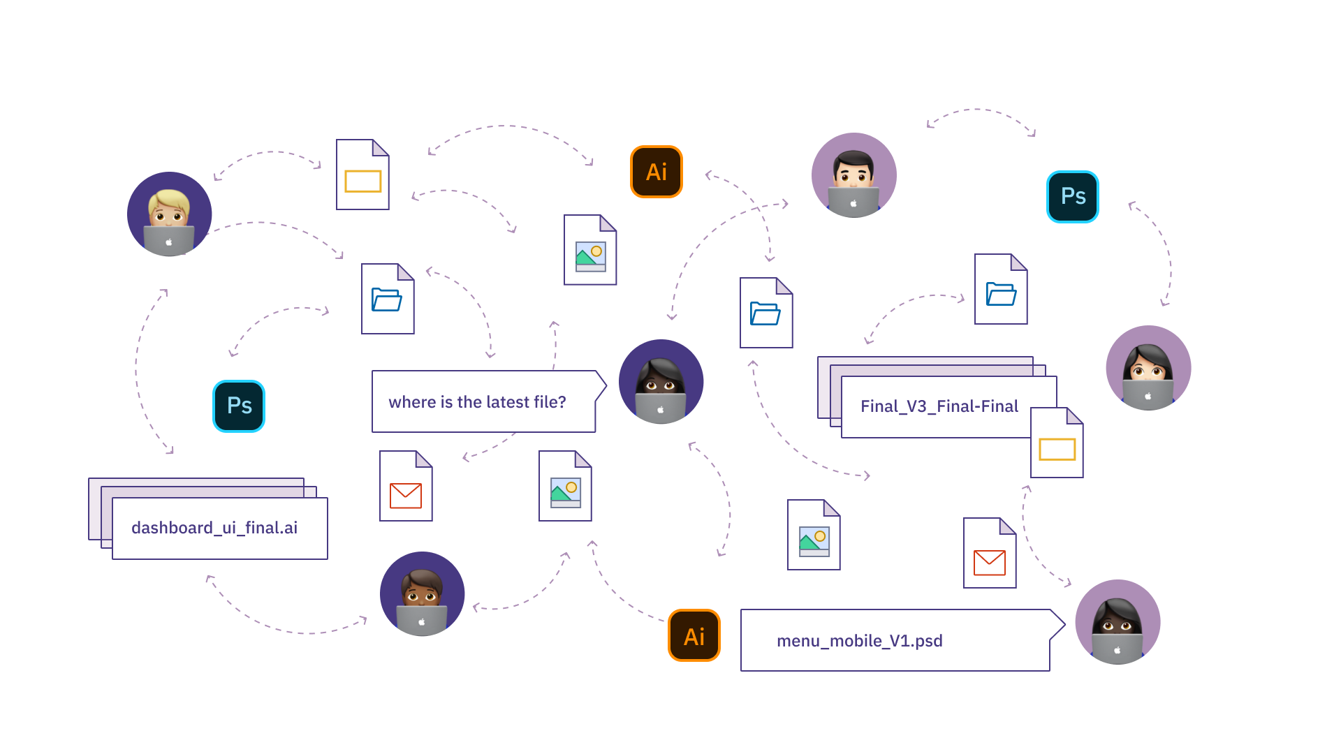
While extremely capable for individual work, these local-file-based tools infamously broke down when it came to collaboration and sharing.

To work with someone else on a design, you’d email files back and forth, or set up shared FTP directories, or use Dropbox folders. Files were often out of date, and it wasn’t uncommon for you and a colleague to make simultaneous edits resulting in un-mergeable differences. Who last touched `Table Design v3 Final new.psd`? It was a slippery slope into versioning nihilism.
Even worse? Working with stakeholders on other teams who didn’t have licenses for design tools. To share with them, we’d have to create PDF exports, or Powerpoints, or literally just print things out (are we out of toner?).
A whole cottage industry of accessory apps, like Abstract, Wake, and InVision sprung up to try and bridge this gap, but the end-to-end workflow still felt fragmented, clunky, and high friction.
And then Figma came along
Figma was originally released in 2015 as a web-first alternative for design, and introduced real-time multiplayer in 2016. At first, it was… not great for many individual tasks. Basic things like creating shapes or masks were clunky and slow compared to my beloved Sketch.
But Figma started gaining adoption because it did one thing way better: best-in-class collaboration. Multiplayer, comments, and shared state transformed the way we as designers work within our teams – no more emailing files around! It’s now easy to partner, review each other’s work, and re-use elements between projects.
Even more profound is the way Figma transforms how Design as a function works with other stakeholders. Now PMs and Marketers and Engineers can participate in the design process, viewing and commenting on work in real time. By lifting the curtain and inviting others in, Figma not only eliminates passed-around screenshots and PDFs, it makes our work as designers more visible and impactful.
Kevin Kwok captured this well in Why Figma Wins:
While Figma has been building the ideal tool for designers, they’ve actually built something more important: a way for non-designers to be involved in the design process.
Figma is easy to access and contribute, so now people from almost every team can participate.
By establishing this collaborative “hub” for designers using Figma, more and more organizations started centralizing their Design function instead of having designers work in silos across departments.
The Stone Age of data and analytics workflows
In my first few months at Hex, I was amazed to see the parallels between how Designers used to work pre-Figma, and how Data Scientists and Analysts work today.
There are powerful, local tools for individuals. Notebooks, SQL IDEs, and scripts have enabled millions of people to analyze data, but they are awful for collaborating. It’s not uncommon to see a Data team operate with emailed .ipynbs, copy-pasted SQL queries, or shared folders full of dubiously-labeled files.

And - you guessed it! – it’s even worse working between teams. One-off PDFs, exported CSVs, and screenshots-of-charts in docs are the _de facto_ standards for sharing data work. This is really frustrating, and also kind of dangerous: people are supposed to be making big decisions based on the work Data teams are producing! The right version really matters.
Related reading: The Sharing Gap: Communicating data work is messy as ever
And now we have Hex
You can probably see where this is going - Hex is fixing these things in the same way as Figma did for design teams.
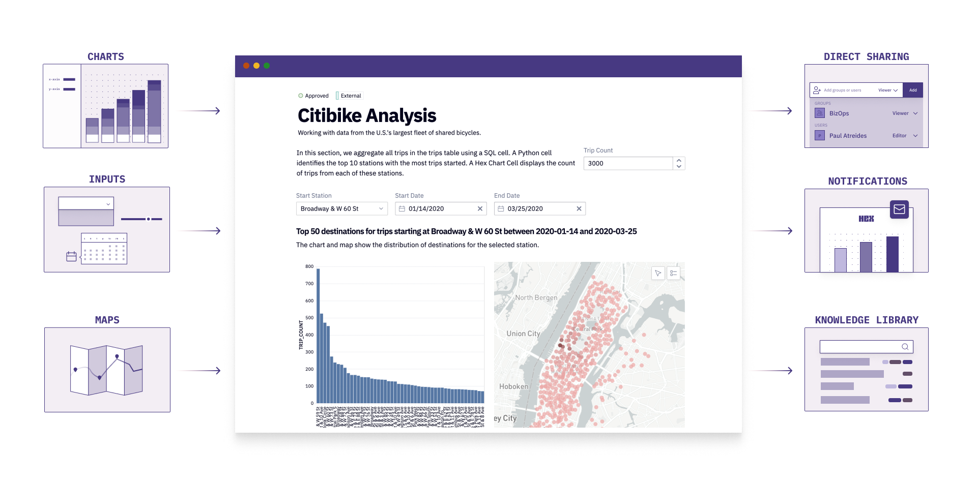
First, Hex is web-based and collaborative by default. Multiplayer, comments, versioning - it all just works. It’s now (finally!) easy to work together and peer review data projects.
Second, Hex makes it easy to publish and share work with other stakeholders in an organization. Users can take their Python or SQL code, make it interactive with input parameters, and publish the project as an interactive data app that anyone else can use.

Finally, Hex lowers the barrier of entry to becoming creators in data workflows. No more local Python environments or plaintext database secrets… anyone can come in, write a query, get started, and continue along their data journey. At many of our customers, most of the users aren’t even on the data team - Hex is for PMs and Engineers and Marketers, too.
Looking forward
Figma’s ultimate mission is coming into focus: a platform for visual thinking and collaboration for the entire organization. Our design team uses it every day, and is excited to see Figma’s growing suite of tools to help us better collaborate across our organization.