Exploratory Data Analysis

Izzy Miller
Exploratory data analysis in Hex is like no other tool you've used before. SQL, Python, rich text, and a library of no-code tools are right at your fingertips in the same...
How to build: Exploratory Data Analysis
Every data project starts with one big question: what’s really going on in the data? That’s precisely what Exploratory Data Analysis (EDA) helps you figure out. Before you build models or make predictions, you need to understand your dataset, its shape, patterns, and hidden insights.
But let’s be honest: EDA can be time-consuming and mentally heavy. It takes patience to examine every variable, trace its interactions, and make sense of complex datasets.
What Is Exploratory Data Analysis?
Data professionals use exploratory data analysis (EDA) to understand the data, its structure, the relationships among features, and where potential issues hide. It’s also where you spot outliers, missing values, anomalies, and hidden patterns that could trip up your model later.
It includes handling data types, using statistical techniques to identify or extract meaningful features, and standardizing data. When done right, EDA not only reveals hidden patterns and insights but also guides your next move, helping you choose the correct machine learning algorithm to tackle the problem.
How Does Exploratory Data Analysis Work?
EDA works by examining and visualizing data to understand its main characteristics and find patterns worth modeling. It’s a mix of math, intuition, and visualization.
It typically involves the following steps:
- Understand the Source Data: Start by examining where the data comes from, its data types, and key statistical summaries.
- Handle Missing Values and Duplicates: Missing values and duplicates are the gremlins of any dataset. Clean them up by filling, removing, or converting as needed. Also, make sure data types are consistent so you don’t end up comparing numbers with strings.
- Feature Engineering and Analysis: Perform feature engineering to select the right features and derive any new meaningful features from the data.
- Normalize or Standardize the Data: To keep all features on the same scale, you normalize or standardize them. Otherwise, one large-valued variable can dominate the rest like a lead singer who refuses to share the mic.
- Visualize the Data: Finally, bring your data to life with visualizations. Use charts and plots to spot correlations, clusters, and outliers. This step turns abstract numbers into visible patterns.
Types of Exploratory Data Analysis
Exploratory Data Analysis (EDA) comes in three types, depending on how many variables you’re exploring at once. Here are the three explained:
Univariate Analysis:
Univariate analysis focuses on studying one variable at a time. It helps you understand that variable’s distribution, variability, and statistical properties.
This step is beneficial for identifying outliers or detecting data entry errors that may have slipped past quality checks.
Common tools include:
- Graphs: Box plots, line charts, and histograms reveal the shape and spread of a single feature.
- Statistics: Metrics like mean, median, skewness, and percentiles of that variable.
Bivariate Analysis
Bivariate analysis explores how two variables relate to each other. It uncovers correlations and shows how one feature might influence another.
For example, explore the relationship between an independent variable (like ad spend) and a target variable (like sales) to measure how strongly the ad spend drives your sales.
It’s also handy for checking relationships among independent variables. If two features are highly correlated, you can drop one to reduce dimensionality without losing much information.
Multivariate Analysis
Multivariate analysis helps analyze the complex relationships between two or more variables.
You can use a correlation matrix to measure relationships across multiple variables or hypothesis testing methods, such as ANOVA, to check whether the means of different groups differ significantly.
For visualization, tools like scatter plot matrices (pair plots) and heatmaps make multi-dimensional relationships easier to see.
With the right tools, you can make this process far smoother. Platforms like Hex streamline EDA by combining Python, SQL, and visualization in one collaborative workspace. In this blog, we’ll walk through how data professionals simplify and speed up EDA so you can focus less on setup and more on uncovering insights that actually matter.
4 Steps of Exploratory Data Analysis Work
Installing and Importing the Necessary Packages
For this tutorial, we will use Python 3.11 and Hex as a development platform. Hex already has a library of pre-installed packages, but to install a new package, you can use the Python Package Manager (PIP) as follows:
! pip install package_nameFor example, one of the essential libraries we will need is pgeocode, which contains information about postal codes and coordinates. You can install it as follows:
! pip install pgeocode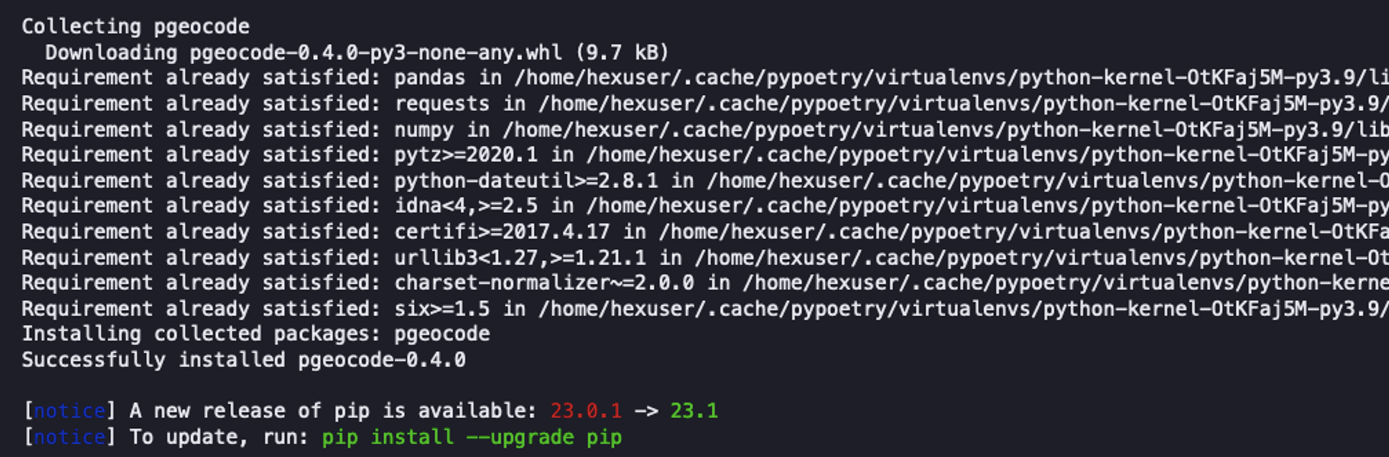
Once installed, you can import the package into the Hex environment as follows:
import seaborn as sns
import numpy as np
from scipy.stats import pearsonr
import warnings
import pgeocode
warnings.filterwarnings("ignore")
We have imported the following set of dependencies:
- Numpy: Package used for scientific computing in Python.
- Scipy: It is a Python package that includes modules for statistics, linear algebra, signal and image processing, and more.
- Seaborn: A famous Python library used for appealing visualization.
- Pgeocode: A Python package that allows for extremely fast offline querying of GPS coordinates and region names from postal codes.
1. Data Collection and Initial Exploration
Now that you have loaded all the dependencies, it’s time to load the data and do some initial exploration.
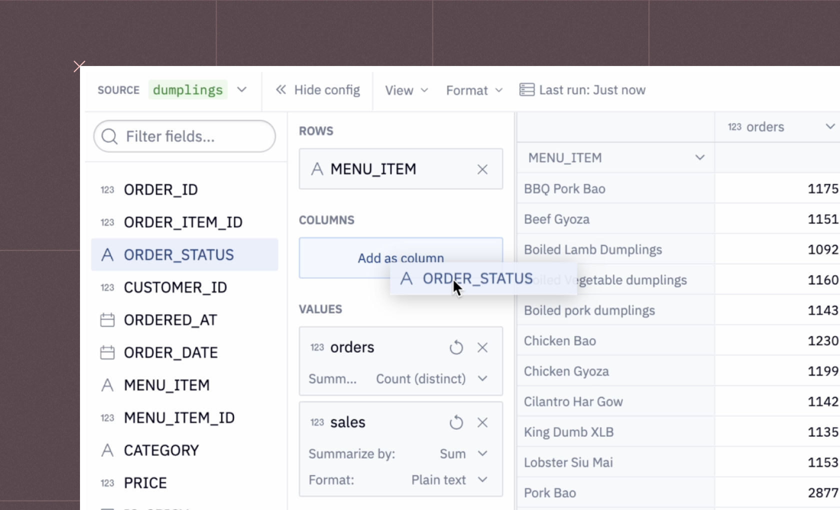
Data sources
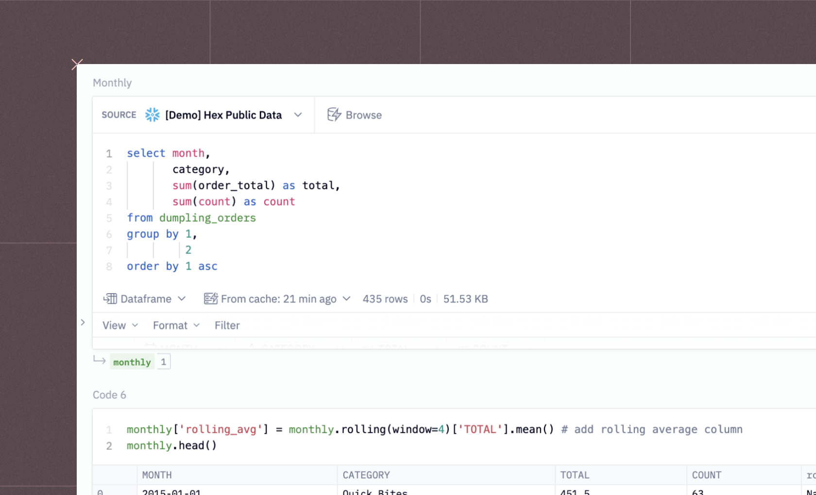
There are various ways to load data in Hex. You can use a file uploader or establish a connection to different databases and warehouses. We will load the data from a Snowflake Warehouse. It is as simple as writing an SQL command, and the result will be loaded as a Pandas Dataframe.
To load the data from the Snowflake warehouse, you can use the following SQL command:
select * from demo_data.demos.food_and_weather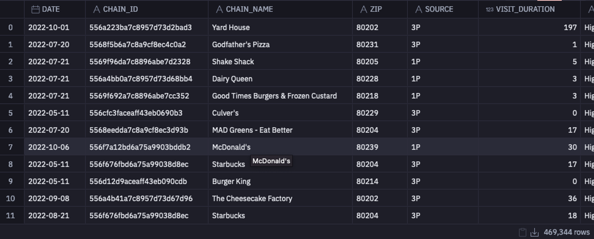
Collect Basic Information
Once the dataset is loaded, you can take a glance at information such as the shape of the data, the data types of each column, different column names, and several non-null values using the info() method from Pandas.
data.info()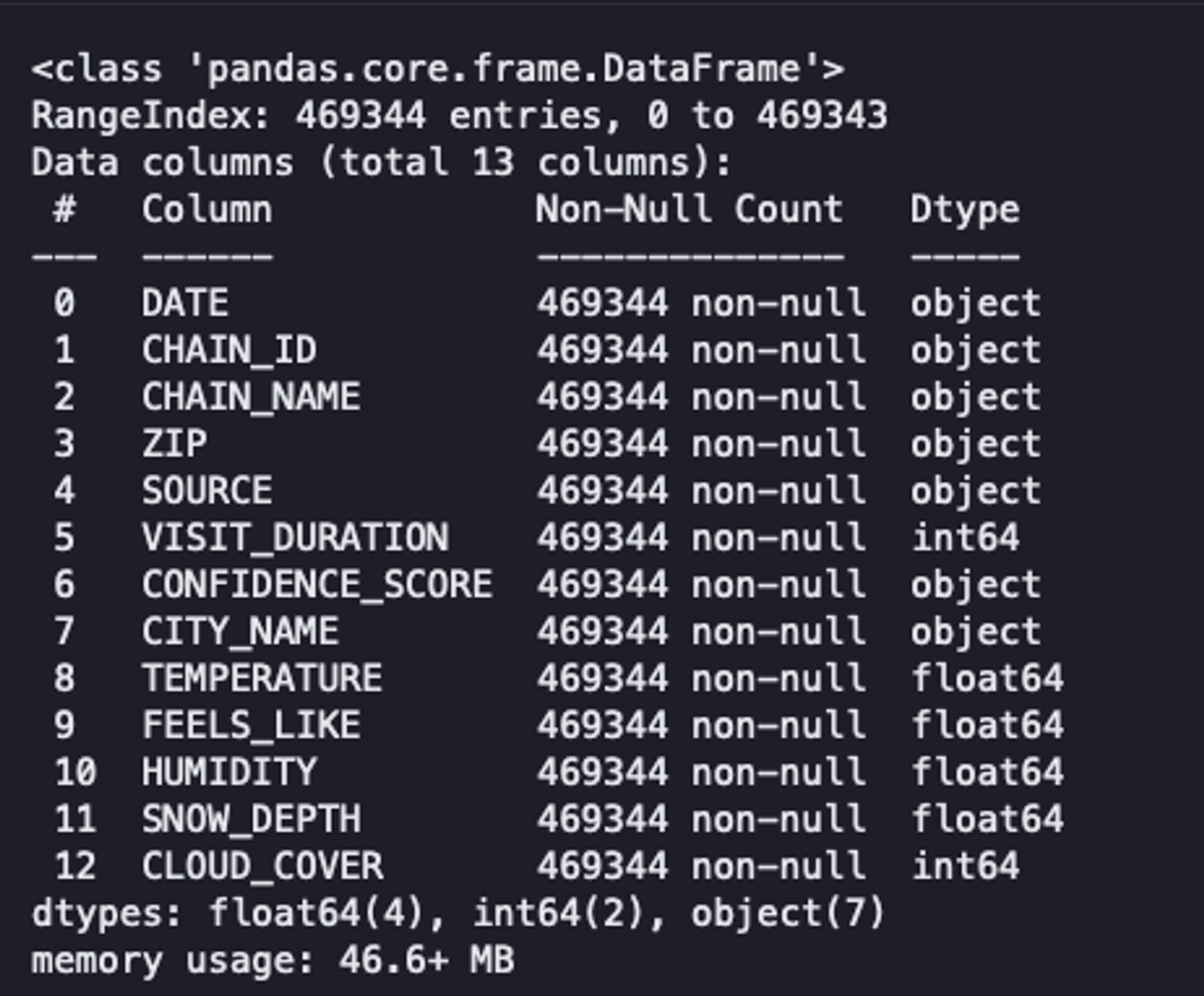
As you can see, our data has 469,344 rows, 13 columns, no null values, and a combination of data types. Although this method provides an overview of the data, it does not enable us to make informed decisions.
Descriptive Statistics
Next, you can check some of the statistical values, such as mean, median, max, min, standard deviation, and IQR for the numerical features using the describe() method of Pandas.
data.describe()Analysts use these summary statistics to quickly identify outliers, assess the spread of the data, and understand the overall trend of a dataset. Descriptive statistics serve as the foundation for more in-depth analysis. They help form hypotheses, guide further exploration, and clearly communicate insights to stakeholders.
For example, check the `VISIT_DURATION` and the `SNOW_DEPTH` columns. You will find that the mean value (center of the distribution) and the standard deviation (dispersion of the values) are pretty low as compared to the maximum value of these columns.
Moreover, the maximum `VISIT_DURATION` is 85 times greater than the `VISIT_DURATION` in the third quartile. When the data is sorted in ascending order, the third quartile marks the point below which 75% of the observations fall.
This indicates that, out of all visitors, 75% spend little more than 34 minutes at their preferred location. Subsequently, the figure abruptly increases to 2,648 minutes. This gives us a hint about the presence of outliers in these columns.
2. Data Cleaning
Next comes the data cleaning stage, where we process the data to remove outliers, missing values, redundant data, and standardize features so everything stays on the same scale.
Dealing With Outliers
Outliers can significantly impact your entire statistical analysis if not appropriately handled. These outliers can result from data entry errors, sampling issues, or natural variation. The two most common methods of identifying outliers are the IQR (already demonstrated with the describe() method) and the Z Score. Once identified, you need to handle them properly. It is vital to have the domain knowledge, as sometimes these outliers may convey crucial information, and by removing them, you could lose it.
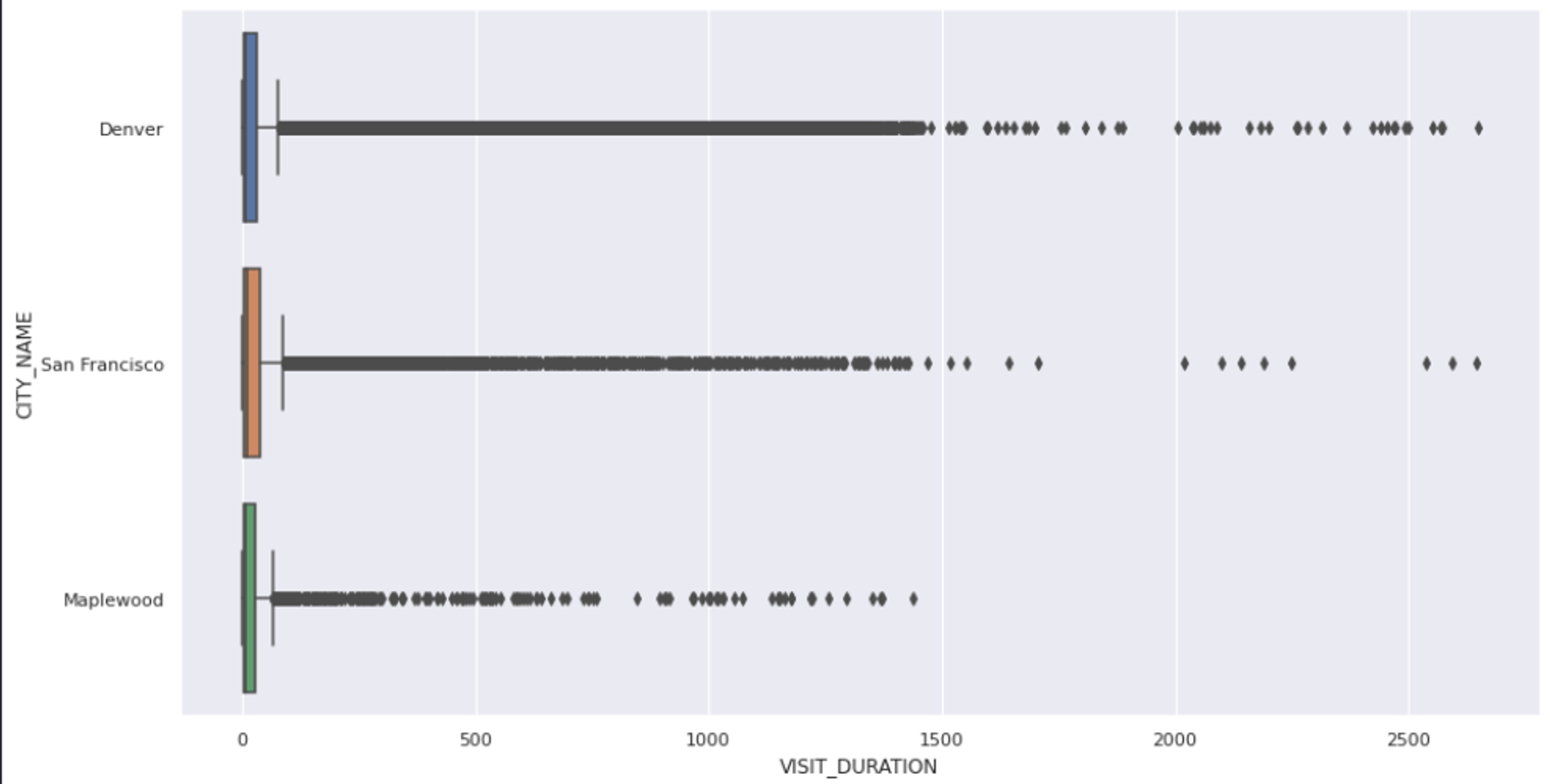
The first step in handling outliers is to visualize the features that might contain them. This can give you an overall picture of the feature and its values. The most common way to visualize the outliers is using the box plots. You can use the `boxplot()` method from Seaborn to create a chart between `VISIT_DURATION` and `CITY_NAME` columns as follows:
sns.set(rc = {'figure.figsize':(15,8)})
sns.boxplot(x = data['VISIT_DURATION'], y = data['CITY_NAME']);
As you can see, the above graph confirms the presence of outliers, but it does not explicitly tell the exact values of these outliers. So we’ll go ahead and use the IQR approach to remove all the values that fall outside the upper (75) and lower (25) bounds of our results.
def outliers(values):
    q1, q3 = np.percentile(values, [25, 75])
    iqr = q3 - q1
    lower = q1 - (1.5 * iqr)
    upper = q3 + (1.5 * iqr)
    return lower, upper

# calculate the lower and upper outlier limit
lower, upper = outliers(data['VISIT_DURATION'])

# create filters that remove all rows that fall outside of these limits
lower_mask = (data['VISIT_DURATION'] > lower)
upper_mask = (data['VISIT_DURATION'] < upper)

# apply the filters to the dataset
cleaned_data = data[lower_mask & upper_mask]
As you can see in the above code, we identify the lower and upper bounds of the values using the `outliers()` method and then filter all the values that are past this range. Finally, when you plot the graph of the filtered data, you will see that there is no outlier present.
sns.boxplot(x = cleaned_data['VISIT_DURATION'], y = cleaned_data['CITY_NAME']);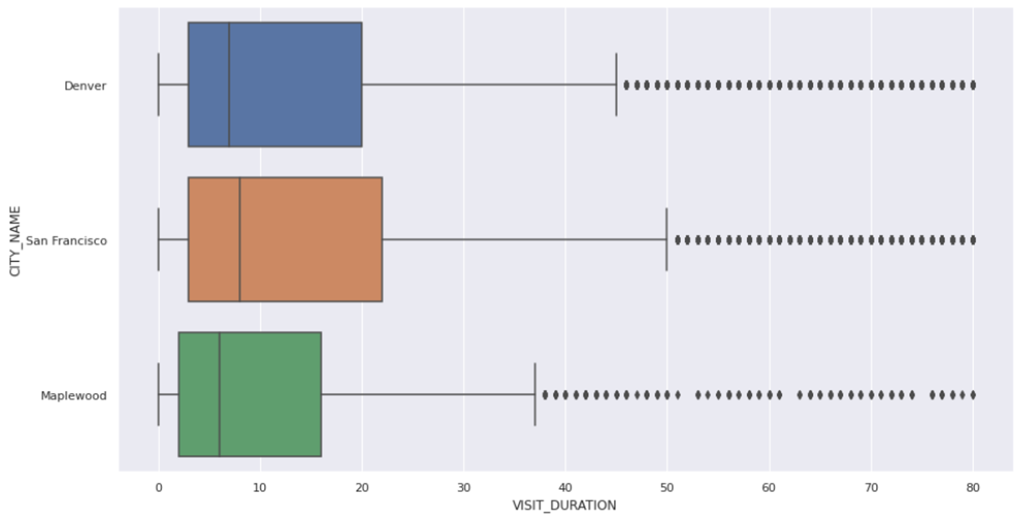
Handling Missing Values
When dealing with real-world data, it is quite common to have missing data (NaN values) in the dataset. There are several ways to handle these missing values; three of the widely used ones are:
- Dropping the rows from the dataset that contain NaN values. This is not a good approach, as we often lose important information that could be crucial for analysis.
- Replacing the NaN values with the measures of central tendency (mean, median, and mode). However, this approach assumes that the missing values are missing at random.
- Finally, use the machine learning algorithms to predict the missing values using the rest of the features in the dataset.
- Our current dataset does not contain any missing values, so we need not take any action on this part.
Data normalization and standardization
Another common problem of the real-world dataset is that feature values often exist on different scales. This happens for many reasons—incorrect measurements, inconsistent units, or simply the nature of the features themselves. When features have varying scales, those with larger magnitudes can dominate the learning process, making machine learning models converge more slowly than they would with standardized data.
The solution to this problem is standardizing the values in a feature to bring them all to the same scale. The most common approaches are Min-Max Scaling and Standard Scaling. You can learn more about them here. As our data is in good shape, we do not need to apply any external scaling to it.
Often, you have duplicate rows in your data, and you need to remove them to ensure data integrity.
3. Feature Engineering
In real-world scenarios, your dataset might come with too many features, too few, or sometimes just the right amount. Either way, you often need to tweak it by removing irrelevant features, creating new ones, or combining existing ones to make them more meaningful. This process of reshaping and refining features is called feature engineering.
Typical operations include creating new features, reducing dimensionality with techniques like PCA, and handling categorical variables to improve the performance of machine learning and deep learning models.
In our dataset, the number of features looks reasonable, but we’ll still create an additional one — coordinates (latitude and longitude) for each venue — to help us plot locations on a map. Now you can probably see why we need the `pgeocode` Python library.
Let’s write a Python function that takes a dataframe and, based on each zip code, returns the corresponding latitude and longitude values.
def add_coordinates(frame):
    '''
   	 Accepts a dataframe and returns it with the new columns lat and lng
    '''
    # create geocoding object
    nomi = pgeocode.Nominatim('us')
    frame = frame.copy()
    # list of each unique zip code
    unique_zips = frame['ZIP'].unique().tolist()
    coordinates = {}
    # for each unique zip code
    for zipcode in unique_zips:
   	 # get the location data
   	 location = nomi.query_postal_code(zipcode)
   	 # extract and add the coordinates to our coordinate dictionary
   	 coordinates.setdefault(zipcode, {'lat':location.latitude, 'lng':location.longitude})
    # add the coordinates to the dataframe
    frame['lat'] = frame['ZIP'].apply(lambda row: coordinates[row]['lat'])
    frame['lng'] = frame['ZIP'].apply(lambda row: coordinates[row]['lng])

    return frame, coordinates

cleaned_data, coordinates = add_coordinates(cleaned_data)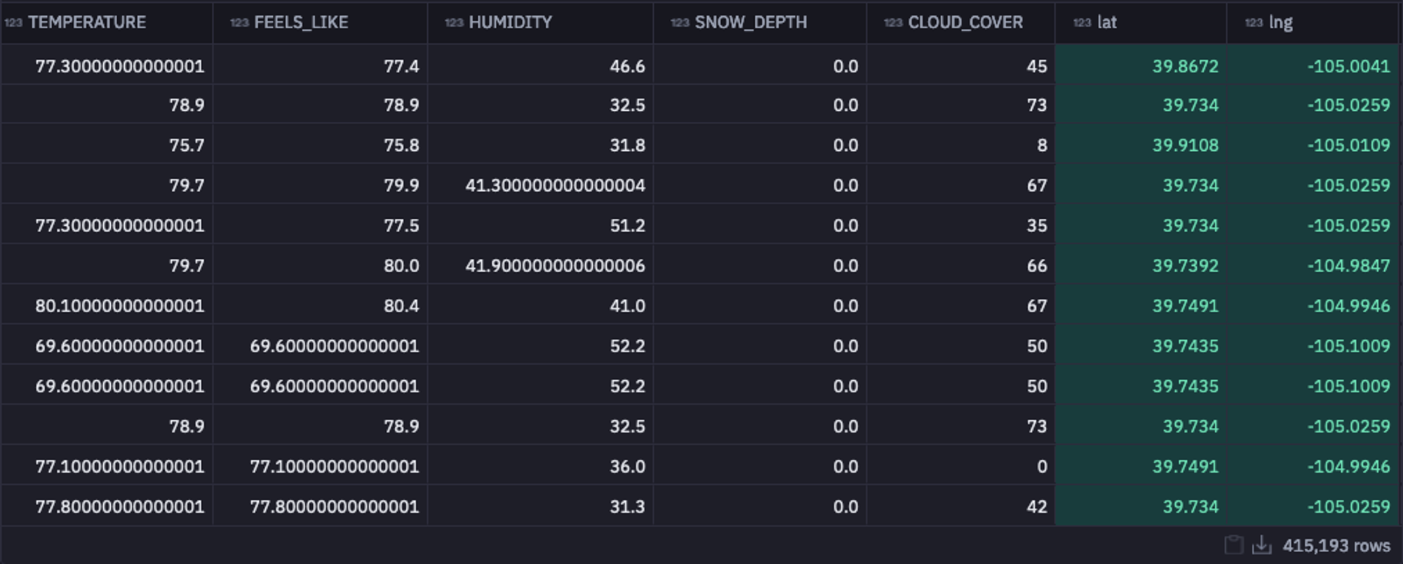
As you can see in the above image, the latitude and longitude information for all postal codes is added to the dataframe. With this, we are all ready to proceed to the most important stage of EDA, i.e., answering the most critical business questions with the help of different charts and graphs.
4. Visual Question Answering
Let’s perform the visual question answering on our dataset. We will try to answer some important business questions, such as “What are the most popular venues?”, “How does humidity affect visit times?”, and “Which popular venues do people stay at the longest?”
What are the Most Popular Venues?
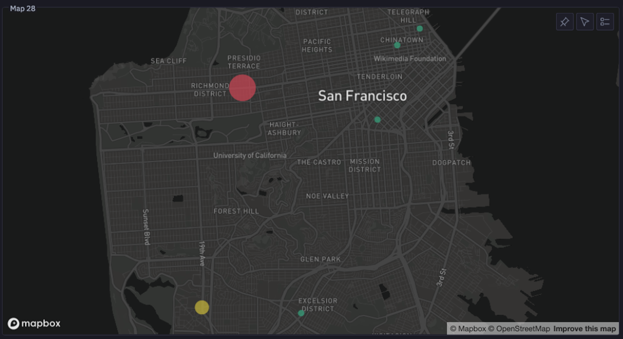
Let’s start with the first one. As a user visiting a city, I would like to know the most popular restaurants there to make an informed decision. So to answer this question, we will identify which zip codes are the most popular for a venue of choice. To do so, let’s first filter out the data based on the city level and then on the venue level.
city_df = cleaned_data[cleaned_data['CITY_NAME'] == city_filter]
venue_df = city_df[city_df['CHAIN_NAME'] == venue]
Then we will group the filtered data by zip code to determine the most popular venue location.
def coordinate_mapping(zip_code):
    coordinates = venue_df[venue_df['ZIP'] == str(zip_code)][['lat', 'lng']].iloc[0].to_list()
    return coordinates

# group by zip code to determine the most popular venue location
venue_grouped = venue_df.groupby(['ZIP', 'CHAIN_NAME']).agg({'VISIT_DURATION':'sum', 'DATE': 'count'}).reset_index()
venue_grouped.rename({'DATE':'total_visits', "VISIT_DURATION":"visit_duration_sum"}, axis = 1, inplace = True)
venue_grouped['coordinates'] = venue_grouped['ZIP'].apply(lambda row: coordinate_mapping(row))

most_popular_zip = venue_grouped.sort_values(by = 'visit_duration_sum', ascending = False)['ZIP'].iloc[0]
total_visits = venue_grouped.sort_values(by = 'total_visits', ascending = False)['total_visits'].iloc[0]
In the above code, we get the coordinates of the most popular venues, and Hex helps us plot them. You can now see a graph like this that clearly states which zipcode is the home of the most popular venue in the selected city, with the total number of visits.
How Does Humidity Affect Visit Times?
Ideally, the change in weather affects the restaurant visits. The higher the humidity, the higher the discomfort for people, so we could expect a pattern with a change in humidity. Since it is a bivariate analysis, we will create a scatter plot to identify the relation between humidity and the average amount of time people stay at a venue.
Hex allows you to create the charts without writing a single line of code, as you can see below:
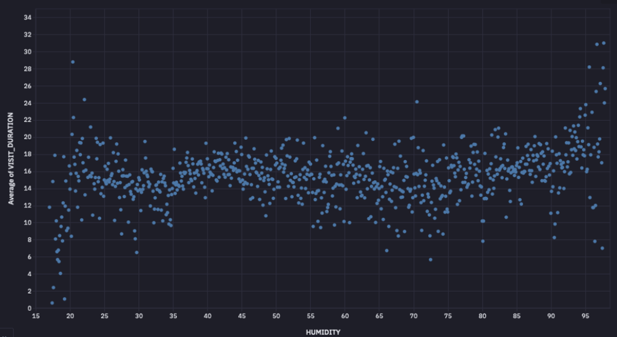
As you can observe, there is no clear relationship between humidity and the number of visits, as depicted by the graph. To verify our finding, we can also check the correlation between these two columns. To apply the Pearson correlation, you can use the pearsonr() method as follows:
corr, _ = pearsonr(cleaned_data['HUMIDITY'], cleaned_data['VISIT_DURATION'])The correlation value will be -0.035, clearly indicating that there is no direct relation between these two variables.
Similarly, you can also plot graphs or calculate the correlation for other weather conditions to check how they affect venue visits.
Which Popular Venues do People Stay at the Longest?
Finally, let’s answer our last question: the most popular venues where people tend to stay the longest. You can use the built-in filtering feature of Hex to select different parameters, such as city and venue count.

Then you can write the logic to `groupby` the venues by `CHAIN_NAME` and identify the top venues based on the venue count parameter.
most_popular = (
    cleaned_data.groupby("CHAIN_NAME")
    .count()
    .sort_values(by="DATE", ascending=False)
    .reset_index()
    .head(limit)['CHAIN_NAME'].tolist()
) if not by_city else (
    cleaned_data[cleaned_data['CITY_NAME'] == city].groupby("CHAIN_NAME")
    .count()
    .sort_values(by="DATE", ascending=False)
    .reset_index()
    .head(limit)['CHAIN_NAME'].tolist()
)

top_ten = cleaned_data[cleaned_data['CHAIN_NAME'].isin(most_popular)]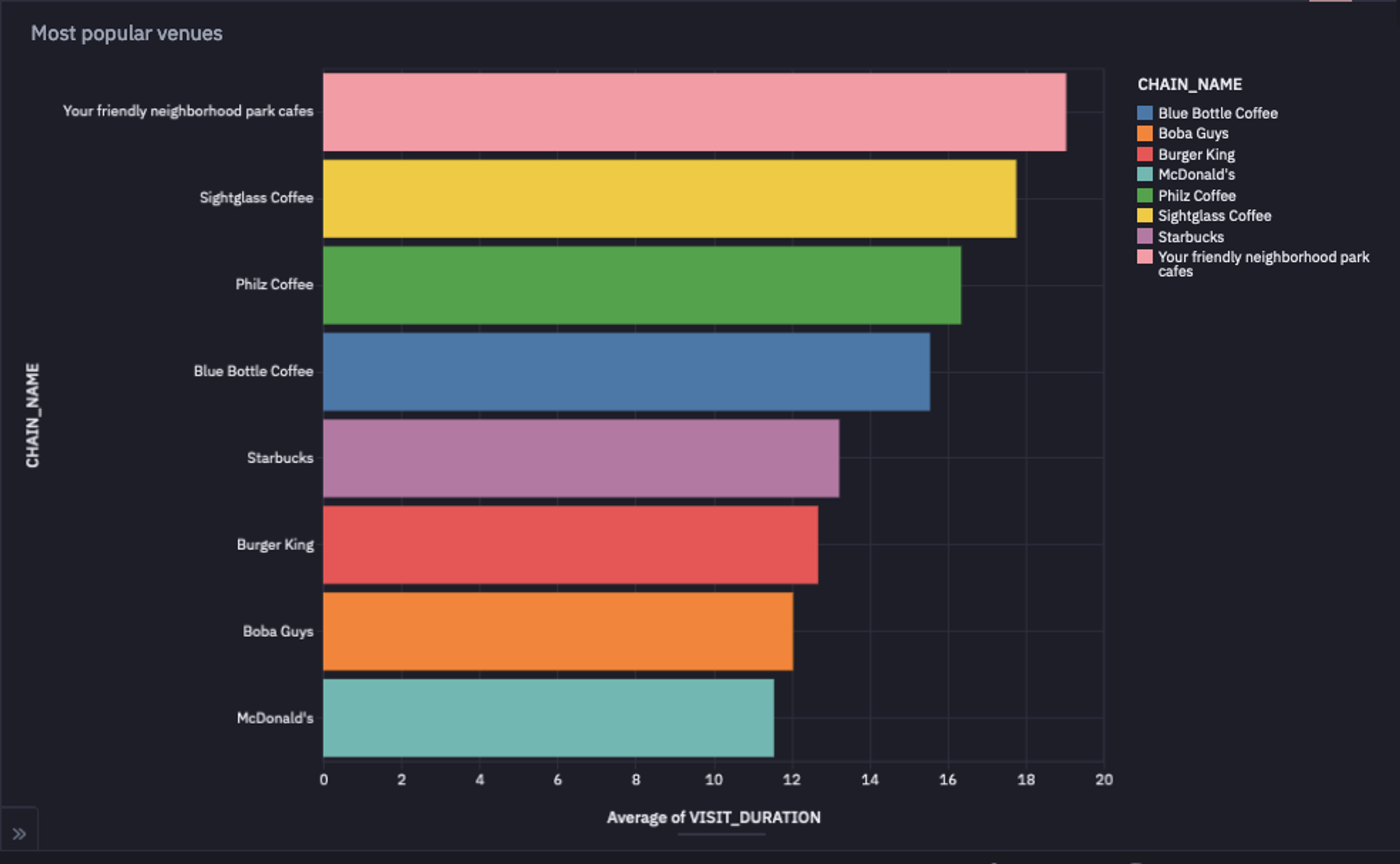
As you can observe in the above image, Your Friendly Neighborhood Park Cafes is the place where people like to stay the longest.
Best Tools for Exploratory Data Analysis Work
When it comes to exploratory data analysis, there’s no shortage of tools, but a few stand out for their flexibility and power in real-world workflows. Let’s look at some of the best options data professionals rely on.
Python
Python has everything you need for data manipulation, statistical analysis, and visualization, packed neatly into one language. Its Pandas library makes it easy to handle DataFrame and Series structures.
It includes built-in functions for data cleaning (handling missing values, removing duplicates, fixing inconsistencies) and data manipulation (filtering, sorting, grouping, merging, joining, and reshaping datasets). For visualization, Matplotlib turns your data into clear visuals, while scikit-learn (sklearn) handles the modeling side.
SQL
SQL is the OG (original) tool of data exploration. It’s the language of relational databases, and it remains unbeatable when it comes to querying, filtering, and aggregating large structured datasets.
Data analysts and scientists use SQL to extract exactly what they need. Whether it’s joining multiple tables, applying filters, or summarizing data with aggregations, SQL keeps your exploration efficient and precise.
Hex
While many data professionals use Jupyter notebooks for analysis, traditional notebooks fall short in terms of collaboration and SQL integration. That’s where Hex steps in.
Hex’s multi-modal capabilities let you write Python and SQL in the same notebook, with built-in features like in-line commenting and version control for smooth teamwork. You can even transform your visuals into interactive dashboards to share with stakeholders. In short, Hex acts as an all-in-one platform that combines analysis, collaboration, and storytelling in one place.
Best Practices in Exploratory Data Work
Understand the Business Context
Domain knowledge is key when working with real-world datasets. Build a solid understanding of the domain your data comes from and stay aligned with the business goals behind your analysis. Tailor your exploratory work to extract insights that actually move the needle for those goals.
Take an Iterative Approach
EDA isn’t a one-and-done checklist. It’s a loop of exploration and refinement. You try different techniques, spot something interesting, adjust your approach, and dig deeper. Each pass through the data gives you new clues and sharper insights.
Make Your Code Reproducible
Make sure your code runs seamlessly on new or updated datasets by writing reusable functions and modular code. Rely on well-documented packages and clear structure so others can easily follow or reuse work.
Use Modern Notebooks
Modern notebooks like Hex take EDA workflows to the next level. You don’t have to manually refresh dashboards or re-run analyses every time new data lands. Hex connects directly to your data warehouse, schedules automatic updates, and refreshes downstream dashboards in real time. Plus, it adds collaboration, multi-modality (Python + SQL in one place), and built-in AI tools that help you move faster and stay aligned as a team.
Challenges in Exploratory Data Analysis Work
Poor Data Quality
The reliability of your EDA depends entirely on the quality of your dataset. No matter how thorough your analysis is, inaccurate or incomplete data will skew your results. Always focus on maintaining quality right from the data sourcing stage, and handle inconsistencies and missing values carefully during your EDA process.
Data Silos
You often have to pull data from multiple sources (databases, APIs, spreadsheets) and bring it together in a single, accessible location. This process of data integration can be tricky, involving schema mapping, data transformation steps, and validation to unify the data.
Resource Intensive
Data scientists spend nearly 80% of their time preparing data and only about 20% modeling it. In other words, exploratory data analysis eats up most of the workload. It requires both technical expertise and time bandwidth to clean, explore, and shape data effectively. And when you’re dealing with large-scale datasets, you often need extra computing resources like distributed computing to keep a smoother performance.
Automation
Automating EDA is tough because the process is iterative and context-specific. Each dataset requires a slightly tailored approach. Still, you can automate repetitive steps, like data fetching, refreshing dashboards, or re-running analyses, using Hex’s AI tools, version control, and direct warehouse connectivity. Hex’s integrated environment for Python, R, and SQL helps you streamline EDA without losing flexibility.
Conclusion
Exploratory Data Analysis isn’t just a technical checkpoint; it’s the foundation of every wise data decision. The more efficiently you explore, the faster you uncover insights that matter.
That’s where modern tools like Hex make all the difference. With built-in Python and SQL support, real-time data connections, and collaborative, AI-powered workflows, Hex turns EDA from a time sink into a smooth, repeatable process.
So if you’re ready to take your exploratory analysis to the next level, try Hex — the modern notebook built for fast, collaborative, and insightful data work.
See what else Hex can do
Discover how other data scientists and analysts use Hex for everything from dashboards to deep dives.
Ready to get started?
You can use Hex in two ways: our centrally-hosted Hex Cloud stack, or a private single-tenant VPC.