Company Metrics Dashboard

Izzy Miller
Don't limit yourself to traditional, old-fashioned BI. Hex lets you turn even the most flexible and complex analyses into beautiful, easy to use dashboards.
How to build: Company Metrics Dashboard
Every business runs on data, but data alone doesn’t drive impact. The real value lies in transforming that data into clear insights that inform day-to-day decision-making. When teams can see how the business is performing in real time, they can act faster, spot opportunities sooner, and make more data-driven decisions.
That’s where metrics dashboards come in. They bring together key metrics from across the organization into one central view, helping teams track performance, identify trends, and stay aligned around shared goals.
In this guide, we’ll explore the top crucial metrics for any business, why a company's metrics dashboard is essential, and how to build one.
What Is a Company Metrics Dashboard?
A company metrics dashboard tracks and displays key performance metrics of a business through visualizations. It uses clickable charts, dynamic graphs, and structured tables to present complex information in an intuitive format for business leaders.
Since these dashboards track real-time data, leaders can make informed, data-driven decisions and respond quickly to changing trends.
Importance of a Company Metrics Dashboard
Every company depends on data-driven metrics to run effectively. That’s why a metrics dashboard is so important. It brings the correct data together in one place, enabling teams to make informed decisions quickly without having to scramble for answers.
For instance, it might rely on just-in-time stocking to ensure merchandise neither runs out nor sits in warehouses for too long, thereby driving up storage costs. To manage this, they need real-time visibility into inventory levels — something a dashboard can provide at a glance. They would use a comprehensive dashboard to track these metrics.
The same company could use customer data to personalize shopping experiences by tailoring homepages, sending targeted marketing strategies, and offering discounts based on past purchases. To do this effectively, they need access to purchase history and customer preferences. And when it comes to ad spend, dashboards help them monitor click-through rates, conversion rates, and acquisition costs, allowing them to optimize high-performing channels and eliminate those that aren’t working.
A single company might need visibility into different metrics for different operations. To manage this, businesses use a company metrics dashboard. They identify the KPIs that matter most, build metrics around them, and track them regularly on a centralized dashboard to support real-time decision-making.
These dashboards don’t just display numbers. They transform metrics into clear visualizations, making it easy for stakeholders to digest information, identify future trend patterns, and take action quickly.
Moreover, a company metrics dashboard that tracks all the required KPIs serves as a single source of truth, improving data accessibility across the organization.
Key Features of a Company Metrics Dashboard
Clearly Defined KPIs
Whether you’re building a comprehensive company metrics dashboard or a dedicated one for a specific business operation, such as marketing or sales, the first step is to define the KPIs you want to track.
For a comprehensive dashboard, you would identify top metrics from multiple areas such as finance, marketing, and sales. In contrast, focused dashboards — for example, a marketing dashboard — should include KPIs that measure campaign effectiveness and marketing ROI.
Automated Alerts
Since this dashboard tracks your most important metrics, it’s a good idea to set up automated alerts or notifications for any unusual drops or changes in patterns. For instance, you might configure an alert that notifies teams if website traffic falls by a certain percentage.
These alerts help you identify performance issues early and take corrective action before they result in substantial losses.
Self-Service Capabilities
Metrics dashboards are often used by business stakeholders who may not have technical or coding expertise. That’s why they should include intuitive UI elements that allow non-technical users to interact with data and uncover insights independently.
Features such as drill-downs, filters, adjustable time ranges, clickable charts, and collapsible sections enable users to explore the data behind a number and identify root causes — all without writing a single line of code.
Security
A company's metrics dashboard may contain sensitive customer information or financial data. So maintaining security and governance is critical. Essential features include role-based access controls, permission management, and adherence to data governance policies.
Hex combines all these capabilities into a single platform. It combines self-service functionality with strong security features, while making dashboard development more flexible than ever. With Hex, you can use native notebooks to write Python and SQL cells, then seamlessly convert your results into dynamic, interactive dashboards for stakeholders.
KPIs You Can Track on a Company Metrics Dashboard
Sales and Revenue Metrics
Conversion Rate
Conversion rate is the percentage of leads or visitors that have been successfully converted into customers. This calculation is based on a specific period of time. For example, an August month conversion rate can be:
(Total number of customers converted in August / Total number of visitors or leads in August) * 100Revenue Growth Rate
Revenue growth rate measures the rate at which a company's revenue increases over a specific period. If you want to quantify your revenue growth rate from last year to this year, you could calculate it as:
(Last year revenue - This year revenue) / This year revenue * 100Monthly Recurring Revenue
Monthly recurring revenue (MRR) measures the predictable revenue a business can expect to earn each month from active, paying customers. It’s most commonly used by subscription-based companies, where revenue is generated on a recurring basis rather than from one-time purchases.
MRR = Number of active subscribers * Average revenue per userNet Revenue Retention
Net revenue retention (NRR) calculates the percentage of revenue retained from existing customers over a specific period of time (usually monthly or yearly), including upgrades, cross-sells, and churn.
An NRR above 100% indicates that your existing customers are generating more revenue over time, even after accounting for customer churn.
NRR = (MRR + expansions + upsells - churn - contractions) / MRR at the start of the monthFinancial Metrics
Net Profit Margin
Net profit margin measures a company’s profit after all its expenses, taxes, and interest. It’s a strong indicator of overall profitability and cost management.
Net Profit Margin = (Net income / Revenue) * 100 Return on Investment
ROI evaluates the return generated relative to the cost of an investment. It’s often used to quantify the success or profits of individual projects or campaigns.
ROI = (total gain from investment - cost of investment) / cost of investment * 100Cash Flow
Cash flow tracks the net movement of cash into and out of a business over a specific period. Positive cash flow means the company generates sufficient liquid assets to cover its operations and support growth. Negative cash flow signals potential liquidity issues, even if the business is profitable on paper.
Net cash flow = Total cash inflows - Total cash outflows- Total Cash Inflows: Money received from all sources, like sales, investments, or loans.
- Total Cash Outflows: Money spent on all expenses, such as inventory, rent, or equipment.
EBITDA
EBITDA stands for Earnings Before Interest, Taxes, Depreciation, and Amortization. It measures a company’s operating profit. It’s simply:
EBITDA = Net Income + Interest + Taxes + Depreciation + Amortization- Net Income: Total profit after all expenses, taxes, and interest have been deducted from revenue.
- Interest: Interest paid on borrowings.
- Taxes: Taxes paid to the government.
- Depreciation: A non-cash expense that spreads the cost of tangible assets (like machinery or equipment) over their useful life.
- Amortization: It’s also a non-cash expense of intangible assets such as patents or software licenses.
Customer Satisfaction Metrics
Customer Satisfaction Score
Customer Satisfaction Score (CSAT) measures how satisfied customers are with your product or service. Businesses usually collect customer ratings on a scale of 1-5 through surveys, then calculate CSAT as:
Number of happy customers (4-5 rating) / Total customers surveyed * 100Churn Rate
Customer churn rate is the percentage of customers or subscribers who stop using a company's product or service within a specified time frame.
Churn rate = (Customers lost during a specific period)/(total customers a beginning of that period) * 100Net Promoter Score
NPS measures customer loyalty by asking one simple question: “How likely are you to recommend us to a friend or colleague?” Respondents are grouped into promoters (who gave scores 9-10), passives(who gave scores 7-8), and detractors (who gave scores < 6).
NPS = %promoters - %detractorsCustomer Lifetime Value
CLV estimates the revenue a customer generates during their entire relationship with the company. Businesses often use this metric to understand customer loyalty and forecast future revenue.
CLV = Average Order Value x Purchase Frequency x Customer Lifespan- Average order value: the average amount a customer spends per purchase.
- Purchase frequency: the number of transactions or purchases within a specific time period.
- Customer lifespan: How much time a customer stays with your business.
Marketing Metrics
Website Traffic
Website traffic refers to the number of visitors to your site within a specified period. It can be categorized into sources such as organic search, paid ads, referrals, and direct visits. It shows how effectively marketing efforts are driving awareness and reach.
Click-Through Rate
CTR measures how often people click on your ad, product link, or call-to-action after seeing it. A higher CTR indicates that your marketing campaigns are effective and are targeting the right audience.
CTR = (number of clicks) / (number of impressions) * 100Customer Acquisition Cost
Customer acquisition cost refers to the average expense incurred to acquire a new customer. It includes advertising costs, affiliate commissions, and salaries for sales and support teams. It’s calculated as:
(Total cost of sales and marketing) / (number of new customers acquired).Create a Company Metrics Dashboard With Hex
Our data is in a Snowflake warehouse. This is a standard setup for many modern businesses, where data is replicated in a warehouse from production servers, allowing data teams to manipulate and analyze data as needed without disrupting the site or application.
We start by writing an SQL query to retrieve comprehensive details about orders from our data warehouse.
SELECT o.order_id,
       o.user_id,
       o.status,
       o.created_at,
       o.returned_at,
       o.shipped_at,
       o.delivered_at,
       oi.product_id,
       oi.inventory_item_id,
       oi.sale_price,
       ii.product_category,
       ii.product_name,
       ii.product_brand,
       ii.product_distribution_center_id
FROM demo_data.ecommerce.orders o
left join demo_data.ecommerce.order_items oi on oi.order_id = o.order_id
left join demo_data.ecommerce.inventory_items ii on ii.id = oi.inventory_item_id
WHERE o.status != 'Cancelled'
GROUP BY 1,2,3,4,5,6,7,8,9,10,11,12,13,14
This returns a preview of our data:
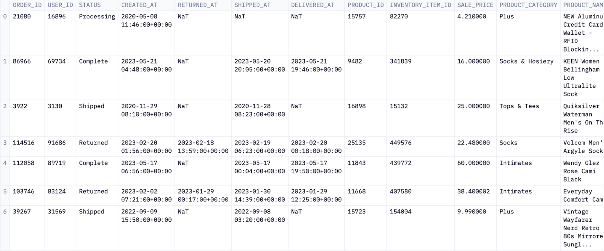
Tabulating the data is great for exploratory analysis. It helps the data team visualize the dataset's structure and data types at a glance. For the final dashboard, though, this level of detail is not very useful, so we will keep it out of view.
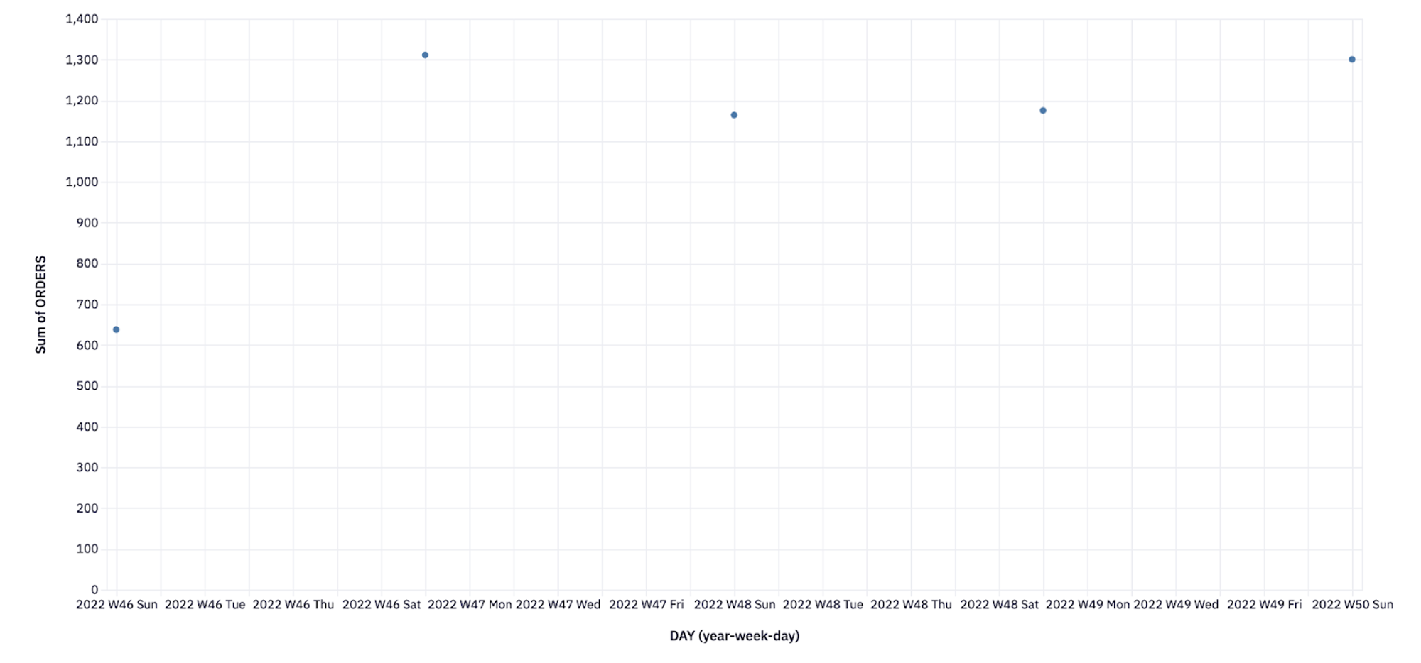
Next, we want to roll all that data up into something more useful, such as orders per day. We don’t have to query the data warehouse again; instead, we can reuse the data from the previous query, a pattern known as Chained SQL. This is an excellent option if you are dealing with a lot of data and want to dive deeper into the dataset slowly–you can start by pulling all the data and then filter and group as needed:
SELECT date_trunc(day,created_at) as day,
product_category,
   product_brand,
   product_name,
      count(distinct order_id) as orders,
      sum(sale_price) as sales
FROM orders_items
WHERE returned_at is null
 and created_at >= DATEADD(day,-365,CURRENT_TIMESTAMP)
group by 1,2,3,4
order by 1
We’ll visualize this as a chart and include it in our published app:
Here, we use an in-built chart from Hex for visualization. However, charts are an integral part of any dashboard, and you need to know how to build these visualizations, regardless of how you create your dashboard. To add a chart similar to this, you can use the Python matplotlib library:
thirty_day_orders["WEEK"] = thirty_day_orders["DAY"].dt.to_period("W")
agg_orders = thirty_day_orders.groupby("WEEK")["ORDERS"].sum().reset_index()
plt.scatter(agg_orders["WEEK"].astype(str), agg_orders["ORDERS"])
plt.xlabel("Week")
plt.ylabel("Sum of Orders")
plt.title("Sum of Orders by Week")
plt.show()
Which produces:
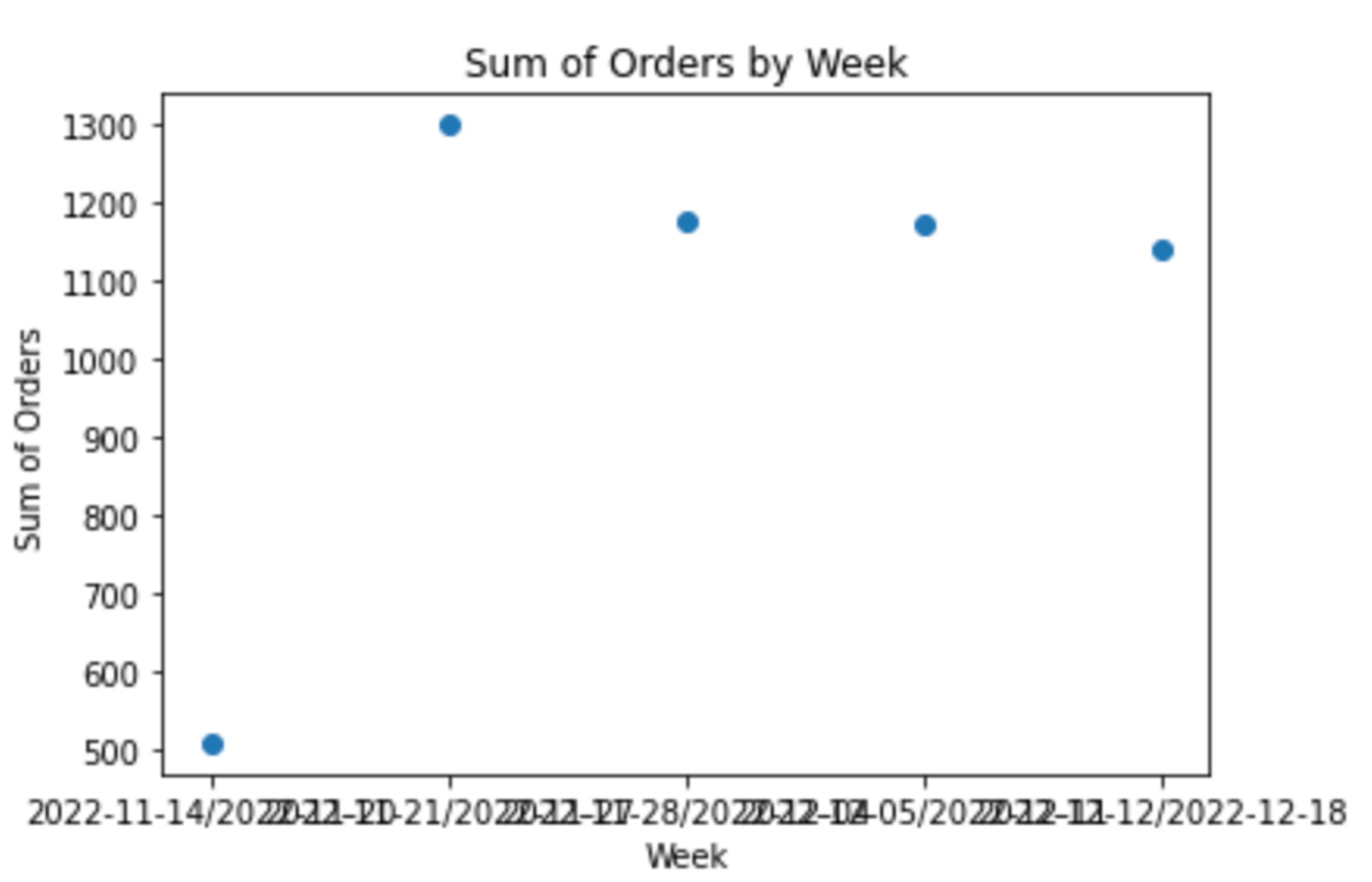
It’s not quite as clean as the Hex chart, nor does it have interactivity, but it still allows you to start telling the story of your data.
We’ll also pull data from the previous period so we can later compute our growth:
SELECT date_trunc(day, created_at) as day,
product_category,
   product_brand,
   product_name,
      count(distinct order_id) as orders,
      sum(sale_price) as sales
FROM orders_items
WHERE returned_at is null
 and created_at <= DATEADD(day,-200,CURRENT_TIMESTAMP) and created_at > DATEADD(day,-300,CURRENT_TIMESTAMP)
group by 1,2,3,4
order by 1
So far, we’ve pulled and filtered data using direct SQL queries. Hex is polyglot, allowing you to combine different languages within the same notebook, so the SQL queries above output Pandas DataFrames.
The next step is to compute the change in orders from the previous month. To do that, we’ll use Python with our DataFrames:
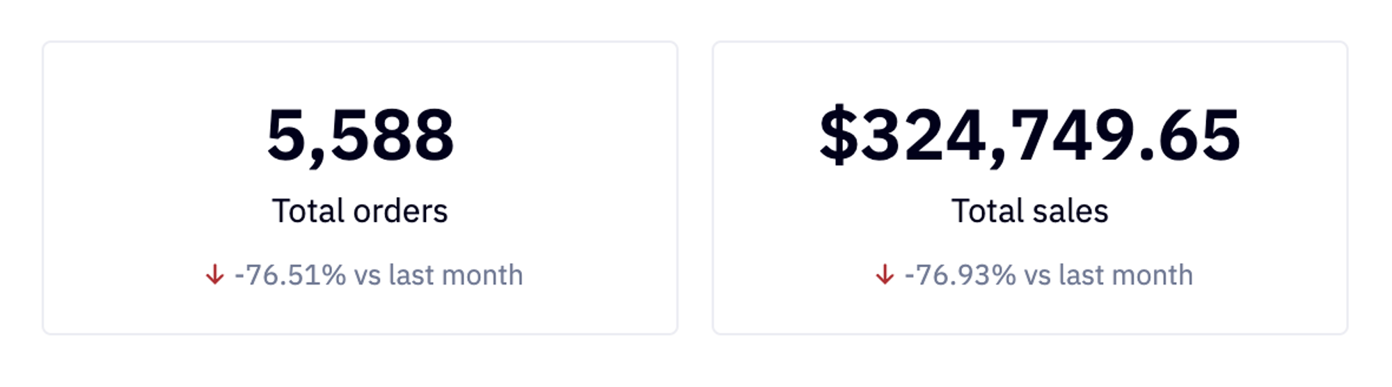
orders_total = int(thirty_day_orders['ORDERS'].sum())
sales_total = thirty_day_orders['SALES'].sum()
prev_orders = int(prev_period_orders['ORDERS'].sum())
prev_total = prev_period_orders['SALES'].sum()
We could print these values to the notebook, but within Hex, we can use them as inputs to single-value fields to highlight them better within the dashboard:
Again, we want to visualize this data. When creating a dashboard, it is essential to think from a user-centric perspective rather than a data-centric view. The end-users need to understand the metrics and data at a glance. Charts, graphs, tables, and single-value visualizations, such as those above, help with this.
Let’s add a line chart for our daily sales data:
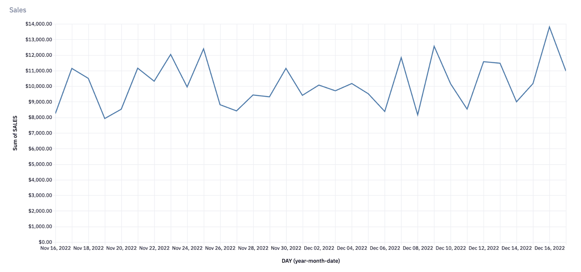
Again, this is a Hex chart, but we can reproduce this (somewhat) using matplotlib:
import matplotlib.pyplot as plt
# Group by day and sum sales
sales_by_day = thirty_day_orders.groupby("DAY")["SALES"].sum()
# Create line chart
plt.figure(figsize=(10, 6))
plt.plot(sales_by_day.index, sales_by_day.values)
plt.xlabel("Day")
plt.ylabel("Sales")
plt.title("Sales by Day")
plt.show()
As we build our dashboard, a pattern is emerging. We write an SQL query to pull and filter the data we want to highlight, and then sometimes follow that with some Python code to manipulate the resultant DataFrame. We then plot the data in the correct format.
So far, that format has consisted only of tables, scatter plots, or line charts. However, the visualization depends entirely on the data type you have.
Company Metrics Dashboard Examples
When it comes to examples of company metrics dashboards, there are many. To give you some ideas of what's possible and what might be most applicable for your company, let’s look at some common ones that teams build.
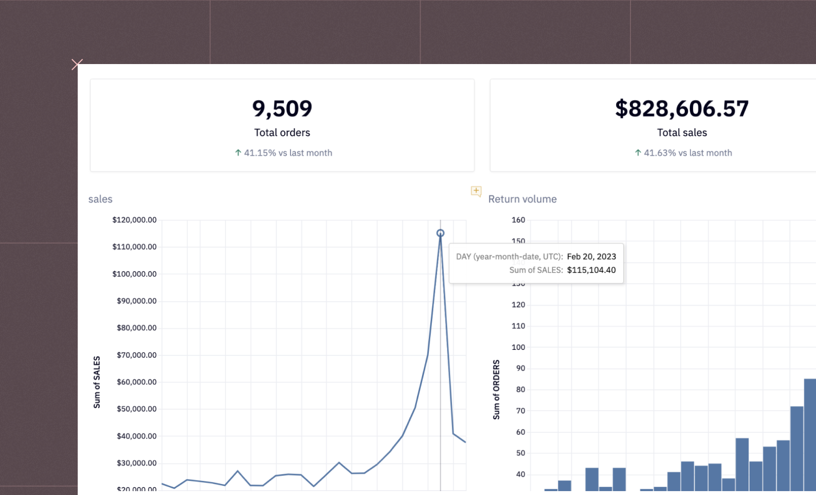
E-commerce Analysis Dashboard
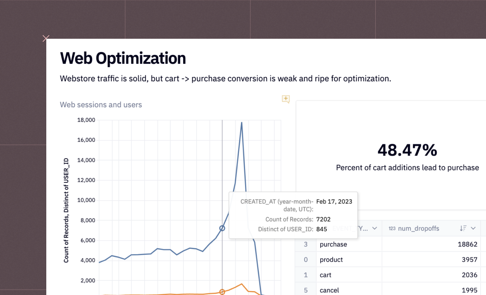
An E-commerce Analysis Dashboard gives teams a bird’s-eye view of their online store’s performance. It tracks key metrics such as sales volume, user sessions, average order value, and purchase conversion rates across different time periods. By visualizing these data points, businesses can easily identify trends in customer behavior, optimize product listings or marketing campaigns, and uncover bottlenecks in the conversion funnel. This type of dashboard is crucial for performance marketers, growth teams, and eCommerce managers looking to increase ROI through data-driven insights.
Feature Success Dashboard
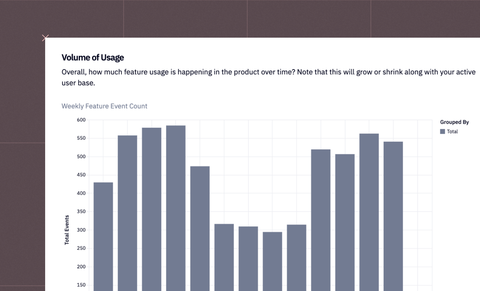
A Feature Success Dashboard helps product teams evaluate how users interact with different features of an app or platform. It tracks metrics such as feature adoption rate, usage frequency, and engagement duration, highlighting which features resonate most with users and which may need rethinking. This insight allows teams to double down on high-performing features, retire underused ones, and make more informed roadmap decisions. It’s particularly valuable for SaaS and product-led growth companies aiming to improve user retention and satisfaction.
Monthly Recurring Revenue (MRR) Dashboard
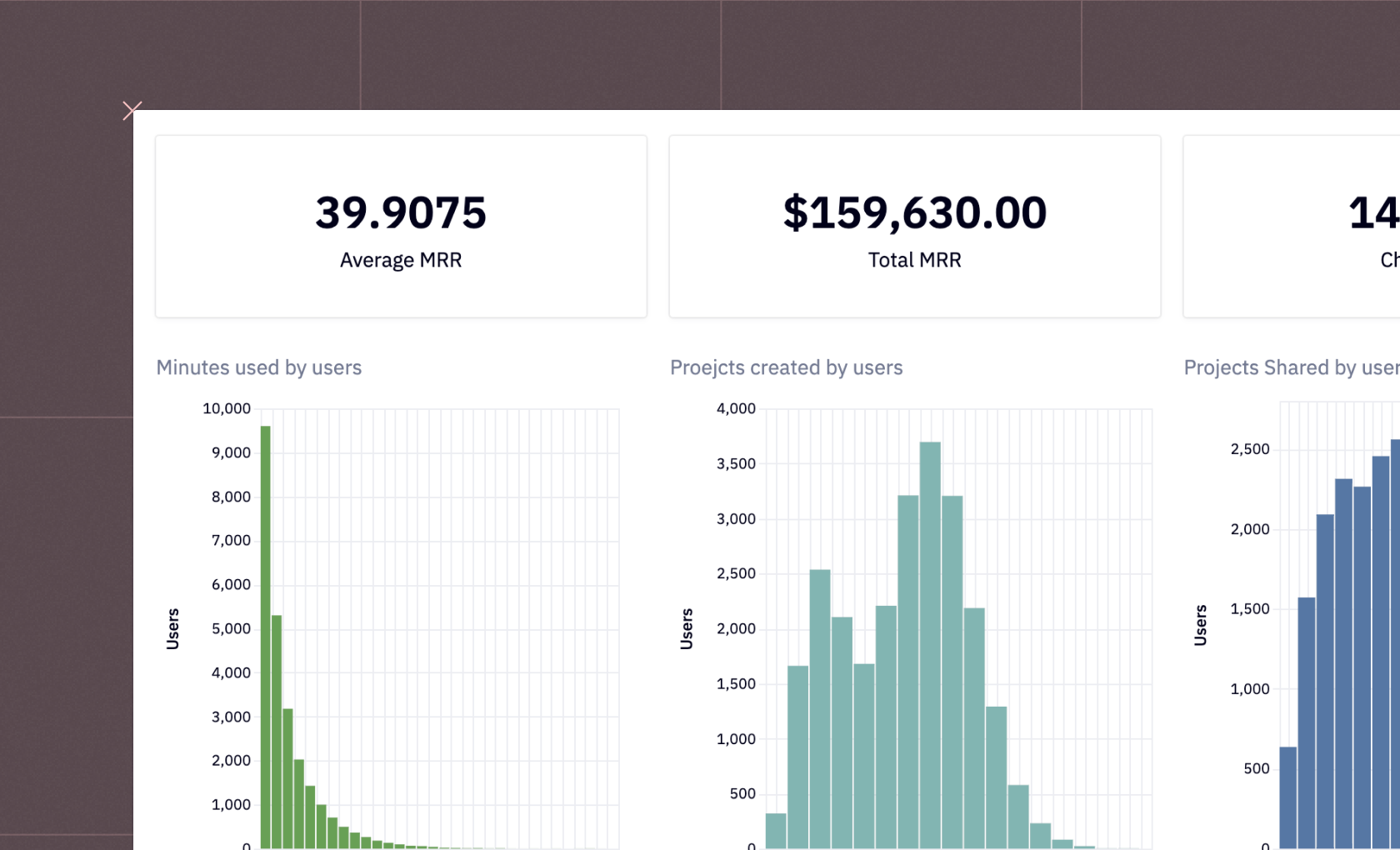
The MRR Dashboard visualizes recurring revenue trends over time, offering insights into growth rate, churn, expansion revenue, and average revenue per user (ARPU). For subscription-based businesses, this dashboard acts as a financial command center, revealing the health of recurring income streams and the impact of new customer acquisitions or upgrades. By monitoring these trends, finance and leadership teams can forecast revenue, evaluate pricing strategies, and make more predictable growth decisions.
Churn Prediction Dashboard
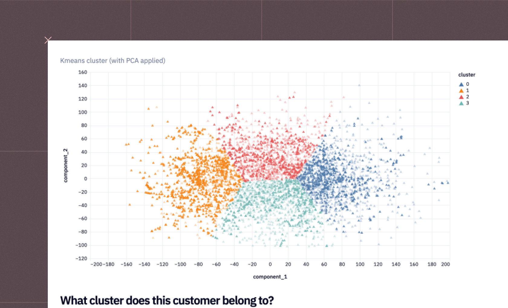
A Churn Prediction Dashboard uses advanced analytics and machine learning models, such as customer segmentation and clustering algorithms, to flag users who are most likely to cancel or discontinue their subscriptions. It brings together behavioral data, engagement metrics, and support interactions to predict churn risk and identify retention opportunities. This allows customer success teams to proactively intervene with personalized outreach, loyalty offers, or targeted engagement campaigns, ultimately helping reduce customer attrition.
Customer Lifetime Value (LTV) Dashboard
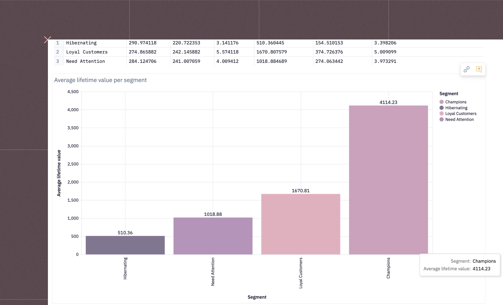
The Customer LTV Dashboard helps businesses understand which customer segments bring the most long-term value. By comparing average order value, repeat purchase rate, and lifespan across cohorts, this dashboard highlights the most profitable user groups and acquisition channels. Marketing teams can use this insight to refine targeting strategies, while finance teams can better forecast future cash flow. In short, the LTV Dashboard turns customer data into actionable intelligence for maximizing profitability and growth efficiency.
Conclusion
Business metrics keep you informed about your business performance and growth. Without tracking them, it’s nearly impossible to make the right decisions in this data-driven world. The best approach is to monitor these metrics on a dynamic dashboard with built-in security controls that ensure both data accuracy and protection.
Building dashboards solely in a traditional BI tool often limits what you can see. BI tools excel at visualization but struggle with data preprocessing and modeling. The better approach is to combine data science and business intelligence in one place. In a platform like Hex, data scientists can clean, transform, and model raw data, then turn those results into interactive dashboards for business users.
Hex also supports self-service analytics, so non-technical users can explore dashboards, apply filters, and uncover insights on their own without waiting for the data team.
To set up your KPI metrics dashboard, sign up for Hex today. You can even start with the Company Metrics Dashboard template, a solid start for tracking the key KPIs.
See what else Hex can do
Discover how other data scientists and analysts use Hex for everything from dashboards to deep dives.
Ready to get started?
You can use Hex in two ways: our centrally-hosted Hex Cloud stack, or a private single-tenant VPC.