Feature Success

Jo Engreitz
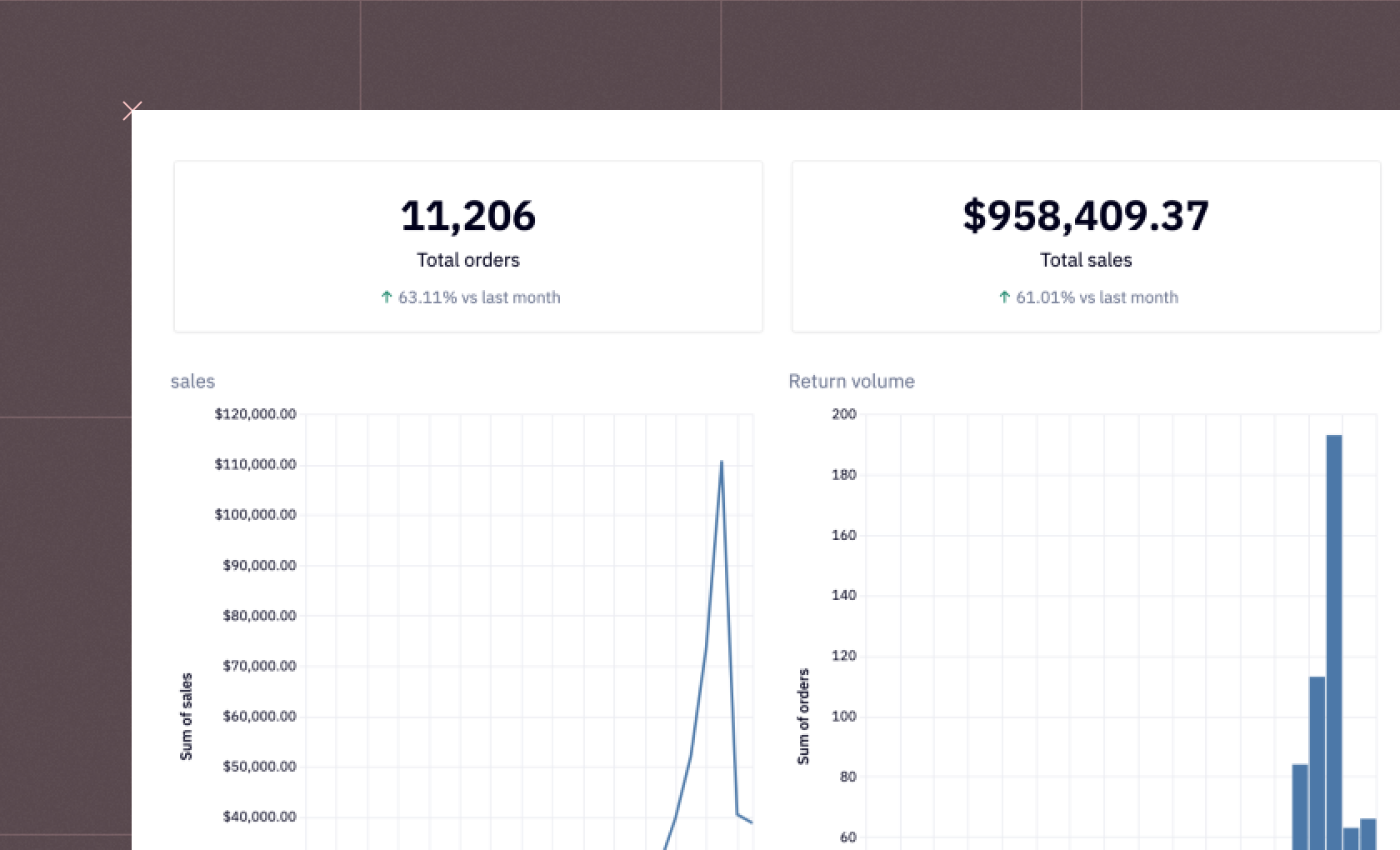
How well is your feature performing? Should you keep it and move on? Spend more time iterating? Kill it entirely? Answer these questions and more with this template Hex app!
How to build: Feature Success
Businesses monitor various KPIs (Key Performance Indicators) to gauge customer reactions to product releases, and determine if a product is successful or not. However, it's also crucial to measure the success of individual features. This helps businesses understand if they're efficiently using their time and resources on feature development that customers actually use. Ultimately, all features should align with the overall business objectives, facilitating tracking through different KPIs.
KPIs help businesses present actionable insights from customer data to help them make different strategic decisions. These are performance metrics that help businesses measure different key performance indicators such as customer satisfaction and feature popularity. Once these indicators are in place, businesses can look for different solutions that can improve the existing product leading to enhanced customer satisfaction. The key rule for choosing a KPI is that it should be measurable, achievable, relevant, and actionable.
Here, we’ll learn about different KPIs that can help you measure the success of a feature and how to create a feature success dashboard, with the help of SQL and Hex, that can help you identify if the released feature will have a significant impact on the customers or not.
Significance of Measuring Feature Success
There's a direct correlation between successful features and happy users. When features address user needs and improve the overall experience, it leads to higher satisfaction. Here are some examples:
Improved Functionality: Imagine a feature that streamlines a previously cumbersome task. This not only saves users time but also reduces frustration, leading to a more positive experience.
Enhanced User Interface: A well-designed and intuitive interface makes interacting with your product enjoyable. Features that simplify navigation or introduce user-friendly elements contribute to a more satisfying experience.
Valuable Content or Resources: Features offering helpful content, tutorials, or resources directly address user needs and demonstrate your commitment to their success. This fosters trust and satisfaction.
They can also influence product adoption. Successful features act as magnets, attracting new users and encouraging existing users to engage more deeply with your product. This can take the form of both:
Drivers of New User Acquisition: Compelling features can be a key differentiator, attracting new users seeking solutions your product offers. Think of features that address a specific pain point or solve a problem in a unique way.
Retention and Increased Engagement: When features deliver value and a positive user experience, users are more likely to stick around. Successful features encourage users to explore other aspects of your product, fostering long-term engagement and loyalty.
Additionally, measuring feature success isn't just about celebrating wins; it also reveals areas for improvement. By analyzing data and user feedback, you can identify features that might be underperforming or not meeting user expectations. This might be identifying unnecessary features through tracking usage data to identify features that users rarely interact with. This allows you to optimize resources and focus on features that deliver higher value.
It might also mean detecting usability issues. Sometimes, features have great potential, but usability issues can hinder user adoption. Measuring things like completion rates or time spent on a feature can help pinpoint areas needing improvement, ensuring a smooth and efficient user experience.
Key Metrics for Measuring Feature Success
Features are the fundamental components of a successful product since they stimulate user interaction and product adoption. However, how can one determine whether a newly added function is indeed beneficial? This is where measures for feature success are useful. These metrics serve as quantitative indicators that assist you in comprehending how users engage with and appreciate your features. You may make data-driven decisions for future development and obtain important insights into the efficacy of your features by monitoring these important variables.
Feature Adoption: This metric reveals how many users are actively using your new feature. It's typically measured as a percentage of your total user base that has tried the feature at least once within a specific timeframe. High adoption rates indicate user interest and potential for success.
Feature Satisfaction: This measure delves further into the opinions of users on the feature. To determine user satisfaction, you can collect data via surveys, in-app evaluations, or user interviews. High satisfaction ratings show that the feature is fulfilling user expectations and providing a satisfying experience.
Active people: This more comprehensive indicator counts the number of people who regularly actively interact with your product. Even if it's not particular to any one feature, it can be useful to determine whether adding a new feature increases user activity in general. Following the release of a feature, a rise in active users may indicate that the feature is increasing engagement.
Customer Satisfaction: It measures the general level of user pleasure with your product, much like feature satisfaction does. Even though it doesn't depend only on one feature, a well-liked feature can raise consumer satisfaction levels all around. Observe patterns in customer satisfaction ratings following the release of a new feature.
Conversion Rates: Conversion rates are important for features that are intended to encourage particular activities (like sign-ups and sales). After using the feature, keep track of the proportion of users who finish the intended action. High conversion rates show that the feature is accomplishing its objectives and successfully influencing user behavior.
Creating a Feature Success Dashboard with SQL and Hex
Now that you know enough about feature success and how to measure it, it is time for some practical implementation. In this section, we will build an interactive dashboard to measure feature success using SQL and Hex, in minutes. Hex is an interactive development environment, that allows you to quickly write the application with its polyglot feature i.e. you can use multiple programming languages in the same environment to build an application. It also provides no-code visualization capabilities for hassle-free visualizations. You can store your data in any database, data warehouse, or cloud storage, with a simple connection to Hex, you can read the data in the Hex environment easily.
We will create a feature success dashboard that can track key metrics like adoption, retention, and satisfaction to measure new features using parameterized SQL and then we will create an interactive app with input parameters. We will also create no-code visualizations of adoption, retention, and satisfaction strategies.
Setup
We need to track events that best represent meaningful feature usage and the criteria for your feature's target audience.
Select the Segment Event(s) that Best Represent Feature Usage
The data that we are going to use for this tutorial is from a fictional design tool. To begin with, we will choose different event_names with the help of SQL select statement as follows:
select * from "segment_events.csv"


Note: One of the best features of Hex is its ability to store the query results in a variable to be used further in a pipeline. For example, the result from the above query can be stored in a variable named segment_events and can be used further with SQL or Python programming language.
To check all distinct event names from the segment_events table, you can use the distinct keyword in SQL as follows:
select distinct event_name
from segment_events


As you can see in the above image, there are a total of 50 distinct event names in the data.
Select Your Target Audience For the Feature
While subscription-based services are taking the world by storm, likely, a new feature is not intended for all users instead it will have different types of exposure to different tier subscriptions. Now we will use some Hex components that will allow us to define variables easily.
As pricing plan (subscription_tier) and user role determine who has access to use a feature we will define the data picker field as follows:


Select the Launch Date for the Feature
We then need to set the input equal to the date we started tracking the feature with event data (For this dummy data set, assume all event data start from 2023-05-15).


As you can see, we have chosen 2023-05-15 as our launch date.
Feature Adoption
Now let's start with our first metric feature adoption. To calculate the same, you need to read the dim_accounts warehouse table as follows:
select * from "dim_accounts.csv";


Associated with this table, we have another database table dim_users that contains the user-specific details. To read it you can use the SQL command as follows:
select * from "dim_users.csv";


Then we will load another hypothetical warehouse table fct_user_updates.
select * from "fct_user_updates.csv";


select * from "fct_account_updates.csv";


Now that all the details are loaded, we will write an SQL query that will return one row per active target user per day since launch. Then we filter out users who don't match the target audience criteria on at least 1 day since launch.
select u.user_id
	, date_trunc('day', s.event_created_at)::date as activity_date
	, uu.user_role
	, au.subscription_tier
from segment_events s
	left join dim_users u using(user_id)
	left join fct_user_updates uu on uu.user_id = s.user_id
    	and date_trunc('day', uu.valid_from)::date <= date_trunc('day', s.event_created_at)::date
    	and date_trunc('day', uu.valid_to)::date > date_trunc('day', s.event_created_at)::date
	left join dim_accounts a on a.account_id = u.account_id
	left join fct_account_updates au on au.account_id = u.account_id
    	and date_trunc('day', au.valid_from)::date <= date_trunc('day',s.event_created_at)::date
    	and date_trunc('day',uu.valid_to)::date > date_trunc('day', s.event_created_at)::date
where s.event_created_at >= {{launch_date}}
	--and uu.user_role in ({{user_role | array}})
	--and au.subscription_tier in ({{subscription_tier | array}})
 	-- in these where clauses we apply parameterized SQL using jinja syntax to update the query based on the App user's input.
 	-- you could also filter out any internal or junk users from dim_accounts or dim_users.
order by 1, 2


Note: The results returned by an sql SELECT statement are always loaded in a dataframe.
Then we will take the target_user_activity dataframe and apply the left join with the segment_events table. The condition that we are going to use is that when segment_event_id is not null, the target user engaged with the feature on that activity date. While this could be joined into the target_user_activity query, it's more readable and easier to test and debug as chained SQL
select a.user_id
	, a.activity_date
	, date_trunc('week', a.activity_date)::date as activity_week
	, date_trunc('month', a.activity_date)::date as activity_month
	, a.user_role
	, a.subscription_tier
	, s.event_id
	, s.event_name as feature_event_name
	, s.event_created_at as feature_event_created_at
from target_user_activity a
left join segment_events s on s.user_id = a.user_id
	and date_trunc('day',s.event_created_at)::date = a.activity_date
	and event_name IN ({{segment_event_table | array}})
--why is event_id coming back null
order by 1, 2


Then, we will take the minimum feature_event_created_at for each target user or leave it null for target users who never interacted with the feature.
select user_id
	, subscription_tier
	, user_role
	, MIN(feature_event_created_at) as first_feature_usage_at
from target_user_feature_activity
group by 1,2,3

Finally, we will calculate the total target users for the feature, total feature users, and subsequent feature adoption rate as follows:
select count(distinct user_id)*1.0 as target_user_count
  , count(distinct case when first_feature_usage_at is not null then user_id end)*1.0 as feature_user_count
  , feature_user_count/target_user_count as adoption_rate
from target_user_first_event


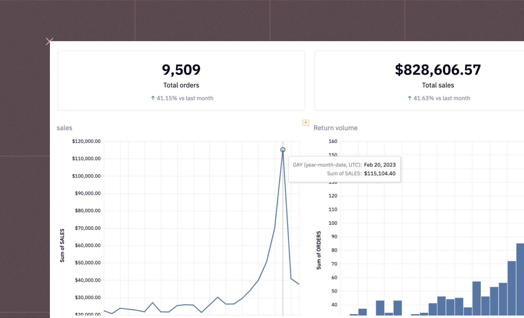
You can also visualization these numbers with Hex as follows:


Feature Retention
The next metric that we are going to calculate for this dummy data is feature retention. To do so, let's first write a query to define the feature adoption cohort that each user falls into.
select user_id
	, subscription_tier
	, user_role
	, date_trunc('week', first_feature_usage_at)::date as cohort_week
from target_user_first_event
where first_feature_usage_at is not null
order by 2


Then we will identify the size of each feature adoption cohort as follows:
select cohort_week
	, count(distinct user_id) as cohort_size
from feature_cohorts
group by 1


Next, let's write a query that returns a row for every user and activity week, giving a count of weekly feature usage for the user that week.
select user_id
	, activity_week
	, activity_month
	, subscription_tier
	, user_role
	, count(distinct event_id) as weekly_user_events
from target_user_feature_activity
group by 1, 2, 3, 4, 5
order by 1, 2


Now, to bring everything together, we will write a query that creates a row for every adopter and activity week, denoting the number of weeks between the user's feature usage cohort, and the count of activities that week.
select c.user_id
	, c.cohort_week
	, a.activity_week
	, c.subscription_tier
	, c.user_role
	, datediff('week', c.cohort_week, a.activity_week) as weeks_after_cohort
	, weekly_user_events
from feature_cohorts c
join activity a on a.user_id=c.user_id and cohort_week <= activity_week


Note: The group-by in this section is based on the users' role or pricing plan at the time of feature adoption.
We will now use the Hex components like the dropdown menu and value selector to make our next query implementation easy.


Visualizations are the best way to understand any of the feature success metrics. To create one for feature retention, we will write a query that pulls the data necessary to chart feature retention.
select weeks_after_cohort
	, {% if group_by == 'Role' %}
    	user_role
  	{% elif group_by == 'Subscription tier' %}
    	subscription_tier
  	{% else %}
    	'Total'
  	{% endif %} as group_by_variable
  	, count(distinct user_id) as user_count
	, count(distinct case when weekly_user_events > 0 then user_id end) as total_retained_users
	, total_retained_users / user_count as retention_rate
from target_user_cohort_activity a
where weeks_after_cohort between 0 and {{weeks}}
group by 1,2
order by 1


You can then use this table with Hex's no-code visualization capability to create a graph for feature retention as follows:


You can also create a simple heatmap to chart cohort feature retention, to prepare the data for the same you can use this SQL statement:
select cohort_week
	, weeks_after_cohort
	, count(distinct user_id) as user_count
	, count(distinct case when weekly_user_events > 0 then user_id end) as total_retained_users
	, total_retained_users/user_count as retention_rate
from target_user_cohort_activity
where weeks_after_cohort between 0 and {{weeks}}
group by 1,2
order by 1,2


Upon using the no-code feature from Hex, you can plot a heat map that looks something like this:


Feature Engagement
Finally, we come to our last feature metric i.e. feature engagement. To do so, let's begin by defining the input field as follows:


Depth of Usage
The first thing that we are going to calculate is the depth of usage which means, when someone uses the feature, how many times do they use it, on average?
select {% if engagement_group_by == 'Role' %}
    	user_role
  	{% elif engagement_group_by == 'Subscription tier' %}
    	subscription__tier
  	{% else %}
    	'Total'
  	{% endif %} as group_by_variable
	, avg(weekly_user_events) as avg_weekly_events_during_weeks_of_usage
from activity
where weekly_user_events != 0
group by 1


As you can see, on average, users use the features exactly once.
Frequency of Usage
By comparing Weekly Feature Users (number of people who used the feature at least once in a given week) vs Monthly Feature Users (number of people who used the feature at least once in a given month), we can get a sense of how frequently the feature is used.
select activity_week
	, {% if engagement_group_by == 'Role' %}
    	user_role
  	{% elif engagement_group_by == 'Subscription tier' %}
    	subscription_tier
  	{% else %}
    	'Total'
  	{% endif %} as group_by_variable
	, count(distinct user_id) as WFU
from activity
where weekly_user_events != 0
group by 1, 2
order by 1


You can also create a graph to get the weekly frequency of feature usage.


Then you can calculate the monthly frequency usage with the help of the following SQL statement.
select activity_month
	, {% if engagement_group_by == 'Role' %}
    	user_role
  	{% elif engagement_group_by == 'Subscription tier' %}
    	subscription_tier
  	{% else %}
    	'Total'
  	{% endif %} as group_by_variable
	, count(distinct user_id) as MFU
from activity
where weekly_user_events != 0
group by 1, 2
order by 1


Similarly, you can create a graph for monthly frequency usage as follows:


As you can observe in the above graph, most of the people used the features in 6/1/23.
Volume of Usage
Finally, we will check overall, how much feature usage is happening in the product over time. Note that this will grow or shrink along with your active user base.
select activity_week
	, weekly_user_events
	, {% if engagement_group_by == 'Role' %}
    	user_role
  	{% elif engagement_group_by == 'Subscription tier' %}
    	subscription_tier
  	{% elif engagement_group_by == 'Language preference' %}
    	user_language_preference
  	{% else %}
    	'Total'
  	{% endif %} as group_by_variable
from activity

The visualization of the above table will look something like this:


Customizing Dashboard and Deployment
Now that you are done implementing all the metrics that help you determine the feature success, you can head over to the App builder section shown on top of the Hex environment. You will see that a dashboard has been already created for you while you were working on the implementation. You can adjust the components of this dashboard by dragging and dropping them to the desired location in the canvas. Once you feel that your dashboard looks good enough, you can then click on the publish button to deploy this dashboard easily.


This is it, you have now created a feature success dashboard and deployed it with a few single clicks.
Strategies for Improving Feature Success
Now that you understand the key metrics for measuring feature success, let's explore strategies to ensure your features thrive and contribute to a flourishing product. Here are some key approaches to keep in mind:
Iterative Development
Imagine building a successful feature as a journey, not a destination. Iterative development embraces this philosophy. It's a continuous process of development, testing, and improvement based on user feedback and data analysis.
Continuous Improvement: Instead of a one-time launch, features should be released in stages, allowing you to gather user feedback and make adjustments based on real-world data. This iterative approach can help you refine your features and ensure they truly meet user needs.
Data-Driven Decisions: Data from your feature success metrics plays a crucial role in iterative development. By analyzing usage patterns, engagement levels, and user feedback, you can identify areas for improvement and prioritize changes that will enhance the feature's effectiveness.
User-Centric Design
The heart of any successful feature lies in understanding and addressing user needs. Here's how to prioritize user-centricity:
User Needs First: Before diving into development, invest time in user research to understand their needs, pain points, and expectations. This ensures the features you build resonate with your target audience and solve real problems.
Feedback Integration: User feedback is a goldmine of insights. Actively seek feedback through surveys, interviews, and user testing throughout the development process. Incorporate this feedback into design decisions to create features that users will find valuable and intuitive.
Gather User Feedback
While covered briefly under User-Centric Design, gathering user feedback deserves its own emphasis. Here are some ways to collect valuable user insights:
User Surveys: Well-designed surveys can provide quantitative data on user sentiment and feature preferences.
In-App Feedback Mechanisms: Make it easy for users to provide feedback directly within your product through in-app surveys or feedback forms.
User Interviews: Conducting in-depth interviews with a targeted group of users allows you to gather qualitative data and gain a deeper understanding of their thoughts and experiences with the feature.
Announce New Features
Proactively announcing new features to users is essential for driving adoption and increasing feature awareness. By effectively communicating the value proposition of new features through targeted marketing campaigns, email notifications, and in-app messages, teams can generate excitement and encourage users to explore and engage with new functionalities. Timely and clear communication about feature releases ensures that users are informed and motivated to leverage new features, contributing to overall feature success.
With a feature success dashboard, you can take control of your feature development process, crafting features that truly resonate with your users and propel your product toward long-term success. Remember, this is an ongoing journey – keep iterating, gather user insights, and use your dashboard to measure progress. By prioritizing user needs and focusing on continuous improvement, you can ensure your features become the driving force behind a thriving product. You can use Hex for building the feature success dashboard with the help of other metrics mentioned in this article.
See what else Hex can do
Discover how other data scientists and analysts use Hex for everything from dashboards to deep dives.

Ready to get started?
You can use Hex in two ways: our centrally-hosted Hex Cloud stack, or a private single-tenant VPC.