Izzy Miller
With Hex, you can easily dive into cohort analysis using Python and unlock insights about your customer groups. Explore their behavior over time, spot retention patterns,...
How to build: Cohort analysis
Cohort analysis, in its simplest form, is like assembling friends who share a common experience, and then observing how their behavior evolves. It's a dynamic method of assembling people with similar traits and following their journeys in tandem. Cohort analysis acts as a compass in the business and marketing domain, helping organizations recognize and address the unique requirements and behaviors of various client segments and, in the process, promote improved strategies and decision-making.
Cohort analysis unveils trends, preferences, and pain points within specific client segments. This insight empowers businesses to tailor approaches, optimizing strategies for maximum impact and enhancing overall customer satisfaction. As a strategic compass, cohort analysis enables organizations to navigate the competitive landscape with precision, staying attuned to the ever-evolving needs of their diverse clientele.
In this article, you will explore several aspects of cohort analysis, such as types of cohorts, important metrics for perceptive analysis, best practices, and additional advantages. Then we’ll work through a practical implementation of cohort analysis with Python and Hex. By the end, you will have a comprehensive plan for using Python to fully utilize cohort analysis, expanding your analytical toolkit for making wise decisions.
Understanding Cohort Analysis
A cohort, in the simplest terms, is a group of individuals who share a common characteristic or experience within a specified timeframe. Cohort analysis, then, is the practice of tracking and analyzing the behavior of these groups over time.
Imagine you're running a business, and you want to understand your customers better. This is where the cohort analysis comes in. Think of a it as a group of customers who share a common experience – maybe they all signed up for a service in the same month or made their first purchase during a specific promotion. By analyzing these cohorts over time, you can see how their behavior changes. Are they using your product more? Are they more likely to make repeat purchases? This valuable information helps you identify trends, predict future behavior, and ultimately optimize your marketing strategies.
In business, cohort analysis is crucial as it reveals details that traditional metrics may overlook. It's not just about big numbers; it's about grasping how various customer groups change over their journey. This helps identify specific trends, preferences, and potential issues within certain cohorts. Businesses use cohort analysis as a guide, customizing strategies for better outcomes whether in retaining customers, refining products, or optimizing marketing. It goes beyond just 'what' the data shows; it's about 'why,' empowering businesses to make well-informed decisions based on a profound understanding of their customer landscape.
Types of Cohorts
Now that we understand the power of analyzing cohorts, let's explore the different ways we can group customers for this analysis. There are two main types of cohorts:
Time-Based Cohorts
Time-based cohorts group individuals are based on a specific time frame, often their initial interaction with a product or service. For example, you might group all users who signed up for your service in January 2024 or all customers who made their first purchase during the Black Friday sale. Time-based cohorts are a great way to track overall user acquisition and retention trends and provide insights into their long-term engagement.
Behavior-Based Cohorts
Behavior-based cohorts categorize individuals based on their actions or behaviors. This could be the frequency of product usage, feature adoption, or any other defined behavior. Examples include users who made a referral, completed a specific tutorial, or opted in to receive email notifications. By analyzing behavior-based cohorts, you can understand how user actions and engagement impact long-term behavior and loyalty.
Key Metrics in Cohort Analysis
Just like any detective needs the right tools, cohort analysis relies on specific metrics to uncover valuable insights. These metrics act as your compass, guiding you toward a deeper understanding of your customer cohorts. Let's delve into some key metrics that play a crucial role in cohort analysis:
Retention Rates
The percentage of cohort users that stick with a product or service over time is called the retention rate. High retention rates signal sustained user interest, showcasing the effectiveness of engagement strategies. It helps assess the ability to retain users, a critical factor for long-term success.
Customer Lifetime Value
This metric estimates the total revenue a customer generates throughout their relationship with your business. By analyzing customer lifetime value across different cohorts, you can understand which customer segments are most valuable and refactor your strategies accordingly. It helps in the improvement of strategic decision-making.
Conversion Rates
This metric measures the percentage of users within a cohort who take a desired action, such as making a purchase, completing a signup form, or upgrading to a paid plan. High conversion rates indicate effective user journeys, contributing to revenue growth. It helps pinpoint areas for improvement in the user experience and marketing strategies.
Average Revenue Per User (ARPU)
This metric calculates the average revenue generated by each user within a cohort over a specific period. Analyzing ARPU across cohorts can reveal differences in spending habits and help you identify opportunities to optimize pricing strategies for different customer segments. It offers insights into revenue-generating potential and informs pricing and product strategies.
Churn Rates
The percentage of users who stop using a product or service within a given time frame is measured by churn rates. High churn rates may indicate issues with product satisfaction or competition. It's vital for understanding user dissatisfaction and refining strategies to improve retention rates.
Benefits of Cohort Analysis
Cohort analysis is a powerful tool that can provide important customer insights; it's not simply a fancy term. You may make data-driven decisions that propel your organization to success and obtain a deeper understanding of your business by examining the behavior of distinct consumer groups (cohorts) over time. Let's examine some of the main advantages of using cohort analysis in your plan:
Identifying Trends and Patterns
Cohort analysis lets you see the bigger picture. By tracking how user behavior changes within cohorts over time, you can identify trends and patterns that might not be evident through individual user data. Imagine you notice a specific cohort's engagement dropping after a product update. This could indicate an issue with the update and guide your efforts to improve user experience.
Evaluating the Effectiveness of Marketing Campaigns
Cohort analysis allows you to track the impact of marketing campaigns on specific cohorts. By analyzing how a cohort acquired through a particular campaign behaves over time, you can assess its effectiveness and optimize your marketing spend for future campaigns.
Improving Customer Retention Strategies
Cohort analysis helps you to identify the customer segment at risk of churning. By analyzing which cohorts exhibit a high churn rate, you can figure out the potential areas to work hard to improve customer retention. Imagine a cohort of students who signed up for your learning platform but haven't returned after a free trial. You might offer them additional resources or personalized learning paths to keep them engaged.
Enhancing Product Development and User Experience
Your product should evolve with your customers. By analyzing how different cohorts interact with your product's features, you can gain valuable insights into user preferences. This can inform future product development efforts and help you prioritize features that resonate most with your target audience.
Cohort Analysis with Python and Hex
In this section, you will see the implementation of the cohort analysis using Python and Hex. Hex is an interactive development environment that can help you dive into cohort analysis using Python and unlock insights about your customer groups. It provides the polyglot functionality that allows you to use multiple programming languages like Python, SQL, etc. in the same environment. It also allows you to create different kinds of interactive plots with both code and no-code functionalities. Hex connects to different data sources including in-house databases to cloud storage. It also provides capabilities to create dashboards and allows you to deploy them with a few clicks. To add it all up, Hex empowers you to make smarter decisions and optimize your business strategies by leveraging the power of cohort analysis.
For cohort analysis, you can choose from several metrics (seen in the previous section) but the most common one is customer retention. Customer retention is derived by tracking how and when people first engage with a product and their subsequent purchases. We'll define a cohort as customers who have made their first purchase within the same month. This means that everyone who made an initial purchase in May belongs to the May cohort, everyone who made the first purchase in June belongs to the June cohort, and so on. You can then use these cohorts to ask more specific, targeted questions about how different sets of customers behave after they've started shopping with you.
Let's start with the practical implementation.
Install and Load Dependencies
Implementation of cohort analysis does not require any specific Python module from Python. You just need to use the libraries for data processing and visualization. You can install these libraries with the help of Python Package Manager (pip) as follows:
$ pip install pandas
$ pip install numpy
$ pip install matplotlib
$ pip install seaborn
Once the dependencies are installed, you can load them in the Hex environment as follows:
import pandas as pd
import matplotlib.pyplot as plt
import warnings
import seaborn as sns
from operator import attrgetter
import matplotlib.colors as mcolors
import numpy as np
import calendar
To read and preprocess the data we will use the pandas, numpy, and operator libraries. To create the visualizations, we will use the matplotlib and seaborn libraries. Finally, to apply the operations related to time, we will use the calendar module.
Load Dataset
We will be using the e-commerce data to perform the cohort analysis, this data can be downloaded from here. For this article, the data we will be using has updated dates and no null values. To load the dataset, we will use the read_csv() method from padnas that reads the CSV files into a DataFrame.
data = pd.read_csv('retail.csv',
            	parse_dates=['InvoiceDate'],
            	dtype={'CustomerID': str,
            	'InvoiceID': str})
Once the data is loaded, you can check the first few rows using the head() method or you can use Hex's no-code functionality to check the same.

Exploratory Data Analysis (EDA)
Next, we will explore the data a bit which will help us understand what the data holds. we'll do some light EDA by calculating the number of orders per customer and the rate at which customers make more than a single purchase.
To begin with, the data contains some returned orders, represented by the negative number in the Quantity column. We will remove these orders as follows:
data = data[data['Quantity'] > 0]Then, we will apply the groupby method on the filter data to identify customers with more than one and multiple orders.
n_orders = data.groupby("CustomerID").nunique()
more_than_one_order = int(
	np.sum(n_orders["InvoiceNo"] > 1) / data["CustomerID"].nunique() * 100
)
multiple_orders = int(
	np.sum(n_orders["InvoiceNo"] > 2) / data["CustomerID"].nunique() * 100
)
Here we find that 65% of customers ordered more than once and 46% have ordered more than twice. This is useful to know because it indicates that there will be noticeable retention across cohorts given that the majority of users are placing multiple orders. We can also visualize this using a histogram.

Similar to these bar graphs, you can create any type of visualization with Hex's no-code functionality. Data loaded in the earlier cells is used to create these graphs in the preceding cells.
Creating Cohorts
Now we can start building our cohorts! Remember, a cohort is just a way to group customers who share something in common. In this case, we're using the month of their first purchase. First, let's reduce our dataset to only include the most relevant columns. We will also drop the duplicate rows from the data if there are any.
data = data[['CustomerID', 'InvoiceNo', 'InvoiceDate', 'UnitPrice']].drop_duplicates()As you can see, we have filtered out the CustomerID, InvoiceNo, InvoiceDate, and UnitPrice columns.
Next, we can create our cohorts by finding the minimum (first) invoice date for each customer. Then we will add another column that tells us the month that each customer has made a purchase, which will be used to indicate the number of periods they've made purchases after their initial purchase. For example, if I make the purchases on these dates:
04/02/2022
04/04/2022
05/03/2022
06/21/2022
Then my cohort month is 04/2022, however, my order months are 04/2022, 05/2022, and 06/2022. So I've made 4 purchases across 3 different periods.
# Indicates the cohort that a customer belongs to based on the initial purchase date (using the transform method will return all of the original indices with the applied transformation)
data['cohort'] = data.groupby('CustomerID')['InvoiceDate'].transform('min').dt.to_period('M')
# Indicates the month that each customer has made a purchase
data['order_month'] = data['InvoiceDate'].dt.to_period('M')
In the above code, we are grouping the data based on the CustomerID column and then we are using the transform(min) method that specifies that we will apply the min aggregation method on the InvoiceDatecolumn. Finally, we are storing it in the cohortcolumn and then in the order_monthcolumn of the dataframe.
Now that we have a table with the initial purchase date and the month of each customer's order, we can aggregate the data for each cohort and order_month and count the number of unique customers in each group. Additionally, we add the period_number, which indicates the difference between the cohort date and the month of each individual purchase.
cohorts = (
	data.groupby(["cohort", "order_month"])
	.agg(n_customers=("CustomerID", "nunique"), total_spent=("UnitPrice", "sum"))
	.reset_index(drop=False)
)
cohorts["period_number"] = (cohorts["order_month"] - cohorts["cohort"]).apply(
	attrgetter("n")
)

# Converts timestamps into calendar dates
cohorts["cohort"] = cohorts["cohort"].apply(
	lambda row: f"{calendar.month_abbr[int(str(row).split('-')[1])]} {str(row).split('-')[0]}"
)
cohorts["order_month"] = cohorts["order_month"].apply(
	lambda row: f"{calendar.month_abbr[int(str(row).split('-')[1])]} {str(row).split('-')[0]}"
)
In the above code, we are simply aggregating the cohort and order_month based on the number of unique customers in each group and then we calculate the difference between the cohort date and the month of each individual purchase and storing it in period_number column. Finally, we are converting the dates in the cohort and order_month columns to a calendar date format.

Now that we have our cohort data in a long format, we can pivot our data to create our retention matrices. A retention matrix will show us how user activity changes over time for each of our cohorts.
retention_relative = cohorts.pivot_table(
	index="cohort", columns="period_number", values="n_customers", sort=False
)

# so that we preserve column order
columns = cohorts["order_month"].unique().tolist()
retention_absolute = cohorts.pivot_table(
	index="cohort", columns="order_month", values="n_customers", sort=False
)[columns]

retention_price = cohorts.pivot_table(
	index="cohort", columns="period_number", values="total_spent", sort=False
)
In the above code, we are using the pivot_table method from pandas that allows us to create the spreadsheet-style pivot table as a DataFrame.

Visualizing Cohorts
The final step of the cohort analysis is to visualize each retention matrix to get an understanding of the overall retention for each cohort, patterns that may appear, and how each cohort compares to the other cohorts.
We are going to define a function that will plot each matrix and format it for the metric we're hoping to understand:
Relative retention
Absolute retention
Spending retention
def matrix_of_retention(pivoted_table, matrix_type):

	metric = 'cohort size'
	cohort_size = pivoted_table.iloc[:,0].tolist()
	label = 'period since initial purchase'

	if matrix_type.lower() == 'relative':
    	title = 'Monthly Cohorts: Relative User Retention'

	elif matrix_type.lower() == 'absolute':
    	cohort_size = np.diag(pivoted_table)
    	label = 'order month'
    	title = 'Monthly Cohorts: Absolute User Retention'

	elif matrix_type.lower() == 'price':
    	metric = "total spent"
    	title = 'Monthly Cohorts: User Spending'
	else:
    	raise ValueError("Invalid matrix type. Options are [relative, absolute, price]")

	retention_matrix = pivoted_table.divide(cohort_size, axis = 0)
	return retention_matrix, metric, label, title, cohort_size

def plot_retention(pivoted_table, matrix_type):

	retention_matrix, metric, label, title, cohort_size = matrix_of_retention(pivoted_table, matrix_type)

	# actual plot code
	with sns.axes_style("white"):
    	if matrix_type != 'price':
        	fig, ax = plt.subplots(1, 2, figsize=(12, 8), sharey=False, gridspec_kw={'width_ratios': [1, 11]})

        	# retention matrix
        	sns.heatmap(retention_matrix,
                    	mask=retention_matrix.isnull(),
                    	annot=True,
                    	fmt='.0%',
                    	cmap='RdYlGn',
                    	ax=ax[1])
        	ax[1].set_title(title, fontsize=16)
        	ax[1].set(xlabel= label,
                	ylabel='cohort')

        	# cohort size
        	cohort_size_df = pd.DataFrame(cohort_size).rename(columns={0: f'{metric}'})
        	white_cmap = mcolors.ListedColormap(['white'])
        	sns.heatmap(cohort_size_df,
                    	annot=True,
                    	cbar=False,
                    	yticklabels=False,
                    	fmt='g',
                    	cmap=white_cmap,
                    	ax=ax[0])
    	else:
        	fig = plt.figure(figsize=(12, 8))
        	sns.heatmap(retention_matrix,
                    	mask=retention_matrix.isnull(),
                    	annot=True,
                    	fmt='.0%',
                    	cmap='RdYlGn')

    	fig.tight_layout()
The above lines of code create a retention matrix using the matrix_of_retention() method and then implement a heatmap for that retention matrix using the plot_retention() method.
To plot the monthly cohorts for relative user retention, you can use the following line of code:
plot_retention(retention_relative, 'relative')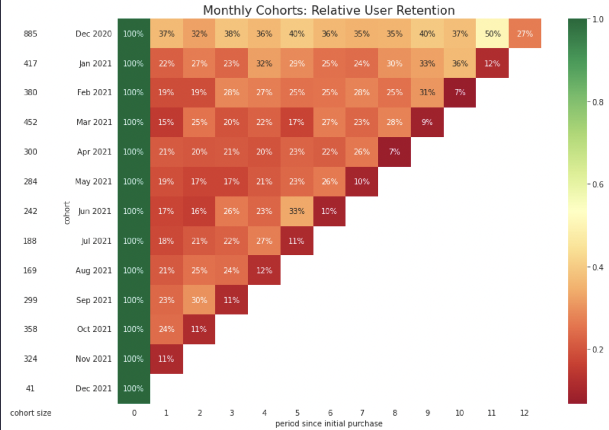
When looking at a relative retention matrix, each dimension represents something different. The rows show us how the activity of the cohort has changed as they all age from the period of their first purchase. The columns tell us how different cohorts compare to each other at the same relative "age" (e.g. periods since their first purchase). Finally, the diagonals on a relative retention matrix highlight each cohort's behavior in the same calendar month.
In the table above, we see an average retention of 20.62% in the first period across all cohorts. Also, if you look at the diagonal that represents the month of November 2021, we can see that there seems to be a slight uptick in purchases across cohorts. This could possibly be caused by customers coming back to do some holiday shopping.
Similarly, to plot the monthly cohorts for absolute user retention, you can use the following line of code:
plot_retention(retention_absolute, 'absolute')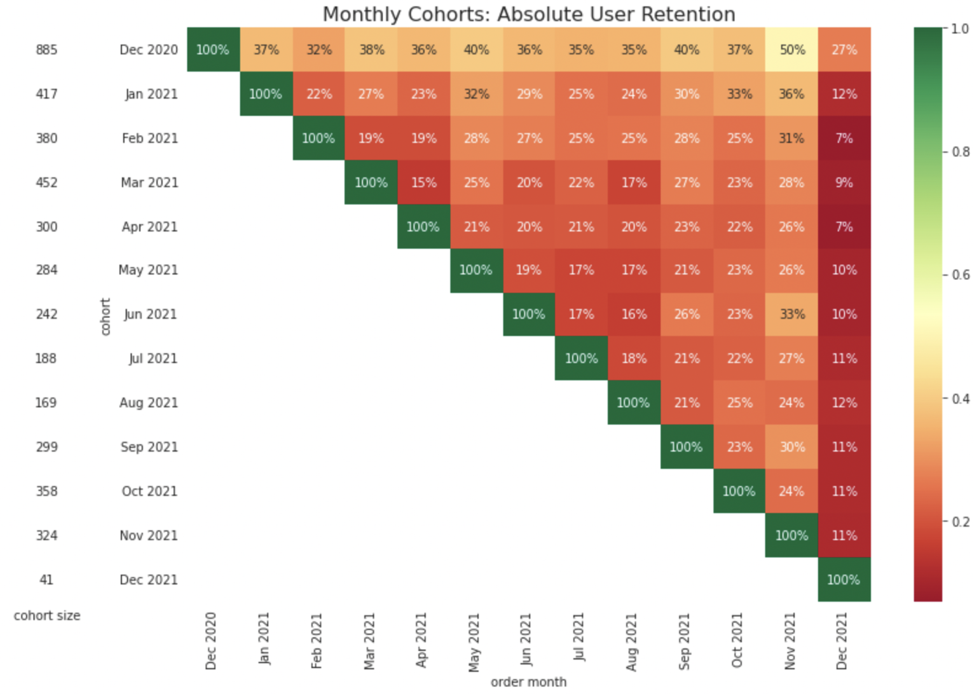
The above plot shows how each cohort stacks up in the same calendar month. In this chart, the columns represent the activity for all cohorts in a given calendar month, which makes it easier to see how a specific time of year may impact the cohort. Only the oldest cohorts will have complete data for all months in this chart, as newer cohorts have not yet made their first purchase in the earliest months. For absolute cohort retention charts, the diagonals give us an idea of cohort activity at the same cohort age.
Next, to check the spending patterns across different cohorts, you can use the following line of code:
plot_retention(retention_price, 'price')
This chart shows us the spending patterns of each cohort. It looks at the total amount each cohort spent during the month of their initial purchase and how much they spent in the following months in comparison. Notice how the August cohort spent 80% of their initial period in October and 101% in November 🤯 . Something about this cohort is especially driven to return to your store for some early fall holiday shopping. You might want to dig into what makes this cohort so special as a following!
The December 2020, and January 2021, cohorts in particular have slightly higher retention than other cohorts. These months can be active due to Christmas, New Year's, and the beginning of the school year in August. Perhaps customers acquired around this time have some incentive to stay loyal throughout the year.
Next, we can visualize the activity of each cohort using line charts to get an alternate view of how the retention of one cohort compares to the others.
cohort_plot = cohorts.copy()
cohort_plot['as_percent'] = cohort_plot['n_customers'] / cohort_plot['n_customers'].max()
See, this is how easy it is to perform cohort analysis, create a dashboard, and publish it in Hex.
Best Practices and Tips
To ensure you get the most valuable insights from your analysis, here are some best practices to keep in mind:
Choosing relevant cohort periods: When defining your cohorts, select timeframes that are relevant to your business cycle and data availability. For instance, if you run a subscription service, analyzing cohorts based on monthly subscriptions might be more insightful than weekly intervals.
Segmenting cohorts effectively: Don't just group all your users together. Segment your cohorts based on meaningful characteristics like acquisition source, signup timeframe, or user behavior (e.g., first purchase, feature usage). This allows you to uncover more specific trends and patterns within different customer segments.
Considering user behavior and characteristics: Go beyond just demographics. Look at user behavior and characteristics alongside your cohort analysis. For example, analyze how purchase frequency or engagement levels differ across cohorts. This can provide a more holistic understanding of your customer base.
Regularly updating and re-evaluating cohort analyses: The world of business is dynamic, and so should your analysis. Regularly update your cohort analyses with fresh data to track evolving trends and user behavior. Re-evaluating your analysis periodically allows you to identify new insights and adapt your strategies accordingly.
Visualize your findings: Don't get lost in numbers. Use charts, graphs, and other visual elements to represent your cohort analysis data. This makes it easier to understand trends, identify patterns, and communicate your findings to others.
Cohort analysis is a powerful tool for understanding and optimizing customer behavior over time. By grouping customers based on shared characteristics or experiences, businesses can uncover valuable insights into retention, engagement, and revenue trends. Python and Hex provide an ideal environment for performing cohort analysis, from data preprocessing to visualization and dashboard creation.
By following best practices such as choosing relevant cohort periods, segmenting effectively, considering user behavior, regularly updating analyses, and visualizing findings, organizations can harness the full potential of cohort analysis to drive data-driven decision-making and improve overall business performance. With the right approach and tools, cohort analysis can be a game-changer in navigating the ever-evolving landscape of customer dynamics and optimizing strategies for long-term success.
See what else Hex can do
Discover how other data scientists and analysts use Hex for everything from dashboards to deep dives.
Ready to get started?
You can use Hex in two ways: our centrally-hosted Hex Cloud stack, or a private single-tenant VPC.
