Izzy Miller
Period over period analysis in a notebook has never been easier or more flexible. With a powerful Python workspace that also supports SQL, you can build a fully interacti...
How to build: Period over period analysis
For data analysts, a fundamental challenge is: How can progress be measured? How can you compare your current performance to past results? These questions are what most business analysis boils down to.
In business and finance, Period-over-Period (PoP) analysis is a reliable method for making such evaluations.
Period Over Period (PoP) Analysis makes evaluating changes in key metrics over consecutive time intervals easier. In simple words, it's a technique for identifying patterns and variances by comparing data from one period to data from the past that covers many trends and variations. PoP analysis is important in the field of business and finance. It is important because it can provide information on changes in performance, point out trends of incline or decline, and support strategic decision-making. Experts who understand the nuances of PoP Analysis are better able to navigate dynamic circumstances from informed positions.
Where does PoP analysis excel? PoP analysis provides valuable insights in many industries. Marketing teams can use it to evaluate the effectiveness of new campaigns, while e-commerce companies can monitor monthly sales growth. Financial experts can track economic indicators over time, and investors can compare quarterly stock performance. By understanding how performance changes over time, businesses can identify areas for improvement, refine their strategies, and ultimately achieve their goals.
In this article, we'll embark on a journey to master PoP analysis with Python and Hex. We'll examine important data, investigate various timeframes and comparison periods, and provide you with the tools necessary to analyze PoP patterns properly. Prepare to unleash the power of time and extract insightful knowledge from your data!
Key Metrics in PoP Analysis
To get meaningful insights that could help drive business decisions it is important to choose the right set of metrics that align properly with your goals and business requirements because these metrics act as a compass guiding you toward a deeper understanding of your business performance in the market over some time. So, here are some of the key metrics that will help you understand the story of business.
Revenue growth rate: This metric is expressed in percentage and indicates the revenue change over a specific period. Positive growth signifies the progress of a business while the decline in the graph prompts further for more investigation into other parameters for better improvements. It is a fundamental factor that helps assess the effectiveness of your sales and marketing strategies.
Profit margin changes: It is also represented in percentage terms which shows the difference in profit margin between two timeframes (profit calculated as a percentage of revenue). It indicates how efficiently you're converting revenue into profit, highlighting areas for cost optimization or pricing adjustments.
Customer acquisition and retention rates: It assesses the number of customers changing in a specific period. In simple words, this metric tracks how effectively you can attract new customers, and retain the existing ones. By comparing the rates over a specific period of time you can track the trends in customer behaviour.
Operational efficiency metrics: This category includes a range of measures that evaluate how well your company runs. Examples include staff productivity, inventory turnover rate, and average order processing time. Finding opportunities for cost-cutting and operational simplification can be aided by tracking changes in these metrics over time.
Return on Investment (ROI): ROI measures the profitability of an investment. Evaluating how returns change over periods and guides strategic investment decisions.
Timeframes and Comparison Periods
Selecting the appropriate timelines and comparison periods is essential for deriving reliable findings from PoP analysis, just as comparing apples to oranges can be deceptive. Ensuring that both periods are comparable to uncover real performance improvements might be compared to laying the groundwork for fair competition.
Choosing the Right Time Intervals for Analysis
The time interval you choose for your analysis should be relevant to your business and data availability. Here are some factors to consider:
Align with Business Cycles: Select timeframes that reflect your industry's natural cycles. For example, quarterly comparisons might be suitable for seasonal businesses, while monthly comparisons might be better for subscription-based services.
Data Availability: Make sure you have enough data for the selected time period to produce statistically meaningful results.
Maintain Consistency: After you've decided on a timeline, make an effort to stick with it so you may compare trends across time in the future.
Selecting Comparable Periods for Meaningful Insights
Selecting comparable periods is essential for ensuring your PoP analysis. It reveals genuine performance changes, not just seasonal fluctuations or external influences. Here are some key points to remember:
Compare Similar Periods: Do not compare off-seasons or times with extraordinary events to peak seasons. Instead, compare similar periods. Choose times when business activity and market circumstances are similar.
Take into Account Other Influences: Consider outside variables in analysis that may have affected performance at either time, such as holidays, market trends, or industry-specific events.
Calendar Variation Adjustment: Take into consideration fluctuations in the number of days between periods being compared, particularly when working with data that is weekly or monthly.
Handling challenges in aligning timeframes
Challenges may arise because timeline alignment is a difficult job due to the presence of multiple irregularities in data. To overcome this messy data you need to perform some operations for data validation, data cleaning, anomaly detection, etc. Below are the methods that need to be addressed and inspected before POP analysis of data.
Missing data: To fill in the gaps, take into account other timeframes or methods like data imputation if data is absent for particular time periods.
Unequal intervals: To guarantee a fair comparison, make necessary adjustments to calculations when comparing periods of differing lengths (such as months vs. quarters).
Seasonality: To account for predictable variations, firms experiencing seasonal fluctuations may think about utilizing year-over-year comparisons or seasonal adjustments.
Interpreting PoP Trends
PoP analysis is not limited to percentage computations. The real power is in how you interpret the patterns from your calculations. These patterns tell the tale of performance over time in a narrative fashion. You will be able to decide on future strategies with knowledge of these trends. Here are key aspects to consider when interpreting PoP trends:
Identifying Positive and Negative Trends
Determining whether your measurements are rising or falling over time is essential to assessing your overall effectiveness. But only determining the change's direction is insufficient.
Context: It's critical to distinguish between upward trends (positive), which point to development and advancement, and downward trends (negative), which point to possible difficulties.
Magnitude: The size of the change is also important. A slight decrease in a measure may not be as alarming as a large one.
Understanding the Implications of Significant Changes
Not every modification to your metrics is made equally. To make wise selections, it is necessary to examine the causes of informed decisions.
Impact: Take into account the extent of the modification and how it can affect the company. While a slight rise in sales might be encouraging, a significant decline might necessitate quick action.
External Factors: Keep in mind the impact of outside variables such as industry trends, seasonal fluctuations, and economic situations. Sometimes surprising variations in your data can be explained by these variables.
Differentiating Between Short-term Fluctuations and Long-term Trends
Not every increase or decrease in your data indicates a long-term pattern. It is important to understand the difference between temporary fluctuations and persistent movements that indicate deeper changes.
Short-term Variations: These may result from some random circumstances such as the passage of time, or even inaccuracies in the data. They are not to be interpreted as long-term patterns.
Underlying Patterns: Recognizing long-term trends aids in both strategic decision-making and understanding the wider picture. These patterns show important shifts in your company's operations or the state of the industry.
Period over Period Analysis with Python and Hex
Now that you know about period-over-period analysis, it is time to see some practical implementation of it using Python and Hex. We will create an interactive dashboard and will deploy it using Hex.
Let us set the context first, Imagine you're a data scientist for Uber and you've been tasked with analyzing rides in New York in order to understand rider behavior over time. This task is a perfect use case for period-over-period analysis, which allows you to compare one or more points in time to all other points of time in the same period. For example, if I have data from 2009 - 2015 and I want to understand how ride behavior changes over time in the month of April, I would compare the month of April across 2009, 2010, 2011, and so on.
Let's start with the implementation of period-over-period analysis.
Install and Load Dependencies
To begin with, you need to load the required Python libraries for PoP analysis. Most of these libraries are preinstalled in Hex but if you want to install the latest versions, you can use the Python Package Manager (PIP) to install them as follows:
pip install pandas
pip install numpy
pip install geopandas
pip install geopy
pip install seaborn
Once the dependencies are installed, you can load them into the Hex environment as follows:
import pandas as pd
import numpy as np
from datetime import datetime, timedelta
import calendar
import warnings
from geopy import distance
import geopandas
import seaborn as sns
warnings.filterwarnings("ignore")
The pandas and numpy libraries will be used to read and manipulate the data. datetime and calendar libraries will be used for applying operations on time data. Geopy and Geopandass will be used for geospatial data analysis. Finally, the Seaborn Library will be used for visualization.
Load and Explore the Data
The next step is to load the dataset. The dataset that we are going to use is based on Uber rides in New York between 2009 and 2015. In our case, the data is patiently waiting in a Snowflake database and we can easily pull it into Hex with the use of a [SQL cell].
You can read the data with the SQL select statement as follows:
select * from "DEMO_DATA"."DEMOS"."UBER_RIDES"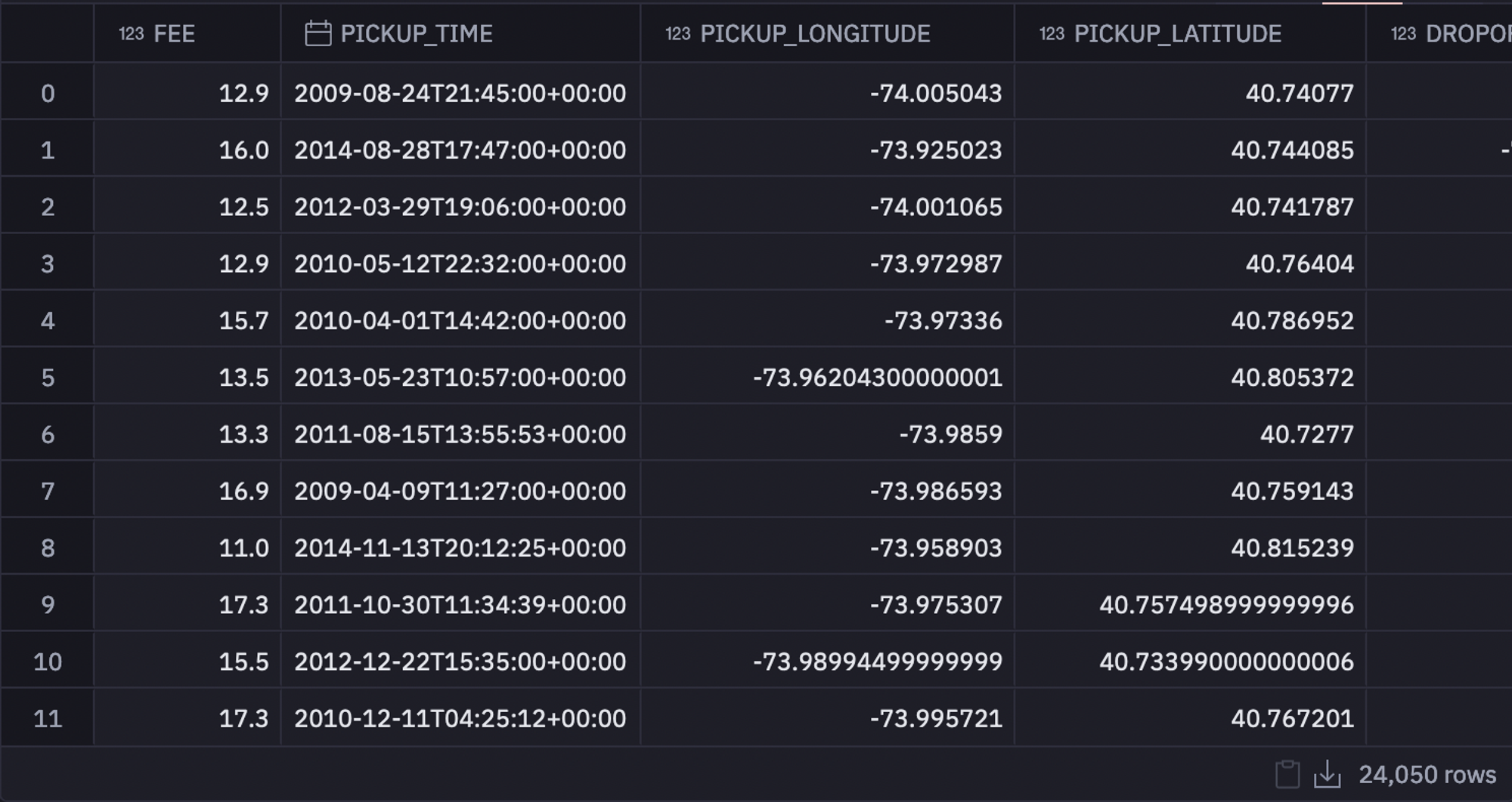
Next, we will define some input parameters so that users can choose a specific time for period-over-period analysis. This will help us later in the logic to decide how to transform the data and will make performing different operations on the same data much easier. Here you need not worry about defining the parameter in the Python language instead you can use the functionality of Hex to create a drop-down menu for the user which looks like this:

You have two choices in the above dropdown (initially you will have to define), one is month over month and the other one is year over year. Users can choose one appropriately as per their requirements.
Next, we will use the original dataframe to get a list of the available years (years present in the data) as well as the available months. We then feed these lists into a dropdown input such that users have full control over which years and months they want to analyze.

Then we will define a function that will create our activity dataframe, which we will use to visualize each period. The reason we do this is so that we can use a single chart to plot the data as it changes, rather than creating a new dataframe and chart each time the data changes.
def build_dataframe(frame):
	''' Takes the dataframe as input and returns a standardized dataframe that can be visualized in a chart even if the data changes '''
	# creates an empty data frame that we will populate with the results
	activity = pd.DataFrame()

	# changing the values from the original column names to the x and y axes along with how to group the data
	activity['x'] = frame['PICKUP_YEAR']  if period == 'year over year' else frame['PICKUP_MONTH']
	activity['y'] = frame['PICKUP_YEAR']
	activity['group'] = None if period == 'year over year' else frame['PICKUP_YEAR']
	columns = ['FEE', 'PICKUP_LONGITUDE', 'PICKUP_LATITUDE', 'DROPOFF_LONGITUDE', 'DROPOFF_LATITUDE', 'PASSENGER_COUNT', 'PICKUP_MONTH', 'PICKUP_DAY', 'TRAVEL_DISTANCE']
	activity[columns] = frame[columns]
	return activity

# this function filters the data to only return the values within the selected period,
# then passes the data off to be transformed by the function above.
def prepare_data(year_filter, month_filter):
	# basically we just want to return all of the information from the selected years
	df = data[data['PICKUP_YEAR'].isin(year_filter)].copy()
	if period == 'month over month':
    	# return the yearly stats but only for the selected months
    	df = df[df['PICKUP_MONTH'].isin(month_filter)]

	return build_dataframe(df)
As you can see in the above code, the prepare_data() method takes the year_filter and month_filter variables and filters the original dataframe based on these values. Then build_dataframe() is responsible for creating the actual activity dataframe.
Now we can call the prepare_data() method to process the data as follows:
activity = prepare_data(years, months)
print(f"Comparing the months {None if len(months) == 0 else months} in {years}")
The activity dataframe will look something like this:

Data Visualization
Now that your data is ready, you can use the no-code visualization functionality of Hex to create the visualization. You can either use the year-over-year period or month-over-month period and create a plot that could look something like this:
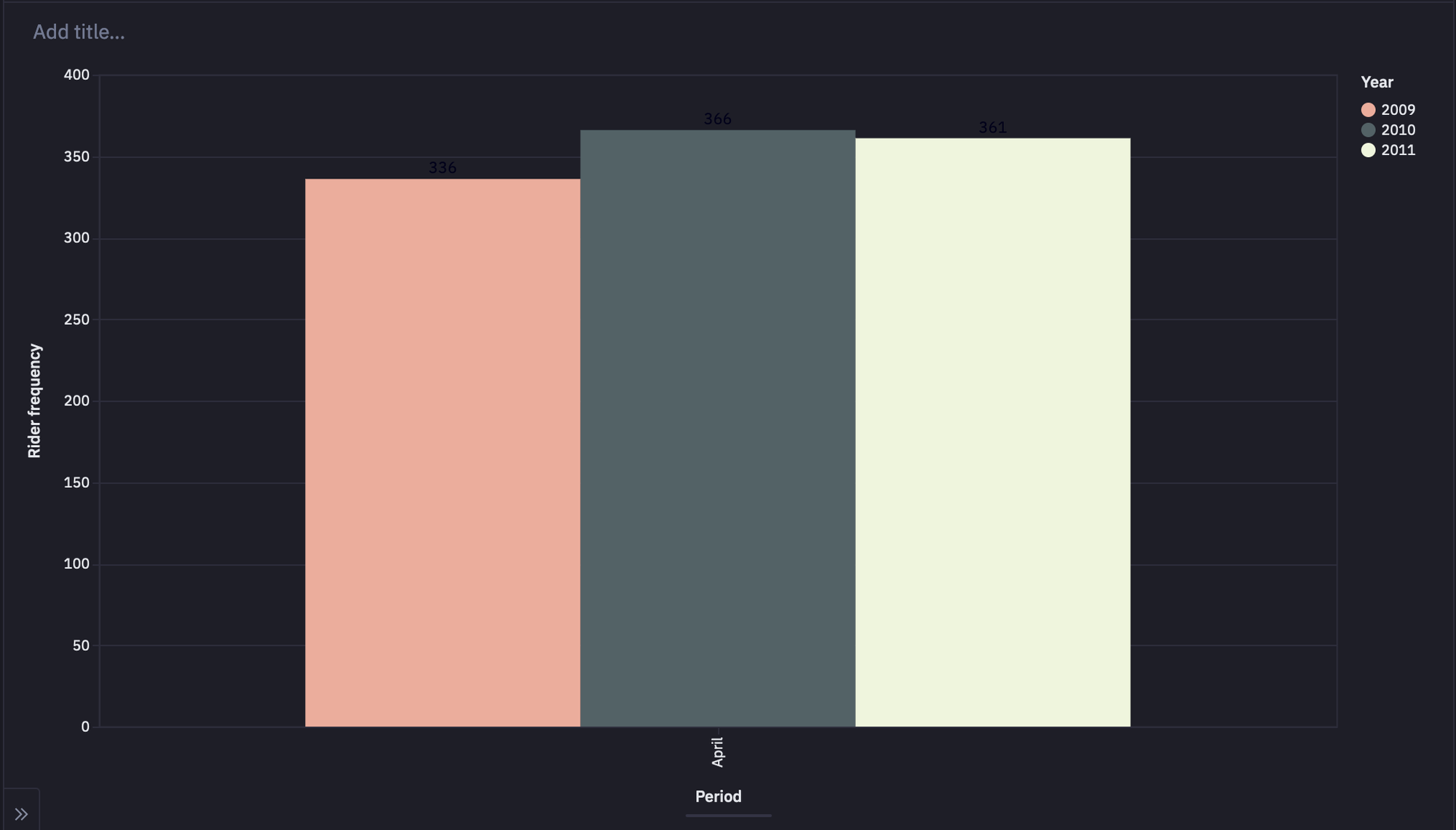
Define Functions for Period Over Period Analysis
Now we will implement two Python methods add_period_data() and extract_data() to know more about the data.
Extract Data Function
The purpose of this function is to look at the activity dataframe and summarize the columns from it. For example, "What was the average travel distance for this month?" Information like this can't be pulled from our dataframe directly until certain transformations are applied, and this function applies those transformations. At the end of the function, the summary from each column is added to a dictionary via the add_period_data() method.
Add Period Data Function
We create an empty dictionary that we want to populate with the data summarized by the extract_data() function. We provide the period (Month or Year) along with how the data should be grouped. If the period is year over year, then there is no grouping, otherwise we group by the selected years. The return value from this method is the period data dictionary with the summarized information from that period.
periods = activity["x"].unique()
groups = activity["group"].unique()
period_data = {
    	key: {} if period == "year over year" else {group: {} for group in groups}
    	for key in periods
	}

def add_period_data(p, group, **variables):
	''' Creates a dictionary with summarized stats across all periods '''

	if period == "year over year":
    	period_data[p]["total_travel_distance"] = variables.get("total_distance_traveled")
    	period_data[p]["average_travel_distance"] = variables.get("average_distance_traveled")
    	period_data[p]["total_revenue"] = variables.get("total_revenue")
    	period_data[p]["ride_count"] = variables.get("rides")
    	period_data[p]["best_month"] = variables.get("best_month_fees")
    	period_data[p]["revenue_best_month"] = variables.get("fees_for_best_month")
    	period_data[p]["worst_month"] = variables.get("worst_month_fees")
    	period_data[p]["revenue_best_month"] = variables.get("fees_for_worst_month")

	elif period == "month over month":
    	period_data[p][group]["total_travel_distance"] = variables.get("total_distance_traveled")
    	period_data[p][group]["average_travel_distance"] = variables.get("average_distance_traveled")
    	period_data[p][group]["total_revenue"] = variables.get("total_revenue")
    	period_data[p][group]["ride_count"] = variables.get("rides")
    	period_data[p][group]["best_day"] = variables.get("best_month_fees")
    	period_data[p][group]["revenue_best_day"] = variables.get("fees_for_best_month")
    	period_data[p][group]["worst_day"] = variables.get("worst_month_fees")
    	period_data[p][group]["revenue_worst_day"] = variables.get("fees_for_worst_month")

	return period_data

def extract_data(activity_df, period_, given_year=None):
	# Determines which column in the activity_df is used to represent the current period (see lines 7-10 in code cell 12)
	chart_axis = "x" if period == "year over year" else "group"

	# returns a grouped dataframe summarizing specific columns
	grouped = (
    	activity_df[activity_df[chart_axis] == period_]
    	.groupby("PICKUP_MONTH")
    	.agg({"FEE": ["sum", "mean"],"TRAVEL_DISTANCE": ["sum", "mean"],"PICKUP_MONTH": "count"}).reset_index()
    	if period == "year over year"
    	else activity_df.groupby(["PICKUP_MONTH", "PICKUP_DAY"])
    	.agg({"FEE": ["sum", "mean"],"TRAVEL_DISTANCE": ["sum", "mean"],"PICKUP_MONTH": "count",'PICKUP_DAY': 'count'}).reset_index()
	)

	# verifies that there is data to report on for this year, this can cause issues if this isn't handled
	# IN ENGLISH: If the selected period is month over month, check to see if any of the years currently present in the activity dataframe
	# are within the given_year. Because this only applies to month-over-month data, if the selected month is showing data for the given_year,
	# return True. If the given year is present in the data return False, otherwise return True. If the period is not
	# month over month, return True. This means that if the current period is month over month and the current month is July, but we don't see any
	# data in that year, then this value will be False.
	has_data_in_year = any(activity_df['y'].isin([given_year]).to_list()) if period == 'month over month' else True

	# if there is data present in this period (some data isn't present for part of 2015 for example)
	if has_data_in_year:
    	# best month in terms of fees
    	index = grouped["FEE"].idxmax()["sum"]
    	best_month_fees = grouped.iloc[index]["PICKUP_MONTH"].values[0] if period == 'year over year' else grouped.iloc[index]["PICKUP_DAY"].values[0]
    	fees_for_best_month = grouped.iloc[index]["FEE"].values[0]

    	# worst month in terms of fees
    	index = grouped["FEE"].idxmin()["sum"]
    	worst_month_fees = grouped.iloc[index]["PICKUP_MONTH"].values[0] if period == 'year over year' else grouped.iloc[index]["PICKUP_DAY"].values[0]
    	fees_for_worst_month = grouped.iloc[index]["FEE"].values[0]

    	# period stats
    	total_distance_traveled = activity_df["TRAVEL_DISTANCE"].sum()
    	average_distance_traveled = activity_df["TRAVEL_DISTANCE"].mean()
    	total_revenue = activity_df["FEE"].sum()
    	rides = activity_df.shape[0]
	else:
    	best_month_fees = None
    	fees_for_best_month = None
    	worst_month_fees = None
    	fees_for_worst_month = None
    	total_distance_traveled = None
    	average_distance_traveled = None
    	total_revenue = None
    	rides = None

	# add to the dictionary
	period_data = add_period_data(
    	p=period_,
    	group=given_year,
    	total_distance_traveled=total_distance_traveled,
    	average_distance_traveled=average_distance_traveled,
    	total_revenue=total_revenue,
    	rides=rides,
    	best_month_fees=best_month_fees,
    	fees_for_best_month=fees_for_best_month,
    	worst_month_fees=worst_month_fees,
    	fees_for_worst_month=fees_for_worst_month,
	)

	return period_data

# for each period
for p in periods:
	# returns all of the year over year period data
	if period == "year over year":
    	p_data = activity[activity["x"] == p]
    	period_data = extract_data(p_data, p)

	else:
    	# returns all of the month over month period data
    	month_data = activity[activity["x"] == p]
    	for year in years:
        	p_data = month_data[month_data["group"] == year]
        	period_data = extract_data(p_data, p, year)
In the above code, a for loop iterates through each period and creates a dictionary summarizing all of the data from the selected periods. In this loop, we call the extract_data() function that extracts this summarized data for us.
Now we will define 4 functions that will work together towards a common goal. In this case, we want a dictionary that can answer the question "Which point in the selected period performed better than all other points in that period"? These functions are:
get_change(): Tells you how much the data has increased by from one period to another (there will always be an increase).get_comparison(): Returns a list showing how each period compares to every other period. (ex. how 2009 compares to 2010).get_maximum(): Returns the period that performed the best out of all selected periods (ex. returns 2010 if 2010 has higher total revenue than 2009).best_period(): Determines which period was the best when compared to all other periods along with the stats that support the results.
def get_change(best_period, comparing_period, results, in_terms_of):
    	''' Tells you how much the data has increased from one period to another (there will always be an increase) '''
    	# gets the value from the current period
    	best = results[best_period][in_terms_of]
    	# gets the value from the other period
    	other_period = results[comparing_period][in_terms_of]
    	# gets the difference of the values as long as each value is not none
    	difference = best - other_period if (best is not None and other_period is not None) else 0

    	# how has the value changed from period to period
    	if difference == 0:
        	return {'percent': None,
                	'value': None,
                	'direction': "No change",
                	'period_total': np.round(other_period, 2) if other_period is not None else other_period,
                	'year': comparing_period}
    	else:
            	p = abs(round((difference / other_period),3)) * 100
            	message = {'percent': np.round(p, 3),
                	'value': np.round(abs(difference), 2),
                	'period_total': np.round(other_period, 2) if other_period is not None else other_period,
                	'direction': 'up',
                	'year': comparing_period}

    	return message

# returns a list showing how each period compares to every other period. (ex. how 2009 compares to 2010)
def get_comparison(winning_period, years, results, in_terms_of):
	comparing_years = [year for year in years if year != winning_period]
	comparison = [get_change(winning_period, year, results, in_terms_of ) for year in comparing_years]
	return comparison

# returns the period that performed the best out of all selected periods (ex. returns 2010 if 2010 has a higher total revenue than 2009)
def get_maximum(results, in_terms_of):
	current_max = 0

	for year in results:
    	stats = results[year]
    	period_value = stats[in_terms_of]
    	if period_value is not None and period_value > current_max :
        	current_max = period_value
        	winning_period = year
    	else:
        	continue

	return winning_period, current_max

# determines which period was the best when compared to all other periods along with the stats that supports the results
def best_period(results, in_terms_of):

	if period == 'year over year':
    	winning_period, current_max = get_maximum(results, in_terms_of)
    	return {
        	'best_year': winning_period,
        	'in_terms_of': in_terms_of,
        	'value': np.round(current_max, 2),
        	'compared_to_other_years': get_comparison(winning_period, years, results, in_terms_of)
    	}

	else:
    	report = {}
    	for month in results:
        	stats = results[month]
        	winning_period, current_max = get_maximum(stats, in_terms_of)

        	report[month] = {
            	'best_year': winning_period,
            	'value': np.round(current_max, 2),
            	'in_terms_of': in_terms_of,
            	'compared_to_other_years': get_comparison(winning_period, years, stats, in_terms_of)
        	}
    	return report
Comparisons
Finally, we will use the above-implemented methods to compare the data over a specific period. We will use the filtered data to make comparisons across the selected periods. The visual above only shows ride count data, however, the comparisons below expand on this to include distance traveled as well as total revenue.
rides = best_period(period_data, 'ride_count')
travel_total = best_period(period_data, 'average_travel_distance') if use_avg_distance else best_period(period_data, 'total_travel_distance')
revenue = best_period(period_data, 'total_revenue')
Then you can use the markdown cell of the Hex environment to compare the data on different features. For example, comparing the travel distance feature will use the following lines of code:
{% if period == 'year over year' %}# Travel distance
{% if use_avg_distance %} On average {% else %} In total {% endif %}, Ubers covered **{{travel_total['value']}}** miles in **{{travel_total['best_year']}}**.#### When compared to other years
{% for y in travel_total['compared_to_other_years'] %}<!-- * From {{y['year']}} to **{{travel_total['best_year']}}**, we see a {{y['percent']}}% increase in travel distance ( or {{y['value']}} miles) -->
* {{y['percent']}}% more miles than {{y['year']}}. (~{{y['period_total']}} miles){% endfor %}
{% else %}# Travel distance
{% for month in travel_total %}### Month of {{month}}
{% if use_avg_distance %} On average {% else %} In total {% endif %}, Ubers covered **{{travel_total[month]['value']}}** miles in **{{travel_total[month]['best_year']}}**. {% for stats in travel_total[month]['compared_to_other_years'] %}* This is a {{stats['percent']}}% increase when compared to {{stats['year']}} which only had a travel distance of {{stats['period_total']}}
{% endfor %}
{% endfor %}{% endif %}
Similarly, you can create the logic for ride count and revenue.
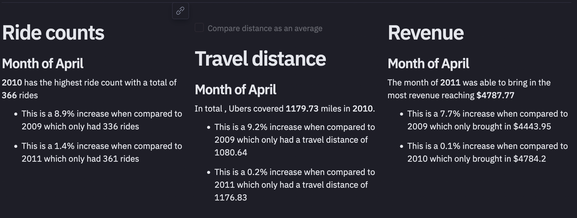
Once you are done with all this implementation, you can head over to the App builder section of the Hex environment to check the dashboard created for you by Hex. You can adjust the components of this dashboard by dragging and dropping them across different regions. Once everything is settled in, you can click on the publish button to deploy your dashboard with Hex.
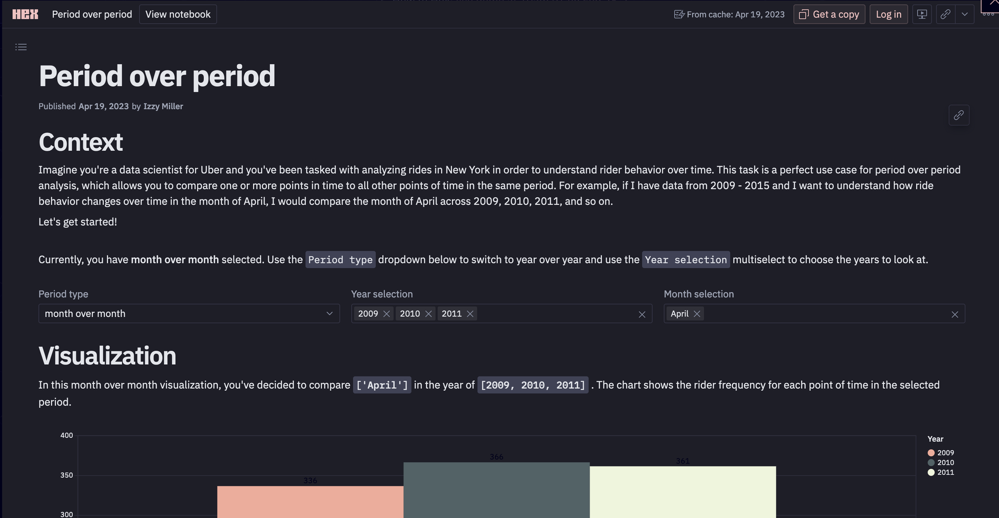
This is it, you have now created and deployed a dashboard for period-over-period analysis.
Understanding how your performance varies over time will help you make wise decisions, maximize your business's potential, and eventually accomplish your objectives. Recall that PoP analysis is only the first step. Continue learning as you go, try out various methods, and realize the full potential of your data to advance your company. You can try Hex for easy development and deployment options.
See what else Hex can do
Discover how other data scientists and analysts use Hex for everything from dashboards to deep dives.
Ready to get started?
You can use Hex in two ways: our centrally-hosted Hex Cloud stack, or a private single-tenant VPC.
