Blog
How to run churn analysis: Actionable steps and tips
Mastering churn analysis with a real datase
Ever tried filling a leaky bucket? No matter how much water you pour in, it keeps draining out. That’s exactly what churn feels like. You spend time and money bringing new customers in, only to watch them quietly slip away without a clue as to why.
Keeping customers isn't just about offering more features or running discount campaigns. It's about knowing who will likely churn, when they start leaving, and why they no longer see value.
Enter churn analysis. It helps you track customer behavior across their journey, from sign-up to drop-off, and spot the predictive patterns or root causes of their departure.
These insights help you take clear, strategic action, whether it’s re-engaging at-risk customers or cutting unnecessary retention spend. In this article, we’ll show you how to perform churn analysis and make the most out of it. Let’s jump right in!
What is churn analysis, and why does it matter?
Churn analysis helps you dig deeper into your customer churn metrics to understand who’s leaving and why. This alone is valuable, but let’s understand all the ways that churn analysis helps the business.
It helps you identify opportunities
Churn analysis goes beyond simply tracking your churn rate. It helps you uncover the pain points behind the exits. Maybe it’s poor onboarding, weak feature adoption, or a mismatch in expectations. Once you know what's driving existing customers away, you can focus on improving your product, service, or communication.
At the same time, it highlights what your happiest, high-value customers enjoy. You can double down on those features to build a stronger product-market fit.
It helps you predict churn
When you use a churn prediction model, you can estimate how likely a customer is to leave. With that insight, you can offer personalized support to turn at-risk users into loyal customers. To build a churn prediction model that improves your retention strategies and reduces churn, you need a solid customer churn analysis. It helps you pick the right algorithm, select meaningful features, and clean up noisy data. That way, your predictions are more accurate.
It helps you optimize spending
If your analysis shows that a customer is certain to churn, you can avoid spending more to retain them. Instead, you can redirect that budget toward improving your product or investing in customers with greater lifetime value (LTV).
If 40% of churned users took a discount and still left, for instance, you’re not just losing customers — you’re paying them to go. For a customer who is already halfway out the door, that coupon won’t change a thing. Handing out discounts to everyone is like watering dead plants.
Churn analysis helps you get smarter with your budget. With the right insights, you can focus on customers who respond to retention tactics, reduce spend on marketing channels that attract high-churn traffic, and avoid wasting offers on users who won’t convert.
What are the most important churn metrics to track?
Churn doesn’t come out of nowhere. It builds up quietly, often hidden behind the wrong metrics. Tracking the following key metrics is therefore essential, especially across different types of customers in various stages of the customer lifecycle:
- Churn rate: Churn rate is the percentage of customers who stop using your product over a set period. You can track it monthly, quarterly, or annually, depending on your goals. If your monthly or quarterly customer churn rate increases, it's time to investigate. Maybe your competitors have rolled out a more compelling offer, or your customer support experience needs work.
- Revenue churn rate: The percentage of revenue your business loses with every lost customer is especially important to track when rolling out new systems or product features. If it rises afterward, those changes likely missed the mark. This metric also tracks the percentage of recurring revenue lost due to customer cancellations. For example, losing two customers out of 100 may seem like a low churn rate, but if they were your highest-paying clients, your business takes a much bigger hit than the churn rate indicates.
- Customer retention rate by cohort: You can group similar customers into cohorts and track their retention rates over time. You might find valuable insights, like customers acquired through referral programs have higher retention than those from paid ads. Or that users in certain regions churn more frequently. Cohort analysis provides a more granular perspective, helping you pinpoint loyal customer groups and identify high churn rate segments.
- Customer engagement metrics: Most churn stories start with silence. A user stops logging in, skips key features, or reduces their activity, and then disappears. Keep a pulse on monthly active users, average session duration (average time spent on your product, website, or feature), session frequency (how often they come back), and other engagement metrics.
- Net promoter score (NPS): The most reliable measure of your customer loyalty and satisfaction, NPS measures how likely your customers are to recommend your company/product on a scale of 0 to 10. If most of your users score you a 9 or 10, you’ve got a solid customer base. But a wave of 6s and 7s could be a sign they’re quietly unhappy, even if they haven’t churned yet.
How to run a churn analysis workflow
There's a structured way to perform churn analysis. We'll walk through those steps using an actual churn dataset.
For this example, we’ll use the Telcom Customer Churn dataset from Kaggle. It’s one of the most popular datasets for churn modeling.
About the dataset: Each row represents a customer, and each column captures key details about their profile, behavior, and payments. The target is the “Churn” column, which tells us whether the customer left in the last month.
The dataset includes:
- Service details like phone plans, multiple lines, and internet subscriptions
- Payment information that includes monthly charges, payment methods, and total charges
- Demographic data such as gender, senior citizen status, tenure, and more
For this analysis, we’re using Hex notebooks instead of traditional Python notebooks. Hex is intuitive and lets you work with both SQL and Python in the same environment. It also comes with Hex AI, an AI assistant that helps troubleshoot errors or guide us when stuck.
1. Collecting and preprocessing data
Every good churn analysis starts with solid churn data. This usually means pulling customer data from multiple sources like CRM platforms, customer feedback surveys, website analytics, mobile apps, and social media engagement. You’ll want to collect data on where customers come from (source or acquisition channel), how often they engage with your product or platform, and their satisfaction levels and feedback.
Once you’ve gathered everything, it’s time for data preprocessing. That includes handling missing values, removing duplicates, and converting data types. Let’s practice this with our dataset.
Handling nulls
First, we’ll check for the percentage of nulls in our dataset:
missing_percent = df.isnull().mean() * 100
print(missing_percent)
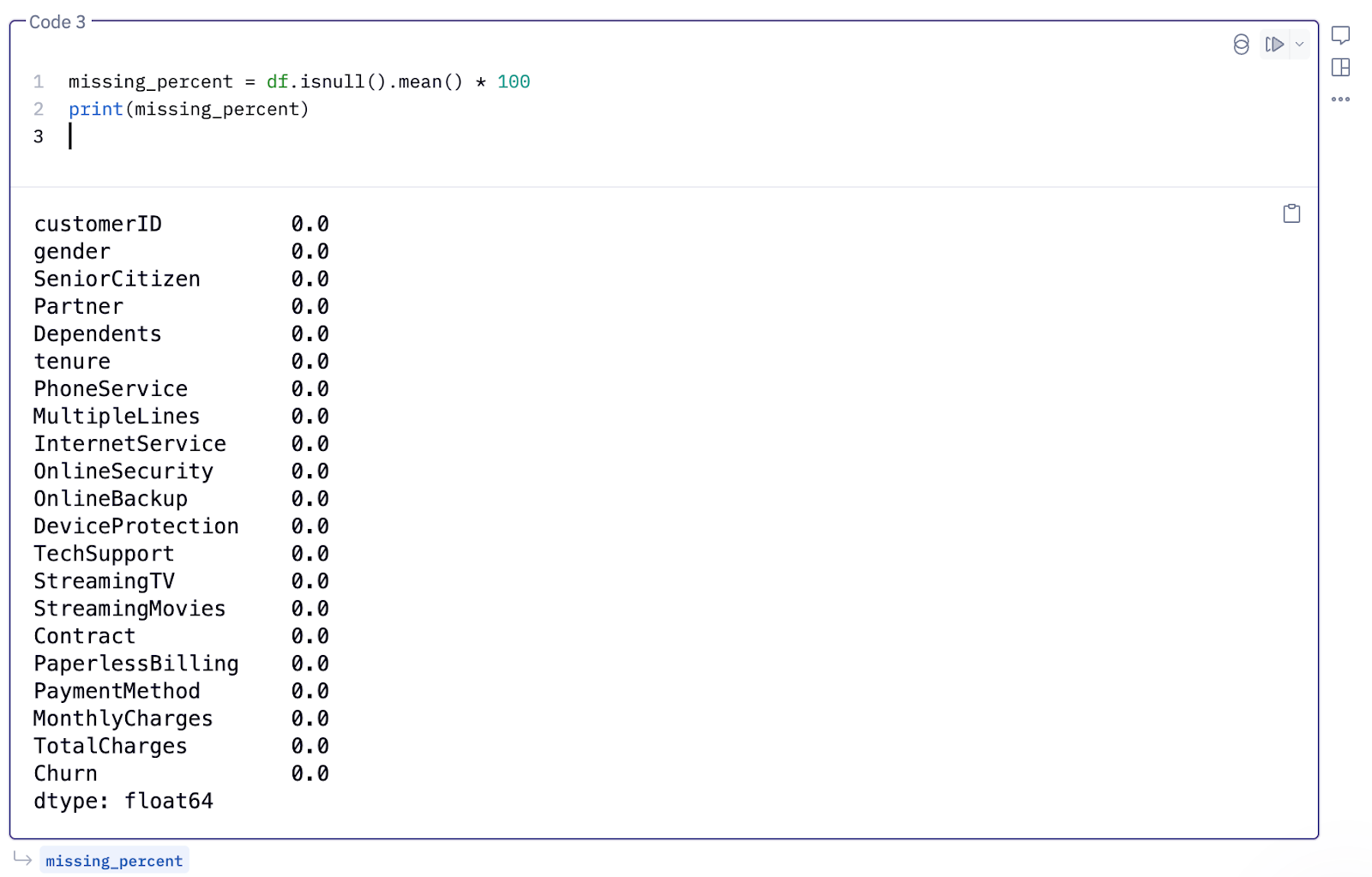
This indicates that our dataset has no null values.
Data type conversion
Now, let’s print `df.info()` to check the data types of each column:
From the `df.info()` output, we can see that the “MonthlyCharges” column is in float, but the “TotalCharges” column is showing up as an object type, which means it likely contains some non-numeric values.
To fix this, we’ll replace the non-numeric entries with NaNs, drop those rows, and convert the rest of the column to float. The below code will accomplish this:
df['TotalCharges'] = df['TotalCharges'].replace(' ', np.nan)
df = df.dropna(subset=['TotalCharges'])df['TotalCharges'] = df['TotalCharges'].astype(float)Encoding categorical features
Then, we’ll print the unique values of each column. This helps us identify categorical columns.
# Get all column names from the DataFrame
columns = df.columns.tolist()

# Loop through and print unique values for each column
for col in columns:
   print(f"🔹 {col}:")
   print(df[col].unique())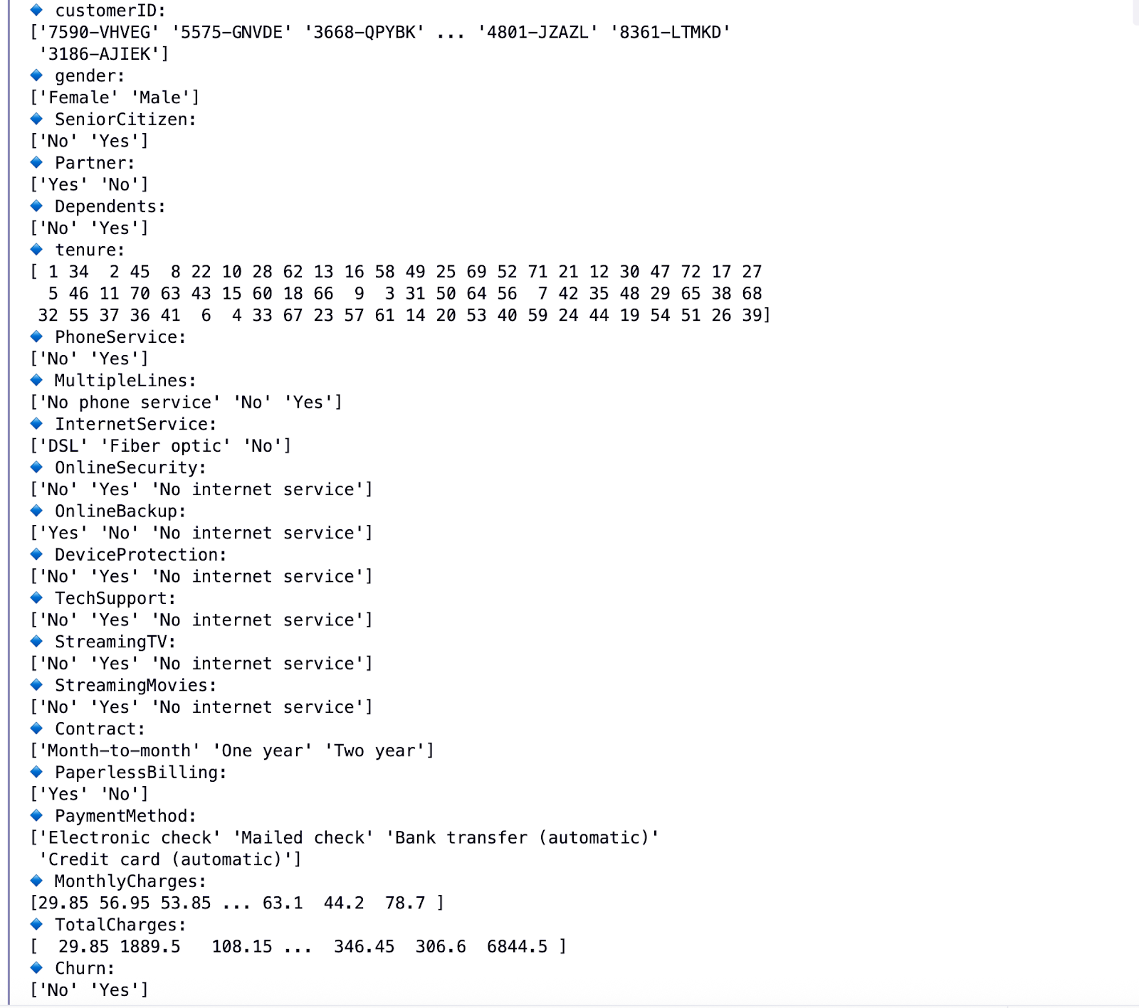
From the output, we can see columns like “Gender,” “SeniorCitizen,” “Partner,” and others have a few unique values. That means they are categorical features, and we need to convert them into a numerical format so that machine learning models can process them.
We’ll use “LabelEncoder” to handle this transformation:
categories = ['gender', 'SeniorCitizen', 'Partner', 'Dependents',
   'PhoneService', 'MultipleLines', 'InternetService', 'OnlineSecurity',
   'OnlineBackup', 'DeviceProtection', 'TechSupport', 'StreamingTV',
   'StreamingMovies', 'Contract', 'PaperlessBilling', 'PaymentMethod','Churn']
encoded_df = pd.DataFrame()
from sklearn.preprocessing import LabelEncoder
le = LabelEncoder()
for item in categories:
   encoded_df[item] = le.fit_transform(df[item].values)
Drop columns
The “customerID” column adds no value to our data, so we can remove it.
encoded_df = encoded_df.drop('customerID', axis=1)
Finally, let’s add our non-categorical variables from `df` to `encoded_df` and remove nulls from our final `encoded_df`:
non_cats = []
for item in enumerate(list(~df.columns.isin(categories))):
   if item[1] == True:
non_cats.append(df.columns[item[0]])for item in non_cats:
encoded_df[item] = df[item]2. Customer segmentation
Grouping customers with similar traits is a powerful way to uncover hidden churn patterns.
One common approach is to group customers by the month they joined, so each cohort shares the same starting point in their journey.
When you analyze this way, you might notice trends like customers signing up in a particular month having a higher churn rate than others.
For example, in our dataset, we have a column called “tenure.” We’ll use it to discover how customer churn relates to how long they have been with you. This answers questions like, ”Are new customers churning?” Or, ”Are long-term customers leaving more frequently?”
Let’s define cohorts as the following:
- New: 0–6 months
- Young: 7–12 months
- Established: 13–24 months
- Loyal: 25+ months
def map_tenure_to_cohort(tenure):
   if tenure <= 6:
       return 'Newbies (0-6m)'
   elif tenure <= 12:
       return 'Young (7-12m)'
   elif tenure <= 24:
       return 'Established (13-24m)'
   elif tenure > 25:
       return 'Loyal'

df['TenureCohort'] = df['tenure'].apply(map_tenure_to_cohort)
Now, let’s calculate the churn rate within each segment.
# Churn count by group
churn_by_group = df.groupby('TenureCohort')['Churn'].value_counts(normalize=True).unstack().fillna(0)# Rename columns for clarity
churn_by_group.columns = ['Not Churned', 'Churned']
churn_by_group['Churn Rate'] = churn_by_group['Churned'] * 100print(churn_by_group[['Churn Rate']].sort_values('Churn Rate', ascending=False))
From the output, it’s clear that new customers are churning more, while long-term customers are sticking around. Now you know you need to dig into your new customers' cohort data to understand why.
3. Feature engineering for churn prediction
Once you’ve explored the data and spotted patterns, it’s time to go a step further: predict who’s likely to churn next. This is where predictive analytics comes into play, and the first building block is feature engineering.
Feature engineering involves selecting (feature selection) or extracting relevant features (feature extraction) to provide more meaningful information to the ML algorithm.
Feature selection is like cleaning out your closet. That means get rid of what you don’t need so your model isn’t overwhelmed with junk. 🧹 It helps you reduce overfitting, improve model performance, and speed up training. To select features you want to keep, you can use a correlation matrix (remove features with high correlation), or run tree models to get feature importance scores (and keep the ones with high scores).
Feature extraction, meanwhile, means creating new features from existing data to add more value. Let’s perform these techniques on our dataset.
Feature selection
Let’s fit a “RandomForestClassifier” on our data and print the feature importance scores. This will help us identify which features carry the most weight in predicting churn. The below code does this:
X = encoded_df.drop('Churn', axis=1)
y = encoded_df['Churn']from sklearn.ensemble import RandomForestClassifiermodel = RandomForestClassifier(n_estimators=100, random_state=42)
model.fit(X, y)import pandas as pd
import matplotlib.pyplot as plt# Get feature importances from the trained model
feature_importances = pd.Series(model.feature_importances_, index=X.columns)# Sort and plot
feature_importances.sort_values(ascending=False).plot(kind='barh', figsize=(10, 8))
plt.title("Feature Importances for Churn Prediction")
plt.gca().invert_yaxis()
plt.show()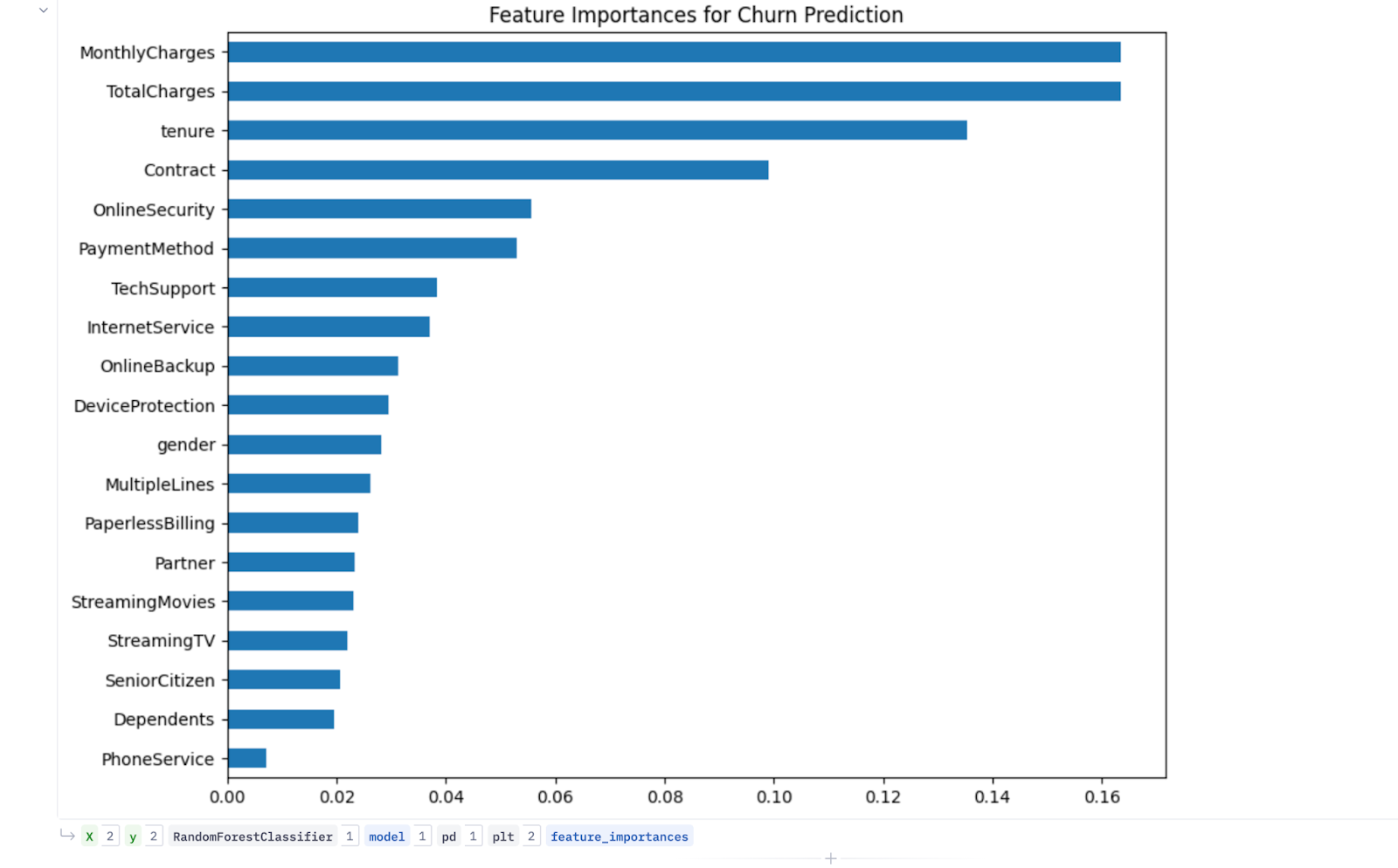
From the output, it’s clear that “MonthlyCharges,” “TotalCharges,” “tenure,” “Contract,” “PaymentMethod,” “OnlineSecurity,” and “TechSupport” columns came out to be the most important ones. We’ll use these during our modeling.
Feature extraction
Looking at the features, we can see that each customer is enrolled in various services like “PhoneService,” “MultipleLines,” “InternetService,” “OnlineSecurity,” “OnlineBackup,” and others. We can create a new feature called “total_services” using this information. This new column represents the total number of services a customer has enrolled in.
services = ['PhoneService', 'MultipleLines', 'InternetService', 'OnlineSecurity', 'OnlineBackup',
            'DeviceProtection', 'TechSupport', 'StreamingTV', 'StreamingMovies', 'PaperlessBilling']

encoded_df['total_services'] = encoded_df[services].apply(lambda x: x.sum(), axis=1)
We can also create another column called “extra_charges,” as shown below:
encoded_df['extra_charges'] = (encoded_df.MonthlyCharges * encoded_df.tenure) - encoded_df.TotalCharges4. Model training and evaluation
You now have processed data ready for modeling. It's time to choose the right models and train our data on it.
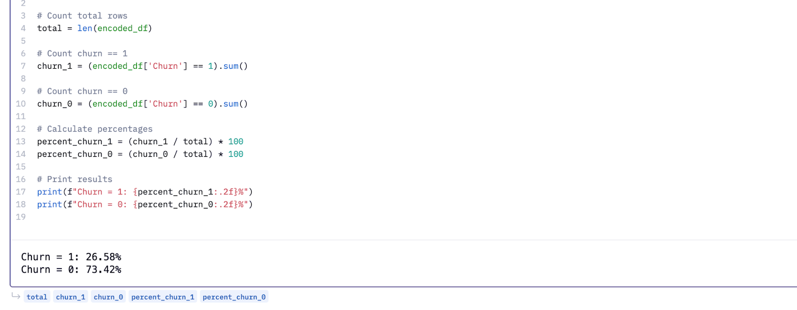
But before we dive in, there’s one more step. Our dataset is imbalanced. Around 73% of customers didn’t churn, while only 26% did. Training a model on this skewed data leads to biased results, where the model favors the majority class.
To fix this, we’ll first downsample the non-churned customers. This creates a more balanced dataset and ensures the model gives equal attention to both classes.
Once balanced, we’ll split the data into training and test sets, then move on to model training and evaluation.
The code below handles downsampling the skewed data and splitting it for training and testing:
#remove features with low importance scores
features = encoded_df.drop(columns=['gender', 'SeniorCitizen', 'Partner', 'Dependents',
'PhoneService', 'MultipleLines',
'OnlineBackup', 'DeviceProtection', 'StreamingTV',
'StreamingMovies', 'PaperlessBilling', 'Churn']).columns
target = ['Churn']
from sklearn.model_selection import train_test_split
from sklearn.utils import resample
down = encoded_df[encoded_df.Churn == 1]
up = encoded_df[encoded_df.Churn == 0]
down = down.Churn.count()
up = up.Churn.count()
print(f'Churn Fraction: {down/(up+down)}')
#let's first separate majority class and minority class and resample
df_majority = encoded_df[encoded_df.Churn == 0]
df_minority = encoded_df[encoded_df.Churn == 1]
# Downsample majority class
df_majority_downsampled = resample(df_majority,
replace=False, # sample without replacement
n_samples=down, # to match minority class
random_state=42) # reproducible results
# combine the new dataframes
df_downsampled = pd.concat([df_majority_downsampled, df_minority])
df_downsampled.Churn.value_counts()
from sklearn.model_selection import train_test_split
y = df_downsampled[target]
X = df_downsampled[features]
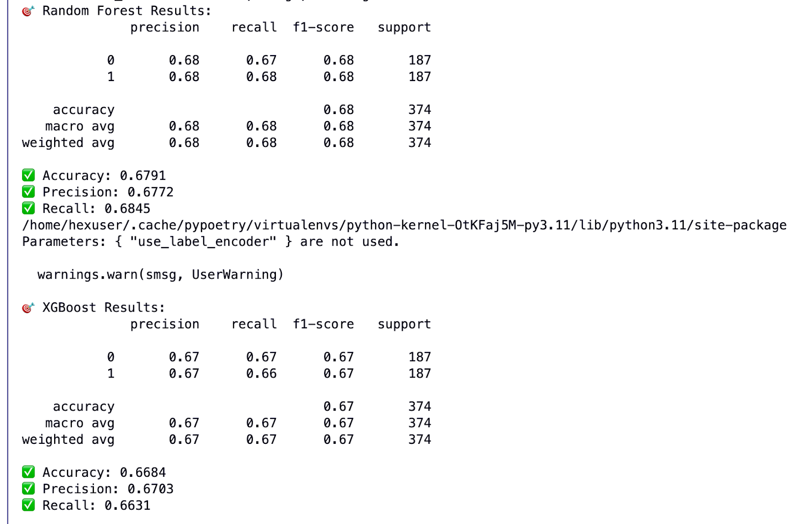
X_train, X_test, y_train, y_test = train_test_split(X, y, test_size = 0.10, random_state=42, stratify=y)Since our goal is to predict whether a customer will churn or not, this is a classification problem. That means we need to use a classification algorithm like Random Forest or XGBoost. I trained on both of them.
Here’s the model training and results code:
from sklearn.ensemble import RandomForestClassifier
from xgboost import XGBClassifier
from sklearn.metrics import (
   accuracy_score, precision_score, recall_score,
   classification_report, confusion_matrix,
   roc_curve, roc_auc_score
)
import matplotlib.pyplot as plt# Set random seed
seed = 42# ------------------ RANDOM FOREST ------------------ #
rf_model = RandomForestClassifier(random_state=seed)
rf_model.fit(X_train, y_train)y_pred_rf = rf_model.predict(X_test)
y_prob_rf = rf_model.predict_proba(X_test)[:, 1]print("🎯 Random Forest Results:")
print(classification_report(y_test, y_pred_rf))
print(f"✅ Accuracy: {accuracy_score(y_test, y_pred_rf):.4f}")
print(f"✅ Precision: {precision_score(y_test, y_pred_rf):.4f}")
print(f"✅ Recall: {recall_score(y_test, y_pred_rf):.4f}")fpr_rf, tpr_rf, _ = roc_curve(y_test, y_prob_rf)# ------------------ XGBOOST ------------------ #
xgb_model = XGBClassifier(use_label_encoder=False, eval_metric='logloss', random_state=seed)
xgb_model.fit(X_train, y_train)y_pred_xgb = xgb_model.predict(X_test)
y_prob_xgb = xgb_model.predict_proba(X_test)[:, 1]print("\n🎯 XGBoost Results:")
print(classification_report(y_test, y_pred_xgb))
print(f"✅ Accuracy: {accuracy_score(y_test, y_pred_xgb):.4f}")
print(f"✅ Precision: {precision_score(y_test, y_pred_xgb):.4f}")
print(f"✅ Recall: {recall_score(y_test, y_pred_xgb):.4f}")
fpr_xgb, tpr_xgb, _ = roc_curve(y_test, y_prob_xgb)# ------------------ PLOT ROC CURVE ------------------ #
plt.figure(figsize=(10, 6))
plt.plot(fpr_rf, tpr_rf, label=f'Random Forest (AUC = {roc_auc_score(y_test, y_prob_rf):.2f})')
plt.plot(fpr_xgb, tpr_xgb, label=f'XGBoost (AUC = {roc_auc_score(y_test, y_prob_xgb):.2f})')
plt.plot([0, 1], [0, 1], 'k--')plt.title("ROC Curve Comparison")
plt.xlabel("False Positive Rate")
plt.ylabel("True Positive Rate")
plt.legend(loc="lower right")
plt.grid(True)
plt.show()And the output:
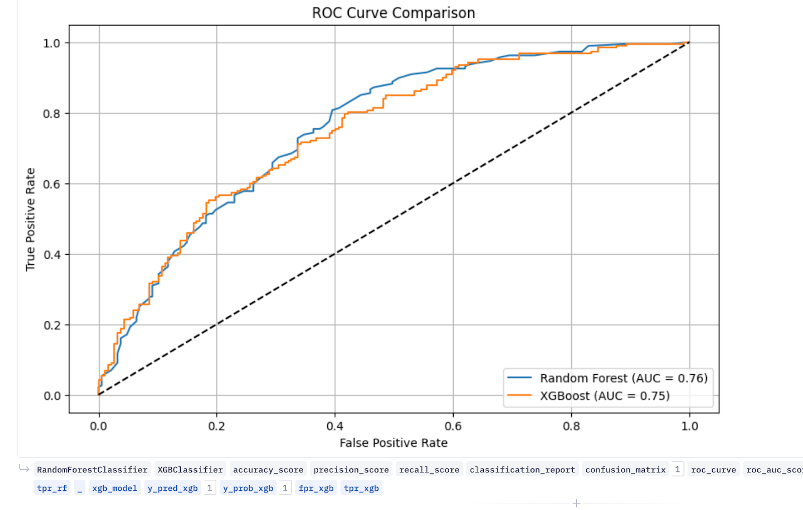
The ROC curves for both models overlap and appear ideal, showing a high true positive rate (correctly predicting positive cases) on the y-axis and a low false positive rate (incorrectly predicting negative cases as positive) on the x-axis. Overall, this indicates strong model performance.
5. Post-model segmentation and reporting
Once your model is trained, the true value comes from turning predictions into action. It’s time for post-model segmentation.
You can group customers into cohorts based on the model’s predictions and make decisions cohort-wise, for example:
- High-risk churners
- Medium-risk customers
- Low-risk, loyal users
To make these insights actionable across teams, you’ll want to visualize the results in a clear, interactive way.
Open-source tools like Plotly, Seaborn, or Dash are great for custom reporting. But if you’re looking for a more intuitive and collaborative tool, Hex is a powerful option.
It offers both intuitive and flexible ways to create visualizations. You can write Python scripts in its cells to build interactive dashboards or use its data apps to build shareable dashboards, all without writing a single line of code.
If you’d like to see another real-world example, check out how ClickUp built data apps using Hex and saved $1M in churn.
Master churn analysis, prevent churn
We’ve covered a lot, from cleaning messy data to building a churn prediction model. If it wasn’t all that exciting, watching your model nail predictions after all that preprocessing is the kind of win that makes the grunt work worth it.
But building the model is only part of the journey. The payoff comes when you bring those results to life. Dashboards transform your raw predictions into actionable insights.
With Hex, this part becomes smooth and even enjoyable. Its interactive UI cells and data app features make dashboard building simpler. Here’s a full template to build a customer churn dashboard to get a head start on your first project.
For an even simpler approach, you can just ask Hex Magic (our AI chatbot) what you need, and it automatically generates the visuals or valuable insights for you with minimal human input.
If this is is interesting, click below to get started, or to check out opportunities to join our team.