Blog
7 data analysis techniques your agent can do (knowing which one to use is on you)
Your agent can run any analysis. Knowing which one to use is the hard part.


AI-native analytics platforms have made it easier than ever to run sophisticated analyses. Anyone can ask a question in plain language and get back working SQL, visualizations, even a first-pass interpretation.
But here's the nuance: even though an agent can pick the right analysis on its own, especially when the question is well-scoped, you can still run into issues when the question itself needs work — when you'd learn more by reframing the problem, or when regression would technically run but clustering would reveal something more useful. That judgment sharpens with experience, and understanding these techniques gives you better instincts for directing the analysis, whether you're running it yourself or reviewing what an agent delivers.
Think of raw data as a crime scene with no detective. The clues are there, scattered across tables and timestamps. But without the right investigative technique, you're just staring at evidence. Analysis is how you connect the dots.
This guide breaks down seven data analysis techniques — from regression and clustering to time series and sentiment analysis. You'll learn what each one does, when to reach for it, and how to apply it to problems you're actually facing. We'll also walk through a practical framework for conducting analysis end-to-end, so you can move from messy data to actionable insight with confidence.
Data analysis is only as good as the technique behind it
You can have the best analytics platform in the world and still get the wrong answer. The technique you choose shapes everything — whether you're finding relationships, identifying groups, predicting outcomes, or quantifying risk. Regression and clustering might both involve the same dataset, but they're asking fundamentally different questions.
AI-native platforms like Hex make it easier than ever to run sophisticated analyses. But an agent won't necessarily know which analysis to run if the question itself isn't well-framed. The goal of this guide is to sharpen your instincts: to know when regression is the right tool, when clustering reveals something regression would miss, and when you're better off letting an agent take the first pass versus guiding the investigation yourself.
Quantitative vs. qualitative data
Before choosing a technique, you need to understand what kind of data you're working with. Naturally, the analysis methods that work for numbers don't work for unstructured data like text and video.
Quantitative data includes things you can count, order, and measure. For example, sales figures, conversion rates, time-on-page, and revenue per customer are all quantitative metrics. They tell you what happened and how much.
Qualitative data, on the other hand, can include text, descriptions, and observations like customer feedback, interview transcripts, and open-ended survey responses. It tells you why something happened and how people experience it.
The most complete picture of what's happening in your business usually comes from combining both. For example, your churn rate climbing is quantitative data. But understanding why customers leave requires reading their cancellation feedback, which is qualitative.
7 most common data analysis techniques
Each data analysis technique is designed to answer a specific type of question, whether you're trying to predict an outcome, understand behavior over time, find hidden patterns, or quantify risk. The technique you choose depends on what you're trying to learn and what kind of data you have to work with.
1. Regression analysis
Regression analysis models relationships between variables. When your data contains outcomes and the factors influencing them (independent variables), a regression model finds the relationship between them and uses it to predict outcomes for unseen data.
A regression analysis chart may look something like this:
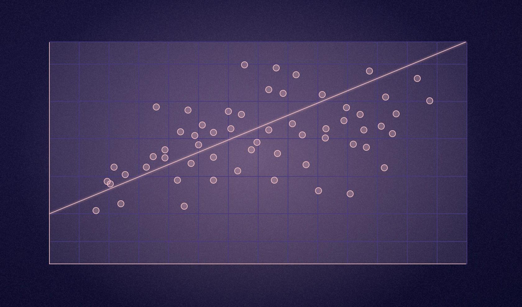
The core idea is that you're trying to understand how one variable relates to another. Simple linear regression handles one predictor variable, like advertising spend predicting sales, and outputs a continuous number. Multiple regression handles several predictors at once — for example, predicting house prices based on size, location, age, and amenities. Logistic regression outputs a probability (a number between 0 and 1) that gets converted into categorical predictions like yes or no, will convert or won't convert, or will churn or won't churn.
Use regression models to predict continuous variables, like a person's income based on their profession, experience, education, industry, and skills. In practice, regression powers everything from sales forecasting to fraud detection.
Building a regression model typically means jumping between tools: SQL for data extraction, Python or R for modeling, and yet another tool for visualization. But in Hex, you can build regression models from start to finish without switching contexts. Write SQL to pull your housing data, transform it with Python using pandas and scikit-learn, visualize the relationship between variables, train both simple and multiple linear regression models, and evaluate performance with r² and RMSE — all in a single workspace.
That said, regression shows associations, not causation. Just because two variables move together doesn't mean one causes the other.
2. Monte Carlo simulation
Monte Carlo simulation runs thousands of scenarios using random sampling to calculate probability distributions of different outcomes. Instead of getting a single forecast, you get a range of possibilities with associated probabilities. It works best when you're dealing with a particularly wide range of uncertainty — when there are too many possible outcomes for a single forecast to be useful.
For example, a financial analyst modeling portfolio risk can use the Monte Carlo simulation to define a range for potential market returns, run thousands of iterations sampling randomly from that range, and get a distribution showing the probability of different portfolio values. Instead of a single forecast that's almost certainly wrong, you get answers like "there's a 70% chance we'll meet our revenue target" or "we have a 15% risk of missing our deadline by more than two weeks."
The only caveat is that Monte Carlo simulations are hypothetical. If your input assumptions are flawed, the outputs will be unreliable regardless of how sophisticated your model is.
3. Factor analysis
Factor analysis reduces complex datasets by finding hidden patterns among many variables. It identifies which variables measure similar underlying constructs and consolidates them into fewer factors.
Factor analysis becomes essential when you're drowning in survey data or trying to make sense of dozens of metrics. Say you run a customer satisfaction survey with 25 questions covering everything from website usability to shipping speed to product quality. Factor analysis might reveal that those 25 questions actually measure just four underlying factors: ease of purchase, product satisfaction, delivery experience, and customer support quality. Instead of analyzing 25 separate variables, you now have four meaningful dimensions that explain most of the variation in your data.
Use factor analysis for questionnaire design, brand perception studies, pricing research, and customer satisfaction analysis. Its ability to consolidate multiple variables into fewer underlying factors reveals what truly drives customer perceptions.
4. Cohort analysis
Cohort analysis groups users who share a common characteristic and tracks how their behavior changes over time. Think of it as sorting customers by a defining moment or action, then watching what happens next. By tracking specific groups over time rather than looking at your entire user base at once, you reveal behavior patterns that would otherwise be invisible.
Cohorts can be organized in several ways:
- Time-based cohorts group users by when something happened, like a signup date or first purchase
- Behavioral cohorts group users by specific actions, such as completing onboarding, using a feature, or engaging with a campaign
- Size-based cohorts group customers by spending levels or business size
- Event-based cohorts group users around specific moments, like a Black Friday sale or product launch
Here’s an example of a time-based cohort chart:
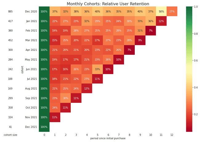
The key difference from general segmentation is that cohort analysis is always tied to time. General customer segmentation might show who your top spenders are overall. Cohort analysis shows when they spend and how that behavior evolves month over month.
SaaS companies rely heavily on cohort analysis for understanding churn patterns. Say your analysis shows users who signed up in March are dropping off faster than in other months. That could mean a buggy feature, a confusing onboarding process, or a broken email flow that month. You don't just react to churn—you prevent it by identifying exactly when and where engagement drops.
Beyond churn analysis, cohorts help you craft personalized marketing strategies for each segment, identify which actions lead to higher customer lifetime value, and build investor narratives that show real customer journeys instead of vanity metrics.
5. Cluster analysis
Cluster analysis is a machine learning (ML) technique that groups similar data points together based on certain characteristics. It's an unsupervised learning method, meaning you don't need labeled data — the algorithm discovers natural patterns rather than relying on predefined categories.
In clustering, data points are grouped based on their similarity or distance, computed using metrics like Euclidean distance, Manhattan distance, or cosine similarity, depending on the context and nature of your data. Points in the same cluster are more similar to each other than those in different clusters.
It can look like this:
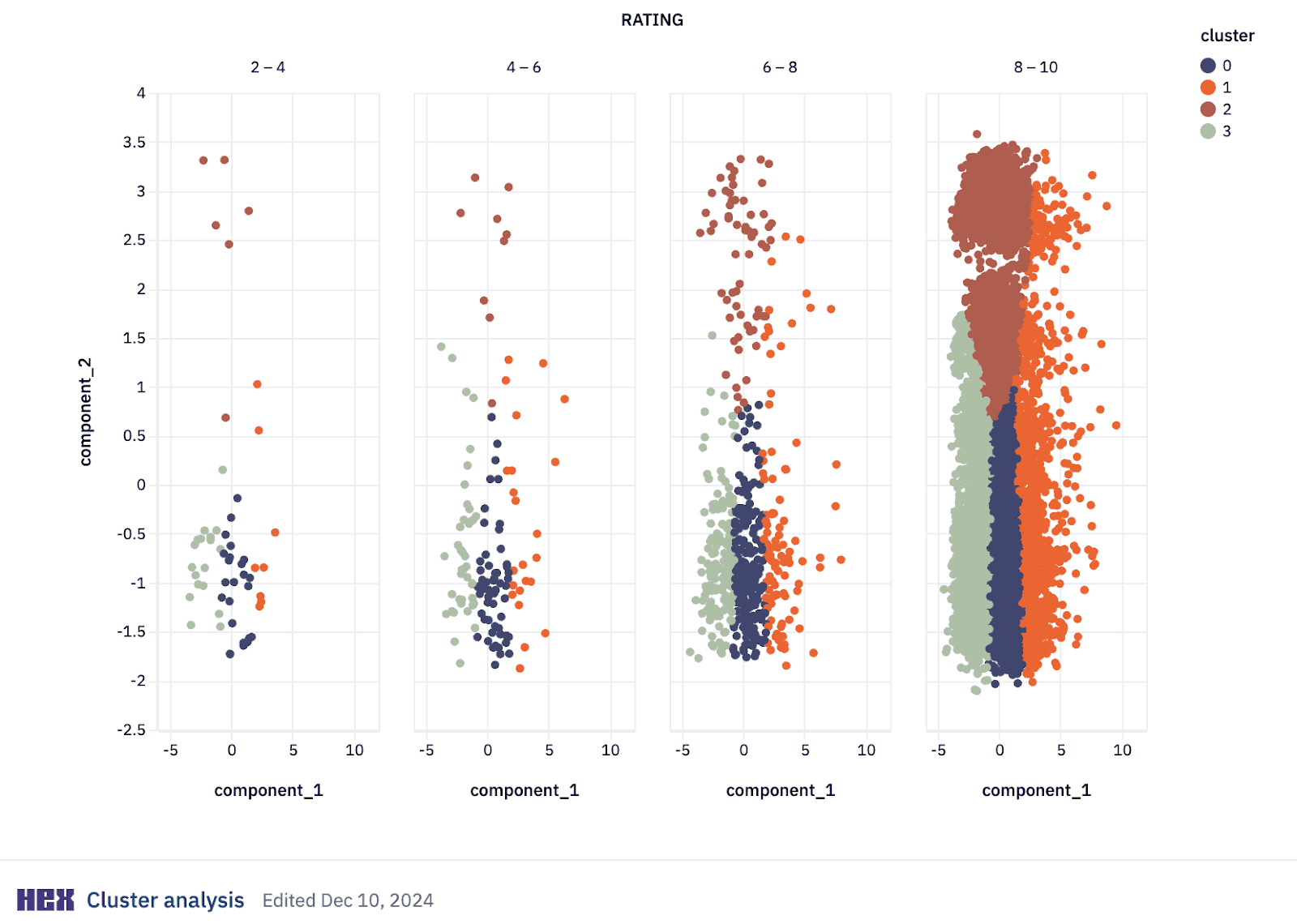
Several clustering approaches exist, each suited to different problems:
- K-means clustering partitions data into K non-overlapping groups based on distance to centroids. It's widely used because of its efficiency and simplicity.
- Hierarchical clustering builds a tree of clusters through either bottom-up or top-down approaches, creating an interpretable hierarchy that's useful when you don't know the number of clusters beforehand.
- Density-Based Spatial Clustering of Applications with Noise (DBSCAN) identifies clusters as dense regions separated by sparse regions, making it particularly useful for spatial data and anomaly detection.
An example of cluster analysis in action is customer segmentation. Analysts combine clustering with Recency, Frequency, Monetary value (RFM) frameworks to segment customers based on behavioral patterns, demographic characteristics, and transactional data. This approach supports targeted marketing, personalized recommendations, and optimized inventory management.
Fraud detection is another powerful use case. For example, Stripe uses clustering to identify similar clusters of accounts created by fraudsters trying to scale their operations. When fraudsters create multiple accounts, their behavioral patterns cluster together distinctly from legitimate customer groups.
6. Time series analysis
Time series analysis is a statistical field that deals with analyzing temporal data — observations collected at specific time intervals. It's the basis for forecasting because it enables predicting future values based on historical patterns.
Time series preprocessing prepares and cleans your data before analysis. Common preprocessing steps include:
- Resampling changes the frequency of your data points, like aggregating daily observations into monthly averages
- Detrending removes underlying trends through methods like differencing (subtracting the previous observation from the current one) or fitting and subtracting a trend line
- Deseasonalizing removes repeating patterns of a fixed period, like increased sales every December
- Normalization rescales data to a specific mean and standard deviation, improving model performance and allowing different time series to be compared on the same scale
After preprocessing, exploratory analysis helps you understand the data's underlying structures before modeling.
Time series modeling identifies the model that best captures the statistical properties in your data — trend, seasonality, cycles, autocorrelation, or randomness. Two common time series models:
- AutoRegressive Integrated Moving Average (ARIMA) combines differencing to make data stationary, autoregression, and a moving average model to forecast future points
- Seasonal ARIMA (SARIMA) extends ARIMA by adding a seasonal differencing term, making it effective for data with seasonal components
Time series forecasting builds on modeling to predict future outcomes. Additional forecasting approaches include:
- Exponential smoothing calculates weighted averages of past observations, with weights decreasing exponentially as observations get older
- State space models represent linear and non-linear time series, capturing complex temporal dynamics (often used with the Kalman Filter)
- Recurrent Neural Networks (RNNs) process sequences of data using loops within the network to maintain information across time steps, handling complex non-linear time dependencies
In Hex's unified workspace, planning teams can replace sprawling spreadsheets with real-time forecasting systems. Data analysts can build ARIMA models in Python, visualize seasonality patterns, and publish interactive forecasts without switching between SQL editors, notebook environments, and presentation tools. Business users can ask questions about existing data through natural language queries using Hex's Threads, but exploring hypothetical scenarios like "What if Q4 growth increases by 15%" requires setup by technical users.
7. Sentiment analysis
Sentiment analysis uses natural language processing (NLP) to automatically categorize the emotional tone of text as positive, negative, or neutral. It transforms unstructured feedback (reviews, support tickets, social media posts) into quantifiable data.
This means companies using NLP to analyze feedback can identify improvement areas significantly faster than with manual analysis. Because NLP can process thousands of customer comments, analyze the sentiment, and reveal what customers do and how they actually feel about their experiences.
A great example of sentiment analysis in real life is when social media teams monitor brand perception in real-time, and catch emerging issues before they escalate. Sentiment analysis tools also help with immediate response to potential PR crises or emerging negative sentiment.
In Hex, you can build sentiment analysis pipelines using Python packages like TextBlob, NLTK, or spaCy directly against data in your warehouse. Load sales calls, product reviews, or support tickets from Snowflake, calculate polarity and subjectivity scores with TextBlob, and visualize sentiment trends over time — all without leaving the workspace, and all possible with the Notebook Agent.
Sentiment analysis should complement quantitative data, not replace it. If sentiment says users hate a feature but usage metrics show they use it daily, dig deeper.
How to analyze data
The data analysis process follows a systematic framework. While this structured approach provides a consistent methodology, real projects often require returning to earlier stages as new questions emerge.
Define your objective
Clarify what you're trying to accomplish. What business problems are you solving? What decisions will this analysis inform? Vague objectives lead to meandering analysis. Specific questions lead to insights you can act on.
Collect your data
Identify which data sources will help answer your questions: databases, APIs, surveys, third-party data. Consider availability, accessibility, and any privacy constraints. In Hex, you can ask Threads or the Notebook Agent about what data you have available.
Clean and prepare
Cleaning and preparing data often takes time, it's just how analysis works. The good news is you don't need to fix everything at once. Start with the basics: remove obvious duplicates, decide how to handle missing values, and fix inconsistencies that would skew your results.
This is where AI can compress the tedious parts. In Hex, you can ask the Notebook Agent to identify nulls, flag outliers, or standardize formats — you stay focused on which cleaning decisions matter while the agent handles the execution.
As you go, document what you changed and why. Future you (and your teammates) will thank you. The goal is data clean enough to trust your results.
Explore your data
Before modeling, explore what you have. Calculate summary statistics, create visualizations, and look for patterns and outliers. This exploratory phase often surfaces questions you didn't know to ask.
This is also where the user-guided approach shines. You're driving the investigation — asking "what does the distribution look like?" or "are there seasonal patterns?" — while the agent handles the code. In Hex, you can prompt the Notebook Agent with plain-language questions and get working visualizations back in seconds, then redirect based on what you see.
For data analysts juggling constant ad hoc requests, this exploration phase is where tool-switching creates the biggest bottleneck. Writing SQL in one tool, exporting CSVs, pasting into spreadsheets, building charts in another tool, then copying into presentations eats entire mornings. In Hex, exploration flows directly into visualization and documentation without context-switching.
Analyze and model
Apply appropriate data analysis techniques (choose from the ones listed above) based on your objectives and data characteristics. Test hypotheses, validate assumptions, and iterate.
Interpret results
Translate statistical findings into business context. What does this actually mean for the problem you're solving? Are the findings practically significant, not just statistically significant?
Communicate insights
The best analysis is worthless if stakeholders can't understand or act on it. Create clear visualizations, write summaries appropriate for your audience, and present recommendations they can act on.
When Calendly's analytics team consolidated their analytical workflows in Hex, they became 2x more efficient. Instead of rebuilding analyses across multiple tools, they publish interactive applications that stakeholders explore directly, eliminating the constant stream of "can you slice this differently" requests.
Matching the technique to the question
The right analysis technique depends entirely on what you're trying to learn. Regression reveals relationships between variables, cohort analysis tracks behavior over time, clustering surfaces natural groupings, and time series forecasting predicts what's coming next. Each one answers a different question, and knowing which to reach for is half the battle.
The other half is workflow. When your analysis spans disconnected tools — SQL editors, notebooks, spreadsheets, presentation software — the overhead compounds quickly. Hex brings SQL, Python, and no-code capabilities into a unified workspace where data teams and business users work side-by-side, so you spend less time switching contexts and more time finding answers.
Book a demo or try Hex for free to see how it works.