Blog
How to perform product feature analysis and use the results
Learn how to perform product feature analysis step-by-step. Tips to streamline the process and drive actionable results.
You’ve got a product packed with features. But which ones are fueling its success? Which ones need a boost or the boot? And most importantly, how do you decide what to build next?
You could guess at the answers to these questions, or you could take the smarter route and run a product feature analysis to find out for sure. A feature analysis examines how your current features perform and pinpoints what your users need but aren’t getting. These insights help you build a product strategy that addresses specific business problems, such as high churn rate, low feature adoption, or declining engagement.
In this guide, we’ll walk you through how to perform a product feature analysis and how to use its results. Let’s dive in!
Why do a product feature analysis?
Every product has features that shine, others that barely get noticed, and a few that frustrate users. A feature analysis makes these patterns visible. It tells you what people actually use, what they avoid, and where they struggle, whether the issue is a confusing workflow, a hidden button, or a design that doesn’t match their needs.
This kind of insight is powerful. It takes the guesswork out of product strategy by showing you exactly where to focus. You’ll see which features deserve more investment, which ones need a redesign, and which aren’t pulling their weight. From there, teams can make decisions that align with business goals, sharpen the user experience, and uncover opportunities competitors might be missing.
In short, feature analysis bridges the gap between user behavior and product direction. Instead of relying on gut feel, you’re using data to guide smarter, faster, and more confident decisions.
Effectively preparing to conduct a product feature analysis
Product analytics should lead to tangible business outcomes. Start with clear, specific goals, like increasing retention by 15% or boosting sales by $1 million annually. Then, use your analysis to uncover insights that directly support those goals.
Here’s how to begin:
Mapping features to KPIs
Once your business goals are clear, the right KPIs follow. For a goal like improving customer retention, key metrics might include monthly/weekly active users, feature adoption rate, and Net Promoter Score (NPS).
Next, list the product features that directly impact those metrics. Ask: If this feature performs well, which KPI improves?
Examples:
This way, the product features are mapped to relevant KPIs.
Balancing leading vs lagging indicators
Once features are mapped to KPIs, the next step is understanding how to measure progress over time. This is where leading and lagging indicators come in.
Leading metrics predict what’s ahead. They track early signals like user behavior or market shifts. For example, the number of users who start a trial after announcing a new feature might give you an estimate of the feature’s success.
Lagging metrics look backward. They show how things performed. Revenue, profit, or completed sales are some popular lagging metrics. These are useful for measuring impact, but only after the fact.
The challenge is that leading indicators can be misleading if you look at them in isolation. A feature might get high adoption initially, but fail to drive long-term value. Similarly, lagging indicators take too long to inform immediate product decisions. That’s why the best product teams use both.
For example, you launch an AI-powered reply suggestion feature in your messaging platform. As a leading metric, you track how many users use it in the first week. You also need lagging metrics like usage rate. If both numbers are positive, you've built a solid feature that drives user engagement.
Two types of product feature analysis
Besides the different types of indicators used in product feature analysis, there are also two main ways to analyze those features: qualitative and quantitative.
Qualitative
Qualitative analysis focuses on the why behind user behavior. It pulls insights from interviews, feedback forms, and customer group discussions.
The goal is to hear directly from users about their pain points, expectations, and experiences, then use those inputs to shape feature development and improvements.
Quantitative
On the other hand, quantitative analysis tracks product performance in numbers. It uses numerical data like active users, adoption rates, and conversion rates to measure feature performance. This approach leans on statistical techniques, A/B testing, and data visualizations to spot patterns and uncover what’s working (and what’s not).
How to perform a product feature analysis
Alright, let’s break down how to analyze product features step-by-step in a way that aligns with your business goals.
1. Set business objectives and KPIs
As we mentioned earlier, define specific business objectives. Use frameworks like SMART or OKR to define them. Then identify the KPIs that track progress toward those goals.
For example, if you're building a SaaS product like a project management tool and aim to improve ease of use, your KPIs might include: collaboration rate, onboarding time, time to first task, and more.
Identify relevant features
After identifying KPIs, pinpoint the features that influence them. Here’s how that looks for the product management SaaS example:
- Onboarding time: Relevant features might include in-app tutorials, help guides, or onboarding navigation flows.
- Collaboration rate: Examples here are mentions, comments, shareable links, or tagging.
- Project setup success rate: Useful features might include built-in templates, project creation flows, or drag-and-drop tools.
Once you link features to each KPI, make sure you're collecting data on these features.
Gathering the qualitative data: Collect this directly from users. Use customer feedback forms, surveys, and interviews to understand opinions, pain points, and suggestions.
Compiling your quantitative data: Identify and track key product metrics like feature usage, session time, and engagement. You can do this by adding event tracking code and setting up data pipelines that move data into your warehouse. Another option is to integrate your warehouse with analytics tools that automatically collect this information in real time. For instance, the image below shows the process of tracking feature usage frequency.
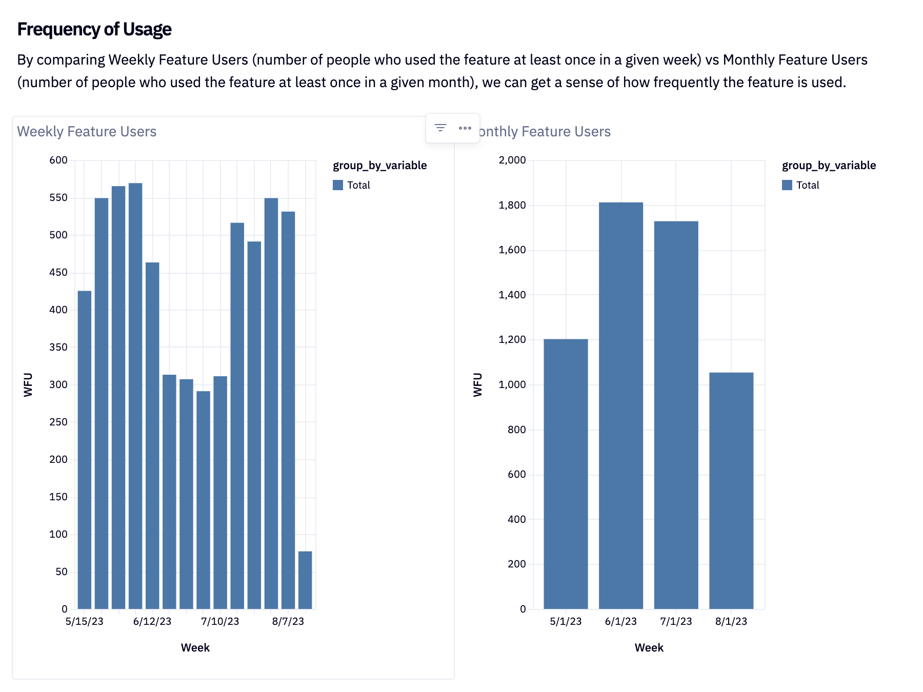
A demo weekly feature usage tracker built in Hex.
3. Conduct competitor analysis
Start by identifying your key competitors. What features do they offer that you don’t? To answer this, compare your current feature set with your competitors’ using a feature matrix.
From this analysis, highlight high-value features your product lacks — especially the ones your users rely on most.
You can also borrow ideas from competitors. If something works well in a similar product, use that insight to strengthen your own features or differentiate further. Since actual feature usage data isn’t public, you’ll need to rely on methods like customer reviews, analyst reports, and even hands-on testing to evaluate whether a competitor’s feature truly delivers value.
4. Perform your product feature analysis
Start by measuring adoption and usage for every feature tied to your KPIs. Track how many people are actually using each one, how often, and for how long. These basic metrics (% of users, frequency, and time spent per feature) are your first indicators of what’s landing and what’s falling flat. For example, the image below shows feature usage tracked on a weekly basis.
A demo weekly feature usage tracker built in Hex.Layer in qualitative insights, too. What are users saying in surveys or interviews? That context helps explain the “why” behind the numbers.
Next, connect the dots. Run a correlation analysis to see which features move your KPIs. If users who engage with built-in templates stick around longer, that’s your signal. Promote that feature, make it easier to discover, and this will lead to increased retention rates.
In addition to correlation analysis, use cohort analysis to segment users by behavior. Group customers based on whether they use a feature and track what happens next. For example:
- Do users who try Feature X adopt Feature Y faster?
- Do groups using Feature X stay longer?
These patterns reveal which groups appreciate which kinds of features, leaving you insights for targeted marketing. In the next section, we’ll show you how to use your analysis results.
How to use the results of your analysis
By now, you know which features impact your goals. You will have also bucketed them into high-impact and low-impact categories. At this point, it’s time to rank the high-impact ones using a feature prioritization framework.
Choose the right framework
Here are a few standard frameworks to categorize or rank product features effortlessly, and how to know which is best to apply to your analysis results.
1. RICE
The RICE method gives you a formula for identifying high-priority features, broken down into four components:
- Reach: How many people benefit from a feature? For example, if 400 out of 1,000 users sign up for your new template feature, your reach is 400.
- Impact: Impact measures how much a feature impacts an individual. A score of 3 means it significantly boosts the user's value, while 0.25 means a minimal impact. For example, a feature that automates a complex workflow will score higher than a minor UI tweak.
- Confidence: Confidence reflects how certain you are about your estimates — reach, impact, and effort. A high confidence score means your data and your assumptions are solid.
- Effort: The time and cost required to build or enhance the feature.
For each feature, calculate all four factors (reach, impact, confidence, and effort) and plug them into this formula: Score = (Reach × Impact × Confidence) / Effort. A high score means it's a high-priority feature.
When to use RICE: When you need a structured, numerical approach to compare features and extract actionable insights.
2. Kano
The Kano model divides your features into three categories.
- Basic features: These are the bare minimum features that users expect. For instance, a direct messaging feature in a chat app.
- Performance features: The better these perform, the happier users become. For example, being able to message multiple users at once quickly and smoothly improves the experience.
- Delighters: These go beyond expectations. Features like AI-assisted message drafting or read receipts for each user in a group chat delight users, even if they’re not essential.
Start with the basics. Then improve performance features. Finally, add delighters where they create the most impact.
When to use Kano: When you need to prioritize features based on how much joy (or disappointment) they’ll bring to customers.
3. MosCoW
The MosCoW model prioritizes features using the following category definitions:
- Must-have: These are non-negotiable requirements to finish a project. If you can’t launch without it, it’s a must-have.
- Should-have: These are important, but not critical. The product works without them, but adding them improves usability and adds significant customer satisfaction.
- Could-have: These are nice to have. These add value but are less important than should-haves and can be skipped with minimal impact.
- Won’t have: These are the lowest priority. The presence or absence of these functionalities won't impact the project's success much.
When to use MosCoW: When you need to prioritize what gets built now vs. later, especially in an agile environment or sprint planning.
Create a roadmap
You’ve ranked your features, which means you know what to tackle first and what can wait. With that clarity, you can decide what to do with each feature. Use this information to build your development roadmap.
Study your available resources (people and tools) and assign work accordingly. Set realistic deadlines to avoid overpromising. Then estimate the broader impact. Will a feature improve user experience or boost ROI? Compare that to the resources required. If the trade-off makes sense, fold it into your product plan.
Level up your product feature analysis with Hex
Using prioritization frameworks to identify core features and running feature analysis in a notebook environment is a smart move. Doing it in a modern notebook environment like Hex further simplifies the process.
You can prioritize features, define metrics, and build visual dashboards, all in the same workspace without jumping between tools.
And once the analysis is done, you can convert your notebook into a live dashboard, pull in inputs directly from your metrics, and make it interactive for stakeholders, all without writing a single line of code. Just select your inputs, drag in charts or filters, and you’ve got a dashboard that’s decision-ready in minutes.
Want to see it in action? Check out this feature success template and on-demand demo to see how simple and effective Hex dashboards make tracking feature metrics.
If this is is interesting, click below to get started, or to check out opportunities to join our team.