


Don't see what you need?
We're always expanding our collection of examples and templates. Let us know what you're working on, and we'll whip up an example just for you.
A quick guide to Data Visualization
Data visualization is the representation of information in a graphical or pictorial format. It allows us to understand patterns, trends, and correlations in data, making complex data more accessible, understandable, and usable. It is an essential part of data analysis and business intelligence. By conveying information in a universally accessible way, data visualization helps to share ideas convincingly and to make informed decisions based on data.Python is the leading tool in data visualization due to its simplicity, versatility, and the powerful libraries it provides for this purpose. Python's Matplotlib, Seaborn, and Plotly, among other libraries, offer a wide array of options for creating static, animated, and interactive plots, making Python a one-stop-shop for all data visualization needs.
Python for Data Visualization
Python basics like data types, variables, lists, and control structures help handle data effectively for preprocessing and visualization. Libraries such as NumPy and Pandas provide tools for data manipulation, while Matplotlib and Seaborn are essential for data visualization.
- Pandas provides two key data structures: DataFrames and Series. These structures are highly flexible and powerful, allowing manipulation of heterogeneously-typed data and integration with many other Python libraries, making them the de-facto structures for data manipulation in Python.
- NumPy provides a object for multi-dimensional array manipulation known as the ndarray. This structure allows for efficient operations on large datasets and supports a wide range of mathematical operations, such as vectorized operations.
Once you have your data in these data structures, you can then start to use Python’s plotting libraries to create visualizations:
- Matplotlib is the foundation of data visualization in Python, providing a flexible and comprehensive platform for creating static, animated, and interactive visualizations in Python. Its versatility makes it a valuable tool for any data scientist or analyst.
- Seaborn simplifies the creation of more complex visualizations, providing a high-level interface for attractive statistical graphics. It is particularly useful when working with DataFrames, offering a more sophisticated approach to visualizing data distributions.
- Plotly stands out for its ability to produce interactive and browser-based plots. With its wide array of chart types, Plotly allows users to create complex visuals with ease, adding a layer of engagement and interactivity to data presentations.
Creating Basic Visualizations
- Line Plots: Line plots are excellent for showcasing trends over time. They are created by connecting data points in the order they appear in the dataset and are especially useful when working with time-series data. You can create this with Matplotlib’s .plot() method.
- Scatter Plots: Scatter plots are used to display the relationship between two numerical variables. By visualizing the data distribution, scatter plots can give a quick overview of correlations, trends, and outliers. You can create this with Matplotlib’s .scatter() method.
- Bar Charts: Bar charts represent categorical data with rectangular bars. Each bar's height or length corresponds to the quantity of the data it represents. Bar charts are effective at comparing quantities across different categories. You can create this with Matplotlib’s .bar() method.
- Box Plots: Box plots provide a summary of the statistical properties of data, including the median, quartiles, and potential outliers. This makes them a powerful tool for understanding data distribution and variability. You can create this with Matplotlib’s .boxplot() method.
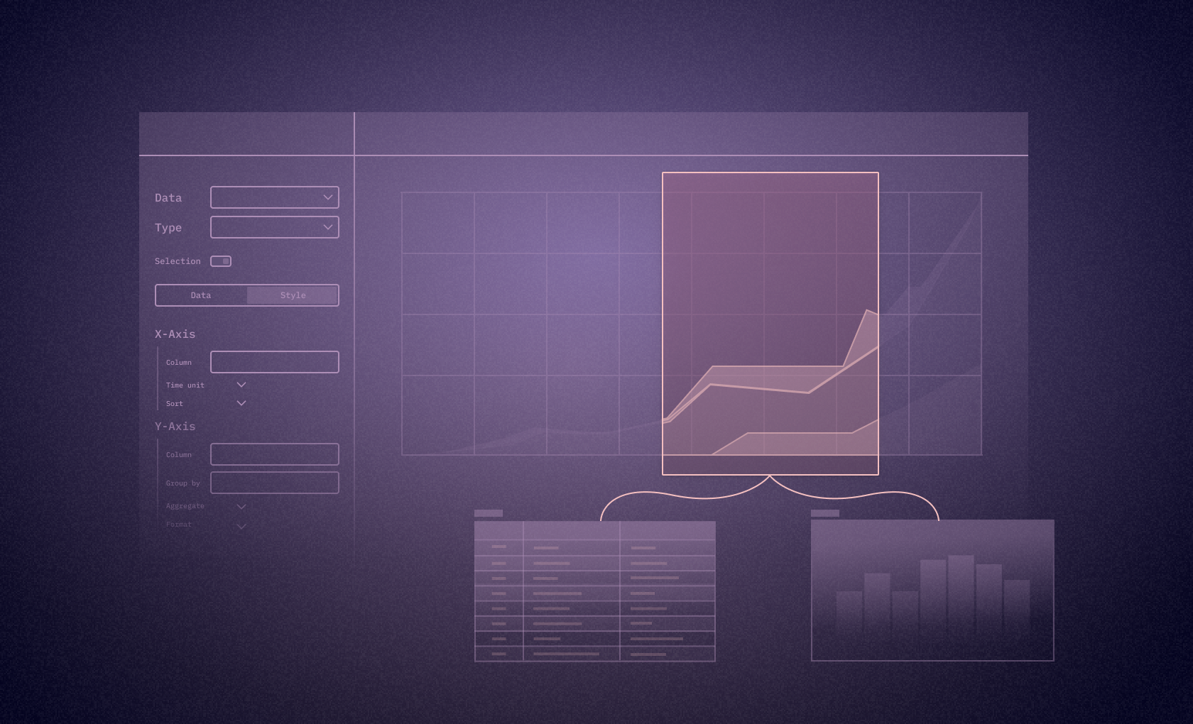
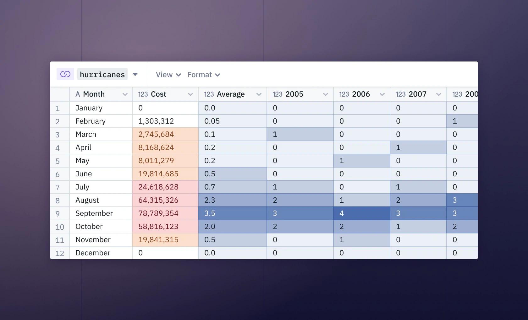
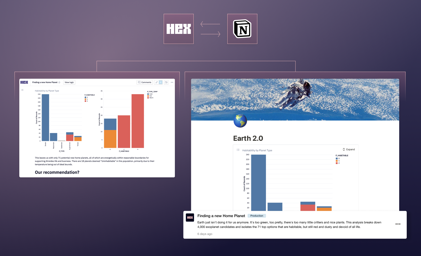
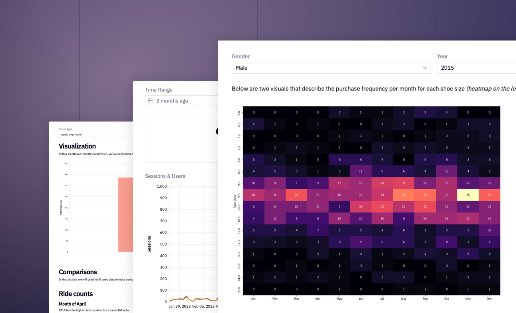
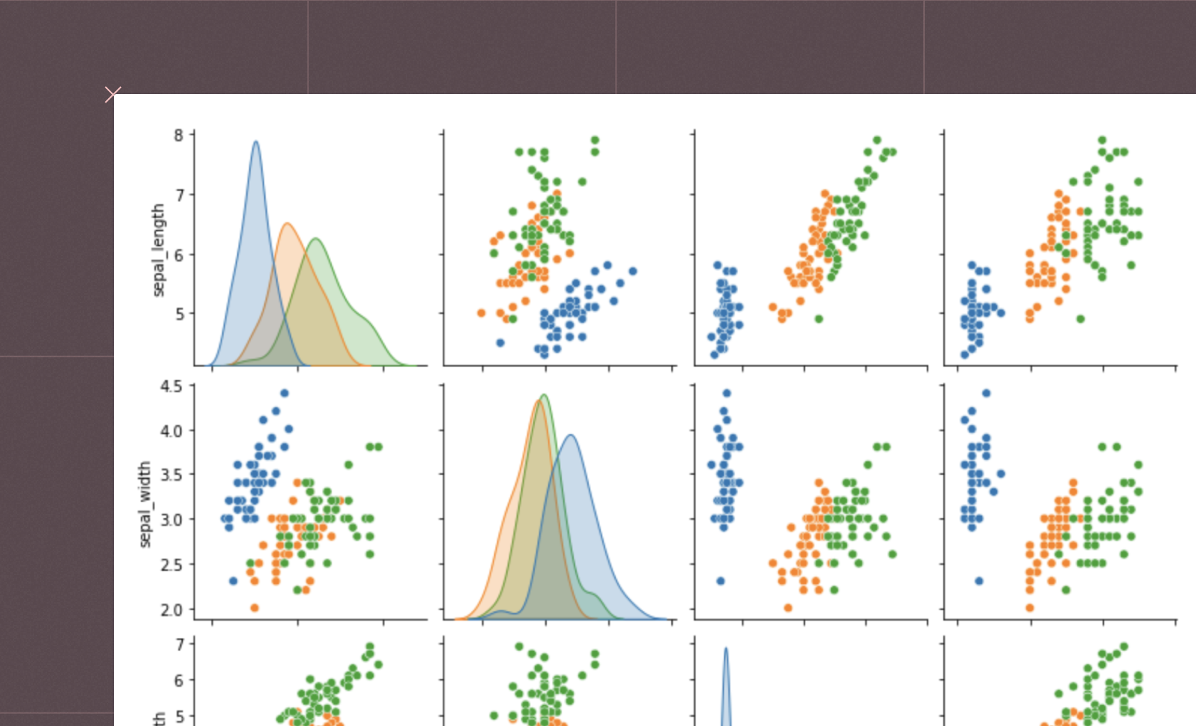
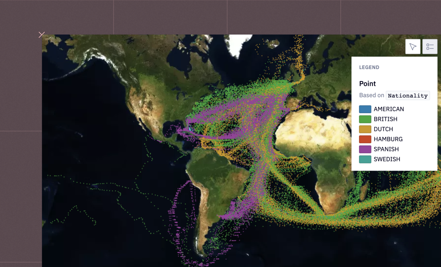
You can then create more advanced visualizations, such as multi-dimensional data visualization to observe complex patterns across multiple variables. Techniques such as parallel coordinate plots, scatterplot matrices, and heatmaps help explore these relationships. You can also create interactive visualizations to allow users to engage with the data more effectively. They can zoom, pan, and hover over the data for more detailed information, leading to better understanding and insight.On this page, you'll find interactive examples demonstrating interactive data visualization. If you see something interesting, click "Get a copy" to dive deeper and adapt any example to your requirements.
See what else Hex can do
Discover how other data scientists and analysts use Hex for everything from dashboards to deep dives.
FAQ
Can't find your answer here? Get in touch.